You are using an out of date browser. It may not display this or other websites correctly.
You should upgrade or use an alternative browser.
You should upgrade or use an alternative browser.
The new basketball uniforms
- Status
- Not open for further replies.
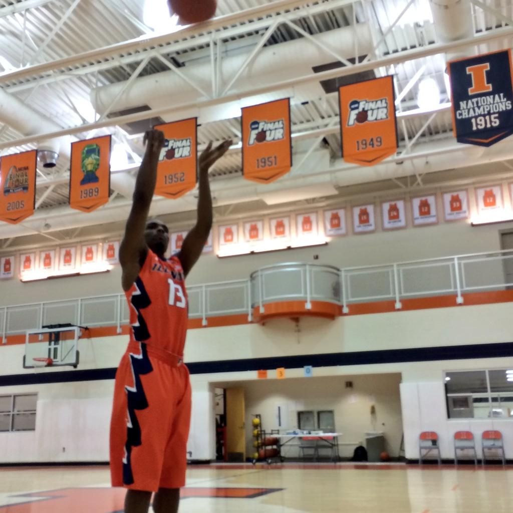
I personally love the zig zags.
Last edited by a moderator:
MuckFichigan
M
Guest
I think the lettering and zigzags on the orange uniforms should be white with blue outlines.
MuckFichigan
M
Guest
And silver looks great, was my favorite when during the unveil.
OrangeandBlue4eva
- Secretcity
People hate the zig zags but that is the only way they were able to put the "chief" in the uniforms.
DrewD007
- Woodridge, IL
People hate the zig zags but that is the only way they were able to put the "chief" in the uniforms.
If they were going to put a zig zag in there it should've been much more subtle like on the previous basketball shorts.

Instead they plastered it down the side and it just looks bad.
I think the zig zags look ok. I like them a little more on the orange jersey.
Maybe they'll look better when the players are moving?
Maybe they'll look better when the players are moving?
MuckFichigan
M
Guest
I think the zig zags look ok. I like them a little more on the orange jersey.
Maybe they'll look better when the players are moving?
I think the zig zags look ok. I like them a little more on the orange jersey.
Maybe they'll look better when the players are moving?
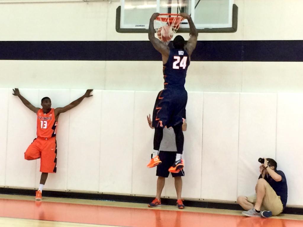
Not a fan of the zig zag either but I do think it looks better when the players arms are down. Unfortunately we don't really have a pic like that.
classof2016
C
Guest
The more I look at those zig zags the more surprised I am that Nike included them. It just seems so far out of line from what they've done in recent re-brands of other schools. I really think the zig zags will either look great in game action and be widely accepted as unique, or people will ridicule them and they'll be gone after one year. I'm leaning towards the latter scenario.
")
Man, I wish Nike had those kd6's available off the shelf somewhere
People hate the zig zags but that is the only way they were able to put the "chief" in the uniforms.
"Some" people hate the zig zags.
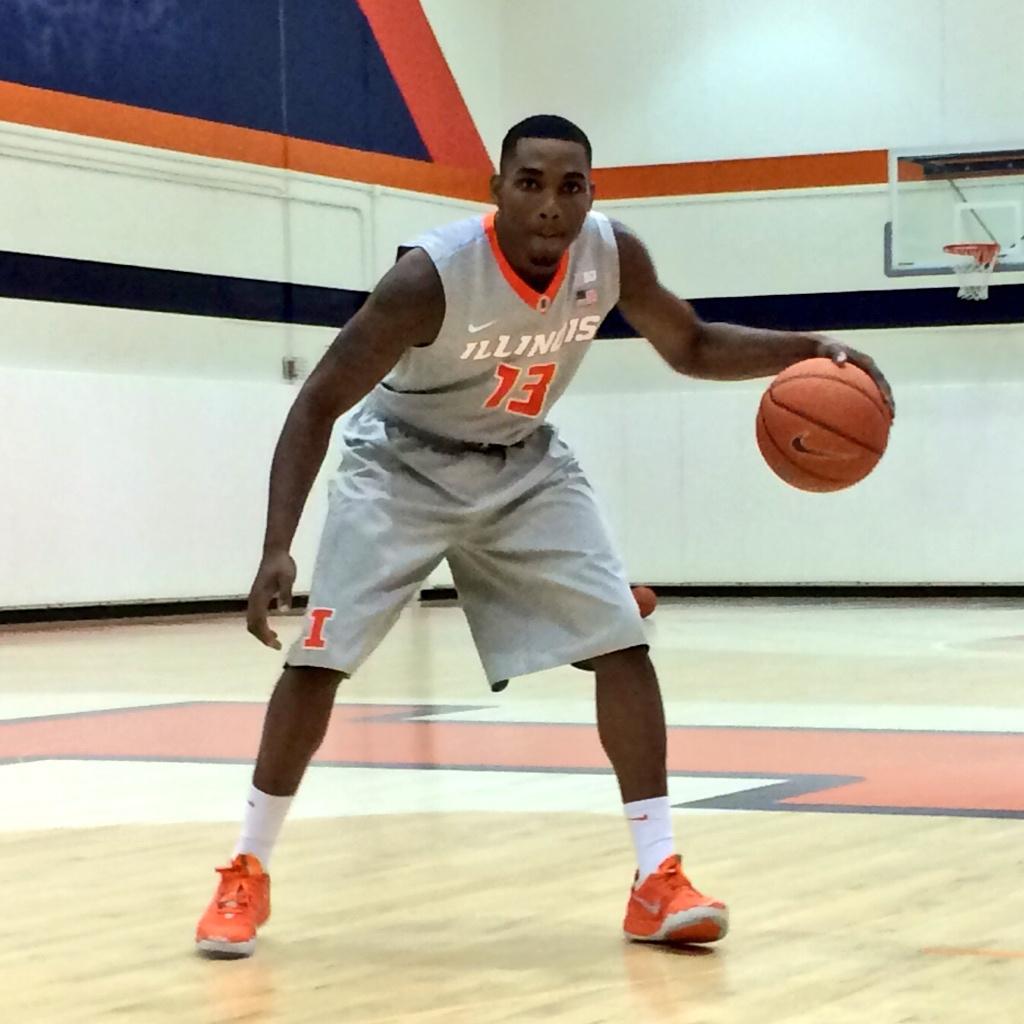
Personally, I like them. I wish they had added them to the grey uniforms - they are a little plain. I wish that they had not used black on the blue uniforms, though. Should have used more white or orange.
ILLiNimob
I
Guest
Greys need something on the side . anything. The Blues look great an i love the brighter orange.overall happy fwiw. The I on the back of the shorts is unique an cool
ILLiNimob
I
Guest
Ya the non use of fighting illini is epic fail.iirc groce said they may have one more uniform coming. Hope that has it on there
JFGsCoffeeMug
BU:1 Trash cans:0
- Chicago
I like the feathers.
My only gripes are we haven't seen anything that says fighting illini, lack of feathers on the grey unis, and the black on the blue unis. Black and navy clash, a sorority girl taught me that in college, lol
Hasn't it been confirmed (in some sense) that there are alternates Groce is holding onto for now? Any ideas what they are? I hope we get a fighting illini uni somewhere.
OrangeandBlue4eva
- Secretcity
I am anxious to see them on live tv.
classof2016
C
Guest
Hasn't it been confirmed (in some sense) that there are alternates Groce is holding onto for now? Any ideas what they are? I hope we get a fighting illini uni somewhere.
Yeah, I don't know if it's officially confirmed but there is going to be a "Fighting Illini" one.
Yeah, I don't know if it's officially confirmed but there is going to be a "Fighting Illini" one.
I thought I'd heard murmurs along those lines. That's all I have on my wish lists. I liked the '05 whites a lot. Not sure when we phased those in/out but that's the team I obviously recall wearing those. If we get anything even close to those ill be ecstatic.
FWIW, the unis aren't meant to make us happy though. If our players like them, that's what matters. We want players to like them, and recruits to like them, not those of us in A/B/C or Krush section :wink:
Greys need something on the side . anything. The Blues look great an i love the brighter orange.overall happy fwiw. The I on the back of the shorts is unique an cool
This is the first I'd noticed this, but on this picture it looks like there really is something on the sides of at least the silver shorts...

- Status
- Not open for further replies.