GrayGhost77
- Centennial, CO
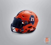
Oooooooh. Can we see it in orange, too?
Oooooooh. Can we see it in orange, too?
Basketball coach Tim Anderson wore a curved Illini shirt that is by Nike. Interesting since we haven't seen that as part of the Nike rebrand stuff.I've seen some merchandise with the curved illini logo lately. I doubt anything new will come this season, but maybe we see thIs next season? It does seem that each new coaching regime comes with uniform changes.
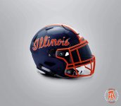
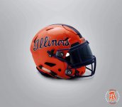
I like it in the orange and the white posted previously. Something about the blue helmet with the orange font I'm not a fan of though. State outline is a no for me.These would be awesome
As an old Rooster Teeth fan, I appreciate this post.
I like the throwback jersey.
Reminds me too much of the Gumby's.Going for a look that would give us a unique identity and make the Galloping Ghost proud.
View attachment 11822
I like it in the orange and the white posted previously. Something about the blue helmet with the orange font I'm not a fan of though. State outline is a no for me.
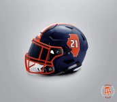
 While I like the ideas already submitted, they remind me of what Indiana has done already. Michigan’s helmets harken back to the leather ‘wing-style’ helmets. I thought it might be kind of neat to do something that is unique, and honors our past somehow. The Bears kind of rolled out something like it for a couple of games. I thought the helmets looked pretty sharp.
That is probably the nicest Illinois football helmet I’ve ever seen.
The Three Horsemen.View attachment 11832
always on my favorite throwback uniform list
Granted it was awhile ago, but I don't think those uniforms worked out so well for them...View attachment 11832
always on my favorite throwback uniform list
Granted it was awhile ago, but I don't think those uniforms worked out so well for them...
View attachment 11858
Good spot, you're right.


Thor, what are you using to make these images? Photoshop or is there a regular website? I would like to put some ideas together, if it is a general website.Going for a look that would give us a unique identity and make the Galloping Ghost proud.
View attachment 11822
Gotta admit, I do like the simple but clean look of the current uniforms. That said, I went to the UI during the Zook years and also liked how those uniforms looked. I hope that the next redesign will have some flash but have a simple but classic look, a la Texas.
Honestly it would not be that bad if they just let the I pop with a white outline. The orange outline on the orange helmet just doesn't do it. Maybe even soften/stylize the arch to be the column and you have a winner with some touches of white in that navy IGood spot, you're right.
The helmet logo though...

")
 on the pants before.