Illinois Football Uniforms

Status
Not open for further replies.
#751      

ChiefGritty

Chicago, IL
Old school Broncos is a fantastic look - I know they won two SBs shortly after rebranding, but from a purely aesthetic standpoint, one of the more unfortunate uniform overhauls in all of pro sports.
3d54b90c-6f9d-44a4-835a-336115f85517_570.Jpeg

"The 80's Broncos unis are mid and the Terrell Davis-era ones are iconic"
 
#754      
A few big things to keep in mind here:
1. Sleeve pipings ain’t what they used to be with the advent of sleeveless/tight cut jerseys. That O-W-B tri stripe would barely hold up on the thin piping elastic sleeve holes. Certainly wouldn’t see it very well. Probably would show up well on collar, but that’s discussed in point 3.
2. If we tried this and moved the stripe up onto the uniform fabric to make it more visible, you’d have to move the numbers up from the sleeve to the shoulder top. That would probably look cool, but wouldn’t be an exact template redo.
3. While Nike still will do multicolor collars (see packers) we don’t do it much on the new templates. Look at the packers template for their uniforms. They still won’t move off the old template to keep that look. Small lines are okay (see bills, buccaneers) but a half and half like this isn’t really done. Could be, but isn’t. I don’t think Nike’d do it just for Illinois.
Update - guess the collars were done for the Seattle throwbacks so wtf do I know. Nobody tells me anything.
 
#755      

217sports

Springfield
Nike is all around lazy in their uniform designs across all sports - CBB, CFB, premier league, etc. in recent years. IMO we're going to get templated uniforms of the branding that their team has come up with as the "new" style without much creativity/individuality to us

So I'm expecting something similar to these and we'll have some BS spin on how it "honors our traditions": https://okstate.com/news/2023/5/10/...present-and-future-with-new-football-uniforms
 
#756      
Nike is all around lazy in their uniform designs across all sports - CBB, CFB, premier league, etc. in recent years. IMO we're going to get templated uniforms of the branding that their team has come up with as the "new" style without much creativity/individuality to us

So I'm expecting something similar to these and we'll have some BS spin on how it "honors our traditions": https://okstate.com/news/2023/5/10/...present-and-future-with-new-football-uniforms
I highly doubt it. Bielema wouldn’t disclose that he had conversations with Mikey about what could, and could not be done the moment he took the job, discuss brand identity, and put this much hype into it. If the end result is going to be something with absolutely none of his input. Wow all the information, whether truth or not, hasn’t all exactly been aligned, it does seem like there’s a general understanding that there will be some form of stripes, and that would recognize some of the look. It’s hard to tell, and I suppose we could get a replica of white OK state just got, and then it seems more likely not to be the case.
 
#757      

ChiefGritty

Chicago, IL
Nike is all around lazy in their uniform designs across all sports - CBB, CFB, premier league, etc. in recent years. IMO we're going to get templated uniforms of the branding that their team has come up with as the "new" style without much creativity/individuality to us

So I'm expecting something similar to these and we'll have some BS spin on how it "honors our traditions": https://okstate.com/news/2023/5/10/...present-and-future-with-new-football-uniforms
The marketing blather is one thing, but those uniforms are basically an exact replica of what OSU wore when Mike Gundy was a player, it's absolutely specific to their history.
 
#758      

mattcoldagelli

The Transfer Portal with Do Not Contact Tag
Nike is all around lazy in their uniform designs across all sports - CBB, CFB, premier league, etc. in recent years. IMO we're going to get templated uniforms of the branding that their team has come up with as the "new" style without much creativity/individuality to us

I have beaten, buried, exhumed, and beaten again the dead horse that is "our rebrand font was lazy and ill-conceived" but the rebrand effort also featured a new secondary logo that us members of #TeamShield loved and everyone else (unwisely) crapped on, and a "Grey Ghost" alternate that, while (as far as I know) was unique to us, was pretty lame. So we got new stuff - it just didn't have staying power.

We're never gonna be the uniform school, nor should we attempt to be. My kingdom for a classic-looking template that we can lock in and stop thinking about for the foreseeable future while we find new ways to deploy the Barge formation and send more maniacal DBs to the first round of the draft.
 
#759      

ChiefGritty

Chicago, IL
I have beaten, buried, exhumed, and beaten again the dead horse that is "our rebrand font was lazy and ill-conceived" but the rebrand effort also featured a new secondary logo that us members of #TeamShield loved and everyone else (unwisely) crapped on, and a "Grey Ghost" alternate that, while (as far as I know) was unique to us, was pretty lame. So we got new stuff - it just didn't have staying power.

We're never gonna be the uniform school, nor should we attempt to be. My kingdom for a classic-looking template that we can lock in and stop thinking about for the foreseeable future while we find new ways to deploy the Barge formation and send more maniacal DBs to the first round of the draft.
The rebellion against the rebrand font is going to continue to be a lingering problem across all sports.
 
#762      

skyIdub

Winged Warrior
I have beaten, buried, exhumed, and beaten again the dead horse that is "our rebrand font was lazy and ill-conceived" but the rebrand effort also featured a new secondary logo that us members of #TeamShield loved and everyone else (unwisely) crapped on, and a "Grey Ghost" alternate that, while (as far as I know) was unique to us, was pretty lame. So we got new stuff - it just didn't have staying power.

We're never gonna be the uniform school, nor should we attempt to be. My kingdom for a classic-looking template that we can lock in and stop thinking about for the foreseeable future while we find new ways to deploy the Barge formation and send more maniacal DBs to the first round of the draft.

I will sit at the round table of this kingdom!!

sir-lancelot.gif
 
#765      

altgeld88

Arlington, Virginia
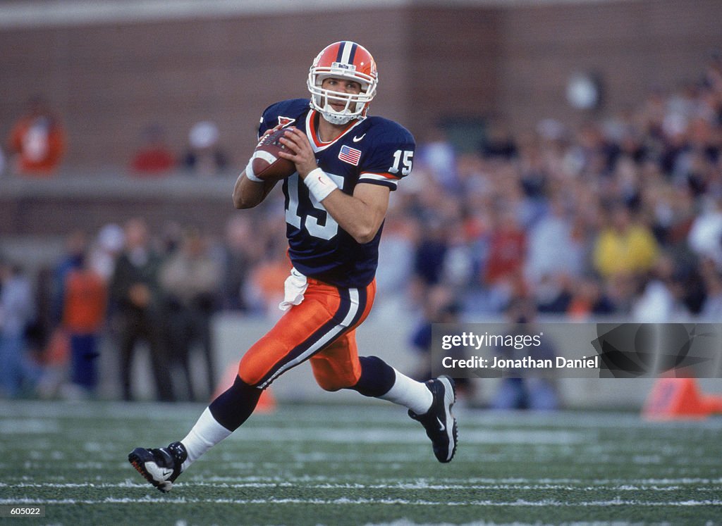
I disagree for the home uniforms, as I actually think this basic look (which it sounds like we are going to be very similar to) looks VERY sharp and classic:

quarterback-kurt-kittner-of-the-illinois-fighting-illini.jpg


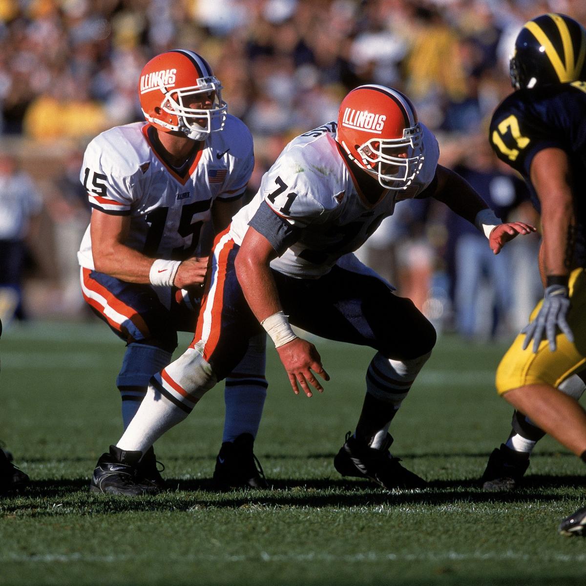
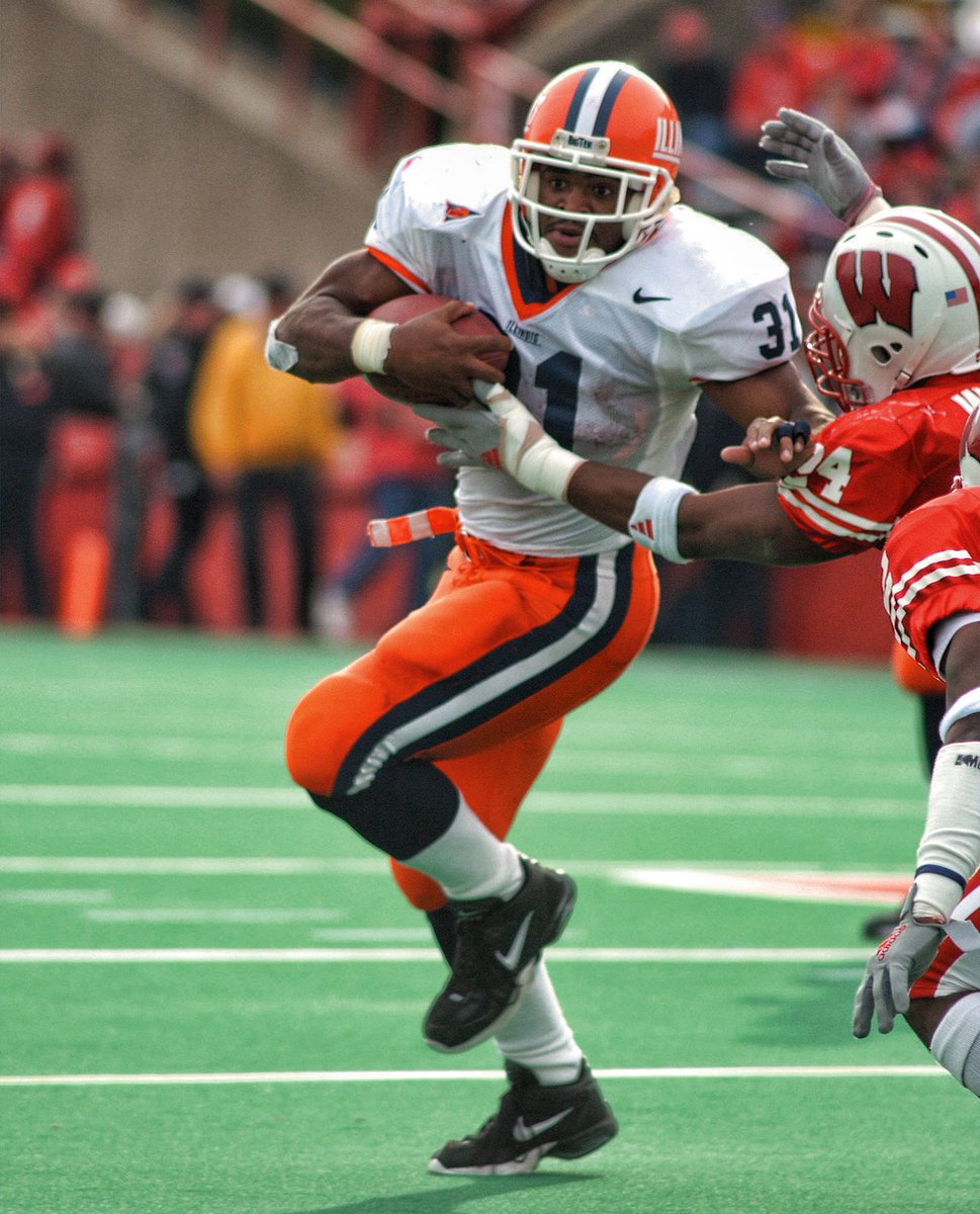
Perfect amount of navy, orange and white, IMO. However, when it comes to a potential road uniform, I REALLY think we too often look like a team whose colors are just white and orange, especially if we have orange numbers with no outline (like our current ones). I know people have said it looks "weird" for a team to have a different color helmet than pants with a white jersey, but hey ... maybe that could be a unique and defining look for us. Because in my opinion...

hi-res-528575_crop_exact.jpg
>
Dp0m94CXcAMv4J5.jpg


Also, as far as those Broncos throwbacks go ... here is some interesting food for thought RE: ditching the orange pants, at least for an alternate. I posted this a while back in this thread, but even though I have ABSOLUTELY ZERO memory of us EVER wearing white pants at home during the 1989-2005 era, I found this photo online:

fredwakefield_illinoisathletics_1000x1000_3.jpg

Personally, I think that looks like a slick combo ... maybe for bowl games or the Mizzou rivalry game or something special? Those white pants are a must if we EVER wear an orange jersey, as O/O/O and O/O/B are both terrible, lol.

EDIT: Come to think of it, given Bret's love of the white pants on the road, I will change my prediction to the new uniforms will include the literal exact white pants above for a O/W/W combo on the road.
Posted this back on Feb. 2. Goodness, that's an '80s stripes combo. From the White (coincidence?) era:

1689799373234.png
 
#769      
From the Syracuse O&B spring game.
Lose the "ORANGE" (or Illinois in our case) on the front...and I love this WBW. Better than Auburns imo.

Sorry if already posted...didn't see it.
T6FLRA6AOBFZ5BQJ5V7MOLJMMY.jpg
You know how you go in to a sports store to buy a simple Illini tee shirt and find that most of the shirts have numerous and/or big graphics. That's what these jerseys look like to me.
 
#772      
I think some sort of psycodelic blue and orange helmet would be distracting to DBs covering our receivers.
 
#773      

skyIdub

Winged Warrior
You know how you go in to a sports store to buy a simple Illini tee shirt and find that most of the shirts have numerous and/or big graphics. That's what these jerseys look like to me.
I agree, which is why I began with “lose the ORANGE…”
The orange border and shoulder stripes make this look for me. Clean it up and it’s solid.
IMG_2029.jpeg
 
Status
Not open for further replies.