Sorry there's no good place to put this but I'm going to be in Chambana this week. I haven't been back in 3 years and wondering if anyone has recommendations on where to get illini apparel or accessories on campus or in town. I do shop fanatics but just wondering if there are good places in town.
You are using an out of date browser. It may not display this or other websites correctly.
You should upgrade or use an alternative browser.
You should upgrade or use an alternative browser.
Illini Basketball Uniforms
- Status
- Not open for further replies.
IlliniKat91
- Chicago, IL
Gameday Spirit or the IUB are where I always go. I was just down in November for a basketball game and they had cute stuff in both spots then.Sorry there's no good place to put this but I'm going to be in Chambana this week. I haven't been back in 3 years and wondering if anyone has recommendations on where to get illini apparel or accessories on campus or in town. I do shop fanatics but just wondering if there are good places in town.
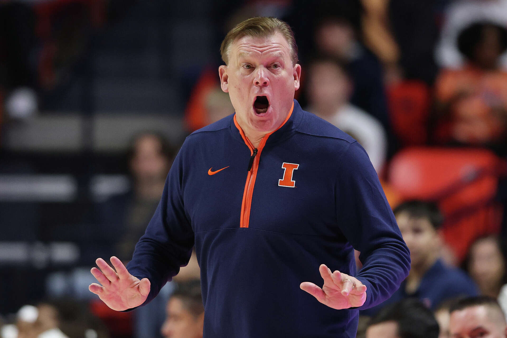
I’d sell everything I own for that 1/4 zip that Coach Stepp is wearing
I got an orange version that is very similar to that at Gameday Spirit when I was down there last Saturday. Not 100% the same but pretty close. It looks like this has a hood, which mine does, and this one looks a little thicker than the one I got.View attachment 38925
I’d sell everything I own for that 1/4 zip that Coach Stepp is wearing
I didn't realize how long we'd be stuck with parts of that 2014 rebrand. Even the new football uniforms released last year had to use the same motifs from that 2014 rebrand it's insane.I will never wear anything with 1LL1NO1S on it. I think it’s terrible. I can’t understand why it is still being used when there are much better choices.
I don't like the font either.I didn't realize how long we'd be stuck with parts of that 2014 rebrand. Even the new football uniforms released last year had to use the same motifs from that 2014 rebrand it's insane.
But, to be fair, a rebrand is meant to last decades. And until we rebrand again, we need to (or at least it's best practice to) follow the current guidelines inclusive of the font. Also, it takes a long time to build brand equity and get a good read on if your rebrand is working so, I don't blame them for sticking with it for a while.
That said, 10 years is long enough to realize the font isn't working. We don't need another full rebrand. There were some good things that came out of the last rebrand like standardized colors, a better looking block I, and the shield. But a brand refresh with a new font is definitely in order.
My hope is, now that our athletic department is in infinitely better shape than it was during the last rebrand, we'll get Nike's A team and they'll take a serious look at our traditional design language and adopt or adapt some of it rather than bolting a modern trend onto our brand.
Yes. I believe I saw that one online. Antigua brand? It looks closer to Tennessee orange. I wish they’d sell more of all the Nike stuff that the coaches(both basketball and football) wear.I got an orange version that is very similar to that at Gameday Spirit when I was down there last Saturday. Not 100% the same but pretty close. It looks like this has a hood, which mine does, and this one looks a little thicker than the one I got.
Fighter of the Nightman
- Chicago, IL
Would have won in the Flyin’ Illini set. Screw you, Nike.
You might be searching a while, because I suspect it’s a full zip hood and not a 1/4 zip.View attachment 38925
I’d sell everything I own for that 1/4 zip that Coach Stepp is wearing
1) the swoosh is on the left chest which means it was a retail or golf piece that they had somebody add the script.
2) if you look closely at the neck line you can see the drape of the hood starting to form.
3) at first I thought I found the zip hood, but it doesn’t have the black piping near the zipper.

Nike Therma-FIT Pocket 1/4-Zip Fleece Hoodie | Product | SanMar
<p>This 1/4-zip hoodie with a zippered left arm pocket brings the heat to your workout with Therma-FIT fabric. Therma-FIT helps manage your body’s natural heat to keep warm in cold-weather conditions.</p> <ul> <li>7.4-ounce polyester Therma-FIT fabric with at least 50% recycled content</li>...
 www.sanmar.com
4) I finally realized that the jersey was blocking the front and it could be a full zip, but I still can’t find one with a black zipper
Long story short we’re probably going to have to start crowd sourcing our own bootlegs, if gameday spirit doesn’t start making some of this stuff for us.
Cook
- Richmond, VA
Was going to say same thing. As soon as I saw what we were wearing today, got that bad feeling.Would have won in the Flyin’ Illini set. Screw you, Nike.
Seriously wish they'd burn those orange and white versions!!!
Cook
- Richmond, VA
FOTN- have you anything to say about the black compression gear? For the love of God, get some blue (or orange, but really blue)!Would have won in the Flyin’ Illini set. Screw you, Nike.
hooraybeer
- Peoria, IL
why are we still wearing these jerseys
Fighter of the Nightman
- Chicago, IL
It literally has to be contractually obligated by negligent, incompetent or both Nike folks. There’s zero other explanation.why are we still wearing these jerseys
PizzaHutParkingLot
- Vodice, Croatia
Add this to the list of apparel that should be available to fans…
OrangeBlue98
Iowa is not in a great spot right now (LvilleILL1)
- Des Moines, IA
To paraphrase our friend Pru, "It blows my mind . . . it really really does . . ."View attachment 39208
Add this to the list of apparel that should be available to fans…
The "coach casual" dress code should be a marketing gold mine. I took one for the team and did a search on Duke's online store. They pretty much have the same type of situation as Illinois. Yes, you can buy half-zips with the "D" logo on it, but you don't see any of the stuff that Scheyer wears on the sideline. You don't think the legions of Duke bandwagon jumpers wouldn't be falling all over themselves to wear the stuff that Scheyer wears on the sidelines?
We've talked about the licensing aspects of this (hat tip to @21ChampaignSt for doing a really good breakdown of that a while back), but you'd think we'd see more of this stuff available for sale to the general public. Let's face it - basketball coaches are now fashion models and mannequins to a degree. If they wear something cool like the Illini coaching staff has shown for a good chunk of this season, the demand should be there.
Duke® Men's Club Fleece 1/2 Zip by Nike®
Online shopping from a great selection of 1/4 and 1/2 Zips at our official Duke University Store. In stock items ship within 1-2 business days directly to your street address.
 shop.duke.edu
Edited to add - Here's a link to the Iowa State official store. You don't see many, if any, of the polos that TJ wears on the sidelines. (Insert your joke of choice here about his shirts being at least a size too tight.
 )
)
Last edited:
OrangeBlue98
Iowa is not in a great spot right now (LvilleILL1)
- Des Moines, IA
I would never claim to be a fashion-forward person, but it seems to me like we have the font elements in place for a brand refresh.I don't like the font either.
That said, 10 years is long enough to realize the font isn't working. We don't need another full rebrand. There were some good things that came out of the last rebrand like standardized colors, a better looking block I, and the shield. But a brand refresh with a new font is definitely in order.
My hope is, now that our athletic department is in infinitely better shape than it was during the last rebrand, we'll get Nike's A team and they'll take a serious look at our traditional design language and adopt or adapt some of it rather than bolting a modern trend onto our brand.
1) Flying Illini font is the "standard" font
2) Script Illinois font is the "alternate" font
3) I have to think we can incorporate the font in the arched "Illini" in some manner
MAYBE do some sort of refresh on the shield without altering it too much. I like the concept, but it is definitely a child of the 2010s "modern and minimalist" philosophy. I like it and think it can be used in a lot of good ways (soccer uniforms, wrestling singlets, secondary end zone markings, etc.). But maybe it's updated to have a slightly less minimalist feel. Like you, I like the standardized colors of the rebrand. The Block I looks good. I genuinely do not think there's a lot to do with a brand refresh, because I feel like the base elements are right there. Just some reworking with what we already have should do the trick.
I agree. A few small adjustments would go a long way. I'm indifferent about the shield. I understand why we felt we needed a secondary logo since our last secondary logo was taken away but I think it's kind of forgettable. JMO as I know some people really like it.I would never claim to be a fashion-forward person, but it seems to me like we have the font elements in place for a brand refresh.
1) Flying Illini font is the "standard" font
2) Script Illinois font is the "alternate" font
3) I have to think we can incorporate the font in the arched "Illini" in some manner
MAYBE do some sort of refresh on the shield without altering it too much. I like the concept, but it is definitely a child of the 2010s "modern and minimalist" philosophy. I like it and think it can be used in a lot of good ways (soccer uniforms, wrestling singlets, secondary end zone markings, etc.). But maybe it's updated to have a slightly less minimalist feel. Like you, I like the standardized colors of the rebrand. The Block I looks good. I genuinely do not think there's a lot to do with a brand refresh, because I feel like the base elements are right there. Just some reworking with what we already have should do the trick.
And frankly, while I don't like the font, the bigger issue with our standard unis to me is that 2010s minimalism like you pointed out. The lack of outlines on the numbers and letters is too stark.
Net net, building the brand is like building the program itself. You have to start by building a solid foundation then continue to refine and improve from there. The 2014 rebrand laid the foundation. Now let's take it to the next level in this new, revenue-above-everything era of college athletics.
OrangeBlue98
Iowa is not in a great spot right now (LvilleILL1)
- Des Moines, IA
Fair point on the shield. I happen to like it, but I'm also a big soccer fan and like logos that could end up on a soccer jersey. But, like you said, if they went away from it, probably not the end of the world as we know it.I agree. A few small adjustments would go a long way. I'm indifferent about the shield. I understand why we felt we needed a secondary logo since our last secondary logo was taken away but I think it's kind of forgettable. JMO as I know some people really like it.
And frankly, while I don't like the font, the bigger issue with our standard unis to me is that 2010s minimalism like you pointed out. The lack of outlines on the numbers and letters is too stark.
Net net, building the brand is like building the program itself. You have to start by building a solid foundation then continue to refine and improve from there. The 2014 rebrand laid the foundation. Now let's take it to the next level in this new, revenue-above-everything era of college athletics.
But, to use what we already have, I think the template for a shield update is already in place - it's the 100-year Memorial Stadium logo. All you'd have to do is remove the "100", the "1924" and "2024", and the "Memorial Stadium" Make the Block I a similar size to the "1" and center it. Alter the colors as needed based on the background color. You have a refreshed shield that isn't as minimalist and modern.
And to think someone at Nike is probably going to be paid six figures for what it took me two posts to figure out.
Illini in Italy
- Illini HQ, Florida Panhandle
I'll be loyal to this logo until the day I'm gone, and then I go out wearing O&B

Fighter of the Nightman
- Chicago, IL
I don't like the unis with the cursive.

I agree with this 110%. The lettering used in our Flyin' Illini jersey should serve as the standard font for things like "FIGHTING ILLINI" on the basketball end line and "ILLINOIS" in the football end zone ... it's classic, simple and not going to age awfully with changes in trends:I would never claim to be a fashion-forward person, but it seems to me like we have the font elements in place for a brand refresh.
1) Flying Illini font is the "standard" font
2) Script Illinois font is the "alternate" font
3) I have to think we can incorporate the font in the arched "Illini" in some manner
MAYBE do some sort of refresh on the shield without altering it too much. I like the concept, but it is definitely a child of the 2010s "modern and minimalist" philosophy. I like it and think it can be used in a lot of good ways (soccer uniforms, wrestling singlets, secondary end zone markings, etc.). But maybe it's updated to have a slightly less minimalist feel. Like you, I like the standardized colors of the rebrand. The Block I looks good. I genuinely do not think there's a lot to do with a brand refresh, because I feel like the base elements are right there. Just some reworking with what we already have should do the trick.
I agree with the Script used as an alternate, and I think it could be used very sparingly, too. It works super well on our basketball jerseys and would perhaps work great for some other sports (baseball immediately comes to mind), but maybe something like wrestling would utilize the font pictured above much better. I could take or leave the Arched ILLINI font as a DIA-wide standard, and I say that as someone who thinks that is our best helmet we wore last year.
As for the Shield, I have no strong feelings about it sticking around or not. However, if it IS going to be kept, I think it needs to incorporate a bit more of a "column" look to give a nod to the history of Memorial Stadium and how integral that is to the Fighting Illini name. In effect, we should look to take the existing Shield logo...

... and borrow heavily from the design elements in this logo from last football season:

A new version of the Shield that looks a bit less MS Paint-like and has some of those column elements would be cool.
Battle89
- Cary-Grove, the better Trojan team
Don't know if this is a dumb question, but is there some rule in place that coaches must have unique apparel? So that it is their 'uniform' for the game?To paraphrase our friend Pru, "It blows my mind . . . it really really does . . ."
The "coach casual" dress code should be a marketing gold mine. I took one for the team and did a search on Duke's online store. They pretty much have the same type of situation as Illinois. Yes, you can buy half-zips with the "D" logo on it, but you don't see any of the stuff that Scheyer wears on the sideline. You don't think the legions of Duke bandwagon jumpers wouldn't be falling all over themselves to wear the stuff that Scheyer wears on the sidelines?
We've talked about the licensing aspects of this (hat tip to @21ChampaignSt for doing a really good breakdown of that a while back), but you'd think we'd see more of this stuff available for sale to the general public. Let's face it - basketball coaches are now fashion models and mannequins to a degree. If they wear something cool like the Illini coaching staff has shown for a good chunk of this season, the demand should be there.
Duke® Men's Club Fleece 1/2 Zip by Nike®
Online shopping from a great selection of 1/4 and 1/2 Zips at our official Duke University Store. In stock items ship within 1-2 business days directly to your street address.
Edited to add - Here's a link to the Iowa State official store. You don't see many, if any, of the polos that TJ wears on the sidelines. (Insert your joke of choice here about his shirts being at least a size too tight.
I wonder if they don't want a bunch of fans sitting behind the bench looking like staff during games.
OrangeBlue98
Iowa is not in a great spot right now (LvilleILL1)
- Des Moines, IA
Actually, that’s a good point. They may want that exclusivity. I could see that.Don't know if this is a dumb question, but is there some rule in place that coaches must have unique apparel? So that it is their 'uniform' for the game?
I wonder if they don't want a bunch of fans sitting behind the bench looking like staff during games.
Maybe don’t sell them until after the season?
Fighter of the Nightman
- Chicago, IL
^ Also, an insider can totally correct me ... but I get the vibe that Nike has quasi-contracted out at least SOME of what the staff will wear, lol. Or at the very least, they said something like, "Look, we made five iterations of casual coach gear, and you're going to need to wear all five at least once this season." Might be totally off-base here, but we have seen Brad and Co. in both some really elite gear that you can't find anywhere and also some standard 1LL1NO1S garbage that Nike practically spams our apparel sites with.
AWESOME GEAR ... Nike/DIA, PLEASE take my money!!

/cdn.vox-cdn.com/uploads/chorus_image/image/73473219/BU_UCONN_Arms_Crossed.0.jpg)
/cdn.vox-cdn.com/uploads/chorus_asset/file/25764335/2186694991.jpg)
STANDARD 1LL1NO1S REBRAND

Might be totally off-base here, but we have seen Brad and Co. in both some really elite gear that you can't find anywhere and also some standard 1LL1NO1S garbage that Nike practically spams our apparel sites with.AWESOME GEAR ... Nike/DIA, PLEASE take my money!!
STANDARD 1LL1NO1S REBRAND
- Status
- Not open for further replies.