You are using an out of date browser. It may not display this or other websites correctly.
You should upgrade or use an alternative browser.
You should upgrade or use an alternative browser.
The 2014 Illini Nike Uniforms and Rebrand
- Status
- Not open for further replies.
FinalFour88
- Charlotte, NC
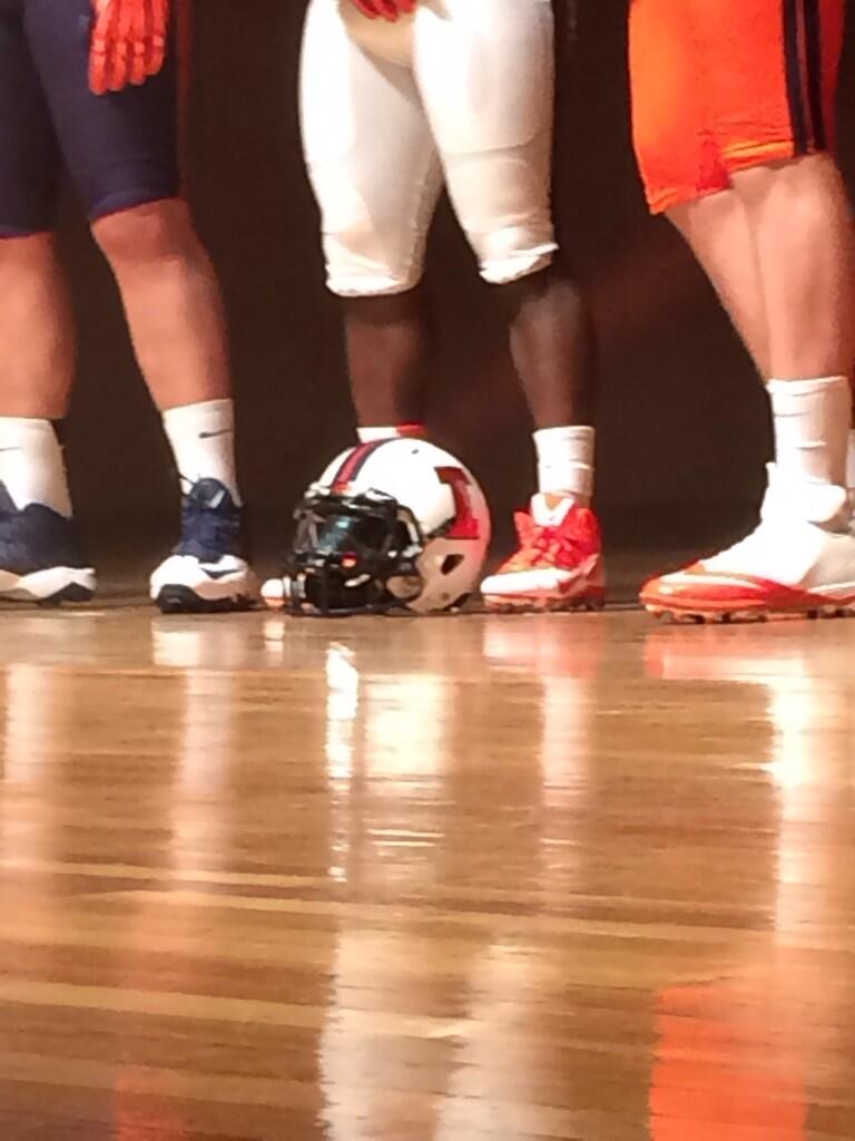
I don't care for the blue helmet at all. Hopefully they don't wear it much. The white football unis are epic. The white hoops uniforms look better than on the photo. The female student-athletes are pretty cute. And the baseball uniforms are horrendous.
LeonardCenter
L
Guest
if that zig zag isn't chief related it's may have just ruined the basketball uniforms for me, but then again it is unique and that's what we wanted. I'm probably just overreacting
Pretty obvious it resembles the chief headdress. Anything chief related I'm all for it.
Well. The football uni's look great. The women's uni's look great; like the shield top for the soccer team. I do like the victory shield. Mens's basketball... I'm sure it appeals to the youngsters. Really don't like the font for the numbers at all. I really wanted, but didn't expect, the return of Fighting Illini. Illinois, at least they used ones and not zeros for the letter replacement. EDIT - I did like the baseball uni's, but then I like an understated, classic look. I'm prolly just old.
Certainly not an earth-shattering re-brand. More like a re-org, consolidation effort. The most exciting part of the event was bumping into Tate and saying howdy. Oh, I did end up liking the colors. The footballs uni's really popped. That was better than I thought it was going to be.
Certainly not an earth-shattering re-brand. More like a re-org, consolidation effort. The most exciting part of the event was bumping into Tate and saying howdy. Oh, I did end up liking the colors. The footballs uni's really popped. That was better than I thought it was going to be.
Last edited:
I also like the fonts and think the basketball uniforms are also good
It is absolutely explicitly Chief related, they just aren't allowed to tell you it is.
In that case, I love them.
peace davids
- Colorado
I really think they did great things with all of them except baseball.
The men's bball uniforms are bold, just like JFG wanted. Like em or not, they will change eventually. This is more about the identity than the uniforms, and I think the identity is good.
The men's bball uniforms are bold, just like JFG wanted. Like em or not, they will change eventually. This is more about the identity than the uniforms, and I think the identity is good.
Boneyard Surfer
Lookin' for some Paign relief
Generic Under Armour with "Illinois" sewn across the front.
IbanezHRC
I
Guest
Zigzags or lightning bolts down the sides of the basketball uniforms are obnoxious and stupid.
But at least they left "no question that we are the Fighting Illini".... You know, since that is written nowhere on any uniform.
I am disappointed.
But at least they left "no question that we are the Fighting Illini".... You know, since that is written nowhere on any uniform.
I am disappointed.
TroubleTheTractor
T
Guest
The zigzags are gonna look sicknasty awesome when we throw down a dunk
Definitely Chief related but neither Nike or Illinois will say it. That is why Thomas didn't shoot it down the other day
Robert just tweeted a picture that the I on the other side is orange for the one they had on stage
Sweet. thanks!
MikeThomas4Prez
M
Guest
White Football jerseys and Silver Basketball jerseys are awesome. Others are good but not great.
illiniCA
- DC Area
The zig zag has to be a reference to the Chief. It makes no sense otherwise.
Since I can't tell it is cheif related I would rather it just not be there. I don't think it is part of the "brand" though so I don't see it lasting.
The only really disappointing thing about the brand is the blue and orange lettering. I would never wear that lettering. JMO
No silver Unis or fighting illini?
The zig zag has to be a reference to the Chief. It makes no sense otherwise.
make no mistake
that was the one bone they threw out to us old timers
I am hoping for a kick !!! football alternate uni down the road, the one where they wear it once a year, that has lots of native amercian imagery.
TheBossIllini
T
Guest
What about the silver?
Well. The football uni's look great. The women's uni's look great; like the shield top for the soccer team. I do like the victory shield. Mens's basketball... I'm sure it appeals to the youngsters. Really don't like the font for the numbers at all. I really wanted, but didn't expect, the return of Fighting Illini. Illinois, at least they used ones and not zeros for the letter replacement.
Certainly not an earthshattering rebrand. More like a re-org, consolidation effort. The most exciting part of the event was bumping into Tate and saying howdy. Oh, I did end up liking the colors. The footballs uni's really popped. That was better than I thought it was going to be.
I'm partial to vertical stripes for soccer but all in all, I liked them.
The Good -
* Football uni's are nice. Matte finish helmets are sweet.
* I can get on board with the victory shield
* Two-tone treatment of "Illinois" is interesting
The Bad -
* The zig zags remind me of those zubas pants
* All the uni's looked good in artwork but on the athletes themselves...nothing special.
* Football uni's are nice. Matte finish helmets are sweet.
* I can get on board with the victory shield
* Two-tone treatment of "Illinois" is interesting
The Bad -
* The zig zags remind me of those zubas pants
* All the uni's looked good in artwork but on the athletes themselves...nothing special.
Definitely Chief related but neither Nike or Illinois will say it. That is why Thomas didn't shoot it down the other day
This. I think it's pretty cool myself. Something different and uniquely Illinois.
IlliniLaw05
I
Guest
I think if you remove the zig zag from the shorts only and leave it on the tops they'd look good.
ajerwin96
- Belleville / Champaign
It is absolutely explicitly Chief related, they just aren't allowed to tell you it is.
that's what I was thinking, and the more I look at it the more I like it. Once the initial shock wore off I released how cool it looked

Lebowski
L
Guest
I don't care for the blue helmet at all. Hopefully they don't wear it much. The white football unis are epic. The white hoops uniforms look better than on the photo. The female student-athletes are pretty cute. And the baseball uniforms are horrendous.
lol The baseball uniforms are totally horrendous. It looks like an imitation jersey you would buy at Wal-Mart or something.
- Status
- Not open for further replies.