As someone with a big head, I will have to wait until someone comes out with larger sizes. Not likely to happen soon.
You are using an out of date browser. It may not display this or other websites correctly.
You should upgrade or use an alternative browser.
You should upgrade or use an alternative browser.
The 2014 Illini Nike Uniforms and Rebrand
- Status
- Not open for further replies.
Deleted member 3875
D
Guest
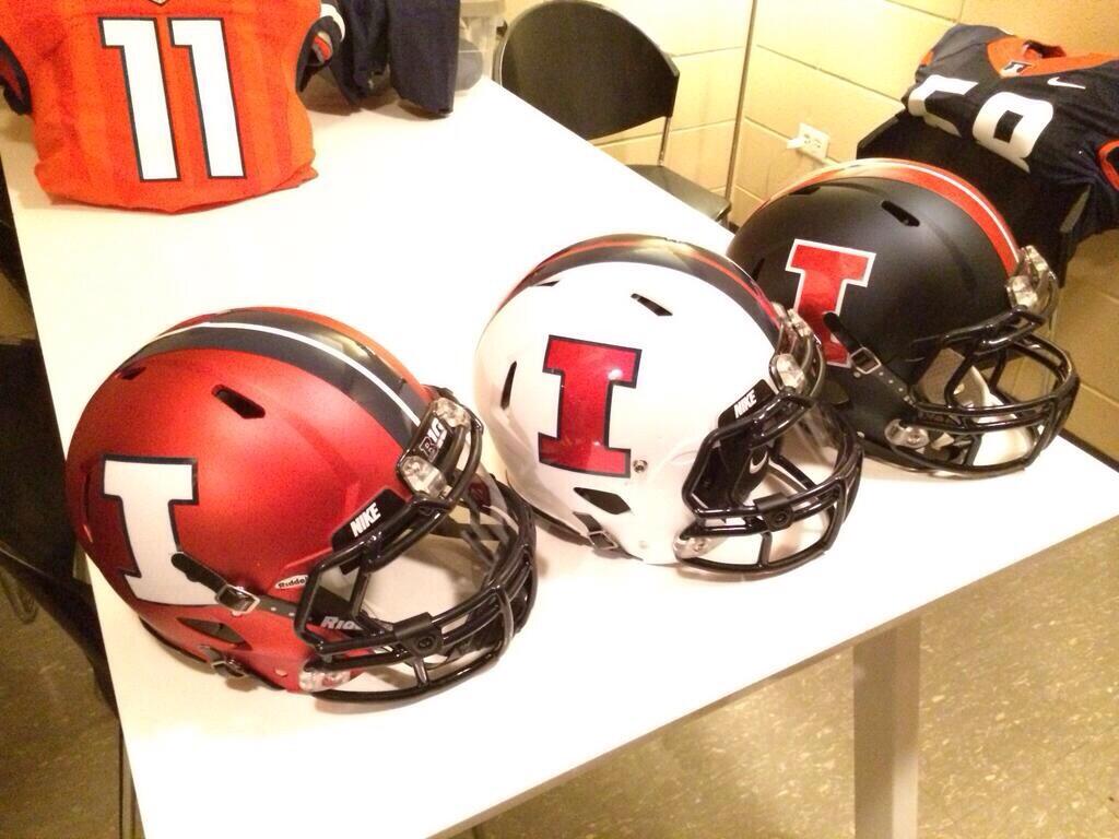
The white football uni's are so nice. I hope we never wear the blue helmet.
Disagree. Mix it up ala Oregon. The more choices the better. Blue one is bad !!!.
I don't think those block i's look very good on the back of the shorts like that...
Also, was anybody else hoping for a little more variety in the helmets? Love the colors and finishes, but one w/ the alternate logo or word mark perhaps for a change of pace?
Also, was anybody else hoping for a little more variety in the helmets? Love the colors and finishes, but one w/ the alternate logo or word mark perhaps for a change of pace?
This keeps me excited and hopeful (the goal, I would assume), and agitates the hell out of me all at the same time. Too impatient. Me want now!!Looks like nike didn't show their whole hand yet. Of this I know with certainty.
Deleted member 3875
D
Guest
I'm betting that they show up more when they are wet from wicking away sweat, especially the blue ones.
Good point. I bet you're correct.
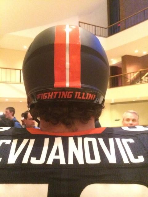
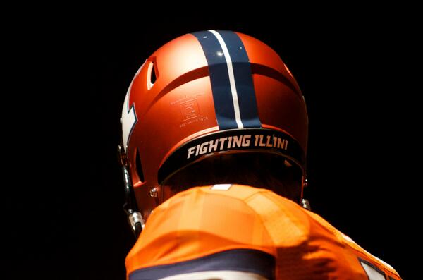
Probably the best helmet picture so far:
Uniswag @Uniformswag 42m
New unis for @IlliniFootball #uniswag #Rebrand pic.twitter.com/ARKbfCQ5xE
Lebowski
L
Guest
I don't think those block i's look very good on the back of the shorts like that...
Also, was anybody else hoping for a little more variety in the helmets? Love the colors and finishes, but one w/ the alternate logo or word mark perhaps for a change of pace?
I agree and yes. With the block I on the back of the shorts, it kind of looks like the shorts are on backwards.
Any shots of the back of the helmet? Its a small thing but I'm curious if it says anything on that back flap part like "Illini" or "Oskee Wow Wow" or something like that.
tis bookstore has it http://tisbookui.com/MerchList.aspx?ID=26220
Holy crap. That white hat is AWESOME.
Birthday coming up soon... boo-yah!
uiba99
I'd rather be at Allerton
Probably the best helmet picture so far:
I don't care if this sounds horrible or shallow, I seriously would divorce my husband to marry that white helmet.
Love the football unis. Basketball is growing on me.
ChiefIllitomek
C
Guest
I feel like I'm in a vast minority but I like the two tone.
Also surprised how little mention the curvature of the new block I is getting.
Also surprised how little mention the curvature of the new block I is getting.
philliniDC
- Kingwood, TX via Rantoul, IL
As someone with a big head, I will have to wait until someone comes out with larger sizes. Not likely to happen soon.
Same here, Nike hats dont fit on my fat head

Any shots of the back of the helmet? Its a small thing but I'm curious if it says anything on that back flap part like "Illini" or "Oskee Wow Wow" or something like that.
Kams Bathroom
K
Guest
There it is!
Illiniwek06
- N of I-80
My question for those of you that like these basketball uniforms, what did you think of the uniforms we wore this past season?
Not a fan. I don't think I've liked any of the recent versions, starting with this one:

:hurl:
IlliniByProxy
- St. Joseph, IL
You can't fool us Nike, that's not even a veiled reference. Those are full blown chief feathers.

Beckman photo bomb!
Dan
Admin
There's also a good one of the orange helmet in this gallery- http://illiniboard.com/2014/04/16/rebrand-photo-gallery/Any shots of the back of the helmet? Its a small thing but I'm curious if it says anything on that back flap part like "Illini" or "Oskee Wow Wow" or something like that.
ChiefIllitomek
C
Guest
Also the zig-zag football emblem seems pretty cool

FinalFour88
- Charlotte, NC
You mean how the insides are curved? I think it looks great, even though it's a small detail.I feel like I'm in a vast minority but I like the two tone.
Also surprised how little mention the curvature of the new block I is getting.
matt1all
- Chicago, IL
There's also a good one of the orange helmet in this gallery- http://illiniboard.com/2014/04/16/rebrand-photo-gallery/
since these are professional photos the basketball unis (especially orange) look so much better then they did on the stream. Hopefully they look just as good in person
Ransom Stoddard
Ordained Dudeist Priest
- Bloomington, IL
I love the anodized orange helmets. I've never liked the chromed-out look, but these are sharp.
As for the rest--I'm not blown away, not a big fan of the font, especially the 2-tone, but there's nothing that makes me unhappy.
As for the rest--I'm not blown away, not a big fan of the font, especially the 2-tone, but there's nothing that makes me unhappy.
Illinois Athletics Unveils Updated Brand Identity
http://www.fightingillini.com/genrel/041614aab.html
Illinois Identity Wallpapers
http://www.fightingillini.com/genrel/identity-wallpapers.html
http://grfx.cstv.com/schools/ill/graphics/wallpapers/identity/1920x1200-fballall.jpg
Broken football links can be found at "fballall".
- Status
- Not open for further replies.