You are using an out of date browser. It may not display this or other websites correctly.
You should upgrade or use an alternative browser.
You should upgrade or use an alternative browser.
The 2014 Illini Nike Uniforms and Rebrand
- Status
- Not open for further replies.
frankfortillini
- Frankfort, IL
The Illinois Nike Rebrand
The orange helmet has the 'I' on properly and the other two are misaligned - can this ever be fixed??
Probably the best helmet picture so far:
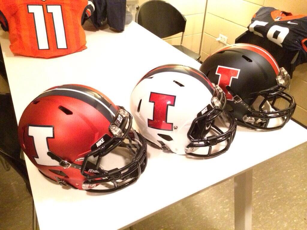
The orange helmet has the 'I' on properly and the other two are misaligned - can this ever be fixed??
JimmyChitwood
J
Guest
The basketball shorts are freaking ugly. Why do shorts keep getting longer and longer. Why not just give them pants to play in and call it a day?
Man I wish that had F1GHT1NG 1LL1N1 on the back instead of the swoosh.
I think I'll be getting mine embroidered with exactly that. Too much?
TheSecretWeapon
- ILLINI NATION!
There's also a good one of the orange helmet in this gallery- http://illiniboard.com/2014/04/16/rebrand-photo-gallery/
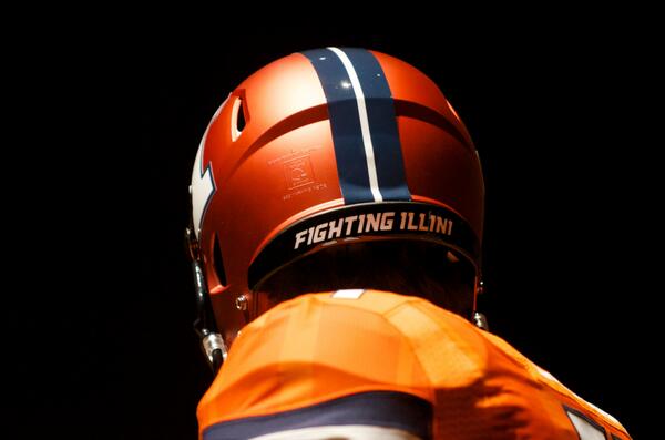
yikes, i hope its just the lighting, but that color orange is awful. looks like something from wal-mart and doesnt match the helmet at all
Not a fan. I don't think I've liked any of the recent versions, starting with this one:

:hurl:
If I had to choose one though, it would be the orange/blue mix. And that's what we have so I'm okay with it.
Lebowski
L
Guest
The basketball shorts are freaking ugly. Why do shorts keep getting longer and longer. Why not just give them pants to play in and call it a day?
Exactly.
Illiniwek06
- N of I-80
Yawn. I bet the kids we recruit would prefer them longer than shorter.The basketball shorts are freaking ugly. Why do shorts keep getting longer and longer. Why not just give them pants to play in and call it a day?
Illiniwek06
- N of I-80
Not sure if you're referring to the pic I posted or the rebrand jerseys, but I'm a big fan of the new ones.If I had to choose one though, it would be the orange/blue mix. And that's what we have so I'm okay with it.
The basketball shorts are freaking ugly. Why do shorts keep getting longer and longer. Why not just give them pants to play in and call it a day?
The past, Jimmy! You're livin' in it!

IlliniNation05
- Champaign, IL
yikes, i hope its just the lighting, but that color orange is awful. looks like something from wal-mart and doesnt match the helmet at all
It is just lighting. I was there and everything looked great!! The blue helmets were the only thing we hadn't previously seen and they were real cool...all the helmets were.
Lebowski
L
Guest

Not a fan. I don't think I've liked any of the recent versions, starting with this one:

:hurl:
I don't see that much of a difference. Same Illinois across the front. The 2 tone is different, but we haven't had 2 tone on anything but the white uniforms in the last couple of years.
JimmyChitwood
J
Guest
Yawn. I bet the kids we recruit would prefer them longer than shorter.
Please. Those are not even shorts. They are capris lol
I doubt they'll ever go all orangeyikes, i hope its just the lighting, but that color orange is awful. looks like something from wal-mart and doesnt match the helmet at all
Kams Bathroom
K
Guest
There is one inconsistency here that is driving me up a wall: The white I on the orange helmet. Not that it looks terrible, but it's not in the brand book, it doesn't match the color contrast of the blue uniform, and it is nowhere else to be found in anything we've seen. In every single other context besides maybe the most visible marking of the Block I of all, the block I is blue with a white stripe against an orange background. How do they screw that up? That's so basic.
JimmyChitwood
J
Guest
I don't see that much of a difference. Same Illinois across the front. The 2 tone is different, but we haven't had 3 tone on anything but the white uniforms in the last couple of years.
Those uniforms are when they started going downhill for sure. I like the new tops ok but the bottoms are just something awful. Im not a real fan of the V neck tops though. Prefer an actual tank top look. The 89 and 05 uniforms are some of the best we have had. Odd that they were our best years in terms of awesomeness lol.
Illiniwek06
- N of I-80
Haha, to-may-to/to-mah-to. :shakehands: :thumb:Please. Those are not even shorts. They are capris lol
Lebowski
L
Guest
Beckman photo bomb!
Thats pretty cool. I cant believe the best uniforms we have are the football uniforms.
peace davids
- Colorado
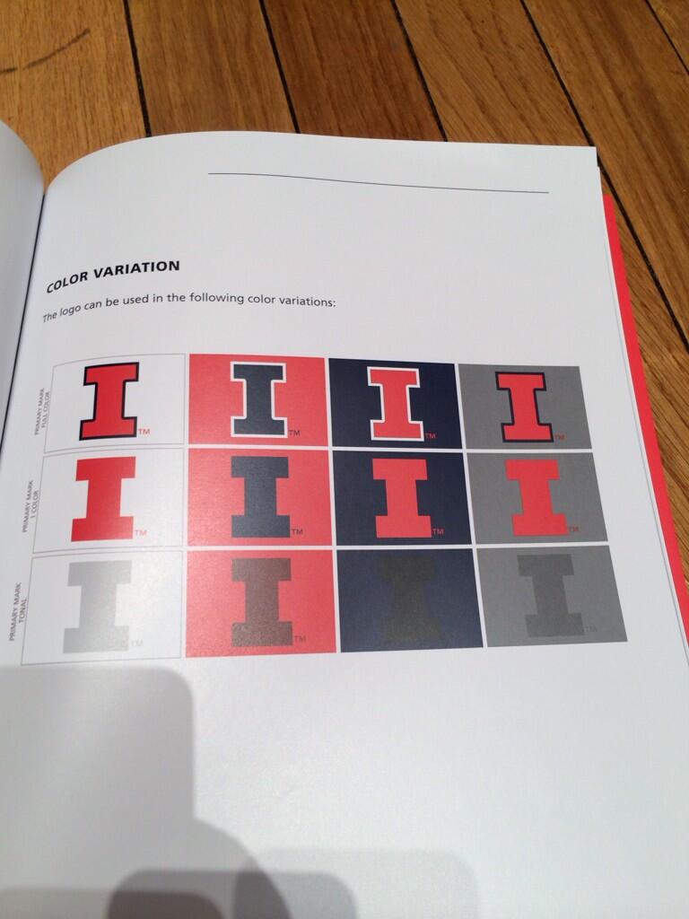
I have mentioned this a few times now, but let's try to count how many times on our uniforms and on linked merchandise that these color standards are broken...
...if Nike can't even keep their "standards", how are all the mom and pop print shops supposed to keep it in order?
Is this something that we'll have to wait for the respective seasons to see?
Almost certainly

I have mentioned this a few times now, but let's try to count how many times on our uniforms and on linked merchandise that these color standards are broken...
...if Nike can't even keep their "standards", how are all the mom and pop print shops supposed to keep it in order?
In all fairness the helmets are not Nike
I agree that the shorts are too long...not only does it look silly but it throws off the symmetry of the uniforms having the shorts so much longer than the jerseys...and I'm a college sr. so I wouldn't call myself old or out of touch...oh no! what if I am getting old and out of touch?!
Kams Bathroom
K
Guest
I have mentioned this a few times now, but let's try to count how many times on our uniforms and on linked merchandise that these color standards are broken...
The only one that I can see is the white I on the orange helmet.
Also, looking at that book, why is the one-color block I not rounded in the corners? As long as we're at it, why does the one-color block I exist at all?
ILLiNimob
I
Guest
The "feathers" maybe should have been on the football uniforms. We have a mock up on this thread somewhere. Will see how it looks on TV during a game in motion I guess. If they have fighting illini on back of helmet they're obviously not trying to avoid it. Hoops uniforms have to have it and this year
peace davids
- Colorado
- Status
- Not open for further replies.


