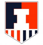
The 2014 Illini Nike Uniforms and Rebrand

Status
Not open for further replies.
#451      

HsvIllini

Alabama
Let 'em. We don't need to care what a casual fan 600 miles from here thinks. There will be no articles written on them for being ugly (thanks, Addidas!), and if a prospective athlete visits and learns what they represent, I think that'd be a cool way to let him in on the heritage.

They look a bit big, but at game-speed, they should be great.

I wonder if Coach Groce had some influence on getting those on there. I know they consulted with the coaches and he seems to support the Chief.
 
#452      
At least at TIS there are some shirts that have an almost tiger stripe motif going on with some slightly raised fabric on the designs. You can only really tell if you look really closely as the colors all blend with the actual design. That's what the poster was seeing in that picture of the Shield.
 
#455      

IlliniNation05

Champaign, IL
I'm really hoping that at some point we can buy a white long-sleeve dry fit shirt with the sacred shield on it...kinda like the soccer jersey
 
#456      
White helmet, blue jersey, orange pants for football.....winning combo.

We've all got our likes and dislikes, but that combo does sound good as I've always been partial to the Blue tops and Orange pants. Just go EASY on the white pants, please? Zook drove those into the ground both on the road and at home.
 
#458      
It would be neat if the athletic department could put up some images of the different possible uniform combinations for football to see how they all look.
 
#462      
DSC_0780.jpg


That tattoo is hostile and abusive.
 
#463      

illinimandan

I
Guest
shield/badge 2.0

I propose shield/badge 2.0, only a few hours after 1.0 goes live. Thoughts?

shield 2.0.jpg
:chief:
 
#464      

JSpence

Evansville, IN
So here is a link from Robert's twitter. See the orange football uniform, #11. Look at the top of his orange glove... a feather or an arrowhead? You may need to scroll through a lot of pics. DSC 0828 is the photo number. Then DSC 0804.

http://illiniboard.com/2014/04/16/rebrand-photo-gallery/

Slide 8. I suppose that looks like a feather on the top.

Slides 16 and 20 reveal "NIKE" on the bottom, which is fine. It's definitely something that can be improved upon in later years.
 
Last edited:
#468      
That tattoo is hostile and abusive.

You beat me to posting that picture. But I believe you meant to say that tattoo is frickin' amazing! ;) Maybe I was under a rock, maybe not, but I never knew about all the Illinois related ink that Simon has.

The cartoon on his right arm may be a slightly different story though...
 
#469      
Okay, upon further review of the right arm Simon does have some pretty hostile and abusive tattoos that I didn't see when I looked at the one on his left arm haha.
 
#471      

Kams Bathroom

K
Guest
Okay, upon further review of the right arm Simon does have some pretty hostile and abusive tattoos that I didn't see when I looked at the one on his left arm haha.

He's a Cleveland guy, I think that's an old school Chief Wahoo
 
#475      

MuckFichigan

M
Guest
Where is lamp? I was told this thread had lamp and pie.

Big improvement over the previous iterations, and big positive if the under 23 crowd likes it.
 
Status
Not open for further replies.