The 2014 Illini Nike Uniforms and Rebrand

Status
Not open for further replies.
#576      

CardsIllinifan8

C
Guest
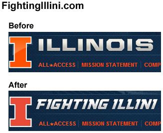
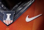
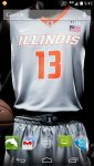
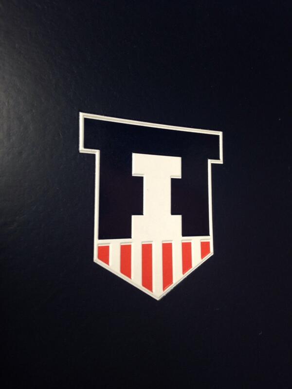
The Illinois Nike Rebrand

I didn't say mine was better - it's just that I'm not really on board with them trying to say those are "Fs" when it would be way easier to not even mention it.


I like their design better than mine fwiw.


Also asked this in previous post but got no replies -


Will Groce get a NIKE rebrand orange blazer?

Which logo will be used for television?

Will Lucas Johnson update the paint job on his car?


My bad. I thought with you posting your own, you were saying you prefer this.
 
#577      

hooraybeer

Pittsburgh, PA
new phone background looking sleeeek
 

Attachments

  • illini.jpg
    illini.jpg
    91.2 KB · Views: 355
#578      
And let there be no doubt about it, this is best mark we could ever have.

illini.jpg
 
#580      

Lebowski

L
Guest
I'll throw my opinion into the mix because, why not? We can all be an amateur designer for a day. I've read most of the reactions and I pretty much agree with the consensus.

-Football uniforms are great. A good update, but not too wild or trendy. Like the addition of the white set.

-The basketball uni's are lacking, with culprit #1 being those hideous zig-zags down the side. You couldn't really see it in the "leaked" images, but when the players came on stage last night I gasped. I'm pretty sure they were trying to use some pseudo-chief/feather imagery, but it just doesn't work.

-The basketball shorts are WAY too long and baggy. Tracy and Ray look like they're wearing bloomers. Current trends are away from the baggy to a sleeker look, although not back to the Bird-Magic nut-hugger days.

-I don't care for the new, specially created font. It reeks of what they did for Mizzou a few years ago.

-I like the shield and think it's a nice secondary mark. Certainly better than the block I in a circle thing that has kind of been our de facto second mark, although I'm not as crazily excited about it as the #TeamShield crowd.

-I also thought the presentation by the Nike guy was hilariously bad. He sounded like a high schooler trying to sound smart in a class presentation. All buzzwords and no substance, and a pretty terrible delivery to top it off.

-One element where I think I differ from the consensus is the two-tone font. I like the idea, although I liked it better on the older jerseys with the taller, leaner font.

brandon-paul.jpg

The basketball shorts are waay to baggy and teams are trending to the sleaker shorts. I hope they modify that before the season starts.
 
#584      

hooraybeer

Pittsburgh, PA
That kicks a*s. :clappy:

Any way you can attach the image you used so I can steal it? :pray: :D

if the quality isn't good you can PM me your number and i'll text it to you.. can't remember where I got the image yesterday
 

Attachments

  • illini2.jpg
    illini2.jpg
    98.1 KB · Views: 278
#585      

jcpelc

J
Guest

Attachments

  • Screenshot_2014-04-17-09-43-12.jpg
    Screenshot_2014-04-17-09-43-12.jpg
    107.5 KB · Views: 326
#586      

jcpelc

J
Guest
although looking at it now I realize every time I open the app drawer I'll be tapping his crotch....might have to change this.
 
#590      
Instead of the lightning bolt down the side of the basketball uniforms, I think it would have been better to do the helmet stripe down the side. That would look great IMO. It would also make the two sports look more cohesive.
 
#594      

Kams Bathroom

K
Guest
Robert said the zig zags (chief reference) look way better in person.

And I think they're a bit more subtle than some of the pictures where people have focused in on the sides of the jersey.
 
#596      

classof2016

C
Guest
Can't quite put my finger on why, but those look like high school uniforms to me.

The font is exactly the same as the '89 Flying Illini jerseys. I have a replica Deron Williams jersey in that '89 throwback style, so that's probably why I like it.
 
#597      

AZillini

A
Guest
Hostile and abusive, abusive and hostile. Warning Warning.

Ironically, your avatar was one of only a handful of images we had used that were offensive, and thus were cited as evidence against us by the white liberals who succeeded in killing off Chief Illiniwek.
 
#598      

classof2016

C
Guest
The basketball shorts are waay to baggy and teams are trending to the sleaker shorts. I hope they modify that before the season starts.

I don't think those shorts were the ones we'll be wearing as far as the size goes. I'm not sure if Ray, Tracy and Nnanna were fitted specifically for those shorts, but I doubt it, because they looked huge on Tracy specifically. I bet the actual unis during the season will fit better.
 
#599      

cwmorga

C
Guest
zatujahu.jpg


This was the best I could do yesterday.
 
#600      

IbanezHRC

I
Guest
The Block I

illini-block-i-logo-before-after.jpg

I actually like the Before much better. That was more unique and identifiable, kinda like the Arizona 'A'.
 
Status
Not open for further replies.