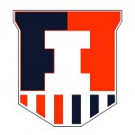
The 2014 Illini Nike Uniforms and Rebrand

Status
Not open for further replies.
#1,026      
Wow ... The shield chatter has certainly hit the 'jump the shark tank' point.

The football uni's are a big improvement and the RG nod is excellent --- the b-ball zigzags are a major fail in my book. Does not harken much of anything related to the original chief logo and looks silly IMO. The 'fighting illini' mock ups someone made are supurb and do not look HSish at all. If u haven't noticed HS and youth b-ball uni's are also sadly following the artsy-fartsy curved lettering soft look these days too.
 
#1,027      

whitesxfan2012

Orange & Blue tweety bird
Louisville, KY
My wife (who is an alum but really doesn't follow sports) and my 3 high school kids (who have varying degrees of cleverness and interest in Illinois sports) all thought the shield looked silly when viewed by itself. My wife said, "that'll last a year before it get's !!!!-canned". They all liked the jerseys a lot though and none really noticed the shield on it. None of them get that those are columns. And my wife had no idea that there were columns prominently displayed on campus.

Hardly a scientific sampling I know.

One thing I agree will happen, is modification.
 
#1,028      

Groundhogday

G
Guest
My wife (who is an alum but really doesn't follow sports) and my 3 high school kids (who have varying degrees of cleverness and interest in Illinois sports) all thought the shield looked silly when viewed by itself. My wife said, "that'll last a year before it get's !!!!-canned". They all liked the jerseys a lot though and none really noticed the shield on it. None of them get that those are columns. And my wife had no idea that there were columns prominently displayed on campus.
I sent the rebrand to four friends at non-B1G universities, and the reaction was pretty much identical. Everyone likes the new uniforms (including the zig zags), and the reaction to the original "Victory Badge" is "huh"? But on the plus side, you really can't see the VB on the uniforms unless you are really looking for it.
 
#1,030      

Groundhogday

G
Guest
Another way to make the VB work on a white or orange jersey. Either you give the bottom part a border, or you have a white and blue border around the entire thing.
 

Attachments

  • Vbadge2 - Copy.png
    Vbadge2 - Copy.png
    13.9 KB · Views: 155
#1,032      
Im not a big fan of the VB, and I came out pretty early when a shield logo was being leaked that it looked too much like Ivy League or Chariots of Fire. But I somewhat reluctantly accept it, as denying it isnt going to do me any good. I am surprised at what seems like positive reaction to it, and I suppose I will get used to it.

I really thought we were going to get something a little more unique and outside the box. I really would like to see what other concepts were pitched and were denied by the admin as being too much N.A. imagery. I suspect Nike pushed that a bit and were turned down. The feathers on the basketball uni's were all that were allowed. I wont be at all surprised if those go away in 2-3 years.

Overall, I give the complete rebranding/new uniform effort a B. I am still hoping for an alternate helmet with an outside the box logo. I suspect I will be dissapointed.
 
#1,033      

Groundhogday

G
Guest
Or the other option would be just to leave it... Just a thought
If a couple of amateurs fooling around for a couple of days can fix major problems in the new athletic logo, then the DIA probably needs to fix the problems with the new logo.
 
#1,034      

OrangeAndBlue217

Decatur, IL
It's kind of like Washington's dog sled logo on their uni's. Who besides them is going to get that? Or the "bowtie" on Syracuse's? Granted, their's is slightly more obvious. I am sure there is other examples. It would seem every school will have to explain these secondary logos to people other their own closely following fans.
 
#1,035      

OrangeAndBlue217

Decatur, IL
If a couple of amateurs fooling around for a couple of days can fix major problems in the new athletic logo, then the DIA probably needs to fix the problems with the new logo.

I am willing to bet that Nike came up with probably all of the designs floating around on here, plus many more, and it was determined the current one was the best choice. These guys have done it in a couple days. You dont think Nike's top professional designers didnt come up with any of that in 18 months?
 
#1,036      

Groundhogday

G
Guest
Overall, I give the complete rebranding/new uniform effort a B. I am still hoping for an alternate helmet with an outside the box logo. I suspect I will be dissapointed.
I've given up on the idea that we will ever get a creative, new interesting logo. Hence the effort to turn lemons into lemonade, and at least get the Victory Badge to work as an I on a shield.
 
#1,037      
If a couple of amateurs fooling around for a couple of days can fix major problems in the new athletic logo, then the DIA probably needs to fix the problems with the new logo.

Major problems to who? A few posters on here like yourself? Didn't know you represent the whole fan base :confused:
 
#1,038      

Groundhogday

G
Guest
I am willing to bet that Nike came up with probably all of the designs floating around on here, plus many more, and it was determined the current one was the best choice. These guys have done it in a couple days. You dont think Nike's top professional designers didnt come up with any of that in 18 months?
I'd bet they didn't come up with the secondary logo as a shield until after that what people called it on internet forums after the accidental release. There was nothing about a shield on the fighting illini website, nothing about superheroes, etc... Both the early video promo and our inside source suggested that the upper part was meant to be modeled on the Hallene Gateway pair of double columns.

Yes, Nike has capable designers. But they weren't looking to put the I on a shield or in a circle, or anything else so simple. They were looking for some sort of a logo that had a fundamental tie to university history, probably at the request of the DIA. And that goal really limited what they could do with the design.
 
#1,039      

JSpence

Evansville, IN
Another way to make the VB work on a white or orange jersey. Either you give the bottom part a border, or you have a white and blue border around the entire thing.

I see you snuck your inverted stripe pattern in there. ;)

Honestly, I find myself less embarrassed by this one than either that is visible on the IL front page.

Since you already have the working file, does the block I look better with the new rounded edges? I presume not. And can you make the corners of the I not line up with the stripes? With the inverted stripes, making it bigger wouldn't work. Maybe making the orange stripes thicker, ala Grange?
 
#1,040      

Groundhogday

G
Guest
I see you snuck your inverted stripe pattern in there. ;)

Honestly, I find myself less embarrassed by this one than either that is visible on the IL front page.

Since you already have the working file, does the block I look better with the new rounded edges? I presume not. And can you make the corners of the I not line up with the stripes? With the inverted stripes, making it bigger wouldn't work. Maybe making the orange stripes thicker, ala Grange?

I could do that, but why? I haven't read all the posts. Is there a problem with having the orange bars line up with the edge of the I? Thought that was intentional?

Inverting the white/orange gives more orange on the bottom part if you are going to put in a border, more clearly sets out the "I".
 
#1,041      

JSpence

Evansville, IN
I am willing to bet that Nike came up with probably all of the designs floating around on here, plus many more, and it was determined the current one was the best choice. These guys have done it in a couple days. You dont think Nike's top professional designers didnt come up with any of that in 18 months?

Of course there were many iterations already passed over.

We got this one because focus groups didn't hate it, and it's obvious that the people working on it had been looking at it for too long.

Their prime directive was to make a shape to fit in the collar. They accomplished that, but went round the bend.
 
#1,042      

Kams Bathroom

K
Guest
Amazing how everyone's friends, wives, and kids opinions exactly echo their own, verbatim....lol
 
#1,043      
It's kinda hard not to refer to it as a shield, especially after showing Capt America during the presentation and all the references to superheroes.
 
#1,045      

JSpence

Evansville, IN
I could do that, but why? I haven't read all the posts. Is there a problem with having the orange bars line up with the edge of the I? Thought that was intentional?

Inverting the white/orange gives more orange on the bottom part if you are going to put in a border, more clearly sets out the "I".

It's fine that they line up, but without the gap, they touch, creating distraction.

I'm definitely not against the inverted stripes (or even an asymmetrical approach). One pattern will end up looking better than the other.
 
#1,046      

JSpence

Evansville, IN
Amazing how everyone's friends, wives, and kids opinions exactly echo their own, verbatim....lol

It's not as bad as those sad videos where people's kids cry after elections... but it's getting there!
 
#1,047      

Groundhogday

G
Guest
GHD if everyone decides not to like the shield is that groupthink? :)
If the DIA changes the logo to fix the obvious design problems, almost everyone who loves the stonehenge victory logo will quickly decide they like the new version better.

But as long as the "official" logo is the current VB, yes, you will continue to see the "true fans" rally around the flag.
 
#1,048      

illinimandan

I
Guest
You can't include gray on something like this. It's not one of our colors... It's listed as a secondary palette simply so that Nike can create alternative jerseys. The logos have to be composed of the primary colors, in my opinion.

Besides being listed as a secondary color, I think gray looks more like the columns than orange does, but I also have this version:

shield 2.2b.jpg
 
#1,049      

Kams Bathroom

K
Guest
If the DIA changes the logo to fix the obvious design problems, almost everyone who loves the stonehenge victory logo will quickly decide they like the new version better.

But as long as the "official" logo is the current VB, yes, you will continue to see the "true fans" rally around the flag.

Lol, you are trolling Lucas Johnson hard right now. Ultimate Warrior intensity of trolling (RIP)
 
#1,050      

trevdv

Champaign
For those interested, I created an "Illini" font using the templates that Nike released. It's not perfect, but it allows you to type in a font that looks pretty darn close to what the "Fighting Illini" font looks like. You can download it here:

http://www.mediafire.com/download/wp3adu347xbawa0/Illini.ttf

Here is an example I typed up in a Word doc (not sure why it underlined 'Illinois' as misspelled :D):

Screen_Shot_2014_04_19_at_1_13_15_PM.png


Obviously you can change the color of the font to more correctly match the newer Nike color tones.
 
Status
Not open for further replies.