Kams Bathroom
K

A Shield pint glass with Oskee-Wow-Wow on the back just came into TIS today. I expect it will be on the shelves by graduation at the latest.
A Shield pint glass with Oskee-Wow-Wow on the back just came into TIS today. I expect it will be on the shelves by graduation at the latest.
I've got beer mugs with the chief and nothing can replace those. Lagers are good in the mugs.
For pint glasses, I've got the rolling stones tongue in 4 different colors. Ales are nice in the pints.
It all tastes good.
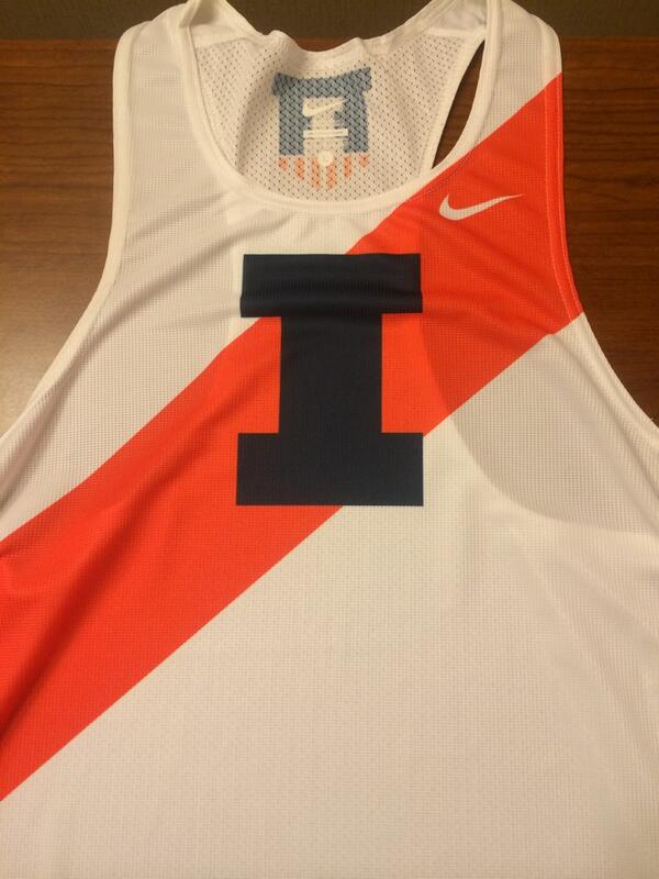
I assume that's the new I but it doesn't look like it has the curved corners.
I assume that's the new I but it doesn't look like it has the curved corners.
 are always going the be the same, with the angular corners. When they use a two color I the inside I will always have the curved corners.
That sash also could have tied into a new shield logo inspired by the old shield logo that has been referenced on this board before.
Sounds interesting. Anyone with the appropriate skills want to take that jersey and superimpose it on a traditional looking shield. White background with blue borders maybe?
Men's Track & Field
Perhaps the sash look was the standard during many years.I assume that's the new I but it doesn't look like it has the curved corners.
Men's Track & Field

According to the uniwatch blog the track unis are throwbacks to this: