The 2014 Illini Nike Uniforms and Rebrand

Status
Not open for further replies.
#1,576      

mattcoldagelli

The Transfer Portal with Do Not Contact Tag
Thankfully STL offered it without comment because I think the second one was the way to go. :shield:

I'd actually be interested in his thoughts - even though it was positioned as being "without comment", it seemed as if he was implying option 2 was a downgrade.
 
#1,577      

STL FANATIC

S
Guest
I'd actually be interested in his thoughts - even though it was positioned as being "without comment", it seemed as if he was implying option 2 was a downgrade.

Haha. Well there ya go ^^.
 
#1,578      

mattcoldagelli

The Transfer Portal with Do Not Contact Tag
I think you're probably all right on the schedule (I don't think two columns is an issue, but it probably should have just been two chronological columns, not home/away), but I can't under any circumstances see the second one as the better design.

The font Frutiger (which is Nike's chosen alternative font) isn't good and looks significantly worse than the font block font United on the original option. Frutiger has a way of making everything look like the mediocre posters of the early to mid-2000s since that was the font those used. Maybe there's nostalgia there, but bleh.

And then the composition and treatment of photos is much better in the first one as well. There's a reason to it. It creates a central and dynamic form in the center, and frames our official cheer, which is pretty unique to us and should get more play. (Oskee-wow-wow has nothing to do with the Chief, so I don't see that as a reason unless all traditions we ever had before 2006 are dead with the Chief.)

These are fair points, but when it comes to a piece that's supposed to serve a purpose (like this schedule poster), shouldn't the design take that into account? It looks as if there was a desire to have the centralized photos (which look nice) but then they realized if they did a chronological, single-column schedule, it would look unbalanced. So they split them in two to balance it and, in the process, drew additional attention to a gross home schedule, while making it kind of a pain in the !!! to figure out who we play next. Which is kind of the point of a schedule poster.
 
#1,579      

STL FANATIC

S
Guest
That's absolutely a fair point, although I'd argue the schedule isn't REALLY the point of these posters. The point is really just to make something cool and get people excited. The schedule is secondary. But that's something that could be debated.

Besides, this poster will be replaced by the real poster + schedule before the season anyways. This was just meant to be a cool giveaway at the spring game.

So while I think the schedule points are very valid here, I think the other design decisions that were forced on it are a pretty brutal downgrade.

I guess I'd sum it up like this:

The second one might be more useable than the first one in theory, but there's no way the second one gets a sniff of my wall, so in the end it doesn't matter. But I'd be happy to hang the first one on my wall and make do with however the schedule is laid out.
 
#1,580      

illinicb

Northbrook
That's absolutely a fair point, although I'd argue the schedule isn't REALLY the point of these posters. The point is really just to make something cool and get people excited. The schedule is secondary. But that's something that could be debated.

Besides, this poster will be replaced by the real poster + schedule before the season anyways. This was just meant to be a cool giveaway at the spring game.

So while I think the schedule points are very valid here, I think the other design decisions that were forced on it are a pretty brutal downgrade.

I guess I'd sum it up like this:

The second one might be more useable than the first one in theory, but there's no way the second one gets a sniff of my wall, so in the end it doesn't matter. But I'd be happy to hang the first one on my wall and make do with however the schedule is laid out.
I wouldn't hand either on my wall, but I might use both as a placemat. As you point out, it's a spring game giveaway, so not much of an issue either way.

In general, I don't think the schedule posters have been great over the last few years, but if I look back today on some of those I liked when I was younger, I might view them differently also.
 
#1,581      

dontlikepants

D
Guest
Took the wife and kids to The Land of Regrettable Tattoos for a 3 day pre-summer respite over the weekend, and I proudly donned my ‘Illini shield’ running shirt at the pool one day. An affable local who aberrantly equates sportswear with fashion approved mightily. “That’s badass!” he said, high five in tow. After talking to him, it’s hard to imagine Illinois ever being a football power (basketball- yes). And I’m fine with that.
 
#1,582      

SuperMetroid

Evanston
Just noticed that FightingIllini.com has been updated with some changes to the layout and colors/typography. They are using the new font in a bunch more places. The peachier orange from the logo is everywhere now, too. It really is way off from the uniform orange.
 
#1,586      

STL FANATIC

S
Guest
So has there been any credible sources on the topic of blue football uniforms? Was that rumor true or we still don't know?


It's credible.

That doesn't mean they couldn't end up finding a way to get blue uniforms. But it's not an empty rumor.
 
#1,588      

HsvIllini

Alabama
Random moment of awesomeness. While wearing my shield t-shirt in a hotel lobby in Nashville, I spotted a fellow Illini wearing the white shield ball cap. #TeamShield
 
#1,591      

Dan

Admin
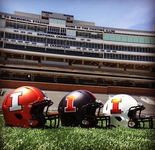
Bomu29PIQAE6Ova.jpg:large


https://twitter.com/CoachGolesh/status/471099895454392321/photo/1

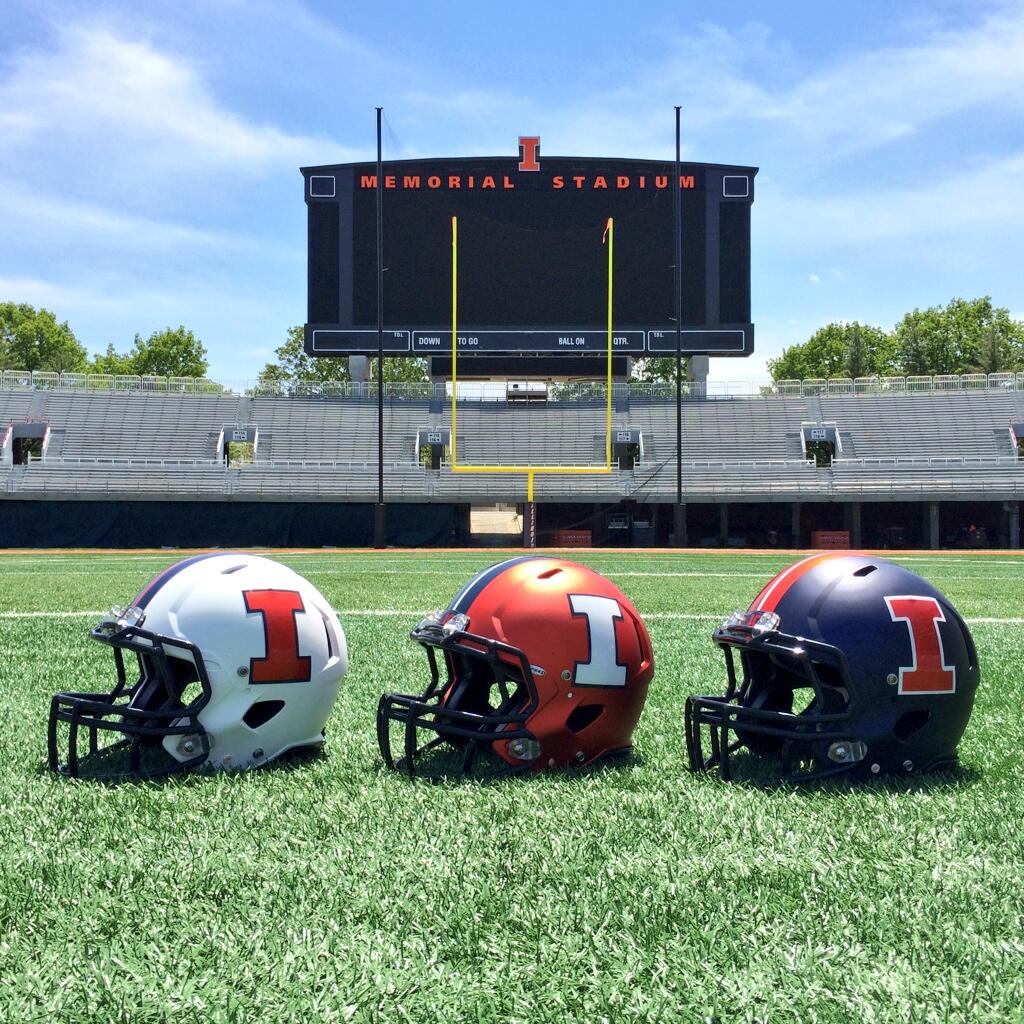
BomsEtACUAE0RqC.jpg:large


https://twitter.com/IlliniFootball/status/471096833889304576/photo/1
 
#1,593      

Kams Bathroom

K
Guest
FYI: Those Block I's with be wildly, laughably, embarrassingly over-rotated if they are placed like that on helmets worn by actual human heads :tsk:
 
#1,594      

frankfortillini

Frankfort, IL
"Kams Bathroom FYI: Those Block I's with be wildly, laughably, embarrassingly over-rotated if they are placed like that on helmets worn by actual human heads :tsk:"

They did the same thing last year. The moran that put them on had them aligned while the helmets were flat on the ground, rather than on a player's head. Those details make us look amateurish, which I guess is fitting.
 
#1,595      

mattcoldagelli

The Transfer Portal with Do Not Contact Tag
FYI: Those Block I's with be wildly, laughably, embarrassingly over-rotated if they are placed like that on helmets worn by actual human heads :tsk:

I know. Why can we not figure this out? Helmets don't sit on heads the way they do on a table.
 
#1,600      

OrangeAndBlue217

Decatur, IL
Honestly the helmets might look just as good or better with no block I on it. I personally like the plain helmet look. Lacks a unique logo but at the same time is sort of unique in itself.
 
Status
Not open for further replies.