

You are using an out of date browser. It may not display this or other websites correctly.
You should upgrade or use an alternative browser.
You should upgrade or use an alternative browser.
Gies Memorial Stadium
- Status
- Not open for further replies.
Shief

- Champaign Area
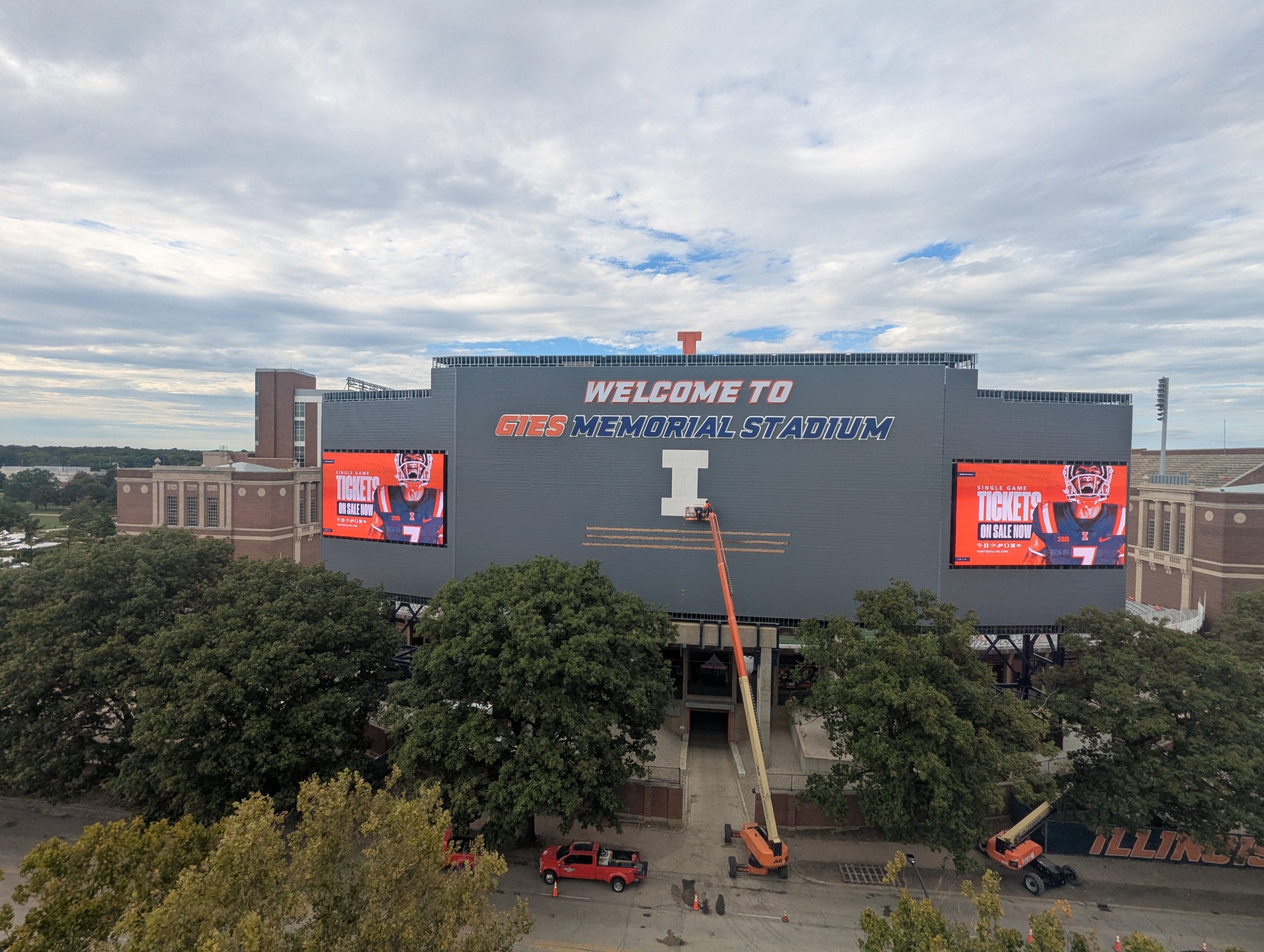
Anyone else hear the announcer voice when you read "Home of the Fighting Illini"?View attachment 51568The large block I will be backlit. That's just a backer so more to come on it. I'm assuming it will be orange and a little bigger.
Below will say Home of the Fighting Illini.
I really need to clean the lens on my cell phone camera.

I’m fine with the “Gies Memorial Stadium” given the money the donor has brought. I’d rather it have a singular color scheme that’s cohesive with everything else. The Big Block I, being most Important; needs to be the focal point.
For me personally, I could very easily drop “Welcome to.” It’s nice but doesn’t add a whole lot. I’m also okay with including a “Home of the Fighting Illini,” but out of cleanliness and minimalism I’d say this would be the next I’d be willing to drop.
Main concerns, from what’s present and the expected finished product, is that the color scheme looks a little hodge podgey, with what? 3-5 different total colors. The “I” itself will be lit up so a different orange. The background all is a different color as well. Also the wording, and fitting it all on there will look busy imo.
Not saying I hate it or dislike it, just pointing out ways I think it could look cleaner and better.
For me personally, I could very easily drop “Welcome to.” It’s nice but doesn’t add a whole lot. I’m also okay with including a “Home of the Fighting Illini,” but out of cleanliness and minimalism I’d say this would be the next I’d be willing to drop.
Main concerns, from what’s present and the expected finished product, is that the color scheme looks a little hodge podgey, with what? 3-5 different total colors. The “I” itself will be lit up so a different orange. The background all is a different color as well. Also the wording, and fitting it all on there will look busy imo.
Not saying I hate it or dislike it, just pointing out ways I think it could look cleaner and better.
RabidDawgClassic

- Los Angeles, CA
Technically, it’s “Gies’ Dad Memorial Stadium,” but I digress.I’m fine with the “Gies Memorial Stadium” given the money the donor has brought. I’d rather it have a singular color scheme that’s cohesive with everything else. The Big Block I, being most Important; needs to be the focal point.
For me personally, I could very easily drop “Welcome to.” It’s nice but doesn’t add a whole lot. I’m also okay with including a “Home of the Fighting Illini,” but out of cleanliness and minimalism I’d say this would be the next I’d be willing to drop.
Main concerns, from what’s present and the expected finished product, is that the color scheme looks a little hodge podgey, with what? 3-5 different total colors. The “I” itself will be lit up so a different orange. The background all is a different color as well. Also the wording, and fitting it all on there will look busy imo.
Not saying I hate it or dislike it, just pointing out ways I think it could look cleaner and better.

agreeI’m fine with the “Gies Memorial Stadium” given the money the donor has brought. I’d rather it have a singular color scheme that’s cohesive with everything else. The Big Block I, being most Important; needs to be the focal point.
For me personally, I could very easily drop “Welcome to.” It’s nice but doesn’t add a whole lot. I’m also okay with including a “Home of the Fighting Illini,” but out of cleanliness and minimalism I’d say this would be the next I’d be willing to drop.
Main concerns, from what’s present and the expected finished product, is that the color scheme looks a little hodge podgey, with what? 3-5 different total colors. The “I” itself will be lit up so a different orange. The background all is a different color as well. Also the wording, and fitting it all on there will look busy imo.
Not saying I hate it or dislike it, just pointing out ways I think it could look cleaner and better.
it’s fine , but would be better w/o the “welcome to” and wish the block I was a bit larger .
just my opinion
Fighter of the Nightman

- Chicago, IL
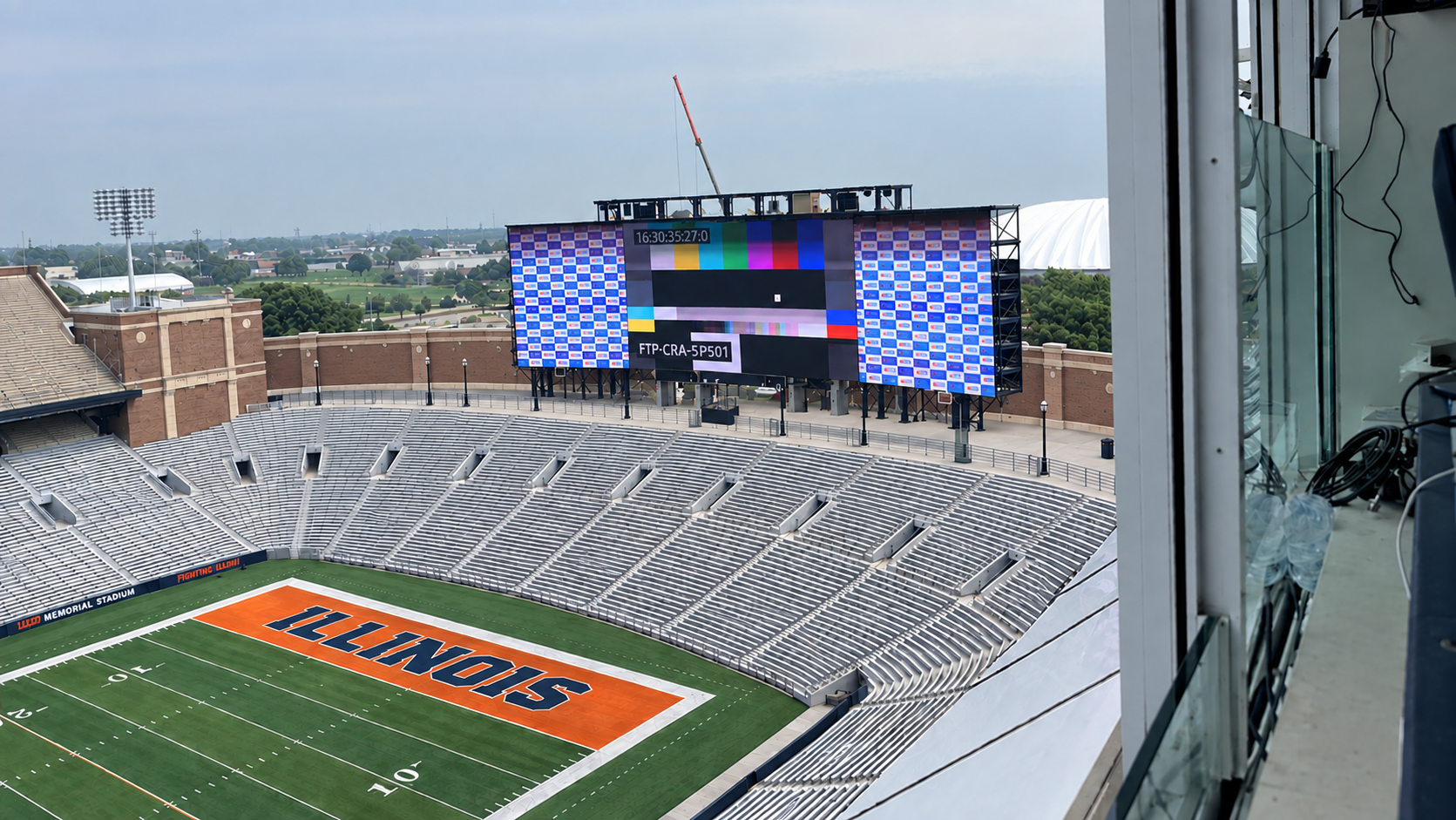
Not to just complain because the scoreboard is awesome, but this angle does a great job of showing how incongruent the 1LL1NO1S font and imagery is with our identity as a program. It looks like what Chat GPT would come up with for a font if I provided it some absolutely ridiculous prompt like "Please create a font that combines the following random words - spaceship, modern, cool, looking forward and not backward!"View attachment 51568The large block I will be backlit. That's just a backer so more to come on it. I'm assuming it will be orange and a little bigger.
Below will say Home of the Fighting Illini.
I really need to clean the lens on my cell phone camera.

It just looks out of style with the majestic brick towers on either side of it. To me (and it sounds like the vast majority of fans), the Illini athletics identity is just fundamentally "old school" in its vibes. Some classic block lettering or script font would just look so much better.

Does anyone know if those gaps at the top are being filled in, or if that's needed for cooling and is part of the design?
i’m pretty sure it’s for a soffit like overhang trim pieceDoes anyone know if those gaps at the top are being filled in, or if that's needed for cooling and is part of the design?
It appears to me those are metal studs and I would think it should be filled in at some point soon.Does anyone know if those gaps at the top are being filled in, or if that's needed for cooling and is part of the design?
I just checked - our previous scoreboard had a soffit trim piece on the top all the way around - that has to be why that is not done yetDoes anyone know if those gaps at the top are being filled in, or if that's needed for cooling and is part of the design?
I also noticed the old scoreboard was decidedly more BLUE in the outside cladding and the new one is more grey-blue in color
Fighter of the Nightman
- Chicago, IL
Also RE: my recent rendering with a concourse behind the SEZ, this picture shows the space we would have. Even at the shortest distance (i.e., directly behind the middle of the scoreboard), there is still quite a lot of space between the scoreboard and that small brick wall, let alone the curb.
You could easily extend the "underground" concourse area toward the current brick wall (right in front of that orange crane) and revamp that area to be a bit nicer, while having an upper concourse above it like in the rendering Chat GPT had done. So in the picture below, I imagine the new brick retaining wall roughly following the footprint / curvature of the smaller one in the photo above, with us effectively replacing that outdoor space where fans wait to get in with an "indoor" (or at least covered underneath the concourse) space. So you wouldn't need a ticket to get underneath the concourse area, just to get past a certain point.
I really wish I were an engineer / architect / graphic designer right about now, because this would be so fun.
You could easily extend the "underground" concourse area toward the current brick wall (right in front of that orange crane) and revamp that area to be a bit nicer, while having an upper concourse above it like in the rendering Chat GPT had done. So in the picture below, I imagine the new brick retaining wall roughly following the footprint / curvature of the smaller one in the photo above, with us effectively replacing that outdoor space where fans wait to get in with an "indoor" (or at least covered underneath the concourse) space. So you wouldn't need a ticket to get underneath the concourse area, just to get past a certain point.
I really wish I were an engineer / architect / graphic designer right about now, because this would be so fun.
They will be filled in. Ran out of time before the UAB game. They are back working this week. Gonna be working on it for at least a couple weeks yet.Does anyone know if those gaps at the top are being filled in, or if that's needed for cooling and is part of the design?
Changes are coming to below the scoreboard. My understanding is the brick wall is coming down eventually. Not sure what replaces it.Also RE: my recent rendering with a concourse behind the SEZ, this picture shows the space we would have. Even at the shortest distance (i.e., directly behind the middle of the scoreboard), there is still quite a lot of space between the scoreboard and that small brick wall, let alone the curb.
You could easily extend the "underground" concourse area toward the current brick wall (right in front of that orange crane) and revamp that area to be a bit nicer, while having an upper concourse above it like in the rendering Chat GPT had done. So in the picture below, I imagine the new brick retaining wall roughly following the footprint / curvature of the smaller one in the photo above, with us effectively replacing that outdoor space where fans wait to get in with an "indoor" (or at least covered underneath the concourse) space. So you wouldn't need a ticket to get underneath the concourse area, just to get past a certain point.
I really wish I were an engineer / architect / graphic designer right about now, because this would be so fun.

Fighter of the Nightman
- Chicago, IL
PREACH, BRET!! Also, get the visitors up in East Balcony already!
ChiefGritty

- Chicago, IL
The actually-existing NEZ would be workable as a low-cost family-friendly area too, it could really all work together.
agreeThe actually-existing NEZ would be workable as a low-cost family-friendly area too, it could really all work together.
sooner or later , thats it’s destiny
gotta get students back jnto Block I to do what they did for 50 years .
we own the card section & need to bring it back to its glory days & make it a national deal again
just wish it was a little more BLUE as previous one
Yes it could. The areas to the sides of the NEZ could also be family areas unless those are for standing room areas for the students.The actually-existing NEZ would be workable as a low-cost family-friendly area too, it could really all work together.
I actually think the USC band was on their own island up in 202 or 203, further north and away from their fans in 109. The Marching Illini were able to drown them out. That is the best place for the visiting bands. Why give them a prime location in 109 close to the field at the south end zone where they are loud when we are trying to score in south end zone? That is not a home field advantage.The last band I recall visiting Gies, USC last year, was shoved up in section 208.

You a probably right. I just remember seeing them up at the top of the East Balcony.I actually think the USC band was on their own island up in 202 or 203, further north and away from their fans in 109. The Marching Illini were able to drown them out. That is the best place for the visiting bands. Why give them a prime location in 109 close to the field at the south end zone where they are loud when we are trying to score in south end zone? That is not a home field advantage.
blackdog

- Champaign
- Status
- Not open for further replies.