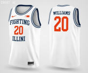
Illini Basketball Uniforms

#451      

PizzaHutParkingLot

McPherson, KS
I believe they just get to pick? However, I always think back to our 2005 team that preferred to wear orange every game and often only wore whites if they other team's away jerseys were (e.g., Wisconsin or Arizona). I do think the higher seed (or home team) just gets to pick whatever they want and the other team can't pick that exact same color, though.

Personally, I hope they wear gold and we go Flyin' Illini. I always like the double-color uniform combos (which we seem to do against Iowa quite a bit).

spongebob squarepants eww GIF

Kidding... But regardless, can someone on the board ask the players who decide these things to wear the throwbacks 🙏
 
#452      
Watching the Illinois -Mizzou baseball game and I don’t mind the 1LL1NO1S font on the baseball uniforms for some reason.
 
#453      
Watching the Illinois -Mizzou baseball game and I don’t mind the 1LL1NO1S font on the baseball uniforms for some reason.
I cannot remember if he thought the font looked better, worse or the same on the baseball jerseys, but I vaguely remember @mattcoldagelli making some great points about the spacing a while back, haha. I will defer to his opinion! :ROFLMAO:

But in general, it's SHOCKING how much classier, timeless and just all around better both "ILLINOIS" and "ILLINI" would look in either one of these fonts...

90

231119_MBB_Southern_CAP141.0.jpg


So IMO, it's not REALLY a question of how bad (or good) the 7LL7NO7S font is ... the more obvious and important question is why on Earth are we even letting it hang around when we have such obviously great and iconic alternatives slapping us in the face?? I'm sorry, but it's just a bad look for Nike, whether they are so oblivious they don't get it, too petty to admit their newer version is far inferior or just too stupid to think it's a big deal.
 
#454      

skyIdub

Winged Warrior
I cannot remember if he thought the font looked better, worse or the same on the baseball jerseys, but I vaguely remember @mattcoldagelli making some great points about the spacing a while back, haha. I will defer to his opinion! :ROFLMAO:

But in general, it's SHOCKING how much classier, timeless and just all around better both "ILLINOIS" and "ILLINI" would look in either one of these fonts...


So IMO, it's not REALLY a question of how bad (or good) the 7LL7NO7S font is ... the more obvious and important question is why on Earth are we even letting it hang around when we have such obviously great and iconic alternatives slapping us in the face?? I'm sorry, but it's just a bad look for Nike, whether they are so oblivious they don't get it, too petty to admit their newer version is far inferior or just too stupid to think it's a big deal.

Come on...we are all sick of the font...but this is silly. Don't be a drama queen FOTNM.:LOL:
 
#456      

mattcoldagelli

The Transfer Portal
[sees font signal from @Fighter of the Nightman, answers the call]

I think I may have been using the baseball uniforms as a place to show why this font works a lot better for Mizzou than for us, and it basically just comes down to “Illinois” or “Illini” consisting of a lot skinny, straight letters and “Mizzou” or “Tigers” consisting of wider ones. You can take or leave the font from a stylistic standpoint, but objectively, they are able to “fill” the space with the letters they need most much more than we are.

By using a “motion” font, we’ve backed ourselves into a corner of it only working in a straight line. That penalizes you quite a bit many places, but maybe nowhere more so than on the front of a baseball jersey, where the minimized uniform number (or complete absence of one) gives you total freedom to arc the wordmark or have it move diagonally across the front.

These problems are all solved with a script font, as you take skinny letters (like I’s and L’s) and stretch them out with loops. Bonus for us that we’ve used it in the past, are using it now, and it looks fantastic. Every day we don’t make the script our primary look is a dumb day!

#SCRIPTOS
 
#457      
Come on...we are all sick of the font...but this is silly. Don't be a drama queen FOTNM.:LOL:
Lol, I actually stole this from @altgeld88 IIRC!

Also, semi-OT point as we consider what jerseys could look cool ... why is it SO difficult to find a good picture of the navy Flyin' Illini jerseys up close? It seems like we wore them a ton in team photos in that period...

1988-89_Illinois_Fighting_Illini_men%27s_basketball_team.jpg


... but it has proven next to impossible to find a good in-game photo. The best I can ever find is this one, and the lighting makes them look discolored:

3cc990a8e09f8f32a289ba303beecad6.jpg


Did we just not wear them very often? I think a modern "remake" of these jerseys like we have in orange would look REALLY good. One thing I will give Nike total credit for is slightly touching up the 1989 orange ones to look even better with just some slight alterations:

9ee42738e9a2d914c030f3c4a711d34a.jpg
230104_mbb_northwestern_cb_043.jpg
 
Last edited:
#459      

texillwek

🔶🔹🔸🔷
Lol, I actually stole this from @altgeld88 IIRC!

Also, semi-OT point as we consider what jerseys could look cool ... why is it SO difficult to find a good picture of the navy Flyin' Illini jerseys up close? It seems like we wore them a ton in team photos in that period...

1988-89_Illinois_Fighting_Illini_men%27s_basketball_team.jpg


... but it has proven next to impossible to find a good in-game photo. The best I can ever find is this one, and the lighting makes them look discolored:

3cc990a8e09f8f32a289ba303beecad6.jpg


Did we just not wear them very often? I think a modern "remake" of these jerseys like we have in orange would look REALLY good.
I think these are mid - at best. Though, I would be open to seeing what a modern revision looks like.
 
#461      
I cannot remember if he thought the font looked better, worse or the same on the baseball jerseys, but I vaguely remember @mattcoldagelli making some great points about the spacing a while back, haha. I will defer to his opinion! :ROFLMAO:

But in general, it's SHOCKING how much classier, timeless and just all around better both "ILLINOIS" and "ILLINI" would look in either one of these fonts...

90

231119_MBB_Southern_CAP141.0.jpg


So IMO, it's not REALLY a question of how bad (or good) the 7LL7NO7S font is ... the more obvious and important question is why on Earth are we even letting it hang around when we have such obviously great and iconic alternatives slapping us in the face?? I'm sorry, but it's just a bad look for Nike, whether they are so oblivious they don't get it, too petty to admit their newer version is far inferior or just too stupid to think it's a big deal.
Unfortunately I don’t see the modern font going away anytime soon. Nike is stubborn and I feel they’ll want to keep a brand consistency across all sports. The football team doesn’t use them on their unis, however the new turf field uses it in the end zones. Other athletics teams use them as well. I highly doubt we do a rebrand only ten years later from the one we have now. I totally agree that we need to get away from it as it doesn’t give us a unique identity that we previously had. We have a great history of great looking uniforms and I’m holding out hope that when we get new uniforms we trend away from it. Would love to see something like these, although I would prefer a little more color.
 

Attachments

  • IMG_0079.png
    IMG_0079.png
    183.5 KB · Views: 44
#462      

OrangeBlue98

Des Moines, IA
Lol, I actually stole this from @altgeld88 IIRC!

Also, semi-OT point as we consider what jerseys could look cool ... why is it SO difficult to find a good picture of the navy Flyin' Illini jerseys up close? It seems like we wore them a ton in team photos in that period...

1988-89_Illinois_Fighting_Illini_men%27s_basketball_team.jpg


... but it has proven next to impossible to find a good in-game photo. The best I can ever find is this one, and the lighting makes them look discolored:

3cc990a8e09f8f32a289ba303beecad6.jpg


Did we just not wear them very often? I think a modern "remake" of these jerseys like we have in orange would look REALLY good.
We wore them a LOT. In fact, if I remember correctly, we first wore the orange version of this uniform at home against Northwestern back in 1989 and people went bananas over it.

While I certainly don’t claim to be a graphic design expert, the “thin letters” concept makes a lot of sense. Compare “ILLINOIS” (five thin letters out of eight) to “KANSAS” (six letters, all wide). The reason why I like the script now that I’ve seen this concept is it makes three of those five letters wide.

Since “Illinois” and “Illini” have some natural barriers to overcome, fonts that widen those letters-like the script-do seem to be more visually appealing.
 
#463      

altgeld88

Arlington, Virginia
Lol, I actually stole this from @altgeld88 IIRC!

Also, semi-OT point as we consider what jerseys could look cool ... why is it SO difficult to find a good picture of the navy Flyin' Illini jerseys up close? It seems like we wore them a ton in team photos in that period...

1988-89_Illinois_Fighting_Illini_men%27s_basketball_team.jpg


... but it has proven next to impossible to find a good in-game photo. The best I can ever find is this one, and the lighting makes them look discolored:

3cc990a8e09f8f32a289ba303beecad6.jpg


Did we just not wear them very often? I think a modern "remake" of these jerseys like we have in orange would look REALLY good. One thing I will give Nike total credit for is slightly touching up the 1989 orange ones to look even better with just some slight alterations:

9ee42738e9a2d914c030f3c4a711d34a.jpg
230104_mbb_northwestern_cb_043.jpg
@Fighter of the Nightman: we wore those block road blues regularly in the '80s. Those were our road unis. We had only home block whites and road block blues. The orange kit didn't exist until (IIRC) the 1988-89 season.

I have good photos of those blue unis in game context at home but am at the office now. Will load them tonight in case anyone's interested unless someone beats me to it. Here's one I recall from an SI article when we lost in WL to Purdue in '84. Efrem, Doug, and Scott looking on as Jim Rowinski takes the rock to the hole. (BTW, love the leather Converse high tops our guys are wearing. Had several pairs of those bad boys in high school and college.)

1711555136634.png
 
#464      
@Fighter of the Nightman: we wore those block road blues regularly in the '80s. Those were our road unis. We had only home block whites and road block blues. The orange kit didn't exist until (IIRC) the 1988-89 season.

I have good photos of those blue unis in game context at home but am at the office now. Will load them tonight in case anyone's interested unless someone beats me to it. Here's one I recall from an SI article when we lost in WL to Purdue in '84. Efrem, Doug, and Scott looking on as Jim Rowinski takes the rock to the hole. (BTW, love the leather Converse high tops our guys are wearing. Had several pairs of those bad boys in high school and college.)

View attachment 32780
I think a "cleaned up" version of these (i.e., with similar stylistic and proportional changes shown above with the orange versions) could possibly have white lettering with an orange outline (instead of the opposite in this pic) and a bit more subtle trim, and it would be a homerun!
 
#465      

altgeld88

Arlington, Virginia
I think a "cleaned up" version of these (i.e., with similar stylistic and proportional changes shown above with the orange versions) could possibly have white lettering with an orange outline (instead of the opposite in this pic) and a bit more subtle trim, and it would be a homerun!
Yep. Interesting how in '83-'84 (and earlier IIRC) the lettering and numbers were orange and later they were white.
 
#466      

altgeld88

Arlington, Virginia
I thought I had some old color photos here at home of the block FI blue road jerseys that the team began wearing in 1980 but all I can find so far are some B&W photos of old games against Ohio State in Columbus that I saw as a kid and, during the long boredom of COVID isolation, downloaded from the OSU student newspaper archives. Both the home and away block FI jerseys had orange lettering until '85 when these switched to white lettering.

Anyway, FWIW, photos below with the years noted. The 1977 shows the road script "Illinois" in blue. We apparently switched to orange road script unis in '78 (L-to-R in '78 photo: Levi Cobb, OSU's Herb Williams and Kelvin Ransey, Eddie Johnson, and either Audie Matthews or Mark Smith.) That's Mark Smith flushin' it in the epic '79 MSU game.

1711591373950.png
1711591453994.png
1711591477306.png