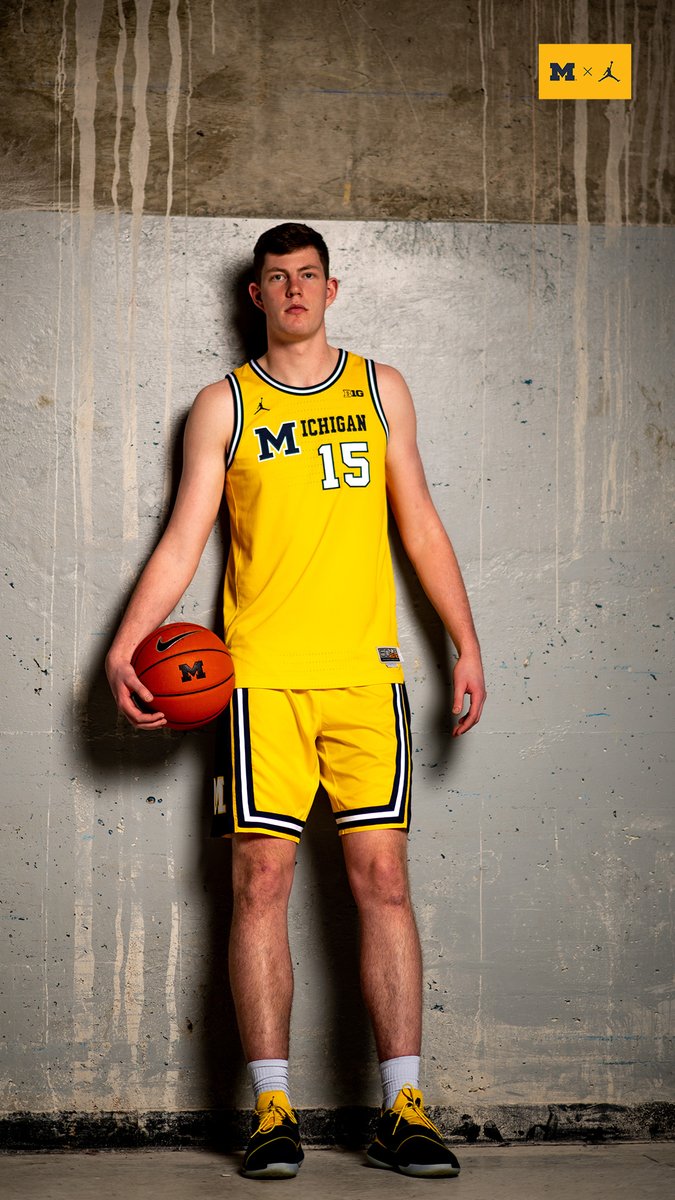
It’s really that simple, not sure why we haven’t done that already.Mizzou is going to a full set of throwbacks as their unis this year.
We should do similar with our Fighting Illini throwbacks in white, orange, and blue versions, with the script white alternates.
You are using an out of date browser. It may not display this or other websites correctly.
You should upgrade or use an alternative browser.
You should upgrade or use an alternative browser.
Illini Basketball Uniforms
- Status
- Not open for further replies.
It looks like someone used format painter in Word but forgot the first letter.Mizzou is going to a full set of throwbacks as their unis this year.
We should do similar with our Fighting Illini throwbacks in white, orange, and blue versions, with the script white alternates.
What’s crazy is that, 30 years from now, there will be Illini fans saying “cool! They’re doing the 1LL1NO1S uniforms as throwbacks!”

The wordmark on these looks way too much like Michigan's throwback uniforms.Mizzou is going to a full set of throwbacks as their unis this year.
We should do similar with our Fighting Illini throwbacks in white, orange, and blue versions, with the script white alternates.
I'm glad our throwback uniforms look pretty unique. Totally agree that we should wear our throwback uniforms full time.
Last edited:
OrangeBlue98
Iowa is not in a great spot right now (LvilleILL1)
- Des Moines, IA
It wouldn't even take an intern to do this. I'd be happy to email Nike a few photos and give them the instructions that I listed a little earlier.It’s really that simple, not sure why we haven’t done that already.
Here's the most complicated uniform instruction needed. I'm trying to find the old Illinois vs Purdue photo where Illinois is wearing navy with the lettering and numbering in orange. Take that photo, put it on someone's desk, and tell them "This, but in the current color shades Illinois uses". Since we already have the white and orange versions, 2/3 of the work on the Flying Illini uniforms is already done.
Then, take the photo in my avatar and say, "make one in orange with blue lettering and white trim, and another in navy with white lettering and orange trim."
Sometimes, design just is not that difficult.
drsmitty74
- Rochester
What’s crazy is that, 30 years from now, there will be Illini fans saying “cool! They’re doing the 1LL1NO1S uniforms as throwbacks!”

Another school getting a 3 base color set of throwbacks. We were soooo close to being trendsetters, but now it's looking like we're going to be late to the party
OrangeBlue98
Iowa is not in a great spot right now (LvilleILL1)
- Des Moines, IA
To be fair, I still say that our script throwbacks was something of a kickstarter. But I do agree that we could and should have been ahead of these other programs.Another school getting a 3 base color set of throwbacks. We were soooo close to being trendsetters, but now it's looking like we're going to be late to the party
The only thing that does give me some hope is that Mizzou and Michigan are both Nike/Jordan programs, so maybe we are still coming down the road and they just did the current uniforms as some sort of placeholder at that event.
Or we can at least hope……
RichardKeenesCousin
Richard Keene's Cousin
You think Jeff would put in a good word to his old man for us?Answer is easy, still Nike overall but it's time we go Jordan Brand. I thinkhas emerged as the undisputed leader in the college uni game. As a separate division, perhaps could resolve JW's concerns and offer the best of both worlds.
Fighter of the Nightman
- Chicago, IL
Actually very skeptical of that, haha.What’s crazy is that, 30 years from now, there will be Illini fans saying “cool! They’re doing the 1LL1NO1S uniforms as throwbacks!”

No. I don’t think we should wear blue in basketball anymore. Blue works for football. Orange should be our primary color in basketballMore Blue uniforms...
Name does not check out...No. I don’t think we should wear blue in basketball anymore. Blue works for football. Orange should be our primary color in basketball

Name does not check out...
Attachments
I like the blue... Break the curse and move forward
Fighter of the Nightman
- Chicago, IL
After seeing all of these promotional posts on social media for the basketball team, I just want to echo two thoughts here:
1. It is truly astounding that our basketball program - after all of the success of the past 5+ years - is STILL waiting for new uniforms.
2. In the absence of new uniforms, it is MIND BOGGLING that we continue to promote our old uniforms literally EVERYWHERE instead of our two throwbacks - two of the best jerseys in all of college hoops.
There simply has to be some contractual obligations that are messing all of this up, because I refuse to believe that the collective taste of Nike and the DIA could be this atrocious, especially when two elite alternatives are slapping them in the face. This is not a lack of a "good new idea" ... it's practically intentional negligence at this point.
1. It is truly astounding that our basketball program - after all of the success of the past 5+ years - is STILL waiting for new uniforms.
2. In the absence of new uniforms, it is MIND BOGGLING that we continue to promote our old uniforms literally EVERYWHERE instead of our two throwbacks - two of the best jerseys in all of college hoops.
There simply has to be some contractual obligations that are messing all of this up, because I refuse to believe that the collective taste of Nike and the DIA could be this atrocious, especially when two elite alternatives are slapping them in the face.
This is not a lack of a "good new idea" ... it's practically intentional negligence at this point.redwingillini11
White and Sixth
- Batavia
Like I indicated earlier, I think there is some frustration on the Illinois side of the relationship, and I think the parties are due to have a sit down in the near future to work on the relationship moving forward, with the understanding that the contract is up in less than 2 years. I have to imagine some of the DIA's frustrations overlap with some of our frustrations like what you mentioned. So we will see. Obviously it will be too late to change anything for this season, and I'm sure whatever happens next season is already at least partly in the works. But we will see. Hopefully Nike gets the message that we need to be treated like more of a priority.After seeing all of these promotional posts on social media for the basketball team, I just want to echo two thoughts here:
1. It is truly astounding that our basketball program - after all of the success of the past 5+ years - is STILL waiting for new uniforms.
2. In the absence of new uniforms, it is MIND BOGGLING that we continue to promote our old uniforms literally EVERYWHERE instead of our two throwbacks - two of the best jerseys in all of college hoops.
There simply has to be some contractual obligations that are messing all of this up, because I refuse to believe that the collective taste of Nike and the DIA could be this atrocious, especially when two elite alternatives are slapping them in the face.
RichardKeenesCousin
Richard Keene's Cousin
I like the blue... Break the curse and move forward

its not Blue Crush.
Orange

splitter
- and not Nebraska
its not Blue Crush.
Orange
Fighter of the Nightman
- Chicago, IL
Since it seems the vast majority of us would prefer that we just adopt our throwbacks full-time since they are so elite (orange, navy and white in BOTH the Script and Flyin' Illini looks), I thought I would post this picture I saw on social media for the Illinois NIL store. Obviously, this version of the orange Script jersey is NOT the same as the white one, as it does not have the more intricate striping. However, it at least gives us a taste of what it might look like with a more modern font (I know a picture of the ACTUAL original orange Script jersey has been posted here before, but still).

So we now know what modern takes of Flyin' Illini look like in orange (currently used) and white (used circa Tracy Abrams' time here instead of the white); we also know what the navy looks like from back in the day, but (1) those pictures are shockingly difficult to find and (2) the modern takes widen the letters and just make the uniform look much sharper, as pictured below:


So, I would still love to see what an updated take on the navy Flyin' Illini uniform looks like. Then for Script, we really only know what the white (currently used) looks like in updated form, but we have seen the gist of what orange would look like. I would KILL to see a quality mockup of our Script uniform in navy ... as that might be the most aesthetically cool uniform of any of the throwback combos. Based on pure looks and how cool a non-Illini fan would likely think they are, I would guess this as my order:
1. Navy Script
2. White Script
3. Orange Flyin' Illini
4. White Flyin' Illini
5. Orange Script
6. Navy Flyin' Illini
So we now know what modern takes of Flyin' Illini look like in orange (currently used) and white (used circa Tracy Abrams' time here instead of the white); we also know what the navy looks like from back in the day, but (1) those pictures are shockingly difficult to find and (2) the modern takes widen the letters and just make the uniform look much sharper, as pictured below:
So, I would still love to see what an updated take on the navy Flyin' Illini uniform looks like. Then for Script, we really only know what the white (currently used) looks like in updated form, but we have seen the gist of what orange would look like. I would KILL to see a quality mockup of our Script uniform in navy ... as that might be the most aesthetically cool uniform of any of the throwback combos. Based on pure looks and how cool a non-Illini fan would likely think they are, I would guess this as my order:
1. Navy Script
2. White Script
3. Orange Flyin' Illini
4. White Flyin' Illini
5. Orange Script
6. Navy Flyin' Illini
Navy script I guess I haven’t seen in reality (or orange script really for that matters). Obviously I agree with everyone that our current script and the orange flyin Illini are our best current uniforms. For me I probably have the orange flyin Illini jersey as the best Illini jersey period in any sport though even above the script and any football uniform. When you see that jersey especially in person in a road environment it pops like nothing else. Probably my favorite jersey of any team I root for.Since it seems the vast majority of us would prefer that we just adopt our throwbacks full-time since they are so elite (orange, navy and white in BOTH the Script and Flyin' Illini looks), I thought I would post this picture I saw on social media for the Illinois NIL store. Obviously, this version of the orange Script jersey is NOT the same as the white one, as it does not have the more intricate striping. However, it at least gives us a taste of what it might look like with a more modern font (I know a picture of the ACTUAL original orange Script jersey has been posted here before, but still).
View attachment 36698
So we now know what modern takes of Flyin' Illini look like in orange (currently used) and white (used circa Tracy Abrams' time here instead of the white); we also know what the navy looks like from back in the day, but (1) those pictures are shockingly difficult to find and (2) the modern takes widen the letters and just make the uniform look much sharper, as pictured below:
So, I would still love to see what an updated take on the navy Flyin' Illini uniform looks like. Then for Script, we really only know what the white (currently used) looks like in updated form, but we have seen the gist of what orange would look like. I would KILL to see a quality mockup of our Script uniform in navy ... as that might be the most aesthetically cool uniform of any of the throwback combos. Based on pure looks and how cool a non-Illini fan would likely think they are, I would guess this as my order:
1. Navy Script
2. White Script
3. Orange Flyin' Illini
4. White Flyin' Illini
5. Orange Script
6. Navy Flyin' Illini
Fighter of the Nightman
- Chicago, IL
Yeah, I go back and forth between which throwback I like better ... they're both awesome. And FWIW, I don't actually think we ever had a navy version of the Script, even in the 1960s ... but I could be wrong. This is the photo of an actual orange Script uniform from back in the day that another poster previously posted in the thread (IIRC, he or she was visiting a hall of fame exhibit or something).Navy script I guess I haven’t seen in reality (or orange script really for that matters). Obviously I agree with everyone that our current script and the orange flyin Illini are our best current uniforms. For me I probably have the orange flyin Illini jersey as the best Illini jersey period in any sport though even above the script and any football uniform. When you see that jersey especially in person in a road environment it pops like nothing else. Probably my favorite jersey of any team I root for.
ChiefGritty
- Chicago, IL

I like our basketball uniforms
OrangeBlue98
Iowa is not in a great spot right now (LvilleILL1)
- Des Moines, IA
Isn't that the guy who wanted Coach Dale fired in the community meeting at the church in "Hoosiers"?
I like our basketball uniforms
Battle89
- Cary-Grove, the better Trojan team
That was Dan DevineIsn't that the guy who wanted Coach Dale fired in the community meeting at the church in "Hoosiers"?
- Status
- Not open for further replies.