At this point I'm wondering if maybe Nike sends out blanks in all the team colors to each team, and then allows the teams to use their various logos, branding, fonts etc.? I think they do something similar with some retail locations, which is apparently why you see a much larger variety of gear at campus stores than through Nike directly, so maybe that's the answer to why coaches gear seems to be different than what you find in retail.^ Also, an insider can totally correct me ... but I get the vibe that Nike has quasi-contracted out at least SOME of what the staff will wear, lol. Or at the very least, they said something like, "Look, we made five iterations of casual coach gear, and you're going to need to wear all five at least once this season."Might be totally off-base here, but we have seen Brad and Co. in both some really elite gear that you can't find anywhere and also some standard 1LL1NO1S garbage that Nike practically spams our apparel sites with.
AWESOME GEAR ... Nike/DIA, PLEASE take my money!!

/cdn.vox-cdn.com/uploads/chorus_image/image/73473219/BU_UCONN_Arms_Crossed.0.jpg)
/cdn.vox-cdn.com/uploads/chorus_asset/file/25764335/2186694991.jpg)
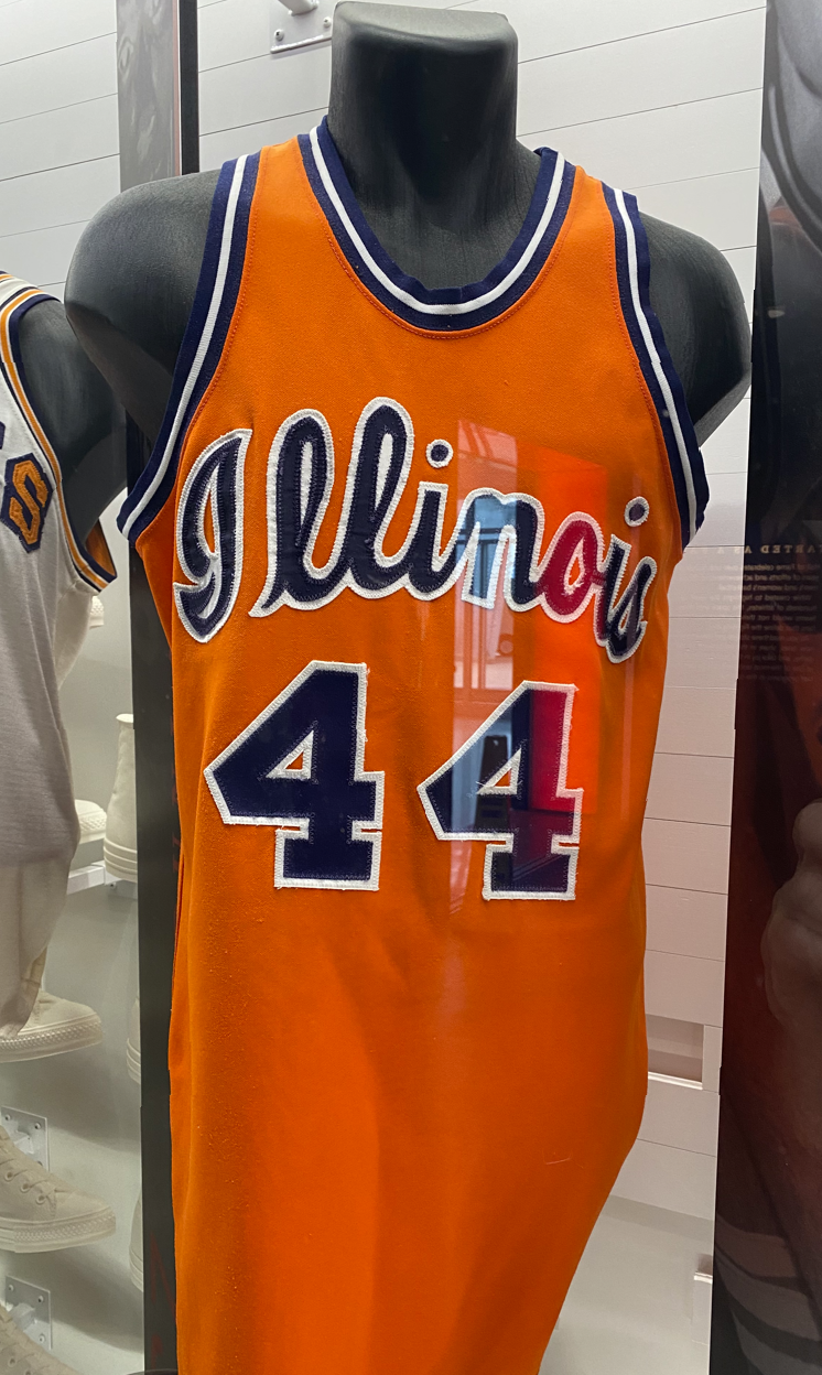
STANDARD 1LL1NO1S REBRAND

You are using an out of date browser. It may not display this or other websites correctly.
You should upgrade or use an alternative browser.
You should upgrade or use an alternative browser.
Illini Basketball Uniforms
- Status
- Not open for further replies.
I could see it. Nike is apparently really bad at fulfilling large orders on time, at least from what I've heard, so it wouldn't be too surprising if they did something like this. I do know I heard something about a local print store doing a lot of this coach gear (forgot if it was on here or somewhere else) so we know they do to some extent.At this point I'm wondering if maybe Nike sends out blanks in all the team colors to each team, and then allows the teams to use their various logos, branding, fonts etc.? I think they do something similar with some retail locations, which is apparently why you see a much larger variety of gear at campus stores than through Nike directly, so maybe that's the answer to why coaches gear seems to be different than what you find in retail.
And to beat the dead horse lol, it is seriously weird that they aren't selling these items somewhere. That was the whole reason the NFL started mandating staff attire. They do it simply to sell the gear to fans, so it's weird that seemingly none of these brands do it with college.
Battle89
- Cary-Grove, the better Trojan team
Was going to rank them 1-5 but that would not be fair to 1-4, because that standard rebrand does not belong with the others.^ Also, an insider can totally correct me ... but I get the vibe that Nike has quasi-contracted out at least SOME of what the staff will wear, lol. Or at the very least, they said something like, "Look, we made five iterations of casual coach gear, and you're going to need to wear all five at least once this season."
AWESOME GEAR ... Nike/DIA, PLEASE take my money!!
STANDARD 1LL1NO1S REBRAND
Script wins here, either color fine. I do love the arched ILLINI too but for me that's more football than basketball. Block I is good too but for some reason I don't like the orange zipper, wish it was navy like the rest of the shirt (also an issue on the rebrand shirt).
This is the uni I like best. Much better than the cursive.
I agree with this 110%. The lettering used in our Flyin' Illini jersey should serve as the standard font for things like "FIGHTING ILLINI" on the basketball end line and "ILLINOIS" in the football end zone ... it's classic, simple and not going to age awfully with changes in trends:
I agree with the Script used as an alternate, and I think it could be used very sparingly, too. It works super well on our basketball jerseys and would perhaps work great for some other sports (baseball immediately comes to mind), but maybe something like wrestling would utilize the font pictured above much better. I could take or leave the Arched ILLINI font as a DIA-wide standard, and I say that as someone who thinks that is our best helmet we wore last year.
As for the Shield, I have no strong feelings about it sticking around or not. However, if it IS going to be kept, I think it needs to incorporate a bit more of a "column" look to give a nod to the history of Memorial Stadium and how integral that is to the Fighting Illini name. In effect, we should look to take the existing Shield logo...

... and borrow heavily from the design elements in this logo from last football season:

A new version of the Shield that looks a bit less MS Paint-like and has some of those column elements would be cool.
Fighter of the Nightman
- Chicago, IL
Couple things I’m curious about for the remainder of the season:
1. With an entirely new group that probably doesn’t care much about past juju, do we see the navy regular uniforms again this season?
2. Will we see the Flyin’ Illini throwbacks at home?? It has been standard in years past to at least occasionally wear orange at home vs. non-red teams. This year’s team has worn the white regulars or Script throwbacks.
3. Will we seriously not see a 2005 throwback uniform this year?! There is not ONE indication from our athletic department that this is the 20th anniversary of that team. Football got a full new throwback uniform, four new throwback helmets, a new twist on our regular helmet for the Wrigley game, a brand new Script helmet and a custom logo for the 100th anniversary, lol. You’d think basketball could get one throwback.
1. With an entirely new group that probably doesn’t care much about past juju, do we see the navy regular uniforms again this season?
2. Will we see the Flyin’ Illini throwbacks at home?? It has been standard in years past to at least occasionally wear orange at home vs. non-red teams. This year’s team has worn the white regulars or Script throwbacks.
3. Will we seriously not see a 2005 throwback uniform this year?! There is not ONE indication from our athletic department that this is the 20th anniversary of that team.
Football got a full new throwback uniform, four new throwback helmets, a new twist on our regular helmet for the Wrigley game, a brand new Script helmet and a custom logo for the 100th anniversary, lol. You’d think basketball could get one throwback.Saw Altmeyer wearing this at the game the other day, I need it.View attachment 39208
Add this to the list of apparel that should be available to fans…
OrangeBlue98
Iowa is not in a great spot right now (LvilleILL1)
- Des Moines, IA
If we had the Flying Illini and the scripts in all three colors (white, navy, orange), I can 100% agree with this. I know I'm speaking for myself, but I would imagine a number of others would also say that since the current base uniforms are so bad, that we want to see the scripts. But if we had the Flying Illini set, I think more of us would back what you're saying here.Imo we wear the scripts too much. I think they look awesome but they should be reserved for special occasions. I would prefer if we had the Flyin Illini uniforms provide for the style of our base set and use the scripts for big home games.
Fighter of the Nightman
- Chicago, IL
Amen. You can only have a “big game” jersey if our regular uniforms don’t suck … ours do. I’d be totally on board with white/orange/navy Flyin’ Illini as the default set and mix in white/orange/navy Script only 3-4 times per year for big games, whether home or away.If we had the Flying Illini and the scripts in all three colors (white, navy, orange), I can 100% agree with this. I know I'm speaking for myself, but I would imagine a number of others would also say that since the current base uniforms are so bad, that we want to see the scripts. But if we had the Flying Illini set, I think more of us would back what you're saying here.
Yeah I am saying we need Flyin Illini base first. I agree with the poster who said the orange Flyin Illini is our best uniform, even better that the script, and should be the base for our future uniforms.If we had the Flying Illini and the scripts in all three colors (white, navy, orange), I can 100% agree with this. I know I'm speaking for myself, but I would imagine a number of others would also say that since the current base uniforms are so bad, that we want to see the scripts. But if we had the Flying Illini set, I think more of us would back what you're saying here.
OrangeBlue98
Iowa is not in a great spot right now (LvilleILL1)
- Des Moines, IA
Of these five, the only one you can buy straight from the Gameday site as shown is the very bottom one.^ Also, an insider can totally correct me ... but I get the vibe that Nike has quasi-contracted out at least SOME of what the staff will wear, lol. Or at the very least, they said something like, "Look, we made five iterations of casual coach gear, and you're going to need to wear all five at least once this season."
AWESOME GEAR ... Nike/DIA, PLEASE take my money!!
STANDARD 1LL1NO1S REBRAND
You can buy the very top one, but only with a block I like Brad's wearing on the bottom one. You can buy a "kind of sort of" version of 4, but it has some blue on the shoulders and a block I instead of the 1LL1NO1S font (which upgrades it automatically).
If 1 and 3 were available, I would immediately - like as in dropping whatever I was doing and immediately go to the Gameday or FightingIllini.com store sites and snap them up - buy them. The top one looks amazing - I'd wear that into the office as much as I possibly could.
Fighter of the Nightman
- Chicago, IL
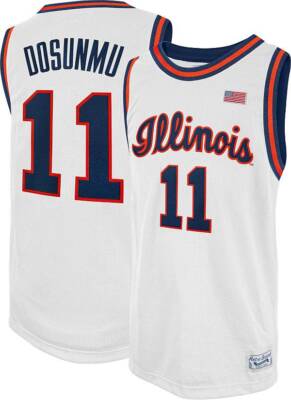
Yeah, it's also annoying that you cannot get the "real" Script or Flyin' Illini jerseys for players. I have an Ayo Script jersey that is much thicker than the usual Script NIL jerseys I see people wearing at games, and it has that extra curl on the end of the cursive S that is on the real ones and not on the "knock-off Script," lol:Another thing is I wish we sold actual NIL jerseys for the Flyin Illini jersey. There's the sublimated jerseys you can get at the NIL Store but the actual Nike ones are only for the orange base set jersey.
Regarding this, imagine that we had the following uniform set, which I know has been posted a ton.Amen. You can only have a “big game” jersey if our regular uniforms don’t suck … ours do. I’d be totally on board with white/orange/navy Flyin’ Illini as the default set and mix in white/orange/navy Script only 3-4 times per year for big games, whether home or away.
REGULAR HOME: White Flyin' Illini

(One note here is that you'll notice the lettering is much "blockier" than the orange iteration below, which was spruced up a bit compared to the original in use in the 1980s. So, we should make the proportions on the white set match the orange one.)
REGULAR AWAY: Orange Flyin' Illini

REGULAR ALTERNATE: Navy Flyin' Illini

(Though it would need the same updating as the orange and white sets, as well as a darker shade of blue, which I imagine is just the lighting in that photo. I'm also very sympathetic to the idea of flipping it to have orange font and a white outline! Lastly, I only said "Alternate" because we'd wear orange more often than not on the road ... but this would strictly be worn for away/neutral games, not at home.)
These would be our main three uniforms, worn the vast majority of the time. Then, we could have these three for "big games," only worn a handful of times per year:
BIG GAME HOME: White Script
BIG GAME AWAY: Orange Script
BIG GAME ALTERNATE: Navy Script
NOTE ... to my knowledge, this has never existed and would be an entirely new uniform. However, it should follow this basic color scheme:
With those six uniforms, I would do something like this for last year's schedule as an example of how each should theoretically be used. "Big games" are in bold, and some have comments explaining my thoughts:
White Flyin' Illini vs. Eastern Illinois
White Flyin' Illini vs. Oakland
Orange Flyin' Illini vs. #4 Marquette ... creates a cool color contrast with their away uniforms.
White Flyin' Illini vs. Valparaiso
White Flyin' Illini vs. Southern
White Flyin' Illini vs. Western Illinois
Orange Flyin' Illini at Rutgers
White Script vs. #11 FAU ... I believe we were the "home team," as we actually did wear the White Scripts in this game.
NAVY Flyin' Illini at #17 Tennessee ... again, a cool color contrast against their orange backdrop
White Flyin' Illini vs. Colgate
Orange Script vs. Missouri ... Mizzou has worn gold vs. us an insane number of years in a row, and I like the orange/gold contrast visual!
White Flyin' Illini vs. Fairleigh Dickinson
White Flyin' Illini vs. Northwestern
Orange Flyin' Illini at #1 Purdue ... while a "big game," some games just feel right to have our classic FIGHTING ILLINI look.
White Flyin' Illini vs. Michigan State
White Flyin' Illini vs. Maryland
Orange Flyin' Illini at Michigan
White Flyin' Illini vs. Rutgers
Orange Flyin' Illini at Northwestern
White Flyin' Illini vs. Indiana
Orange Flyin' Illini at Ohio State
White Flyin' Illini vs. Nebraska
Orange Flyin' Illini at Michigan State
White Flyin' Illini vs. Michigan
NAVY Flyin' Illini at Maryland ... better color contrast against the red, and we'd try some reverse psychology to mix up our bad juju vs. Maryland
Orange Flyin' Illini at Penn State
Orange Script vs. Iowa ... "Orange Out" game on a Saturday vs. a rival.
White Flyin' Illini vs. Minnesota
NAVY Flyin' Illini at Wisconsin ... see Maryland comment about color contrast.
White Script vs. #3 Purdue ... was a HUGE game last year for our seeding and conference championship dreams.
Orange Flyin' Illini at Iowa
White Flyin' Illini vs. Ohio State in BTT Quarterfinals
White Flyin' Illini vs. Nebraska in BTT Semifinals
Navy Script vs. Wisconsin in BTT Championship ... first use of the Navy Script throwbacks all year for the BTT Championship Game.
White Flyin' Illini vs. (14) Morehead State in NCAAT First Round
White Flyin' Illini vs. (11) Duquesne in NCAAT Second Round
Orange Script vs. (2) #4 Iowa State in NCAAT Sweet Sixteen ... obviously a big game, and we hadn't worn the Orange Script in a while.
Orange Script vs. (1) #1 UConn in NCAAT Elite Eight ... stick with what worked vs. ISU, to no avail.
Honestly, though - and I cannot stress how DIFFERENT this is than our current situation!! - you cannot go wrong with any of those six. I would literally never be disappointed about what we trotted out.
I may be in the minority here but I also love the 2005 team jerseys, and would love to see that mixed in as a second alternate/special set. Maybe even just forego the orange script and use the 2005 orange as the away big game jersey, so as not to overdo the different jersey sets.Yeah, it's also annoying that you cannot get the "real" Script or Flyin' Illini jerseys for players. I have an Ayo Script jersey that is much thicker than the usual Script NIL jerseys I see people wearing at games, and it has that extra curl on the end of the cursive S that is on the real ones and not on the "knock-off Script," lol:
Regarding this, imagine that we had the following uniform set, which I know has been posted a ton.
REGULAR HOME: White Flyin' Illini
(One note here is that you'll notice the lettering is much "blockier" than the orange iteration below, which was spruced up a bit compared to the original in use in the 1980s. So, we should make the proportions on the white set match the orange one.)
REGULAR AWAY: Orange Flyin' Illini
REGULAR ALTERNATE: Navy Flyin' Illini
(Though it would need the same updating as the orange and white sets, as well as a darker shade of blue, which I imagine is just the lighting in that photo. I'm also very sympathetic to the idea of flipping it to have orange font and a white outline! Lastly, I only said "Alternate" because we'd wear orange more often than not on the road ... but this would strictly be worn for away/neutral games, not at home.)
These would be our main three uniforms, worn the vast majority of the time. Then, we could have these three for "big games," only worn a handful of times per year:
BIG GAME HOME: White Script
BIG GAME AWAY: Orange Script
BIG GAME ALTERNATE: Navy Script
NOTE ... to my knowledge, this has never existed and would be an entirely new uniform. However, it should follow this basic color scheme:
With those six uniforms, I would do something like this for last year's schedule as an example of how each should theoretically be used. "Big games" are in bold, and some have comments explaining my thoughts:
White Flyin' Illini vs. Eastern Illinois
White Flyin' Illini vs. Oakland
Orange Flyin' Illini vs. #4 Marquette ... creates a cool color contrast with their away uniforms.
White Flyin' Illini vs. Valparaiso
White Flyin' Illini vs. Southern
White Flyin' Illini vs. Western Illinois
Orange Flyin' Illini at Rutgers
White Script vs. #11 FAU ... I believe we were the "home team," as we actually did wear the White Scripts in this game.
NAVY Flyin' Illini at #17 Tennessee ... again, a cool color contrast against their orange backdrop
White Flyin' Illini vs. Colgate
Orange Script vs. Missouri ... Mizzou has worn gold vs. us an insane number of years in a row, and I like the orange/gold contrast visual!
White Flyin' Illini vs. Fairleigh Dickinson
White Flyin' Illini vs. Northwestern
Orange Flyin' Illini at #1 Purdue ... while a "big game," some games just feel right to have our classic FIGHTING ILLINI look.
White Flyin' Illini vs. Michigan State
White Flyin' Illini vs. Maryland
Orange Flyin' Illini at Michigan
White Flyin' Illini vs. Rutgers
Orange Flyin' Illini at Northwestern
White Flyin' Illini vs. Indiana
Orange Flyin' Illini at Ohio State
White Flyin' Illini vs. Nebraska
Orange Flyin' Illini at Michigan State
White Flyin' Illini vs. Michigan
NAVY Flyin' Illini at Maryland ... better color contrast against the red, and we'd try some reverse psychology to mix up our bad juju vs. Maryland
Orange Flyin' Illini at Penn State
Orange Script vs. Iowa ... "Orange Out" game on a Saturday vs. a rival.
White Flyin' Illini vs. Minnesota
NAVY Flyin' Illini at Wisconsin ... see Maryland comment about color contrast.
White Script vs. #3 Purdue ... was a HUGE game last year for our seeding and conference championship dreams.
Orange Flyin' Illini at Iowa
White Flyin' Illini vs. Ohio State in BTT Quarterfinals
White Flyin' Illini vs. Nebraska in BTT Semifinals
Navy Script vs. Wisconsin in BTT Championship ... first use of the Navy Script throwbacks all year for the BTT Championship Game.
White Flyin' Illini vs. (14) Morehead State in NCAAT First Round
White Flyin' Illini vs. (11) Duquesne in NCAAT Second Round
Orange Script vs. (2) #4 Iowa State in NCAAT Sweet Sixteen ... obviously a big game, and we hadn't worn the Orange Script in a while.
Orange Script vs. (1) #1 UConn in NCAAT Elite Eight ... stick with what worked vs. ISU, to no avail.
Honestly, though - and I cannot stress how DIFFERENT this is than our current situation!! - you cannot go wrong with any of those six. I would literally never be disappointed about what we trotted out.
OrangeBlue98
Iowa is not in a great spot right now (LvilleILL1)
- Des Moines, IA
I'll add this season and what I would have picked if we had all six options. I'm using the code (Color)/(Style), with FI - Flying Illini and SC - Scripts. So, O/FI would be Orange Flying Illini, W/SC would be White Scripts, B/FI is blue Flying Illini, etc.
I'd lean more toward wearing blue more than FOTN suggests, primarily because I think the blue Flying Illini uniforms with orange letters would look great. I'd wear blue a lot on the road against teams that wear red or yellow, and I'd wear orange a little more at home. I'd just save the orange at home either for a big game or when the orange would be a good color contrast with the opponent's road jersey. (Side note - when Illinois eventually goes to the Rose Bowl to play UCLA in conference play, I'd love to see a UCLA gold/blue/gold vs Illinois orange/orange/white game - I think that would look awesome on TV).
@Ole Miss (Exh) - O/FI
EIU - W/FI
SIU-E - W/FI
Oakland - W/FI
@ Alabama (technically neutral) - B/SC (debut these in a big game)
Maryland-ES - W/FI
Little Rock - W/FI
(Neutral) Arkansas - O/FI (what we wore)
@Northwestern - O/SC (I wouldn't normally do this since I don't want to consider NW a rivalry game, but not a bad way to debut the orange scripts in front of a lot of Illini fans)
Wisconsin - W/FI
Tennessee - W/SC
(Neutral) Missouri - O/SC or B/SC
Chicago State - W/FI
@ Oregon - B/FI (especially if Oregon wore the neon yellow like they wore or their lighter green)
@ Washington - O/FI
Penn State - W/FI or O/FI
USC - W/FI
@ Indiana - O/FI (an exception to my "wear blue against a team with a bright color" rule above because of Nick Anderson 1989)
@ Mich St - B/FI
Maryland - W/FI
Northwestern - O/FI or W/FI
@ Nebraska - B/FI
Ohio State - W/FI
@ Rutgers - B/FI
@ Minnesota - O/FI
UCLA - O/FI (that would look so good contrasted with UCLA's blue)
Michigan State - O/SC
@ Wisconsin - B/FI
(Neutral) Duke - O/SC or W/SC
Iowa - W/FI or O/FI
@ Michigan - O/FI or O/SC (but definitely orange)
Purdue - W/SC
I'm in favor of wearing the blues more, too. The anti-blue movement is relatively new. For example, in 2000 - 2001, we only wore orange one time. The following year, it looks like we wore orange three times.
I've always really liked the blues from that era. They had an edge to them. If we're doing jersey a la carte, those would be my blues of choice.
I've always really liked the blues from that era. They had an edge to them. If we're doing jersey a la carte, those would be my blues of choice.
Fighter of the Nightman
- Chicago, IL
IIRC, it was the 2005 team that developed a unique love for the orange uniforms, and it kicked off a streak of defaulting to orange on the road. As far as I can tell (and I have NOT looked into this extensively, mind you), 2005 and 2022 were the only years this century where we didn't wear a navy uniform once. By mid-season, it seemed the 2005 team defaulted to orange home, away or neutral unless the other team had to wear red.* Not 100% on this, but I am pretty sure from the game at Indiana in 2004 to the game at North Carolina in 2006, we never wore navy uniforms once ... which would be a streak of 58 games.I'm in favor of wearing the blues more, too. The anti-blue movement is relatively new. For example, in 2000 - 2001, we only wore orange one time. The following year, it looks like we wore orange three times.
I've always really liked the blues from that era. They had an edge to them. If we're doing jersey a la carte, those would be my blues of choice.
The 2022 team also seemed to have a clear distaste for the navy uniforms; if we wore them at all that year, I forgot about it, lol. The 2023 squad busted them out a couple times (I at least recall at Wisconsin and maybe at OSU, too??), and we wore them twice last season (one random early home game, a practice which I am very much against, and then the epic collapse at PSU).
* Yes, I remember the game in 2004 when we wore orange at home while Wisconsin wore red.
EDIT: To get back on the point of your post, I too would be totally fine with wearing navy more often ... I don't think they're REALLY bad luck (hell, you could argue this WHOLE Underwood Renaissance really got going when we won in Madison in 2019-20 ... and that was in the navy uniforms!), and they generally look great. However, I do think that realistically we will prioritize the orange look.
OrangeBlue98
Iowa is not in a great spot right now (LvilleILL1)
- Des Moines, IA
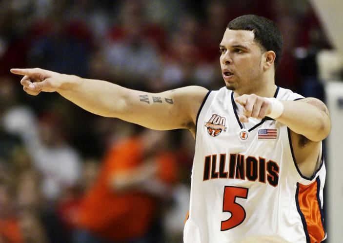
The thing is that, like FOTN has said, if we had both sets in all colors, any of them would look great. The best thing about the 2014 rebrand was that the colors finally became really, really good. That Kendall Gill uniform picture shows that the orange of the 1980s was not that great of an orange - it wasn't a Tennessee orange, but it was considerably lighter than the orange of today.
It's not that I think we should ALWAYS wear navy or PRIMARILY wear navy for a road game, it's just that I think we can wear it more than we have over the last decade or so if the base uniform looks good (which I think most agree both the FI and the scripts do and/or would). The good thing about orange is you can wear it at home, similar to how Iowa and Miznoz wear yellow a lot at home. So that means you can wear orange a little more at home (obviously not against teams wearing red - that Wisconsin game in 2004 was PAINFUL to watch on TV) and move to blue a little more on the road.
My high school colors were purple and gold, and there was a time where the team had white, gold, and purple uniforms. They tended to wear gold quite a bit on the road and didn't wear purple that much (this was before high school mandated the home team wear white, or at least had to get special permission from the state to wear any light color that wasn't white at home). The purples didn't look that good, but the golds did. But the current color scheme has two really good colors. Just like I want to see us wear all three colors (white, navy, and orange) in football during the season, I'd like to see a decent balance of white, navy, and orange for basketball.
OrangeBlue98
Iowa is not in a great spot right now (LvilleILL1)
- Des Moines, IA
Trying to find a photo of the early 80s blue Flying Illini uniforms is like trying to find Bigfoot. Here is a look at a white FI uniform with orange letters

It’s black and white, but here is Efrem (RIP) in a blue FI uniform with orange lettering. Have to use your imagination a bit.

It’s black and white, but here is Efrem (RIP) in a blue FI uniform with orange lettering. Have to use your imagination a bit.
Last edited:
Fighter of the Nightman
- Chicago, IL
*Anything to distract me from our actual basketball team*Trying to find a photo of the early 80s blue Flying Illini uniforms is like trying to find Bigfoot. Here is a look at a white FI uniform with orange letters
View attachment 39233
It’s black and white, but here is Efrem (RIP) in a blue FI uniform with orange lettering. Have to use your imagination a bit.
View attachment 39234
I think I’m solidly in the camp of preferring navy font/orange outline for the white jersey … but man, even in black and white I can tell that the orange font/white outline on the navy jersey would look great.
Fighter of the Nightman
- Chicago, IL
Also … obligatory plea to burn the regular uniforms.
OrangeBlue98
Iowa is not in a great spot right now (LvilleILL1)
- Des Moines, IA
To be clear, I'm fully in support of staying with blue lettering/orange outline on the whites. That clearly looks better than the Altenberger photo, plus the current white FI uniforms are a nod to the 1989 team.*Anything to distract me from our actual basketball team*
I think I’m solidly in the camp of preferring navy font/orange outline for the white jersey … but man, even in black and white I can tell that the orange font/white outline on the navy jersey would look great.
I was hoping to find a photo like the one of Efrem in color. Alas, I couldn't find one. So I improvised and put the Altenberger photo up to show the orange lettering along with the B&W of the blue with orange lettering. You just have to play some mind games to envision that blue FI uniform. If anyone can find a color photo of the early 80s era Flying Illini blue uniforms with orange lettering, please post it.
I miss the days when the alternate orange meant big game. It stood out so much more. Can’t stand the orange slant jerseys now. Begging for blue as we haven’t worn once this year - get over the mojo from years past. Regular orange are getting to that level imo
Fighter of the Nightman
- Chicago, IL
Big Ten play results by uniform since New Year's...Also … obligatory plea to burn the regular uniforms.
WHITE SCRIPT
W 83-74 vs. Northwestern
ORANGE FLYIN' ILLINI
W 109-77 at #9 Oregon
W 94-69 at Indiana
L 78-80 at #12 Michigan State
REGULAR WHITE
W 91-52 vs. Penn State
L 72-82 vs. USC
L 71-90 vs. Maryland
REGULAR ORANGE
W 81-77 at Washington
L 74-80 in OT at Nebraska
3-1 in the throwbacks with the only loss being by two points on the road at MSU with RIDICULOUS refereeing on KJ. 2-3 in the regular uniforms, including three straight losses. If we are going to lose, can we at least look cool doing it?!
I'll go ahead and spoil the rest of the season's uniforms for you, lol, it seems pretty predictable:
White Script vs. Ohio State because "it's a big game we NEED TO WIN"
Regular Navy at Rutgers to switch things up
Regular Orange at Minnesota because "it's a business trip" or whatever
Regular White vs. UCLA because we have to honor that shltty contract with Nike
White Script vs. MSU because it's a "big game"
Regular Orange at Wisconsin (see shltty Nike contract)
Orange Flyin' Illini vs. Duke at MSG because "it's a really big game"
Regular Orange vs. Iowa because it's an "Orange Out," and for some reason Orange Flyin' Illini won't cut it...
Regular Navy at Michigan because why not?
White Script vs. Purdue because it SHOULD have been a big game :/
If there's no 2005 throwback this year, it's an epic and lazy fail.
Fighter of the Nightman
- Chicago, IL
While I hate all of our regular/default uniforms with a passion, the orange one is easily the worst, and the navy one is the only uniform that is even remotely decent. This minimalist 1LL1NO1S design makes the painful mistake of only using two colors on our white/orange jerseys (just as the Lovie Era football uniforms did), and it gives off the vibe that our colors are white and orange.I miss the days when the alternate orange meant big game. It stood out so much more. Can’t stand the orange slant jerseys now. Begging for blue as we haven’t worn once this year - get over the mojo from years past. Regular orange are getting to that level imo
Any white Illini jersey should have orange and navy both featured (at LEAST as an outline!), and any orange Illini jersey should have white and navy featured (again, at LEAST as an outline). It's less noticeable on a navy uniform because we get orange font and thus both primary colors emphasized, but it still looks so much better with a little bit of white, IMO. No outline and small italic letters doesn't look sleek and simple ... it looks cheap and dated now.
Whatever one thinks of them, look at how much better all three uniforms in the 2001-2006 era utilized orange, navy and a subtle amount of white in every set compared to today's.

/cdn.vox-cdn.com/uploads/chorus_image/image/59004719/GettyImages_52621439.0.0.jpg)

And of course both of our current throwbacks have proper amounts of navy, orange and white:
Those two throwbacks scream "Fighting Illini" to me ... orange font without an outline on a white jersey (or the inverse on our regular orange jerseys) looks like a different school.
- Status
- Not open for further replies.