redwingillini11
White and Sixth
- North Aurora
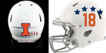
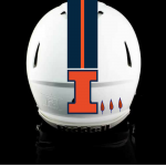
So it seems that there is a new football uniform set in the works, to be delivered for the 2018 season I believe. The biggest visible change it seems would be the colors of the numbers. Blue numbers on orange, orange numbers on blue, and maybe blue on white. The jersey numbers might also be slanted and closer to the modern Illinois font rather than the current rounder numbers. It seemed that the Shield would be off of the collar. I've also heard that Lovie isn't a huge fan of the shield, and likes to keep it simple with the I.
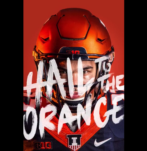

 logo is a major upgrade over the slant ILLINOIS, but I think there's still room for improvement. Was just playing around today with a couple ideas, and thought it might look cool if the