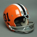
I think Richard Simmons used to wear those as shorts.
Pretty close. Looks like he's making a V for Victory Badge. Go Illini!
I think Richard Simmons used to wear those as shorts.
I don't think the original intent was to pit the block I against the victory shield, nor should it be. The cleaned up, standardized block I is a primary logo, and the victory shield is a secondary logo. In a perfect world where nobody in DIA treated them like an either/or, they both serve functions and work better in different places. It gives more flexibility than a single logo, so you don't end up like Indiana, whose entire brand is the IU logo and candy-striped warmup pants.Oh it could, sure, and I'm sure we still have all the necessary copyright and whatnot. But it has been totally buried, you basically never see it anywhere in official places or merchandise anymore. It is still on the waistband of the basketball shorts actually, but most of our guys roll their shorts down these days, so it gets hidden.
The DIA and Main Campus have also since unified their branding under the Block I logo. The war is over.
It's probably more likely that the DIA adopts the main campus font than anything.

A little bit of a "this porridge is too hot, this porridge is too cold" thing going on with that font and the DIA 1LL1NO1S one.
got 99% of the way there, just couldn't punch it accross the goal lineComing up with distinctive, helmet-ready logo (The Shield) and then never attempting to put it on the helmet is such an Illinois outcome I feel silly for assuming it would ever be any different.
I mean if we can't do the absolute basics right, we're screwed no matter what.Plus, if you think the I placement on our current helmets is bad, wait until they can’t put the shield on straight.
Agreed, at that point just go plain orange helmet and be done with it.I mean if we can't do the absolute basics right, we're screwed no matter what.
Yeah when has something with hard edges ever worked on a helmet?I’m dumbfounded by the shield love here recently. The hard sharp corners could never look good on a football helmet. It’s the complete opposite of the Clemson logo with soft round edges. Plus, if you think the I placement on our current helmets is bad, wait until they can’t put the shield on straight. I’ve never considered myself a shield hater, but I’m so thankful it’s never made it on the helmet or at center court/field.
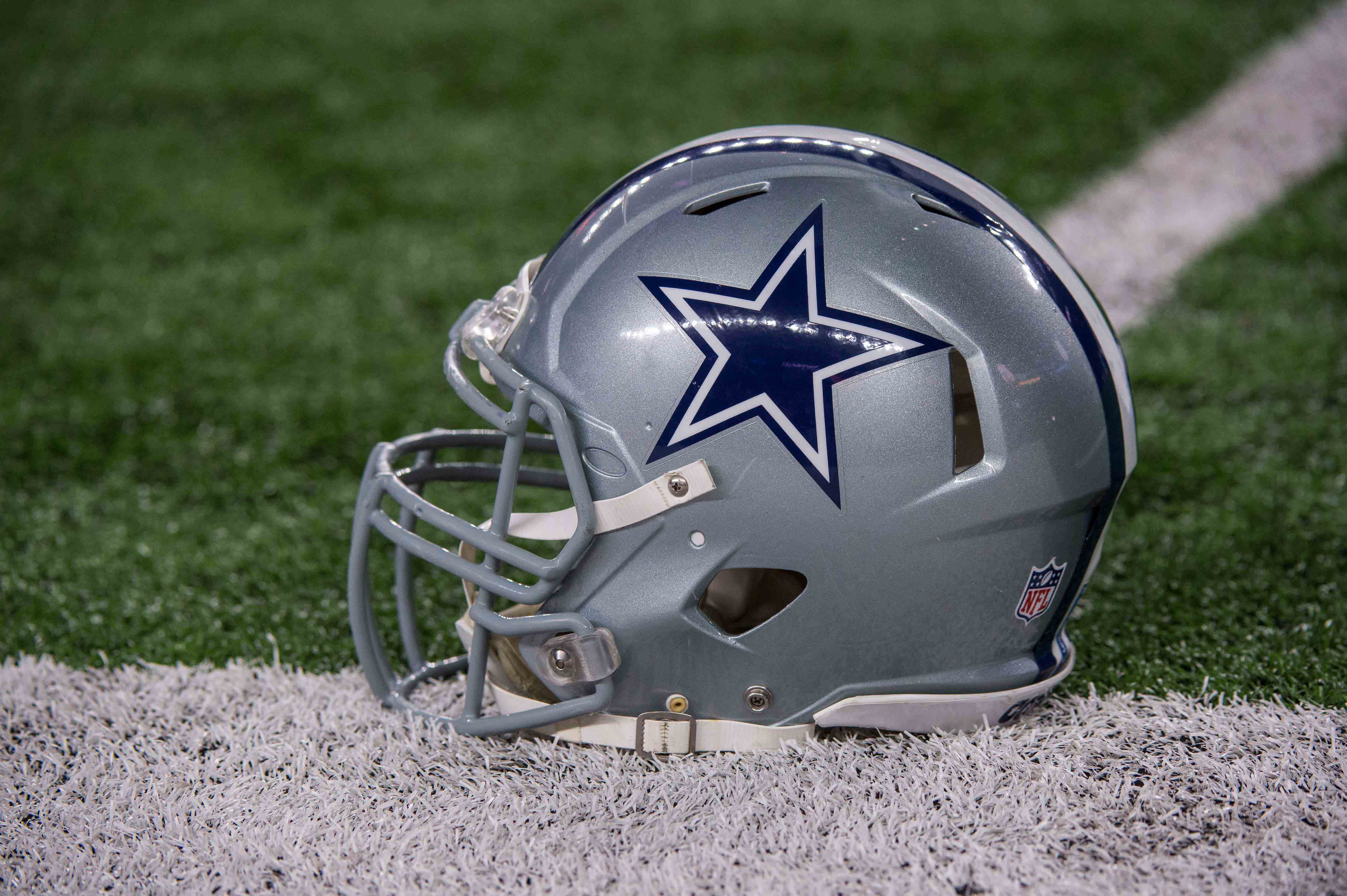


Yeah when has something with hard edges ever worked on a helmet?
Pictured: Helmet logo concept for the "University of Illinois Oilers"Yeah when has something with hard edges ever worked on a helmet?
Does our Helmet Sticker Guy have one leg longer than the other?Pictured: Helmet logo concept for the "University of Illinois Oilers"
No, you're thinking of his wife, Eileen. The sticker guy actually has an interesting story. He was born without eyelids, so the doctors grafted some using his foreskin when he was a baby. He's been fine, just a little cockeyed.Does our Helmet Sticker Guy have one leg longer than the other?
I agree. The shield would need to be redone for people to buy in because the design just isn’t that great, the thick white dividing line between the I and the pillars connects to the I and makes it look like the bottom is larger than the top and like it’s constantly off center. I could be a little OCD though too.It looks like a t-shirt and bikini bottom. The fact that people ask what it is should be a good indication of a bad design.
Those look like he chopped up a pair of Indiana warm up pants.View attachment 6952
Pretty close. Looks like he's making a V for Victory Badge. Go Illini!
Needs some arch for a better fit (a la Ragin' Cajuns helmet).
Take the stars out of the state decal and it would look better IMHO.
And make the decal biggerTake the stars out of the state decal and it would look better IMHO.
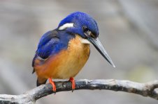
I like all but the one with the Illinois script but this will never happen. I don't think Kingfishers have feathers.Just looked up cool helmet designs, in general. Not Illinois specific. But right near the top was
View attachment 6933
Not trying to get anyone on a Chief tangent, I just thought these were cool for what could have been. If anyone has not seen these in the past
Is he wearing IU warm ups?View attachment 6952
Pretty close. Looks like he's making a V for Victory Badge. Go Illini!
It's a bird, it has feathers... Or did I miss sarcasm?I like all but the one with the Illinois script but this will never happen. I don't think Kingfishers have feathers.
I like all but the one with the Illinois script but this will never happen. I don't think Kingfishers have feathers