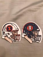
Of course we still do have white facemasks, just on our white helmets in our frequent white-out road look, the absolute worst uniform trend in college football.
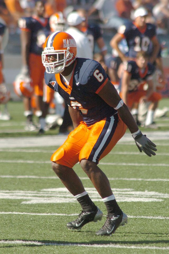
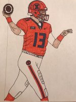
I really do think the 2001-era uniforms are the best we've done though. There was a crispness to the whole package that we haven't ever matched.
And there is a lesson in us making some very subtle changes in 2004-ish, and ending up with a much lesser overall product
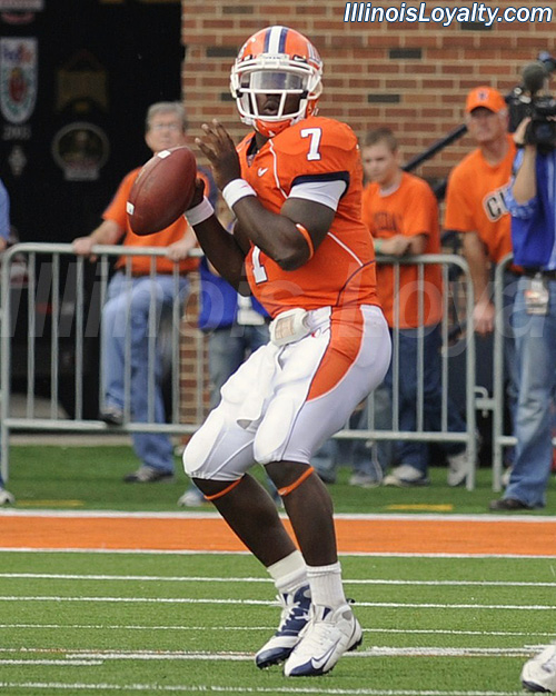
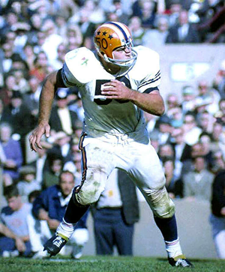
As I said before, they aren't wearing the same equipment, so it can't all be exactly the same, and I'm no devotee of slant Illinois, but if I'm looking to draw visual inspiration for what we should do, 2001 is where I'm going. That it's our last Big Ten championship team (and of course the era our AD played) makes it that much more natural.