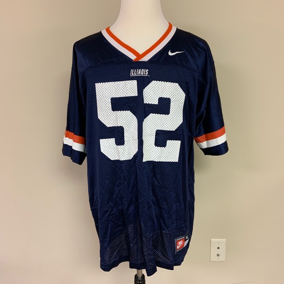
Illinois Football Uniforms

Status
Not open for further replies.
#176      

B-ILL

Working From Home
These are fantastic, especially with the white number. I don't understand the significance of the shoulder pattern you created, but everything else is so nice it's easy to overlook. Great job!
The pattern is literally in his avatar...

c1fc0cf07e9c39f729ccdf0262f3102fda72e90fb10f641872ce9a09a65fdf3b_1.gif
 
#177      
I think that script white helmet is nice but I just prefer Illinois always wearing orange lids. You see a big ten game, and a team in orange helmets, you know right away we are playing. (So the neutral can change the channel haha)
 
#178      

Deleted member 29907

D
Guest
View attachment 7123

I hope somebody at DIA realizes that they stumbled bass-ackwards into uniform gold with this basketball jersey script. It’s so simple and in theory (“it’s the name of the state, in cursive!”) should not be nearly as awesome as it somehow came out in real life. Please, please, this.
NO way the sticker-applier guy puts that on correctly ;)
 
#179      

JFGsCoffeeMug

BU:1 Trash cans:0
Chicago
With Bret's recent comments about wanting a strong brand identity, I would expect him to also care about the way proper sticker application can impact brand image. At least, that's my hope.
 
#180      

Deleted member 654622

D
Guest
View attachment 7123

I hope somebody at DIA realizes that they stumbled bass-ackwards into uniform gold with this basketball jersey script. It’s so simple and in theory (“it’s the name of the state, in cursive!”) should not be nearly as awesome as it somehow came out in real life. Please, please, this.
1611414712592.png

Don't forget the other side of that design. You want a look that really* no one can steal....use this.
*I said really not literally because it would be in bad taste if Northwestern used it

I may just buy a helmet like that just to wear around the house it looks so freaking good
 
#181      

ChiefGritty

Chicago, IL
Somebody explain the appeal of numbers on the helmet to me, I am utterly baffled by it.

It's one thing to just copy Bama out of a desire to have a Boomer-coddling "classic" look, I understand that even if I disagree, but as above people seem to respond to even a modern interpretation of it. Why?

For one thing it's extremely MAC, especially when it's a logo on one side and a number on the other, tons of MAC schools do that in a very new-coded "look at our edgy new uniforms" sense. But even that begs the question, why are the MAC schools doing it? Who thinks this looks good?
 
#182      

Deleted member 654622

D
Guest
Somebody explain the appeal of numbers on the helmet to me, I am utterly baffled by it.
Personally - Your number is your identity. This particular design of state and number is a combination of yourself within the team. I believe the jerseys hold the same concept. This is the team and this is the particular individual on this team. This helmet design does that
It's one thing to just copy Bama out of a desire to have a Boomer-coddling "classic" look, I understand that even if I disagree, but as above people seem to respond to even a modern interpretation of it. Why?
You see numbers on helmets and see Bama regardless of the rest. I do not. When I look at this particular design, I see Illinois. I would be hard pressed to believe anyone could look at this design and think something other than Illinois. I think that is the point. Same argument can be said for using Illini on the helmet. Personally I don't like the Illini helmets. But I like the identity concept
For one thing it's extremely MAC, especially when it's a logo on one side and a number on the other, tons of MAC schools do that in a very new-coded "look at our edgy new uniforms" sense. But even that begs the question, why are the MAC schools doing it? Who thinks this looks good?
I don't watch MAC schools so I cannot speak on their uniforms. Really, I don't want players that watch MAC schools either.
 
#183      

ChiefGritty

Chicago, IL
Personally - Your number is your identity. This particular design of state and number is a combination of yourself within the team.
That makes a decent amount of sense from the player perspective. It makes their equipment a one-of-a-kind item.

But aesthetically that kind of defeats the whole point.

And yeah, guilty as charged that I associate every number on helmet scheme as a Bama ripoff. When they're the only major program doing that for 30 years or more and everybody starts incorporating that as they become the dynastic standard for the sport, I feel pretty comfortable stating that position.

But beyond any of this, the biggest sin in these helmet images Barstool made is the asymmetry. Cardinal sin of uniform design, count me out.
 
#189      
Is it a marketing/branding no-no to have 3 different logos on 3 different helmets?

I like the arched ILLINI on the orange, script ILLINOIS on the white, and an orange BLOCK I on the blue.
 
#190      

ChiefGritty

Chicago, IL
why not keep white for the stroke outlines only? so blue lettering with thin white stroke on orange backgrounds, would go with blue face mask instead too (I know a lot folks like the white face masks)
The trouble is, you're not trying to make the best helmet, you're trying to make the best uniform as a whole.

You say, well it looks more "Illinois" to do this
m_5d22af819ed36d26e974927b.jpg

Instead of this
m_5c8c7bbac89e1dc0f912d4e7.jpg


And it looks more "Illinois" to do this
CW4hMN7hlOfLr0Rvnw82KKtVAEM4DIlhyJSN6nL53kXmH_IZEY1T2sT05ij_I57rwIoqG3P-VRFQZRV0lZTlUh23Pvxzqvi2c9LCDvZfk87iRfxisKWhYwI1_thOhxqIJ971Bw8qNArPdzmRewHgkRNs7AAAXoAXTSLUMh6oFnGSs2609ZF0N2DkS8c


Instead of this
illinois-fighting-illini-riddell-authentic-on-field-proline-football-helmet-9.jpg


And by "improving" every individual element, you end up looking like this
illinois-quarterback-tim-brasic-the-michigan-state-spartans-defeated-picture-id576883776


Instead of this

nov-2001-line-backer-ty-myers-of-the-illinois-fighting-illini-on-the-picture-id605018


Though even the Tim Brasic ones were fine. They're better than this

5DLJEM2LCBCSRDHVT5KCHTGLNI.jpg


The current jerseys look cool as an individual item. The whole package just doesn't work though.
 
#191      
The trouble is, you're not trying to make the best helmet, you're trying to make the best uniform as a whole.

You say, well it looks more "Illinois" to do this
m_5d22af819ed36d26e974927b.jpg

Instead of this
m_5c8c7bbac89e1dc0f912d4e7.jpg


And it looks more "Illinois" to do this
CW4hMN7hlOfLr0Rvnw82KKtVAEM4DIlhyJSN6nL53kXmH_IZEY1T2sT05ij_I57rwIoqG3P-VRFQZRV0lZTlUh23Pvxzqvi2c9LCDvZfk87iRfxisKWhYwI1_thOhxqIJ971Bw8qNArPdzmRewHgkRNs7AAAXoAXTSLUMh6oFnGSs2609ZF0N2DkS8c


Instead of this
illinois-fighting-illini-riddell-authentic-on-field-proline-football-helmet-9.jpg


And by "improving" every individual element, you end up looking like this
illinois-quarterback-tim-brasic-the-michigan-state-spartans-defeated-picture-id576883776


Instead of this

nov-2001-line-backer-ty-myers-of-the-illinois-fighting-illini-on-the-picture-id605018


Though even the Tim Brasic ones were fine. They're better than this

5DLJEM2LCBCSRDHVT5KCHTGLNI.jpg


The current jerseys look cool as an individual item. The whole package just doesn't work though.
I actually like these 2020 unis...
simple and clean...O and B. We all have different tastes.
 
#192      

lstewart53x3

Scottsdale, Arizona
The trouble is, you're not trying to make the best helmet, you're trying to make the best uniform as a whole.

You say, well it looks more "Illinois" to do this
m_5d22af819ed36d26e974927b.jpg

Instead of this
m_5c8c7bbac89e1dc0f912d4e7.jpg


And it looks more "Illinois" to do this
CW4hMN7hlOfLr0Rvnw82KKtVAEM4DIlhyJSN6nL53kXmH_IZEY1T2sT05ij_I57rwIoqG3P-VRFQZRV0lZTlUh23Pvxzqvi2c9LCDvZfk87iRfxisKWhYwI1_thOhxqIJ971Bw8qNArPdzmRewHgkRNs7AAAXoAXTSLUMh6oFnGSs2609ZF0N2DkS8c


Instead of this
illinois-fighting-illini-riddell-authentic-on-field-proline-football-helmet-9.jpg


And by "improving" every individual element, you end up looking like this
illinois-quarterback-tim-brasic-the-michigan-state-spartans-defeated-picture-id576883776


Instead of this

nov-2001-line-backer-ty-myers-of-the-illinois-fighting-illini-on-the-picture-id605018


Though even the Tim Brasic ones were fine. They're better than this

5DLJEM2LCBCSRDHVT5KCHTGLNI.jpg


The current jerseys look cool as an individual item. The whole package just doesn't work though.
A person’s football uniform preference generally comes down to:

1: Their own personal style.
2: The uniforms worn during their years in school.
3: The uniforms worn during years the team was good.
 
#193      

BZuppke

Plainfield
Yes. That’s why we have uniform threads.
 
#194      

Cook

Richmond, VA
The trouble is, you're not trying to make the best helmet, you're trying to make the best uniform as a whole.

You say, well it looks more "Illinois" to do this
m_5d22af819ed36d26e974927b.jpg

Instead of this
m_5c8c7bbac89e1dc0f912d4e7.jpg


And it looks more "Illinois" to do this
CW4hMN7hlOfLr0Rvnw82KKtVAEM4DIlhyJSN6nL53kXmH_IZEY1T2sT05ij_I57rwIoqG3P-VRFQZRV0lZTlUh23Pvxzqvi2c9LCDvZfk87iRfxisKWhYwI1_thOhxqIJ971Bw8qNArPdzmRewHgkRNs7AAAXoAXTSLUMh6oFnGSs2609ZF0N2DkS8c


Instead of this
illinois-fighting-illini-riddell-authentic-on-field-proline-football-helmet-9.jpg


And by "improving" every individual element, you end up looking like this
illinois-quarterback-tim-brasic-the-michigan-state-spartans-defeated-picture-id576883776


Instead of this

nov-2001-line-backer-ty-myers-of-the-illinois-fighting-illini-on-the-picture-id605018


Though even the Tim Brasic ones were fine. They're better than this

5DLJEM2LCBCSRDHVT5KCHTGLNI.jpg


The current jerseys look cool as an individual item. The whole package just doesn't work though.
Of all you pictured, I like the current ones the best. Although, I'd remove Fighting Illini from the rear waistband and add a single blue stripe to the helmet and the side of the pants.

What I was trying to say before is our marks should always be orange or blue (the outline could be white, orange or blue) but the lettering never white even if with an orange or blue outline. Just like there is no white block I.
 
#195      

skyIdub

Winged Warrior
Blue background orange letters white outline looks like pure sex

What kind of freaky porn are you watching?? (and maybe a link?) Just kidding. Except I'm not kidding.

Or am I?


I'm not.
 
#196      

Deleted member 654622

D
Guest
The trouble is, you're not trying to make the best helmet, you're trying to make the best uniform as a whole.

You say, well it looks more "Illinois" to do this
m_5d22af819ed36d26e974927b.jpg

Instead of this
m_5c8c7bbac89e1dc0f912d4e7.jpg


And it looks more "Illinois" to do this
CW4hMN7hlOfLr0Rvnw82KKtVAEM4DIlhyJSN6nL53kXmH_IZEY1T2sT05ij_I57rwIoqG3P-VRFQZRV0lZTlUh23Pvxzqvi2c9LCDvZfk87iRfxisKWhYwI1_thOhxqIJ971Bw8qNArPdzmRewHgkRNs7AAAXoAXTSLUMh6oFnGSs2609ZF0N2DkS8c


Instead of this
illinois-fighting-illini-riddell-authentic-on-field-proline-football-helmet-9.jpg


And by "improving" every individual element, you end up looking like this
illinois-quarterback-tim-brasic-the-michigan-state-spartans-defeated-picture-id576883776


Instead of this

nov-2001-line-backer-ty-myers-of-the-illinois-fighting-illini-on-the-picture-id605018


Though even the Tim Brasic ones were fine. They're better than this

5DLJEM2LCBCSRDHVT5KCHTGLNI.jpg


The current jerseys look cool as an individual item. The whole package just doesn't work though.
When you see numbers on helmets you see Alabama. When I see underlined team names on a helmet, I see the New Yuck Giants
 
#197      

skyIdub

Winged Warrior
When you see numbers on helmets you see Alabama. When I see underlined team names on a helmet, I see the New Yuck Giants

Yep, and when I see "ILLINI" helmet in block letters, I see this...

51PIIcwYARL._AC_.jpg


The script "Illinois" or "Illini" is the winner for me.
 
#198      
When you see numbers on helmets you see Alabama. When I see underlined team names on a helmet, I see the New Yuck Giants
Not nice/fair using my sleeping jersey in top picture, Gritty.
 
#199      
Personally I'd love it if we brought out some Chrome helmets and maybe went for a more modern look somewhat like Minnesota and Oklahoma State. Although I am certainly not opposed to "script Illinois"
 
#200      
View attachment 7141
Don't forget the other side of that design. You want a look that really* no one can steal....use this.
*I said really not literally because it would be in bad taste if Northwestern used it

I may just buy a helmet like that just to wear around the house it looks so freaking good
The white script Illinois helmet looks good (although we should never have a white primary helmet), but this one is awful.
 
Status
Not open for further replies.