Illinois Football Uniforms

Status
Not open for further replies.
#1      

redwingillini11

North Aurora
Any whispers on whether we are getting new uniforms anytime soon? I think I was down in Champaign the summer of 2017, and saw the mockups for what would become our new uniform set in the 2018 season. So I guess it does take time for Nike to hook us up with a new look, but maybe the new designs are already out there.

Our last uniform set lasted for four seasons, I believe. So maybe Bielema comes in and approves a new look to debut in the 2022 season?
 
#2      
Id be very surprised if there was any uniform change this year or anytime soon
 
#4      
I thought our pre-Syracuse uniforms we the best in a super long time. I don't think we could be any more boring, uninspiring, and in-original than we have now. My Syracuse friend reminds me all the time.
But our jerseys look better than Syracuse, and since when do they own the colors orange and blue?! Also the galloping ghost uni's are slick and an amazing tribute to the greatest player of all time.
 
#6      

Deleted member 747817

D
Guest
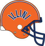
I've seen some merchandise with the curved illini logo lately. I doubt anything new will come this season, but maybe we see thIs next season? It does seem that each new coaching regime comes with uniform changes.
 

Attachments

  • 20210720_072251.jpg
    20210720_072251.jpg
    487.9 KB · Views: 320
  • download.png
    download.png
    9.8 KB · Views: 314
#7      

illini80

Forgottonia
Id be very surprised if there was any uniform change this year or anytime soon
Beilema seems to be the kind of guy who wants something established that will stick, not looking for the next hot trend. And I’m totally on board with that. I know people say that it matters to the kids, but I’m guessing a winning tradition and good football is what will bring in recruits year after year.
 
#8      

Illini92and96

Austin, TX
But our jerseys look better than Syracuse, and since when do they own the colors orange and blue?! Also the galloping ghost uni's are slick and an amazing tribute to the greatest player of all time.
IMO they are exactly like the previous gen Syracuse, which I never liked when they wore them. Obvioulsy, no one owns any color - no sure how that relates to us (Nike) having hand me downs. Personally I prefer cool looking uniforms over any tribute, and I’m old enough to be nostalgic.
 
#9      
IMO they are exactly like the previous gen Syracuse, which I never liked when they wore them. Obvioulsy, no one owns any color - no sure how that relates to us (Nike) having hand me downs. Personally I prefer cool looking uniforms over any tribute, and I’m old enough to be nostalgic.
Most neutrals I watch games with always compliment our jerseys, maybe it's the Chicago Bears bias, but the general consensus among my neutral friends are that our Orange-Blue-Orange jerseys look really good.
 
#10      
With our current unis, I'm always struck by how orange the orange is. It's the orangest orange I've ever seen. It certainly pops on TV.
 
#11      

Ransom Stoddard

Ordained Dudeist Priest
Bloomington, IL
With our current unis, I'm always struck by how orange the orange is. It's the orangest orange I've ever seen. It certainly pops on TV.
Depending on the broadcaster's color settings it can come across as almost red sometimes. Texas, Tennessee, Auburn, and Clemson all look the same to my old, semi-color-blind eyes.
 
#15      
As we close in on August I once again shout from the wilderness to put the throwback script Illinois on the helmet.

This is completely anecdotal but it seems like the script basketball unis are pretty much universally loved, so this seems like the closest thing we could have to a helmet that pleases everyone. Block I and the "Giants" style 2000s helmets are uninspired. Lots of people don't like the shield and it's not really designed to work well on a rounded surface. Anything even hinting at the Chief or Native American imagery will never fly.
Curved script ILLINI is clean and would be relatively unique to us (I think Florida has a script GATORS alternate that they use but can't think of anyone else who uses this design). I'm also not a fan of the white helmets, but that might be just a Block I problem, I could live with all three colors with the script logo (but would still prefer we use one color lid 90% of the time, hopefully orange).

Oh and on a completely different note I'll continue my yearly drum beat to forever burn the white pants. Everyone has their hill, this is mine.
 
#18      

redwingillini11

North Aurora
I know it's generally reviled, but I have a soft spot for "B" and the all-white variant that preceded it. I welcome your angry calls and letters.
Yeah I am definitely in the camp that the 1989-2004 and "B" were underrated and are pretty uniquely Illinois at this point. I'd love an occasional use of that helmet.

But definitely, the whole fanbase could probably unite around a script Illinois or Illini helmet like the basketball throwbacks. Those would really look great.
 
#19      

mattcoldagelli

The Transfer Portal
This is completely anecdotal but it seems like the script basketball unis are pretty much universally loved, so this seems like the closest thing we could have to a helmet that pleases everyone. Block I and the "Giants" style 2000s helmets are uninspired. Lots of people don't like the shield and it's not really designed to work well on a rounded surface. Anything even hinting at the Chief or Native American imagery will never fly.
Curved script ILLINI is clean and would be relatively unique to us (I think Florida has a script GATORS alternate that they use but can't think of anyone else who uses this design). I'm also not a fan of the white helmets, but that might be just a Block I problem, I could live with all three colors with the script logo (but would still prefer we use one color lid 90% of the time, hopefully orange).

Oh and on a completely different note I'll continue my yearly drum beat to forever burn the white pants. Everyone has their hill, this is mine.
In an extremely Illinois move, the rebrand was a....well, let's call it a partial failure. We've got consistency across our non-revenue sports, which was one of the goals, but football and basketball have kind of retreated into their own corners with what can best be called a conditional commitment to how things are supposed to look. We're kind of right back where we started there.

In an extremely NOT Illinois move, we stumbled into an absolutely gorgeous wordmark that everybody likes, is flexible enough to for both football and basketball, and also can co-exist with the Block I (try taking the script I out and having it stand on its own - doesn't work).
 
#22      
I think the helmets should say simply "ILLINI" - there ain't no other word , nowhere, no-how in any language, Distinctive. But to put " Illinois" on the helmet or unis is generic and Walmart, JC Penney stuff.

GO ILLINI!

"ILLINI" is the unique selling difference (USD), as we used to say when I audited a sales/marketing class.

Memo to Josh.
 
Last edited:
Status
Not open for further replies.