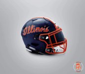
I think these are awful and hope Illinois wouldn't go in that direction.View attachment 13334
View attachment 13333
Just became aware of these OSU lids this weekend. Makes me want the script Illinois design even more now. Seems doubtful, however.
You are using an out of date browser. It may not display this or other websites correctly.
You should upgrade or use an alternative browser.
You should upgrade or use an alternative browser.
Illinois Football Uniforms
- Status
- Not open for further replies.
I disagree with you.I think these are awful and hope Illinois wouldn't go in that direction.
Attachments
Alright, here's my novel helmet idea. From afar it looks like some kind of blue and orange houndstooth type of pattern, but upon closer inspection it's a bunch of small interlocking blue and orange  I feel like someone with way more talent and time than me could mock up something that looks great with that idea, and it would certainly be unique. Or awful! Think I'd have to actually see it to know.
I feel like someone with way more talent and time than me could mock up something that looks great with that idea, and it would certainly be unique. Or awful! Think I'd have to actually see it to know.Illini in Italy
- Illini HQ, Florida Panhandle
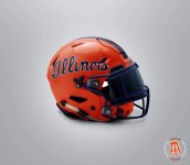
I’m not a fan either . . .I disagree with you.
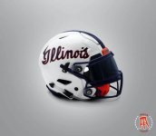
The white one looks good, but that would never be our primary helmet color. The orange and blue are rough.I disagree with you.
Shief
- Champaign Area
I agree that the white helmet is good and can also support the orange one. I am not a big fan of the blue option. If we can develop jerseys and pants to go with the white and orange helmets, I think that we'd be in business.The white one looks good, but that would never be our primary helmet color. The orange and blue are rough.
Illini92and96
- Austin, TX
You want noisy uniforms, like Oregon or Maryland?Surprised it's been so quiet regarding uniforms.
mattcoldagelli
- Script Illinois Enthusiast
Yeah I mean an orange helmet with white lettering is what we've had for most of my (our?) lives:

Not sure if these are mock ups, but the basketball jerseys on this are the actual jerseys
illinipioneer
- Richmond, VA
Idk about you guys but….yikes
View attachment 18239
Not sure if these are mock ups, but the basketball jerseys on this are the actual jerseys
Fighter of the Nightman
- Chicago, IL
Not a fan … I like that our style is clearly moving into throwback territory, but mixing and matching looks awful.Idk about you guys but….yikes
The Galloping Ghost
- Washington, DC
View attachment 18239
Not sure if these are mock ups, but the basketball jerseys on this are the actual jerseys

Why are there so many sets of stripes? We don't need side piping, two sets of stripes on the sleeves, AND stripes on the collar. Also, I really never want to see Illinois in the slanted font across the chest of our football jerseys. Everything about it is much too much. Keep the jerseys clean and simple.

I wouldn't be surprised if those are correct, basically a 70s throwback. Still can't say I like them from the mock up though. I would have expected something more closer to what would be considered typical Illini uniforms from Bielema since I don't think the 70s style uniforms are what most people see as the typical Illini style uniforms. It would make sense I guess though if they want to use the 70s script to use a 70s uniform.
Last edited:

 Why in the world can't the DIA get a decent in house Designer to avoid the oh so-many literally text book design mistakes that continue to be made over and over. It's sad
Krombopulos_Michael
- Aurora, Illinois (that’s a suburb of Chicago)
If it’s closer to the actual throwback I’m all in, but the random blue side stripe + slanted Illinois ruin the whole thingThese I’d be fine with I’ve always thought we should wear orange jerseys View attachment 18242
Yikes, no thanks. I wish they would get rid of the 1LL1NO1S logo. It's just ugly. It's ugly here, it's ugly on the basketball jerseys, it's ugly on the baseball jerseys, it's ugly everywhere. Those jerseys remind me of this skit
View attachment 18239
Not sure if these are mock ups, but the basketball jerseys on this are the actual jerseys
Last edited:
I agree. Blue does not belong, neither does the name.If it’s closer to the actual throwback I’m all in, but the random blue side stripe + slanted Illinois ruin the whole thing
Cook
- Richmond, VA
This is a great case study right here. Because of the position of the two stripes, the ILLINI was lower, closer to the ear hole. When we changed to one center stripe, however, the ILLINI remained down low by the ear hole resulting in this awkward spacing and generally crappy look. The ILLINI should have been brought higher on the helmet closer the striping.These I’d be fine with I’ve always thought we should wear orange jerseys View attachment 18242

ILLINIShox24
Orange Krush '04 & '05
Why would the name of the school be on the front of a football jersey? Can we not please?

- Status
- Not open for further replies.