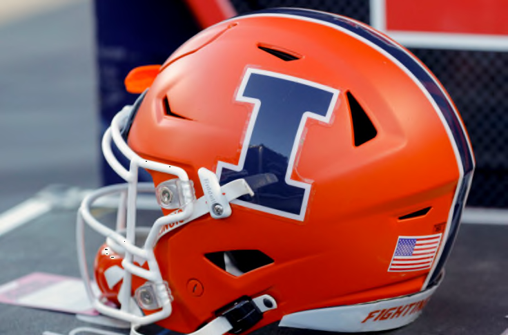
Illinois Football Uniforms

Status
Not open for further replies.
#401      

redwingillini11

North Aurora
It wasn’t executed as well as you’re insisting. The negative “I” itself, the central component to the shield, was wrong. Nike’s rebrand introduced a new block I with softer interior corners. That was a subtle, but major, part of the symbology rebrand. The shield Block I has hard corners. How is it possible for a professional design team to f#*% up something so central to the design? At least it’s the right vowel.

I’ve never developed the strong feelings about it that the “team shield” or the “team anti-shield” did. I feel ambivalent about it. There you go. A team symbol that generates ambivalence in the heart of its most ardent fans. Great work everyone.

Those of you who keep pushing this bland shield design are like the person who restates the punch line of a lame joke, waiting for laughter. We heard you the first time.
I agree with this. I will also add that I think a fundamental flaw with the shield was that, while use of negative space can be a brilliant feature of logo design, the main #1 feature of the shield that is meant to identify it as representing Illinois was the negative space "I". What other primary logo has the main identifying feature as negative space? Negative space features are used as a compliment, because its is just a fact that your eyes are not immediately drawn to them. If you take away the negative space "I", there is absolutely nothing about it that would suggest it represents UIUC or the Fighting Illini. Now if you had an orange "I" on the shield, such that your eyes were drawn to it, you might have something there.

Bottom line, if you have to explain the hidden meaning behind your logo to outsiders who don't get it at first glance, then it just isn't an effective primary logo.
 
#402      

mattcoldagelli

The Transfer Portal
I’ve never developed the strong feelings about it that the “team shield” or the “team anti-shield” did. I feel ambivalent about it. There you go. A team symbol that generates ambivalence in the heart of its most ardent fans. Great work everyone.

Not to speak for @ChiefGritty but I think his point is it is (nearly) always thus. Do you think the Motion W at Wisconsin had fans wanting to run through a wall for it at first sight?
 
#403      
View attachment 18993
So, this is wrong. The shield uses the proper silhouette. The official silhouette of the "I" is the one with right angles (you can see it in the picture). The curved corners are only ever used inside the "I" with right angles. The official style guide with the rebrand stated that the "I" would never simply be the curved angle "I." It has to have the full right-angled "I" behind it (in the link I provided, it's why the "I" in the limited-use section all have right angles. It's also why I like the shield. It emphasizes that the right angles are a key component of our letter.

Edit: just gonna throw this in here https://marketing.illinois.edu/design/logo
Is there any way to have this explanation incorporated into the shield design so that when every single person who sees them and immediately perceives the difference between the hard and soft corners, they can also read your blurb that explains why they're wrong for perceiving the difference that way?
 

Attachments

  • Illinois I.jpg
    Illinois I.jpg
    16.2 KB · Views: 74
#404      

ChiefGritty

Chicago, IL
Not to speak for @ChiefGritty but I think his point is it is (nearly) always thus. Do you think the Motion W at Wisconsin had fans wanting to run through a wall for it at first sight?
Interesting point that kinda ties together the two threads I've been boring everyone to tears in today, because like the Powercat at KSU and the Tigerhawk at Iowa, the Motion W was generated and introduced by a brand new head coach who wound up (in due time) being the savior of the program and athletic department.

And as we can still see "new coach can do no wrong, all narratives must be bent in their favor until year 3 or 4 falls apart then they were a disaster from day 1 and the next guy is the answer to the mess he left" remains core programming to the college football fan.

If the shield had been Bret Bielema's brainchild and thrown on the helmets last year, it would currently have a 100% approval rating, and in three years would have an approval rating determined solely by our intervening W-L record.

I agree with this. I will also add that I think a fundamental flaw with the shield was that, while use of negative space can be a brilliant feature of logo design, the main #1 feature of the shield that is meant to identify it as representing Illinois was the negative space "I". What other primary logo has the main identifying feature as negative space? Negative space features are used as a compliment, because its is just a fact that your eyes are not immediately drawn to them. If you take away the negative space "I", there is absolutely nothing about it that would suggest it represents UIUC or the Fighting Illini. Now if you had an orange "I" on the shield, such that your eyes were drawn to it, you might have something there.

Bottom line, if you have to explain the hidden meaning behind your logo to outsiders who don't get it at first glance, then it just isn't an effective primary logo.
Is there any way to have this explanation incorporated into the shield design so that when every single person who sees them and immediately perceives the difference between the hard and soft corners, they can also read your blurb that explains why they're wrong for perceiving the difference that way?
Guys, it's just a gussied up letter I. :shield:

This is all post-hoc rationalization for it having Mike Thomas stink on it, I'm sorry.
 
#406      
For me it’s a “once seen can’t unsee” thing. It has always looked like a train to me, which makes me think of Purdue, which sends me in search of some Pepto.

If I strain I can sort of see a shield, but as others have said, if you have to strain then I don’t think it’s doing the job intended.
 
#408      
View attachment 18988View attachment 18989
Speaking of, I'm sure I'm in the minority, but this will forever be my favorite Illinois "I". To me, it just screams "university" in the best possible way and transforms a simple letter into something far more visually appealing. I understand why we dropped it. Having a different "I" for the academic and athletic departments isn't ideal, but I miss it.

+2 to the minority. I personally love this icon. Liked it so much I got a sticker of it.
 
#409      
I don’t really understand why a very obvious silhouette of an “I” needs an explanation. It’s not complex.

No one is confused about which letter is represented. Speaking only for myself, the Block I in the shield with hard corners doesn't appear to match the branded Block I with curved interior corners. Sure, there's a formal brand explanation why it's actually super consistent, but one looks different than the other.

I actually agree with Gritty's general point about building sentiment behind any sort of recognizable iconography. If we won a string of NC's over the next decade with that lame shield prominently displayed on our uniforms, I'm sure I'd eventually feel nostalgic about it at some point in the future.
 
#410      

ChiefGritty

Chicago, IL
+2 to the minority. I personally love this icon. Liked it so much I got a sticker of it.
I quite liked that too tbh. A little bit tweedy and East Coast to be an athletic logo, but all the stuff I said about about context still applies if they had ever tried.

And honestly, we seem to be making most of the right moves in making the best of the Block I. It has some inherent limitations but it beats the heck out of one of those word-in-front-of-letter struggle bus logos.

https%3A%2F%2Fwritingillini.com%2Fwp-content%2Fuploads%2Fgetty-images%2F2017%2F07%2F1235523833-850x560.jpeg


There's a lot of sensible, detail oriented thinking evident there. I have confidence that what we see in 2023 will demonstrate the same.
 
#411      

The Galloping Ghost

Washington, DC
And honestly, we seem to be making most of the right moves in making the best of the Block I.

https%3A%2F%2Fwritingillini.com%2Fwp-content%2Fuploads%2Fgetty-images%2F2017%2F07%2F1235523833-850x560.jpeg


There's a lot of sensible, detail oriented thinking evident there. I have confidence that what we see in 2023 will demonstrate the same.
Now that we actually have the "I" situated properly on the helmet. That it took multiple years to get that done still makes my eyes twitch.
 
#412      
I quite liked that too tbh. A little bit tweedy and East Coast to be an athletic logo, but all the stuff I said about about context still applies if they had ever tried.

And honestly, we seem to be making most of the right moves in making the best of the Block I. It has some inherent limitations but it beats the heck out of one of those word-in-front-of-letter struggle bus logos.
Okay, I'm probably the minority on this one -

be0f51943f4ee0400b150ef2f3b9cb9e.jpg

But I adore this.

rachel-mc-adams-smile.gif
 
#415      

ILLINIShox24

Orange Krush '04 & '05
We should take submissions for a new logo here. I'd love to see everyone's ideas. I am not thrilled about any of our current options. The shield has been on a downward trend to me since it first came out. The more I look at it, the more I get stuck on its flaws. I prefer the current I with the rounded interior corners, but there's not much to it. I know some of you have to have better ideas.
 
#420      

Cook

Richmond, VA
Have always thought an opportunity missed is not going with simply "Illini" more. E.g. everywhere you see Illinois, just replace with Illini (jerseys, end zones, etc.). Over time, it could/would become commonly synonymous with all of the U of I, athletics, alumni, fans, and anyone/anything living in or from Illinois (similar to how Hoosier can connote all things Indiana). Seems subtle, but it feeds a certain brand eminence and something you can never get using Illinois. Do Purdue fans cringe hearing "Hoosier State" or being called Hoosiers because they're from Indiana? ;)
 
Last edited:
#421      

IlliniSaluki

IL metro east burbs of St. Louis
Have always thought an opportunity missed is not going with simply "Illini" more. E.g. everywhere you see Illinois, just replace with Illini. Over time, it could/would become commonly synonymous with all of the U of I, athletics, alumni, fans, and anyone/anything living in or from Illinois (similar to how Hoosier can connote all things Indiana). Seems subtle, but it feeds a certain brand eminence and something you can never get using Illinois. Do Purdue fans cringe hearing "Hoosier State" or being called Hoosiers because they're from Indiana? ;)
Just to throw some shade on the use of Hoosier as an example. If you have ever been to the St. Louis area or Southern Illinois the term 'Hoosier' is used in place of hick and redneck or anyone deemed unintelligent and/or uncultured.
 
#422      
I thought the shield was supposed to be in homage to Memorial stadium and the original 'Fighting Illini' WWI vets. If not, it should've been. That tie-in makes it work. Otherwise it's just decorative.

I liked the idea of the shield (if historically tied-in). But either way I never liked the execution.

The orange lines made me think of this:
1659077587244.png


Which made me think of this:

1659077635940.png
 
#423      
I think the shield concept isn't a bad one but just really don't like the execution. I think it was a missed opportunity and I found this old shield looking around online that would have been a much better way to go:

View attachment 18986

This shield has a classic simplicity to it that I like. I'd update it by swapping out the old logo for the Block I. Then I'd add a flourish you see in European soccer leagues - add stars to signify championships. Since this is the logo for the entire athletic department, I'd add a star for every five national championships in all sports. As of right now that would give us four stars (23 nattys). Most European shields/crests do this by adding the stars above the shield, which is a fine way to go. But given the simplicity of this design, I'd add them to the background. Start at the top left corner and work your way down and across the shield. Maybe one day (in like 1000 years) it can look something like this:

View attachment 18987
(Boca Juniors - 1 star for each championship)
This was the shield that I had envisioned. Simple, strong and timeless design. Change to the Block I and stay away from flourishes.
 
Status
Not open for further replies.