Illinois Football Uniforms

Status
Not open for further replies.
#26      

InDaAZ

Eugene, Oregon
Being a transplant from “da AZ” (via IL & IN), I love the temperate, drizzly winters here.

Autzen is an absolutely ROCKIN’ place to take in a FB game - loud, passionate (borderline crazy) fan base… and yes, those neon pajamas the players trot out on Saturdays adds a pizzazz that would send Penn State fans grabbing for their sunglasses.
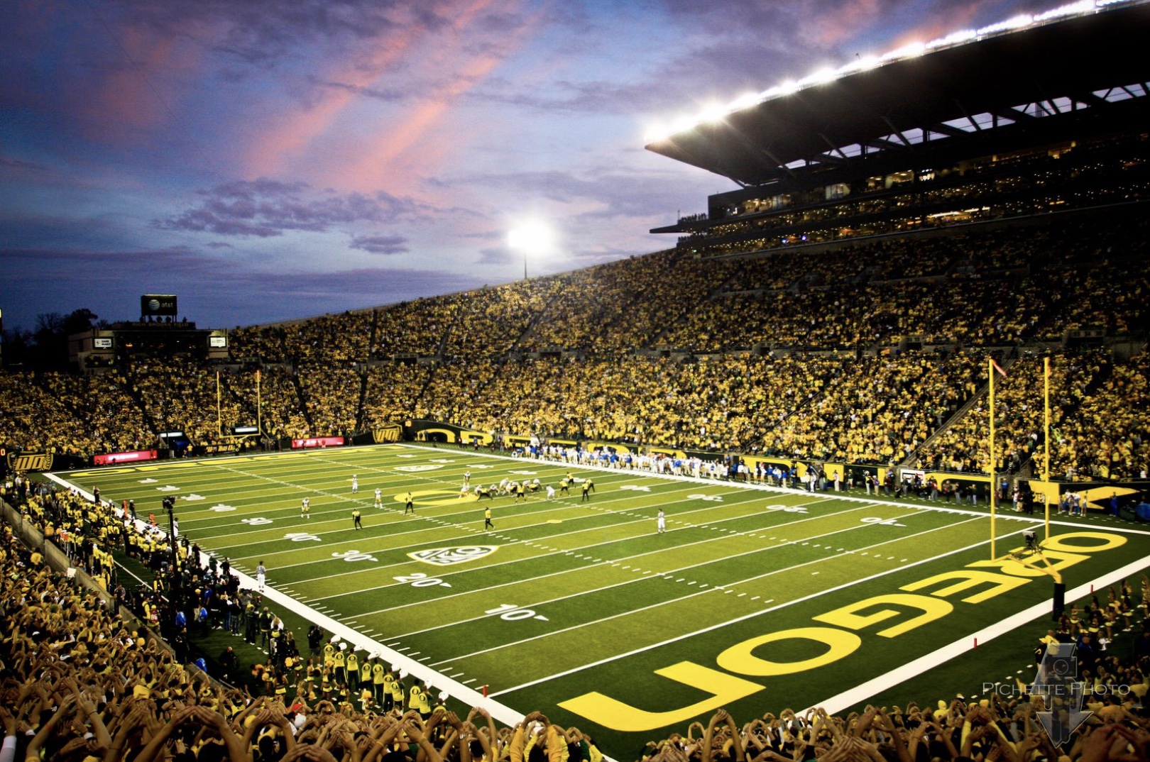
28668C14-FBD1-4E9E-BB4C-BBECDE7F5FD0.jpeg


It would be something if the product from Memorial Stadium generated that kind of fervor, and football season more than a place-card for hoops. Go, Illini, make it happen!
 
#27      

altgeld88

Arlington, Virginia
Being a transplant from “da AZ” (via IL & IN), I love the temperate, drizzly winters here.

Autzen is an absolutely ROCKIN’ place to take in a FB game - loud, passionate (borderline crazy) fan base… and yes, those neon pajamas the players trot out on Saturdays adds a pizzazz that would send Penn State fans grabbing for their sunglasses.
View attachment 19225

It would be something if the product from Memorial Stadium generated that kind of fervor, and football season more than a place-card for hoops. Go, Illini, make it happen!
Have been in that empty stadium twice. Love watching games televised there. It's a beautiful town... the entire Willamette Valley is pretty but Eugene-Springfield is especially nice. Gotta say that during my visits in July and August it was sunny, clear and warm. But I do recall the Lewis & Clark journal entries from Fort Clatsop on the NW OR coast. Rained every day that winter and drove them nearly insane! :ROFLMAO:

I second your sentiment that it would be great to get this atmosphere back to Memorial Stadium again.
 
#28      

Cook

Richmond, VA
Unfortunately, the helmet wall brings back bad memories. Beckman-Cubit-LS. Ugh.
1. top left helmet sticker is literally peeling off 🤦‍♂️
2. top row lame GIANTS rip-off was never inspiring
2. 2 bottom row helmets accurately reflect the :illinois: sticker misalignment issues 😒
3. all the different shades of orange (4 in this pic, more in the video) highlights the lack of conviction in establishing what orange is actually Illini orange 🤷‍♂️

Screen Shot 2022-08-18 at 7.41.26 PM.png


Still hopeful that the current leadership rights the design, branding errs. Some of the new font usage the last 2 days, however, hasn't been a positive indicator.
 
#36      
I know everyone here is a hater, but those throwback Giants helmets looked pretty darn good last night...

#__________
It's strange, I absolutely hated them for Illinois and pray we never go back.

That said, the old Giants ones are not bad, and my local high school Lincoln-Way East wears helmets with EAST as the logo and I love them. . . but for the Illini, for some reason, I always hated them.
 
#37      

altgeld88

Arlington, Virginia
It's strange, I absolutely hated them for Illinois and pray we never go back.

That said, the old Giants ones are not bad, and my local high school Lincoln-Way East wears helmets with EAST as the logo and I love them. . . but for the Illini, for some reason, I always hated them.
I'm with you. I didn't like them because they were unoriginal. IMO, that Giants logo was far inferior to the old NY one they're back to using now.

My favorites remain the helmet you use as your avatar, and the '70s Bob Blackman-era ones with the white stripes on either side. He brought that stripe motif with him from Dartmouth.

1664313109246.png

1664312939083.png
1664312954010.png
1664312961673.png

1664313406954.png
 
#39      
Everything positive happening in the program right now has been directly caused by correcting the bordering and orientation of the helmet logo.

I will not be taking questions.
Hey, it’s where your head is at that matters.
 
#41      
I'm with you. I didn't like them because they were unoriginal. IMO, that Giants logo was far inferior to the old NY one they're back to using now.

My favorites remain the helmet you use as your avatar, and the '70s Bob Blackman-era ones with the white stripes on either side. He brought that stripe motif with him from Dartmouth.

View attachment 20143
View attachment 20140View attachment 20141View attachment 20142
View attachment 20144
I like that, actually, and a tie and hat like that for Bret. Seriously, going Old School is good, because our New School hasn’t been that good, at least until right now.
 
#43      
Part of me is a little sad we are losing the uniforms from this fun season but excited to see what Bielema picked out.
 
#45      

redwingillini11

North Aurora
I’m guessing it’s honestly a better version of these … like with outlines on the numbers, numbers in a bit more classic of a font, maybe a stripe on the pants, etc.
Yeah I think the biggest issue with the Uni set currently is that there are no white accents on the jerseys to compliment the white on the helmets. I imagine the new set won’t be a drastic change, and will just bring more consistency to the set overall. I’m excited to see what they look like.
 
Status
Not open for further replies.