Illinois Football Uniforms

Status
Not open for further replies.
#651      
Yeah my whole point is kind of that the current flag is literally a pre-existing logo, that predates the flag by about 50 years, and was repurposed as a flag...
Yes, got that. I don't think I've made an argument to the contrary.

My George Lucas comment was more about a macro trend vs the Illinois flag specifically. In general, I do not have strong, unflappable feelings about flags.
 
#652      
Since we're on this topic, what on earth was the State of Maine thinking voting against changing their flag from this
Maine-flag.jpg


To this beauty

firstflag-2-e1543084347255.png
They’re not the “Pine Tree State”?
 
#653      
It's a good seal, as seals go! It should stay and do the job that state seals do (appearing on documents and podiums and whatnot).

I mentioned the Wallace Rice centennial flag earlier, and didn't share an image, so here it is:
us_il100.gif


Illinois is the 21st state, so there are 21 stars - the most prominent one representing the state itself and then the 10 Northern and 10 Southern states already in existence when Illinois entered the Union.
Booooring
 
#654      
It's a good seal, as seals go! It should stay and do the job that state seals do (appearing on documents and podiums and whatnot).

I mentioned the Wallace Rice centennial flag earlier, and didn't share an image, so here it is:
us_il100.gif


Illinois is the 21st state, so there are 21 stars - the most prominent one representing the state itself and then the 10 Northern and 10 Southern states already in existence when Illinois entered the Union.

So is that the Mason Dixon line then?

Also it does look very rocket/missile-on-its-side esque.

Does Illinois have ties to the space/missile defense industry? Or is it design coincidence? If there are obvious ties I’m blanking on them.
 
#657      
So is that the Mason Dixon line then?

Also it does look very rocket/missile-on-its-side esque.

Does Illinois have ties to the space/missile defense industry? Or is it design coincidence? If there are obvious ties I’m blanking on them.
The Mason Dixon Line is the border between PA and MD. There once was a sign marking it along I-70, but it isn't there anymore.
 
#665      
I think O/B/O looks the best and is the traditional home set so we will see that the most under Bret. I am fine with seeing the orange though once a year. We've worn orange uniforms since the 70s and this orange uniform looks good.
 
#666      
I think O/B/O looks the best and is the traditional home set so we will see that the most under Bret. I am fine with seeing the orange though once a year. We've worn orange uniforms since the 70s and this orange uniform looks good.
Agreed, and I think the best approach is to wear orange for only our identified "orange-out" game. More than once per year is overkill, JMO.
 
#668      
Okay, slightly OT and for fun ... what are your favorite other teams' looks in the Big Ten and least favorite? You can pick just one uniform, a helmet, logo, full set, etc .... meant to be more of a casual conversation starter! These are my thoughts:

FAVORITE
UCLA:
Not sure why, but I find UCLA's look charming. I wish they would switch their shoulder stripes to have the darker color on the outside (i.e., using the Illini home jersey as an example, their shoulder stripes go W/O/W instead of O/W/O), but I really like their home uniforms and the script font on the helmet. This praise does not extend to the away uniforms, however.

Washington: I really like their look in general. They actually have very similar uniforms to us - classic and relatively simple. I definitely like their home uniforms better, though.

LEAST FAVORITE
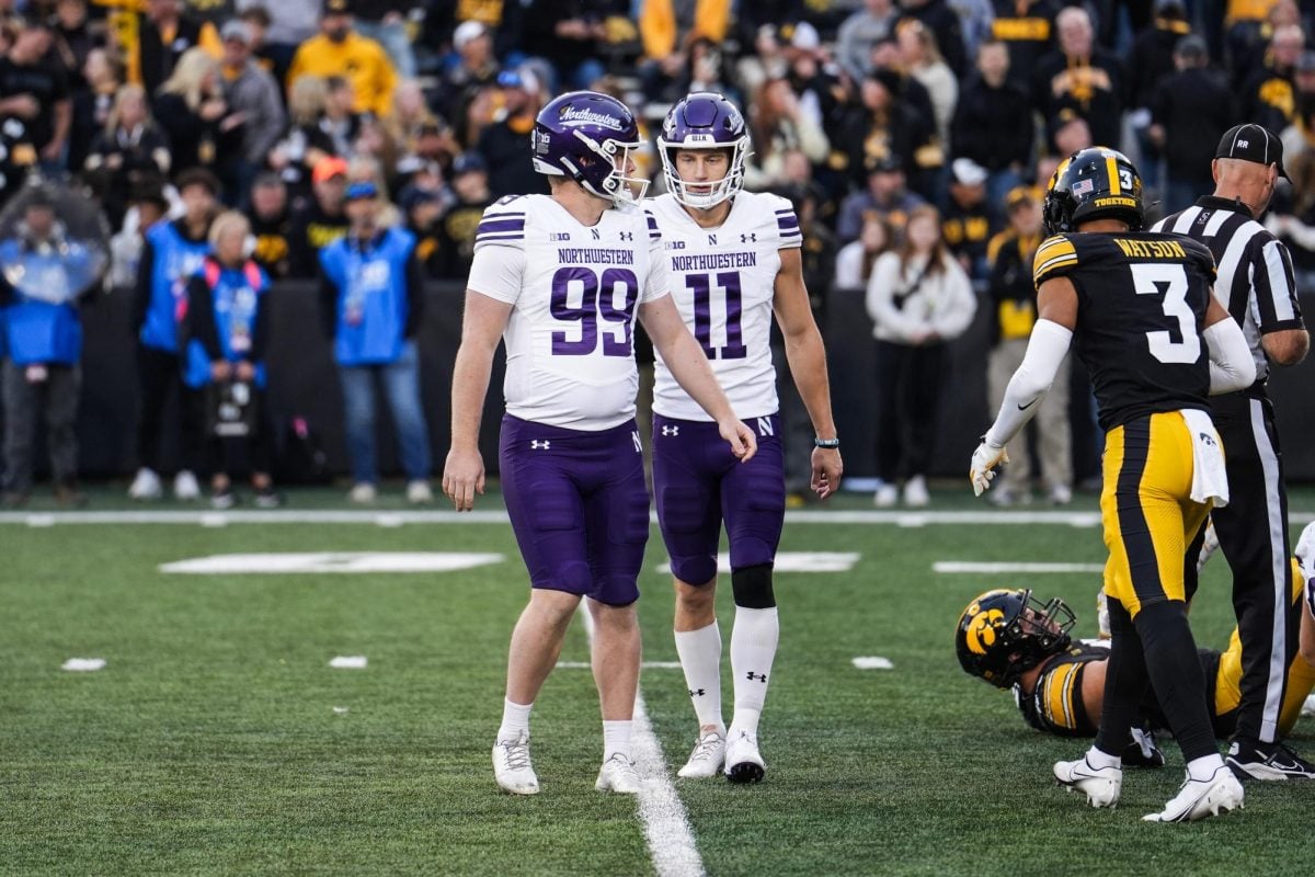
Northwestern:
Not trying to be biased here, but I find their experimenting with black, gold, purple, silver and white to be a total mess, lol.

Minnesota: I feel like this should work. I mean, yeah, nobody wants to wear reddish maroon and mustard yellow in their personal lives ... but you could say the same for orange! Minnesota should have similarly iconic uniforms since they are like us in having totally unique colors within the league. However, I find the way they utilize their colors and the design choices they make (e.g., the oversized collar or the color combos they choose) almost ruin their uniforms.

For a lot of others, I have conflicting thoughts. For example, as much as I hate to admit it ... I love the look of Penn State's and Michigan's home uniforms (the latter only when they were the traditional yellow pants). However, I don't really like either's away uniforms. Also probably not a coincidence that the two I like the most are new to the Big Ten and haven't had as much time to build up animosity with us. :ROFLMAO:
 
#669      
Agree on Washington, really like most of their combos, but gold/purple/gold looks excellent:
1732302783352.jpeg

When Sparty isn't drunk, I think their green/green/white look is really good, and I like the original Spartan helmet w/ the new Grecian-stylized stripe:
1806327082.0.jpg


Seconded on Northwestern, who has diluted their on-field look to a really egregious level. I also don't like Rutgers, who is essentially "diet Nebraska". A plain "R" on the helmet just doesn't look good. Also generally opposed to Name on Front jerseys. There's not a ton of crazy stuff happening with these jerseys, yet they somehow don't look traditional/classic, either.
75163930007-rutgers-910.jpg
 
#671      
A general ranking on B1G overall "looks" (I started from the bottom and worked my way to the top):

Tied for 1st - Michigan, Ohio State, Oregon - These are all just very unique and good and have the aura and performance to elevate their looks to being perceived as among the best of the best. Anyone could make an argument for a particular order of these three. I would personally say Michigan, Oregon, Ohio State, but that is my personal bias. IMO these are the top three, and it's tough to compare and critique them beyond that.
4. UCLA - Big improvement moving from Adidas to Under Armor and then Jordan brand. A very classy brand with great and unique colors. Just wish the performance matched the look.
5. Penn State - A very good clean look. But the overall simplicity means that they are not the best of the best.
6. USC - The aura is there, but I am starting to think that overall it's a bit overrated. I'm not sure about the grey facemasks, and I think the shoulders are a bit outdated. I prefer their throwbacks as I think it is a better look, though I will admit that those types of shoulder stripes are becoming very overused across college football (see Purdue, Minnesota, etc.).
7. Iowa - Unique look in the conference and a top, top logo, but minus some points for copying the Steelers.
8. Wisconsin - I'm not sure why, but I think Under Armor has really helped the on the field uniforms look so much better, especially the home reds. It's a good logo as well, that's why it is so much higher than Nebraska.
9. Washington - Good color scheme, but I really don't like the way the numbers look in action.
10. Maryland - Surprisingly high, but their "classic" simple look is actually really amazing, even if it doesn't have much history behind it. If they do too much with the state flag, they will drop. Less and subtle with the state flag is more IMO.
11. Michigan State - Sometimes they hit it out of the park, sometimes they are absolutely devastatingly bad. Credit though for a top notch logo.
12. Illinois - I hate to have us so low, but it's the reality when you look at us without a bias and it's just what happens in a good conference. The more we wear our Illinois and arched Illini, the higher we will climb.
13. Northwestern - I think they get too much hate. And I think the standard look and the N logo are really underrated and pretty good. But they try to do too much with the gothic nonsense and Chicago flag-look. Those bring them down from a top 10 look.
14. Minnesota - Recently improved. Kind of clunky, but points for a unique color scheme.
15. Nebraska - Classic, but no aspect of the uniform is really special.
16. Purdue - They have improved from their really ugly train motif. But the Purdue on the chest is just lame as can be.
17. Indiana - Its not awful, and I like their throwbacks. But the IU football brand just isn't there, despite their awesome season.
18. Rutgers - Probably the only objectively bad uniform. Just absolute bland nothingness. Just negative aura all around. Nothing is worth complimenting them on.
 
#672      
I love everything about U-Dub except one very important thing (and it's not totally a uniform gripe). Illinois is forced into the block I for a variety of reasons and it's boring as all get out. Washington has the potential to have a really cool logo, and, by extension, helmet, by having a husky as their primary imagery. I know they have in the past, but why oh why would they use a block W when schools like UConn and Northern have shown the power of the big ol dog?
 
#674      
13. Northwestern - I think they get too much hate. And I think the standard look and the N logo are really underrated and pretty good. But they try to do too much with the gothic nonsense and Chicago flag-look. Those bring them down from a top 10 look.
Yeah, I don't know why they feel compelled to tinker the way they have. Is it an UnderArmour thing? An inferiority complex? I would agree that both the Northwestern N and the N with the wildcat incorporated are above-average. So why are they trotting out this type of nonsense?

IOWA-RAPID-21-1200x800.jpeg

We're gonna write out "Northwestern" on both the front of the jersey AND on the helmet? Wut?

Also - is black a Northwestern color? Because they go back and forth between seeming like they really want it to be (and would have a decent argument for it, their '90s Rose Bowl team that started their modern era of competitiveness rolled with purple/black/purple), and dropping it altogether.
 
#675      
I think the #1 uniform in all of sports is the San Diego Chargers powder blue unis. Very similar to UCLA

@Fighter of the Nightman and while I am doing my best not to be a Chargers fan since their move to LA, it's not easy, lol. LOVE those powder blues! The lightning bolt in lieu of stripes on both the jersey and pants is phenomenal! Those jerseys look good with the white or yellow pants even. Kinda like their arched bolt helmet with the jersey number underneath....
 

Attachments

  • chargers uni.jpg
    chargers uni.jpg
    92.4 KB · Views: 129
Status
Not open for further replies.
Back