Stevegarbs
- Mokena, IL
not sure "admire" is the word...
The script version looks soft to me. The Butkus era version looks tough. I'm all in on Team Butkus.Agree with this! Yes, its different for us and aligns with what the Basketball team has been wearing a lot in recent years. But its not unique, especially when you see all of the other college teams doing some kind of script look.
Another slant Illinois hater classic that makes no sense. Do you also get upset that the basketball jersey displays the word Illinois? Do Longhorn fans bemoan the word Texas being prominentlyrics emblazoned across the front of their jersey? I can't believe Jordan would don a jersey that says "North Carolina" on it. What a loser. If we should be ashamed of having to tell people who we are, perhaps we should eschew the block I too. Maybe even our school colors. If we just go plain black and white with no logos or defining features and people still know who we are then maybe we can finally let this inferiority complex go.
And its funny you keep talking about "drawing on our history and tradition" in favor of the Block I, which as far as I can tell first graced a helmet more than 20 years after the slant Illinois. We were also wearing the slant Illinois last time we won 10 games - how's that for "positive history and tradition?"
 I’m a slant Illinois hater and I vote!
My issue with the Butkus helmet is the striping pattern … B/W/B is so much better than W/B/W on an orange helmet.The script version looks soft to me. The Butkus era version looks tough. I'm all in on Team Butkus.
Interesting aside. I understand that cursive handwriting is not being taught in grade school much anymore.
"Daddy, what's that on the Illini helmet?"
"That spells Illinois in something called cursive handwriting. They used to teach us to write it and use all the time when I was a little boy."
Do you also get upset that the basketball jersey displays the word Illinois?
Hey, if you don't like the font, that's fair. But that's not the criticism I was responding to. The idea that displaying the name at all shows insecurity has nothing to do with whether you like the font or not.I would if it looked like a second grader discovered a word processor, typed it up in Arial Narrow, and clicked Bold, Italic, Underline.
"This font is so boring and basic. It looks like anyone could do it. Can't we have something that is more unique to us?"I would if it looked like a second grader discovered a word processor, typed it up in Arial Narrow, and clicked Bold, Italic, Underline.
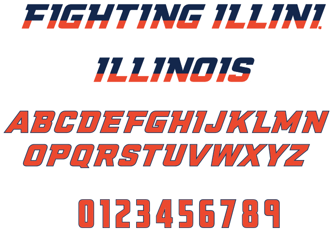
I think people's (and my) issue is not really with the font ... it's that having a boring font (which is not problematic at all) and then adding two "accents" to it that are simultaneously boring/unimaginative/lame AND overkill (i.e., hitting ctrl + B and ctrl + I) is a bad combo ... just as our new font is a bad combo of trendy and minimalist."This font is so boring and basic. It looks like anyone could do it. Can't we have something that is more unique to us?"
[monkey's paw unfurls]

You just summarized my epistle from Saturday morning into two very concise paragraphs. I don't have anything additional to add.Regarding other comments, though, I actually have no problem myself with having multiple helmets. I think the "consistency" or establishing our "own look" is accomplished with the return to a striping pattern that at least resembles what we had from 1989 to 2005. JMO, of course, but our current set looks so much more classic, visually complete and "like Illinois" than what we were wearing pre-2023. Having a few different helmets (as long as they are all orange) doesn't detract from that very much.
For example, if we pretty much always wore O/B/O, O/W/O and sparingly used an orange uniform and (PLEASE) O/W/B but mixed in every helmet we used this year, I still feel we'd have a "consistent look."
")
I have different gripe with the Butkus, it is surprisingly hard to see the numbers and stars on the helmet when they wore it versus Purdue. I think the orange the Illini currently wear is much darker than the Butkus era orange. I think it is the best design of all Illini helmets, but for the modern color scheme it needs to tweaked a bit.My issue with the Butkus helmet is the striping pattern … B/W/B is so much better than W/B/W on an orange helmet.
This is how you do it. Something new for the bowl game that fits right into our current brand and the fanbase loves.
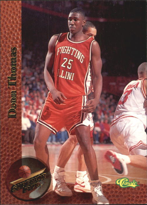
Yeah, I have posted this before in the basketball uniforms thread, but not enough people comment on the fact that we didn't just revive the orange Flyin' Illini uniforms ... we improved them for a new, if barely different, look:I have different gripe with the Butkus, it is surprisingly hard to see the numbers and stars on the helmet when they wore it versus Purdue. I think the orange the Illini currently wear is much darker than the Butkus era orange. I think it is the best design of all Illini helmets, but for the modern color scheme it needs to tweaked a bit.

 3. Block I and then 4. ILLINOIS, worst option we have and I'd like it gone forever, but realize some folks like it a lot.
Yeah, "consistency" can be defined in different ways. IMO, always having our helmet be orange is an important part of creating a consistent football look. And in some ways, that grants us a bit more flexibility with what we put on said helmet.Regarding other comments, though, I actually have no problem myself with having multiple helmets. I think the "consistency" or establishing our "own look" is accomplished with the return to a striping pattern that at least resembles what we had from 1989 to 2005. JMO, of course, but our current set looks so much more classic, visually complete and "like Illinois" than what we were wearing pre-2023. Having a few different helmets (as long as they are all orange) doesn't detract from that very much.
For example, if we pretty much always wore O/B/O, O/W/O and sparingly used an orange uniform and (PLEASE) O/W/B but mixed in every helmet we used this year, I still feel we'd have a "consistent look."
^This. Exactly.How I learned to stop worrying and accept Illinois. It’s amazing what competency, winning, and time can do.
Coming from the DC suburbs, it was impossible for me to not associate that wordmark with the Giants, a team I hated. Couple that with having no attachment to the university till I stepped on campus in 2003 and those helmets came to represent the worst aspects of the university to me. Going 1-15 in the conference with an uninspired copy-cat word mark of one of my team’s rivals does that.
Then, you take that wordmark and slap it across a block I and, somehow even worse, a basketball and it just felt like we didn’t care about our brand. In a sea of iconic collegiate identifiers, we decided to punt on the entire endeavor. We joke about RG running the DIA as if he was the AD of the University of East-Central Illinois, but for me, that wordmark was the very real representation of that.
Now, obviously, I know another thing was going on during that time that created the void the slant wordmark filled. Goodness knows I don’t want to open that can of worms. All I’m saying is that intermediate steps could have been taken. Steps our current DIA and JW have shown can be applied thoughtfully and rapidly.
And that’s the thing. The reintegration of the slant wordmark in 2024 by the DIA and JW feels natural. It was done in a series of helmet decals representing our past on the 100th anniversary of one of the most historic stadiums in college football. It’s amazing what smart people and a little bit of effort can do. Now, you couple a profoundly competent DIA with the Giants no longer utilizing that helmet and actually winning games, and suddenly what once represented mediocrity is significantly more palatable.
Now, admittedly, I’m never going to love Illinois. I prefer the arched Illini and, of course, the script, but darn it, I don’t hate it anymore. And damn it feels good to have a DIA that understands and cares about the brand as much as we do.
Definitely AI created, but it’s actually pretty closeNow why you gotta go and introduce that mockup into the ongoing helmet/logo/font discussion???? lol
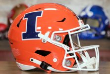
I kinda like it..... Is that the actual helmet we wear? Seems like the vents/holes are placed perfectly for that logo. Too convenient....
Yes! That looks so awesome!No idea how this would look in real life, but the render looks great: