This should be a poster on every fans wall.
You are using an out of date browser. It may not display this or other websites correctly.
You should upgrade or use an alternative browser.
You should upgrade or use an alternative browser.
Illinois Football Uniforms
- Status
- Not open for further replies.
Fighter of the Nightman
- Chicago, IL
Some final thoughts on this:
1. I agree with others that say the helmets with a "navy icon" look much better with the navy jersey. For example, the regular Block I looks much better with the navy jersey than with the white jersey, at least to me. Additionally, the arched ILLINI looks damn slick here with that navy jersey.
2. As an inverse of point #1, the slant ILLINOIS indeed works much better with the white jersey. While we didn't get to see it with the navy jersey this year, we have seen it plenty in the past.
3. I am really pumped to see the Script helmets in action today.
4. I hate to say it and it might just be because it's familiar/"regular," but the Block I now looks like the weakest helmet by far. It looks the simplest out of those designs, and yet it actually has the LEAST amount of nostalgic appeal, as we never wore it on a helmet until Tim Beckman was coach! Every other helmet design looks a bit "old school" and cool in comparison. The more I think about it, quite a few historically iconic programs do NOT have their primary logos on their helmets, and the helmets thus stand on their own as a component of that program's identity. Ohio State, Penn State, Michigan, Alabama, Florida, Notre Dame, etc. are just a couple. Not saying it can't work if you have a cool logo (think Texas, USC, Iowa, Michigan State, Florida State, etc.), but ours is - err - on the simpler side of things, haha.
OrangeBlue98
Iowa is not in a great spot right now (LvilleILL1)
- Des Moines, IA
I don't even think the Block I looks bad. Other programs use a single letter logo like Purdue, Nebraska, Wisconsin, and (sometimes) Oregon just in our own conference. Plus, the Block I can have some unique/fun things like when the logo had ivy on it for the NW game at Wrigley. It would be much harder to do that with any of the other logos.Some final thoughts on this:
1. I agree with others that say the helmets with a "navy icon" look much better with the navy jersey. For example, the regular Block I looks much better with the navy jersey than with the white jersey, at least to me. Additionally, the arched ILLINI looks damn slick here with that navy jersey.
2. As an inverse of point #1, the slant ILLINOIS indeed works much better with the white jersey. While we didn't get to see it with the navy jersey this year, we have seen it plenty in the past.
3. I am really pumped to see the Script helmets in action today.
4. I hate to say it and it might just be because it's familiar/"regular," but the Block I now looks like the weakest helmet by far. It looks the simplest out of those designs, and yet it actually has the LEAST amount of nostalgic appeal, as we never wore it on a helmet until Tim Beckman was coach! Every other helmet design looks a bit "old school" and cool in comparison. The more I think about it, quite a few historically iconic programs do NOT have their primary logos on their helmets, and the helmets thus stand on their own as a component of that program's identity. Ohio State, Penn State, Michigan, Alabama, Florida, Notre Dame, etc. are just a couple. Not saying it can't work if you have a cool logo (think Texas, USC, Iowa, Michigan State, Florida State, etc.), but ours is - err - on the simpler side of things, haha.
After seeing the helmets from this season, I'm even more convinced in my post from the weekend. I'd retire the Butkus-era helmets. Those just didn't really do anything at all for me. Use the Block I and arched Illini with the blue jerseys, and the slant and script with the white and orange jerseys. Maybe you break the routine every so often and use the arched Illini with white jerseys and blue pants (I'd actually really like to see that), but I really like a lot of our current branding. Just have to launch the 1LL1NO1S script for all sports and the current base basketball uniforms into the sun, go to the "three color/two throwback" uniforms for basketball, and make the shield I more retro-looking (like what Iowa State did with their Jack Trice five stripes logo).
Oh, and get more of the apparel we see on the sidelines for football and basketball available for sale!!
Fighter of the Nightman
- Chicago, IL
^ To be clear, I don't think the Block I looks "bad" whatsoever. I have just warmed up to the idea of being like those programs I mentioned and having something other than our primary logo on our football helmets - especially because those other designs (specifically arched ILLINI and the Script, to me) work so well!
If we win this one, I think the Scripts might become so legendary as to be adopted, not gonna lie.
If we win this one, I think the Scripts might become so legendary as to be adopted, not gonna lie.
mattcoldagelli
- Script Illinois Enthusiast
The Script looks great on the field/on camera. Gotta consider it as a long-term option.
TentakilRex
- Land O Insects between Quincy-Macomb-Jacksonville
BTW this is for other teams, Navy teams like us can't pull off a "Black For Black's Sakes" jersey: if you have to do a black jersey copy Washington's look. It is really well done.
mattcoldagelli
- Script Illinois Enthusiast
Scriptos rn

Fighter of the Nightman
- Chicago, IL
Honestly, they’ve literally performed as legendarily as they could in one game … and it was a massive, intense and potentially program-changing game.
WTF else do they have to do to get the starting job?!
WTF else do they have to do to get the starting job?!
Hear me out:

Shief
- Champaign Area
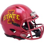
Kinda reminds me of Iowa State's helmets. I loved seeing the cursive Illinois in the bowl game, would have to see how this would come together.Hear me out:View attachment 38369
Attachments
RabidDawgClassic
- Los Angeles, CA
Illini are 1-0 all-time in the Script Illinois helmet
Illini are 2-0 all-time in the Citrus Bowl
Today was a good day!
Illini are 2-0 all-time in the Citrus Bowl
Today was a good day!
No thanks. Too much like this:Hear me out:View attachment 38369
https://sportslogohistory.com/idaho-vandals-primary-logo/
No thanks. Too much like this:
View attachment 38375
https://sportslogohistory.com/idaho-vandals-primary-logo/
Counter point: script helmets and block letters are done by nearly everyone. So, don’t think it would be a big deal.
- Status
- Not open for further replies.