Battle89
- Cary-Grove, the better Trojan team
NopeIs there a Hlemet to the amount of times you can vote?
I think Hlemet is some sort of dish the Swedish Chef would have cooked up after finishing the chicken in the basket.Voted but cripes View attachment 40010


Regarding the basketball uniforms, @21ChampaignSt managed to track down this black and white picture of what LOOKS like it was our navy Script option from back in the day:
I think others have said it as well, but I know I was one of those on the "navy logo/navy jerseys, white logo/white or orange jerseys" train.
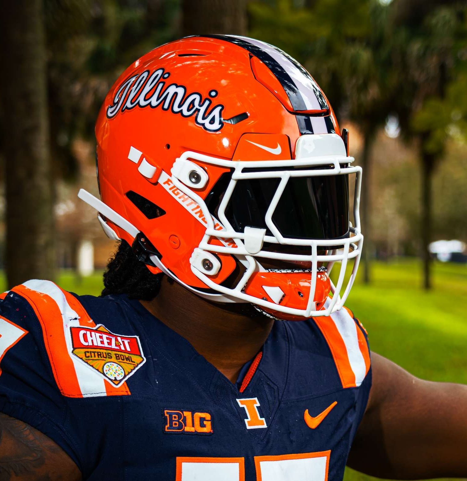
Now as for that navy script/white trim on an orange helmet, yes please. Not that we needed any additional confirmation about an orange/blue/white script basketball uniform, but seeing that with something a lot close to our current color shades pretty much confirms that for me.
RE: helmets, I am having trouble remembering exactly who right now, but one poster made a great point that our helmets with navy-on-orange look better with the navy uniforms, and our helmets with white-on-orange look better with our white or orange uniforms ... and I have to agree. To use an easy example, the regular Block I helmets look better with the navy uniforms than they do with the white uniforms, because the Block I itself is navy. And an example the other way is that the slant ILLINOIS looks better with our white and orange uniforms than I think it would with our navy uniforms (though we haven't seen it).

SameVoted
Is there a Hlemet to the amount of times you can vote?
Jsut vtoed.Voted but cripes View attachment 40010
")
I have a theory on this, the hat might be this oneWe're the only one to use a block I? There have been several times (most recently yesterday) where I almost I-L-L'd a guy in an Iowa hat.

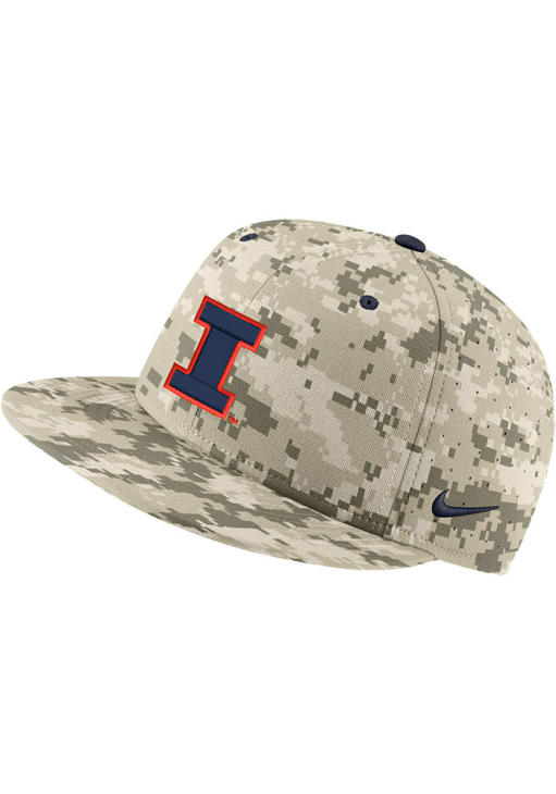
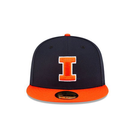
Those could be confusing, but it's actually faded black and gold hats that sometimes make me do a double take. Probably because I don't put a lot of trust in color. For reference, here's my hat, with some color references.I have a theory on this, the hat might be this one..
It is has a close Illini cousin

Looks like you got a few that need to cracked openThose could be confusing, but it's actually faded black and gold hats that sometimes make me do a double take. Probably because I don't put a lot of trust in color. For reference, here's my hat, with some color references.View attachment 40020
Nice looking hat. Bought a new one a few years back and working to get it there. Gonna take a few more years.Those could be confusing, but it's actually faded black and gold hats that sometimes make me do a double take. Probably because I don't put a lot of trust in color. For reference, here's my hat, with some color references.View attachment 40020
As someone who used to live in Iowa City growing up around Iowa fans as we were all getting really into college sports, this topic came up a lot. The conclusion of our elementary school space brains was actually very apt ... Iowa had a "skinny Block I," and Illinois had a "fat Block I" ... and the difference is actually quite stark once you notice it. Using the logos that were around at the time of this scholarly debate...I have a theory on this, the hat might be this one
It is has a close Illini cousin
They are both baseball caps plus any navy block I w/o an orange outline might be tricky to be from an Iowa cap.
Mad props. So proud of our program and those unis. And the win.
I still wouldn't hate the idea of making those our homecoming unis every year. That stadium-opening performance is something no other team can even come close to matching, and commemorating it at the homecoming game every year would be a fantastic tradition that no other school could match.
I don't think your idea is a bad one. It certainly is a very distinct tradition we could have. But with how much effort (time and money) went into to painting those helmets, I would be a bit surprised if they made it an annual tradition. It just seems like it was a massive undertaking that could probably be only a one time thing. But if they could pull it off its an idea worth considering.I still wouldn't hate the idea of making those our homecoming unis every year. That stadium-opening performance is something no other team can even come close to matching, and commemorating it at the homecoming game every year would be a fantastic tradition that no other school could match.
I read last fall that they sold the helmets for a nice profit. Repeat this annually as a fund raiser?I don't think your idea is a bad one. It certainly is a very distinct tradition we could have. But with how much effort (time and money) went into to painting those helmets, I would be a bit surprised if they made it an annual tradition. It just seems like it was a massive undertaking that could probably be only a one time thing. But if they could pull it off its an idea worth considering.
Funny because I look at the vertical portion in relation to the horizontal bars. And in that aspect, it is Illinois with the 'skinny I' and Iowa with the 'fat I'. Kind of like a torso with arms and legs sticking out.As someone who used to live in Iowa City growing up around Iowa fans as we were all getting really into college sports, this topic came up a lot. The conclusion of our elementary school space brains was actually very apt ... Iowa had a "skinny Block I," and Illinois had a "fat Block I" ... and the difference is actually quite stark once you notice it. Using the logos that were around at the time of this scholarly debate...


And when you actually saw it on something like a baseball hat, the difference seemed even more pronounced:
Plus, as I have said in a previous post, there is just no comparison for usage. Even circa 2006 when I entered high school, Illinois was already probably utilizing a Block I logo 10 times as often as the Chief, especially in an "official" capacity. Now, the Block I is used about 15 times more than the Shield logo, and the Shield logo also literally centers around a Block I, lol. Compare that to Iowa, where the Tiger Hawk logo is used at least 15 times more often than any Block I logo, which seem to be restricted to baseball hats and random flags on lamp posts around campus every once in a while, haha.
I think that was such a special occasion last year that I would be surprised if we ever busted those uniforms out, and that is honestly totally fine with me. The 100th anniversary, playing Michigan again, the perfect fall day, the amazing production by CBS ... I worry that with each iteration, the shine of last year's debut might wear off a bit. If anything, maybe we could wear those uniforms on each 10-year anniversary marker?I don't think your idea is a bad one. It certainly is a very distinct tradition we could have. But with how much effort (time and money) went into to painting those helmets, I would be a bit surprised if they made it an annual tradition. It just seems like it was a massive undertaking that could probably be only a one time thing. But if they could pull it off its an idea worth considering.

The unique and glorious nature of this set would begin to fade with the first loss. IMO. it should be one and done with the possible exception of each centennial anniversary. Unfortunately, baring a significant breakthrough in medical science, I'll miss the next one. I'll (we'll) always be here in spirit though. Think of our loyalty in this way. With each lightening flash, millions of us are chanting ILL! Each roll of thunder. INI!I still wouldn't hate the idea of making those our homecoming unis every year. That stadium-opening performance is something no other team can even come close to matching, and commemorating it at the homecoming game every year would be a fantastic tradition that no other school could match.