redwingillini11
White and Sixth
- Batavia
Honestly, all orange grows on me every time I see it. It’s a great look.
And yet what’s stopping him?! Block I should be worn never.And also, yes Bret really wants these to be the full time helmets lol
Unfortunately under the lights or sunshine the orange looks a little lighter vs the darker shade you see here. I would definitely prefer O/B/O with the arched or the slant helmet, but considering how bad other all orange uniforms look ours are pretty good.
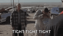
My thing is these look much better for a night game than a day game. That said it's so so much better than that visual train wreck that all orange game against Mizzou was like 20 years ago.I am opposed on principle but we are executing it well
My thing is these look much better for a night game than a day game. That said it's so so much better than that visual train wreck that all orange game against Mizzou was like 20 years ago.

I would absolutely say the same is true for me. However, I am fairly confident that I would really like the O/O/W look ... it was an extremely slick look with our Zook Era uniforms, and I think it would work just as well with these uniforms with that B/O/B stripe on the white pants really popping. I also just want to see a different helmet with the orange, like the Script or especially the Arched ILLINI. Since we added more options than just the Block I, we have worn Slant ILLINOIS all four times we've worn orange. I particularly think these two combos would look really great:Honestly, all orange grows on me every time I see it. It’s a great look.
Yeah, it's not debatable that this current all orange look is light years better than any of its predecessors, with that look you mentioned being the worst of the worst. When you look at all of them together, it's clear that our current set is head-and-shoulders better, with the pre-Zook and Lovie Era ones being particularly awful. For eras where we wore white pants, I included that to show how much better I think it looked, at least with those era's orange jerseys (even if both sucked, lol!)...My thing is these look much better for a night game than a day game. That said it's so so much better than that visual train wreck that all orange game against Mizzou was like 20 years ago.


I actually don't mind the Zook-era ones. Big time early 2000s Broncos vibes (and I liked those Broncos teams). Particularly the thick pant stripe that tapers to a point (on the white pants). Definitely prefer the current design but those were not bad.I would absolutely say the same is true for me. However, I am fairly confident that I would really like the O/O/W look ... it was an extremely slick look with our Zook Era uniforms, and I think it would work just as well with these uniforms with that B/O/B stripe on the white pants really popping. I also just want to see a different helmet with the orange, like the Script or especially the Arched ILLINI. Since we added more options than just the Block I, we have worn Slant ILLINOIS all four times we've worn orange. I particularly think these two combos would look really great:
View attachment 44205
View attachment 44206
Yeah, it's not debatable that this current all orange look is light years better than any of its predecessors, with that look you mentioned being the worst of the worst. When you look at all of them together, it's clear that our current set is head-and-shoulders better, with the pre-Zook and Lovie Era ones being particularly awful. For eras where we wore white pants, I included that to show how much better I think it looked, at least with those era's orange jerseys (even if both sucked, lol!)...
It's probably the stripes, but something about the current all-orange is just miles better ... but any artistically skilled posters want to give us a mockup of that bottom photo with white pants instead??
Agreed on both points! I'm all for having the consistency of an orange helmet every game (or at least almost every game), but I think something like this would be objectively slick from a strictly aesthetic point of view, and I wouldn't hate reserving this look for a "special occasion" (e.g., annual color rush game vs. Mizzou).... I know orange helmets are a brand thing so I don't necessarily want to change that, but I will say, it would be fun to see a W/O/W look with the white helmet featuring orange Script.
the problem with these is it’s a very red-tinted orange. So they feel heavy.
These really aren’t too bad
The problem with these is the helmet doesn’t match. With the right color of helmet, these would actually look pretty good.
The problem with these is there’s no white accent, so it’s just too much orange.
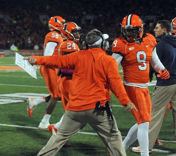
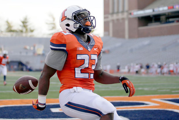
These are perfect. No notes. Best all-orange combo by a long shot.
It's probably the stripes, but something about the current all-orange is just miles better ... but any artistically skilled posters want to give us a mockup of that bottom photo with white pants instead??
Espn's College Football Final gave Luke a 'helmet sticker' last week and the helmet they used was this one. I hope we overnighted them a new one.Omg...the copper helmets.

@Fighter of the Nightman : Your services are needed!I’ll ask again? What is our record in all orange? It may look pretty but it’s a loser.
Not sure if we were asking for like an all-time record (that would take way more time, haha), but there isn't really a story to tell since we got these new uniforms...@Fighter of the Nightman : Your services are needed!
 The only uniform pattern I think people could unfortunately draw a pattern from (foolishly, of course) is the O/B/B at home ... which sucks, because it looks objectively great, but for whatever reason we have just NOT brought it when we've worn that combo, and I fear Bret is now superstitious about it (but no amount of "meh" in the Block I can finally retire it??). Even the wins have been shaky, haha.
Agreed on both points! I'm all for having the consistency of an orange helmet every game (or at least almost every game), but I think something like this would be objectively slick from a strictly aesthetic point of view, and I wouldn't hate reserving this look for a "special occasion" (e.g., annual color rush game vs. Mizzou).
View attachment 44212
(I cannot take credit for any of these images, I merely saved them!!)
I still hate them. The script Illinois would have been betterSomething oddly funny about the helmets a lot of us hated at the time (slants) are now like one of our biggest Illini football traditions because of Bret, which I’m good with