MustangWally
- Mayfield

80K views · 2.2K reactions | The reaction says it all. | Fighting Illini Football
The reaction says it all.
 www.facebook.com
www.facebook.com
www.facebook.com
if we play really well and win, I’m gonna guess we get a repeat of them next SeptemberFrom the equipment manager video that showed the process, these are helmets that have been worn before (makes me think the standard orange helmets) which have all been painted blue.
It was a quick turnaround to get it done specifically for the bowl game and opponent.
So I am assuming they will be returned to their normal orange color on a standard timeline during the winter and we will rarely see them again.
Ok…… hear me out……. What if we went with the Bears color scheme…… with the Bears “C” on the helmet for “Champaign”?I think wearing the navy helmet against Northwestern would work for me, especially when played in Chicago.

Exactly, and this is why certain 1LL1NO1S-based uniforms are so, so lame … e.g., our Lovie Era white football uniforms and the current default white and orange set for hoops (though I’m hopeful they’re history now…).This really does show the advantage of having two strong colors in your color scheme. When playing a school who only has orange as a “strong color” (I.e. not white), we can pivot and wear navy to stand out more against orange.
crazy how the shorter uprights make the field goal target seem wider
If I’m remembering correctly, the NCAA goal posts used to be wider (like the width in high school). I think it was the late 1990s when the NCAA adopted the width of NFL goalposts.
Yeah... thought the same thing and confirmed it. This is an interesting Substack piece (below) on goal posts with an Illini tie-in. Also, I was a little kid when the H-posts were still stationed on the goal line, which was crazy and resulted in nasty collisions. Lol at the photo of Kezar Satdium in SF with two sets of goal posts. BTW, that stadium is still there (though rebuilt on a smaller scale). Rode my bike around the track 30 years ago.i just looked it up . they went to pro width in 1991 . I totally forgot that
 www.footballarchaeology.com
Did anyone else play table football (with the little triangle paper ‘football’)?Yeah... thought the same thing and confirmed it. This is an interesting Substack piece (below) on goal posts with an Illini tie-in. Also, I was a little kid when the H-posts were still stationed on the goal line, which was crazy and resulted in nasty collisions. Lol at the photo of Kezar Satdium in SF with two sets of goal posts. BTW, that stadium is still there (though rebuilt on a smaller scale). Rode my bike around the track 30 years ago.
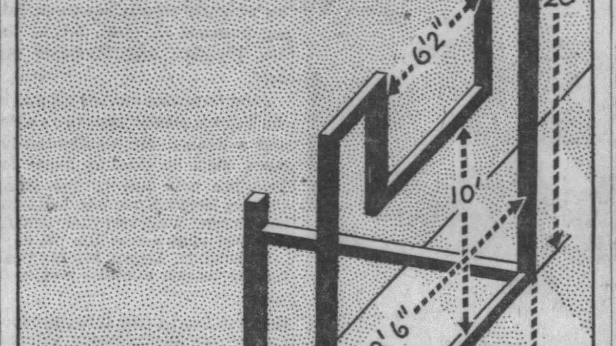
In the end, the NCAA increased the goal post width to 23 feet 9 inches in 1959 and kept that standard until 1991, when they returned to the 18 feet 6-inch goal posts as extra point and field goal accuracy rates skyrocketed.
Today's Tidbit... Setting New Standards For Goal Posts
A few days ago, I wrote about college football's adoption of the two-point conversion in 1958. In that article, I mentioned that college football increased the width of its goal posts in 1959 from 18 feet 6 inches to 24 feet 4 inches, which led to a reduced use of the two-point conversion...
By the way Northwestern has the ugliest football and basketball uniforms in the country
YesDid anyone else play table football (with the little triangle paper ‘football’)?
I remember playing as a kid and you had to agree beforehand if you were playing college goalposts (index fingers touching and thumbs up) or pro goalposts (thumbs touching and index fingers up).
Good memories.
Unfortunately, as we've seen in the past when Illinois has called for an "Orange Out" at Memorial Stadium during cooler weather, you won't get a common color look when people are wearing jackets that, mostly, aren't Illini colors. With the projected high temperature of 36 DegF in Nashville on Tuesday we'll see the most common color of winter coats as the Illini fan side color scheme.Illini fans wear mostly orange for the vast majority of games. I hope we are trying to spread this message a bit more widespread than the end of a Werner post! It should be posted by our official football account daily.
I'll be wearing blue under my black coatUnfortunately, as we've seen in the past when Illinois has called for an "Orange Out" at Memorial Stadium during cooler weather, you won't get a common color look when people are wearing jackets that, mostly, aren't Illini colors. With the projected high temperature of 36 DegF in Nashville on Tuesday we'll see the most common color of winter coats as the Illini fan side color scheme.
My dude... I never would have remembered that detail but now that you mentioned it I do, c. early '70s. Loved the triangle field goal kicking. I made some killer goalposts using my Tinkertoy set.Did anyone else play table football (with the little triangle paper ‘football’)?
I remember playing as a kid and you had to agree beforehand if you were playing college goalposts (index fingers touching and thumbs up) or pro goalposts (thumbs touching and index fingers up).
Good memories.
I think Mizzou has terrible combos. The black/black/white combo last night was awful. And im glad.By the way Northwestern has the ugliest football and basketball uniforms in the country
Those helmets are not these helmets. Those helmets (and those uniforms for that matter) belong in history and the garbage. These helmets are what dreams are made of. . . and, under Bret Bielema, this is hopefully only the beginning of a sweet, sweet dream turned reality.
80K views · 2.2K reactions | The reaction says it all. | Fighting Illini Football
The reaction says it all.

Played it in grade school on winter days when we couldn't go out for recession. As you said, good memories.Did anyone else play table football (with the little triangle paper ‘football’)?
I remember playing as a kid and you had to agree beforehand if you were playing college goalposts (index fingers touching and thumbs up) or pro goalposts (thumbs touching and index fingers up).
Good memories.
FotN ladies and gentlemen. Nobody does it better.Some random uniform thoughts.
1. I don't care if this helmet is worked into the rotation or if it remains a super rare/special one we only bust out for things like this. I will say, however, that I think it should only be matched with navy or white pants. Nothing more than personal preference here, but I hate the look where the darker primary color is used for the helmet and the lighter one is used for the pants ... I think only the opposite works aesthetically. This obviously excludes accent colors like white and only includes two "bold" colors.
To use an Illini example, O/W/B would look awesome, but I think B/W/O would look bad. If we want the navy helmet on the road, you gotta to go with B/W/B.
2. I was totally onboard with never wearing anything but an orange helmet, but that ship has obviously somewhat sailed, lol. Given that, I would TOTALLY support getting to see this bad boy next year ... now that "only orange" isn't a strict rule, this is just objectively an awesome look.
View attachment 45940
I could totally be swayed to switch things around like having navy font with an orange outline or using a navy facemask, but this is the only picture I had, lol.
3. It seems obvious that Bret feels that two of our three 3-stripe patterns must match. With all navy and all orange, all three obviously match. With our O/W/W or O/B/B looks, the jersey and pants match. With O/W/O and O/B/O (and B/W/B if it ever happens now), the helmet pattern matches the pants. I find it highly unlikely that we will ever see the combos that use three different versions of the 3-stripe pattern in one uniform, which unfortunately includes the classic #BPOTR look of O/W/B (B/W/B helmet stripe, B/O/B jersey stripe and O/W/O pants stripe).
4. Lastly, it is kind of interesting to see our uniform combos laid out in chronological order since we got the new uniforms. Skipping the helmets just to show a more apples-to-apples trend.
BASE
O/B/O vxxxx
O/B/B vxxxx
O/O/O vxxxx
O/W/O vxxxx
O/W/W vxxxx
2023
O/B/O vs. Toledo
O/W/W at Kansas
O/B/O vs. Penn State (Orange Out ... uniforms weren't ready yet, lol)
O/B/B vs. FAU
O/W/W at Purdue
O/B/B vs. Nebraska
O/W/W at Maryland
O/B/O vs. Wisconsin (Homecoming)
O/W/W at Minnesota
O/O/O vs. Indiana (Veterans Day)
O/W/W at Iowa
O/B/O vs. Northwestern
2024
O/B/O vs. Eastern Illinois
O/O/O vs. Kansas (Orange Out)
O/B/O vs. Central Michigan (Homecoming)
O/W/O at Nebraska
O/W/O at Penn State
O/B/B vs. Purdue
N/A vs. Michigan (Grange Era Throwbacks)
O/W/W at Oregon
O/O/O vs. Minnesota (Veterans Day)
O/B/O vs. Michigan State
O/W/O at Rutgers
O/W/O vs. Northwestern (Wrigley Field - Chicago, IL)
O/B/O vs. South Carolina (Citrus Bowl - Orlando, FL)
2025
O/B/O vs. Western Illinois
O/W/O at Duke
O/B/O vs. Western Michigan
O/W/O at Indiana
O/B/O vs. USC (Homecoming)
O/W/O at Purdue
O/O/O vs. Ohio State (Orange Out)
O/W/W at Washington
O/B/O vs. Rutgers
O/B/O vs. Maryland (Veterans Day)
O/W/O at Wisconsin
O/B/O vs. Northwestern
B/B/B vs. Tennessee (Music City Bowl - Nashville, TN)
The fall from grace of the O/W/W look has been awesome for me personally, lol ... I hate it.
Exactly, and this is why certain 1LL1NO1S-based uniforms are so, so lame … e.g., our Lovie Era white football uniforms and the current default white and orange set for hoops (though I’m hopeful they’re history now…).
What I mean is we should never have a uniform that only truly features white and orange or white and navy. Any time we use white, it should be accompanied by both prominent colors. The plain orange font on a white uniform with no navy outline looks SO bad and incomplete.

I see what you did there.The Blue reigns supreme in the South just like 64 65 season ILL!!!!
The Blue reigns supreme in the South just like 64 65 season ILL!!!!
