TentakilRex
- Land O Insects between Quincy-Macomb-Jacksonville
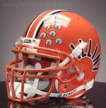
Orange script
A real Sophie’s Choice here…
Navy script (all the navy helmets are underrated)
Arched
Slanted (too much trauma for me)
Underrated helmet- the Butkus era helmet, though they need some changes for TV because it is hard to see the numbers.