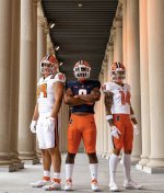
You just lit the "Fighter of the Nightman" signalWould like to see Blue Jersey with white pants combo and blue or orange helmet. I like that combination of Bears uniform and feel that would be fairly close.
You are using an out of date browser. It may not display this or other websites correctly.
You should upgrade or use an alternative browser.
You should upgrade or use an alternative browser.
New Illinois Football Uniforms
- Status
- Not open for further replies.
TheFlyingIllini1317
- Chicago, IL
It's okay. The big reveal is underwhelming, all things considered. People on this forum can debate the differences ("omigosh there's block I on the pants") but I don't think most viewers will notice or care. A week ago we weren't sure if there would be a script font on the helmet or if we'd have block letters on the front or whever. All-in-all, nothing shocking here. I think that's a good thing.
My bar for a good uniform is pretty low. The block I is correctly afixed to the helmet and Nike didn't F*#% up our hue of orange to make it less orange. Hit those two criteria and we're starting at a good, solid B+ for whatever the team wears on Saturdays.
If I'm being critical, the O/W/W and O/W/O combos give the impression that our school colors are orange and white.
Fighter of the Nightman
- Chicago, IL
… Crap, you’re right.Quick photoshop without the stripes, I think it is much better. The away still needs a blue # with an orange outline.

RabidDawgClassic
- Los Angeles, CA
I like em! The classic look with modern tweaks.
Can you photoshop the white pants with the blue jersey?Quick photoshop without the stripes, I think it is much better. The away still needs a blue # with an orange outline.
Epsilon
M tipping over
- Pdx
Overall I think they look nice. I may be in the minority here but I like the idea of changing things up here and there. I love the fact that the Ducks do something different all the time. Keep it fresh, make it retro, I don’t care much. As long as it looks tight overall.
The numbers are inconsistent in look. The 9 in 19 and 4 are not the same style font. This appears to be true in some other numbers. I like the 4 but not the 9.

Agreed. To me, the shoulder stripe's give me the look of being incomplete.Not a huge fan of the shoulder stripe placement, BUT a huge improvement!
skyIdub
"I can't tell you. Secret."
7.8/10
Minor deductions for font, collar Block I over Shield, and no blue pants for OWB.
As Gritty and mattco... have alluded.....the program is where my energy is centered. Not stripes or fonts or...Syracuse...
Our coach gets it. Our ADJDubs gets it.
It's like a choice between taking a 7 or 8 to the dance vs. getting to 2nd base with a 10.
Sure, I want us to look good...but gd I also want to dance.
SuperMetroid
- Evanston
The mono-white was definitely the worst look of the old set (and we used it far too often for some reason), but this white / orange combo is so much betterEh, agree to disagree. Our away uniforms were so plain as to be a bit of a joke, and our pants should have the stripe. The number outlines alone make the orange numbers on the white look a million times more professional. I don’t love the shoulder stripes, but these are absolutely better than the old whites.

After months of speculation and debate, in the end all the choices seem pretty obvious.
The only even remote break from tradition is the stripe placement on the shoulders rather than the base of the sleeve but with the modern jersey template even that’s a fairly innocuous choice.
It’s not like the old days where shoulder stripes comprised a third of the shirt.

The only even remote break from tradition is the stripe placement on the shoulders rather than the base of the sleeve but with the modern jersey template even that’s a fairly innocuous choice.
It’s not like the old days where shoulder stripes comprised a third of the shirt.
Fighter of the Nightman
- Chicago, IL
Again, I won’t defend the shoulder stripes, but … the new ones are like these except a better helmet, better numbers (with an outline) and better pants, if you ask me.The mono-white was definitely the worst look of the old set (and we used it far too often for some reason), but this white / orange combo is so much better
Agree with you on the 9 vs. 4, I am not a fan of the 9 but like the 4The numbers are inconsistent in look. The 9 in 19 and 4 are not the same style font. This appears to be true in some other numbers. I like the 4 but not the 9.
MoCoMdIllini
- Montgomery County, Maryland
This one is reserved for Northwestern games.View attachment 27398l
Would like to see Illini Blue Jersey with white pants combo and blue or orange helmet. I like that combination of Bears uniform and feel that would be fairly close.
Cook
- Richmond, VA
With close inspection of the 3 uniforms shown, it's clear the 14 is squared off at corners, different than 8 in blue or 89 in white are all rounded. It makes it look like 2 different number fontsThe numbers are inconsistent in look. The 9 in 19 and 4 are not the same style font. This appears to be true in some other numbers. I like the 4 but not the 9.
 I like the look of the 1 and 4 better with the sharp corners.
Last edited:
Much better. Shoulder stripes are awful imo and yes, invite unwanted comparisons to Cuse.Quick photoshop without the stripes, I think it is much better. The away still needs a blue # with an orange outline.
That would be the best look! The blue jersey with white pants and orange jersey would look sweet!Can you photoshop the white pants with the blue jersey?
Fighter of the Nightman
- Chicago, IL
Now that I have seen the new uniforms, I suggest the following:
vs. Toledo: O/B/O
at Kansas: O/W/O
vs. Penn State: O/O/W ... an orange jersey with those white pants would look great for an orange out.
vs. FAU: O/B/O
vs. Toledo: O/B/O
at Purdue: O/W/W ... the game is announced for a 6:30 pm start time, and PU bills it as a "Black Out" game. We come in with those fresh all whites on our way to a victory.
vs. Nebraska: O/B/B ... We go with the navy pants underneath the Friday night lights ala the ultra-hyped home game vs. Michigan in 2000 ... but this time we get the W!
at Maryland: O/W/O
vs. Wisconsin: O/B/O
at Minnesota: O/W/O
vs. Indiana: O/B/O
at Iowa: O/W/B ... we bust out the absolutely glorious navy pants for our first win in Iowa City in over two decades, with shades of our win at the Big House in 1999!
vs. Northwestern: O/B/O ... I have largely abandoned my "dress like the Bears vs. NU" campaign only because I now think we should just always have an orange helmet. However, if we for some reason busted out a navy helmet in the future (which I do not support), this game would become either a B/B/W or a B/O/W combo (and then B/W/B in Evanston).
You're welcome, DIA!
vs. Toledo: O/B/O
at Kansas: O/W/O
vs. Penn State: O/O/W ... an orange jersey with those white pants would look great for an orange out.
vs. FAU: O/B/O
vs. Toledo: O/B/O
at Purdue: O/W/W ... the game is announced for a 6:30 pm start time, and PU bills it as a "Black Out" game. We come in with those fresh all whites on our way to a victory.
vs. Nebraska: O/B/B ... We go with the navy pants underneath the Friday night lights ala the ultra-hyped home game vs. Michigan in 2000 ... but this time we get the W!
at Maryland: O/W/O
vs. Wisconsin: O/B/O
at Minnesota: O/W/O
vs. Indiana: O/B/O
at Iowa: O/W/B ... we bust out the absolutely glorious navy pants for our first win in Iowa City in over two decades, with shades of our win at the Big House in 1999!
vs. Northwestern: O/B/O ... I have largely abandoned my "dress like the Bears vs. NU" campaign only because I now think we should just always have an orange helmet. However, if we for some reason busted out a navy helmet in the future (which I do not support), this game would become either a B/B/W or a B/O/W combo (and then B/W/B in Evanston).
You're welcome, DIA!
The more I think about it the shoulder stripes are growing on me. We are an orange top and navy pants (not at the same time) away from this being a great look.
- Status
- Not open for further replies.