New Illinois Football Uniforms

Status
Not open for further replies.
#101      

redwingillini11

White and Sixth
North Aurora
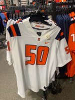
Just the way these things seem to always work (I remember the Philadelphia Eagles had some uniform combo snafu a few years ago due to Nike), and because there had already been some kind of delay in getting us the set that was announced, I wouldn't be surprised if this year this is all we have, and next year we might get the orange jersey or blue pants a lot of us want to see. Maybe 3 distinct jerseys and 3 distinct pants is too much to expect for Nike's production process all at once.
 
#103      

Mr. Tibbs

southeast DuPage
We are distinctly orange and blue
Syracuse is distinctly orange and blue

we are both Nike schools
there are always going to be similarities in the uniforms. People need to accept that . So be it
 
#104      
Could one of you anti-Syracuse obsessives give us all a quick rundown for your uniform proposal that would definitely not “look too much like Syracuse” because as far as I can tell their tradition historically is just to haphazardly bounce between alternatively retro and modern variations of orange/navy/white exactly like we have.

I cannot envision any uniform combo that evokes our classic look for which you couldn’t pull up a Syracuse doppelgänger with a 15-second google images search.

 
#105      

skyIdub

Winged Warrior
Omg...there is no "Syracuse vibe". They have the same colors. They tried a similar design.
So did UCLA, LSU, VA Tech, Iowa St.....etc.etc.etc.

We are only like Syracuse because O&B. Who cares? Nobody should care.
 
#106      

ChiefGritty

Chicago, IL
Could one of you anti-Syracuse obsessives give us all a quick rundown for your uniform proposal that would definitely not “look too much like Syracuse” because as far as I can tell their tradition historically is just to haphazardly bounce between alternatively retro and modern variations of orange/navy/white exactly like we have.

I cannot envision any uniform combo that evokes our classic look for which you couldn’t pull up a Syracuse doppelgänger with a 15-second google images search.

Both for the sanity of a handful of posters here and also because I think it was a genuinely good look that would definitely work today in a quasi-retro context: Syracuse should bring back the drop shadow.

To me, the drop shadow, the logo-less helmet and the distinct lighting environment of playing inside the dome says "Syracuse". None of those has ever been an issue on any Illini uniform. They've always been the ones to move closer to us rather than the other way around.
 
#107      
I just don’t understand how we collectively decided Syracuse has priority on orange and blue.
 
#109      
TBF, this article is from a Syracuse website. However, I maintain that our old uniforms and Syracuse's old uniforms "looked more alike" because they were both trying to look somewhat "trendy" (JMO). Our new uniforms are about as classic as it gets, like yeah - it's going to look like other orange blue combos.
I hope they were being sarcastic in all those articles cause wow. If they were serious, I suddenly don't think our fanbase is that insecure in comparison.
 
#113      
We could become the Turtles, cowering at any hint of intimidation. What will the state name then become?
 
#114      
I liked that the press release mentioned that the stripes symbolized the memorial stadium columns less because they actually meant to design it based on that (most likely just marketing speak) and more because it kind of at least gives the uniform a consistent marker all over the whole uniform. I was kind of confused with why they did the stripes at the shoulder, but now I see it as stripes is the theme of the uniform and should be front and center, and vertical. Plus, I think they had to put the stripes there because otherwise it's a pretty close facsimile of the current Syracuse uniforms and that would look bad.
 
Last edited:
#115      

Ransom Stoddard

Ordained Dudeist Priest
Bloomington, IL
I liked that the press release mentioned that the stripes symbolized the memorial stadium columns less because they actually meant to design it based on that (most likely just marketing speak) and more because it kind of at least gives the uniform a consistent marker all over the whole uniform. I was kind of confused with why they did the stripes at the shoulder, but now I see it as stripes is the theme of the uniform and should be front and center, and vertical. Plus, I think they had to put the stripes there because otherwise it's a pretty close facsimile of the current Syracuse uniforms and that would look bad.

Batman Facepalm GIF by WE tv
 
#116      
It would look bad for Nike if the two schools had the same colored uniforms with the same striping in the same places lol not that it would look bad. If you don't think that goes into Nike's calculus you're being naive.
 
#117      

Ryllini

Lombard
20230725_200435.jpg
Should ever get a white snow cap, let it be just like this. I believe they are wearing these with all orange. Would look good all white.
 
#118      
I liked that the press release mentioned that the stripes symbolized the memorial stadium columns less because they actually meant to design it based on that (most likely just marketing speak) and more because it kind of at least gives the uniform a consistent marker all over the whole uniform. I was kind of confused with why they did the stripes at the shoulder, but now I see it as stripes is the theme of the uniform and should be front and center, and vertical. Plus, I think they had to put the stripes there because otherwise it's a pretty close facsimile of the current Syracuse uniforms and that would look bad.
All the more reason for the collar to have the Victory Badge instead of another block-I.
 
#120      
We basically had this a couple years ago. Best looking helmet we've ever had IMO, especially paired with that orange jersey.

usa-today-8056102.0.jpg
I have repeatedly stated my opinion that we should have a "special" jersey for either the Mizzou game every year or for our bowl games, and that would likely have to be orange. I think the following combo would look REALLY fresh if used sparingly with the current designs:

1. White helmet with a B/O/B stripe.
2. Orange jersey with white numbers that have a navy outline and switch the shoulder stripes to B/W/B.
3. The white pants pictured in the post about the new uniforms with the B/O/B stripe.

You could also wear our regular orange helmet for a O/O/W combo, but I think the white helmet would look great with an orange jersey and white pants (and you pretty much have to go with white pants if you wear an orange jersey, as all orange and O/O/B look terrible, if you ask me). Pretty much this exact look with our current uniforms:

GettyImages-459417800.0.jpg


Like I said, don't overuse it and save it for a special game like Mizzou (where we could always wear orange, given their color scheme) or bowl games. JMO, of course, but that's a great alternate color combo to bust out!
 
#121      
I'd have no problem if they wore this jersey just for orange outs, but knowing Bielema I think we stick to o/b/o for every home game which is fine. I doubt we ever wear it but smart to sell orange.

 
#122      

ChiefGritty

Chicago, IL
I'd have no problem if they wore this jersey just for orange outs, but knowing Bielema I think we stick to o/b/o for every home game which is fine. I doubt we ever wear it but smart to sell orange.

Whoa, that answers the question of whether there's a secret orange version.
 
#124      

skyIdub

Winged Warrior
Whoa, that answers the question of whether there's a secret orange version.

I'm guessing it will be paired with the white pants, but I think it might be a good opportunity to throw blue pants into the mix?

Syracuse-Football-Orange-Jersey-2.0.0.jpg


abf2f469e593fe3cfee3fb388ea79cd7--the-florida-florida-gators.jpg
 
Status
Not open for further replies.