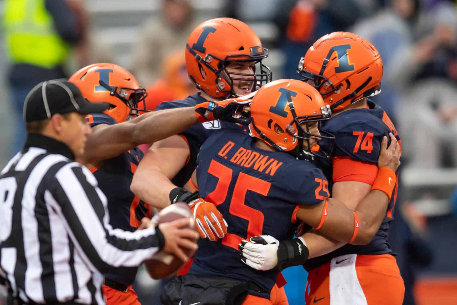
That’s a beautiful jersey that I can’t feel is slightly tainted by the dumb rebrand font. Something I didn’t realize at the time is how long lasting all of that would be. 9 years later when the school seems to want to move towards cursive styling it’s stuck with f1ght1ng 1ll1n1. We still have the sets of two pattern on everything Nike says references the columns (the actual subtle stripes on the original 2014 uniforms are not really Grange stripes as they look nothing like any of his uniforms. They are the two by two pattern that kind of looks like a 1920s uniform when in the front of the uniform so they used that in part as a reference. In fact the only time the grange stripes look correct is in inverse on the shield which they said was actually the columns lol). Considering we were more bound by the rebrand restraints with numbering and patterns these uniforms are about as well as they could do imo.Saw this bad boy in Dicks yesterday
You are using an out of date browser. It may not display this or other websites correctly.
You should upgrade or use an alternative browser.
You should upgrade or use an alternative browser.
New Illinois Football Uniforms
- Status
- Not open for further replies.
Yes, they're pretty good but they would be awesome without that terrible shoulder stripe.That’s a beautiful jersey that I can’t feel is slightly tainted by the dumb rebrand font. Something I didn’t realize at the time is how long lasting all of that would be. 9 years later when the school seems to want to move towards cursive styling it’s stuck with f1ght1ng 1ll1n1. We still have the sets of two pattern on everything Nike says references the columns (the actual subtle stripes on the original 2014 uniforms are not really Grange stripes as they look nothing like any of his uniforms. They are the two by two pattern that kind of looks like a 1920s uniform when in the front of the uniform so they used that in part as a reference. In fact the only time the grange stripes look correct is in inverse on the shield which they said was actually the columns lol). Considering we were more bound by the rebrand restraints with numbering and patterns these uniforms are about as well as they could do imo.
skyIdub
"I can't tell you. Secret."
Yes, they're pretty good but they would be awesome without that terrible shoulder stripe.
I'm not sure what the obsession is this day and age with exaggeration. Everyone feels they have to exaggerate and hyperbolize in order to make a point.
The shoulder stripes aren't "terrible"...you just don't like them. Just as no shoulder stripe would not be terrible for someone who likes the shoulder stripe. They would just like it less.
"Terrible" shoulder stripes look like this:
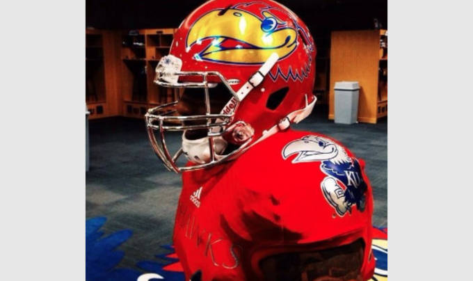
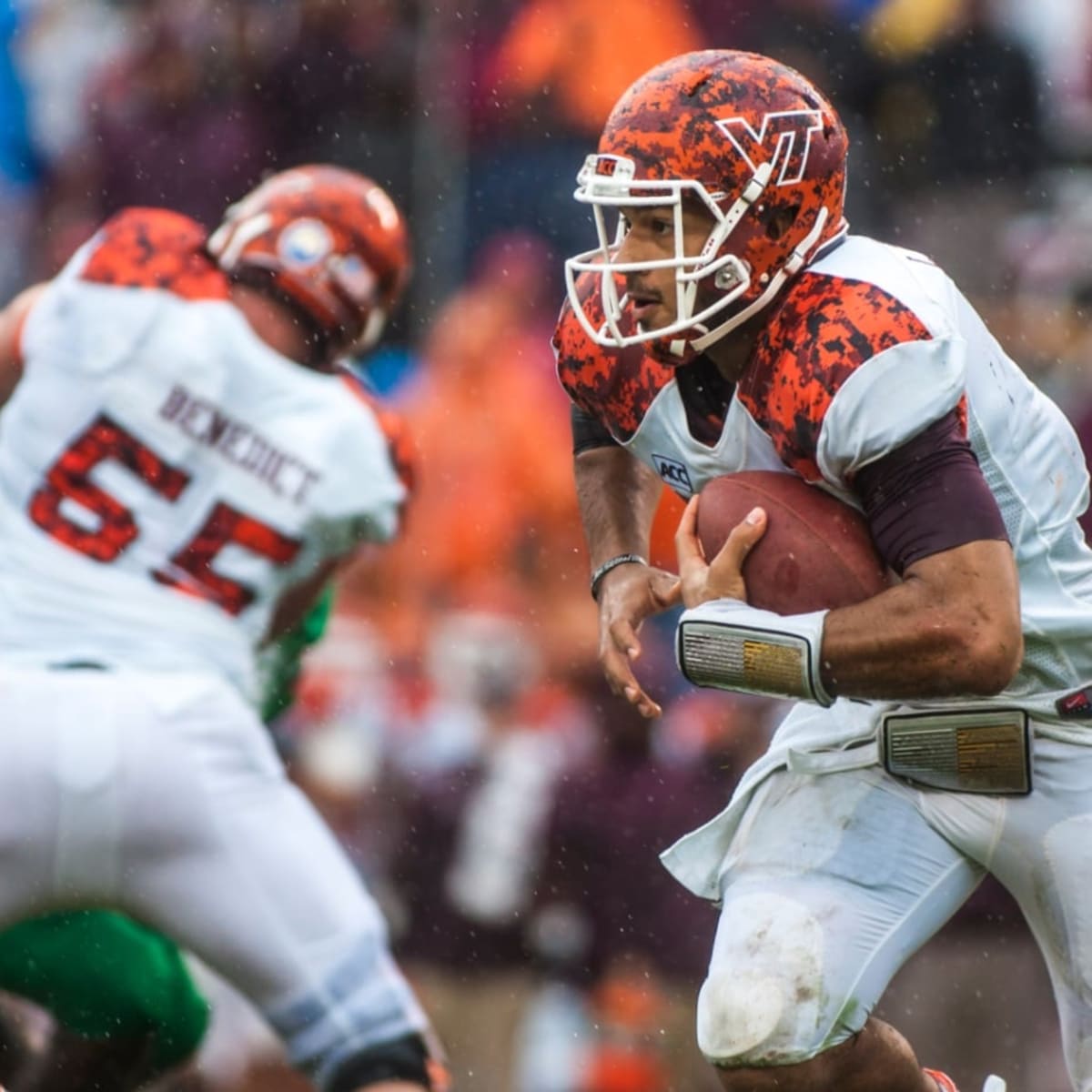
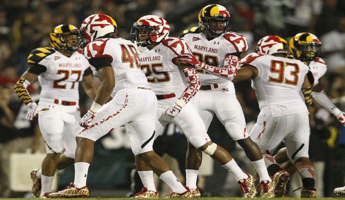
I don't "love" the shoulder stripes. They are not "amazing". They're just stripes. They look fine. They won't be forever. IDGAF about Syracuse.
How is it exaggeration? How is Syracuse involved in my post? To each their own, I agree. Are you not exaggerating for effect in your post? I don't like them, and think they're terrible... Not exactly the hot take of the year.I'm not sure what the obsession is this day and age with exaggeration. Everyone feels they have to exaggerate and hyperbolize in order to make a point.
The shoulder stripes aren't "terrible"...you just don't like them. Just as no shoulder stripe would not be terrible for someone who likes the shoulder stripe. They would just like it less.
"Terrible" shoulder stripes look like this:


I don't "love" the shoulder stripes. They are not "amazing". They're just stripes. They look fine. They won't be forever. IDGAF about Syracuse.
skyIdub
"I can't tell you. Secret."
How is it exaggeration? How is Syracuse involved in my post? To each their own, I agree. Are you not exaggerating for effect in your post? I don't like them, and think they're terrible... Not exactly the hot take of the year.
Lol yeah the last bit wasn’t really aimed at you just a rant.
The use of the word “terrible” to describe your dislike of the shoulder stripe is the exaggeration.
If I simply like the stripe, but say it’s “incredible” or “amazing”, then that is also exaggeration.
So my point is that it’s is neither “terrible”, nor is it “amazing”, it’s just stripes that some like and some don’t. I’ve simply noticed in our society we insert the hyperbole so much for effect.
Probably a learned thing from the news media. Sensationalism.
It’s just an observation.
Fighter of the Nightman
- Chicago, IL
Agreed on the overreaction to the shoulder stripes. Personally, I think those exact same stripes would look a lot better on the sleeve, but it's a relatively minor issue, and a string of 7-8+ win seasons in a row will have an entire generation of Illini fans falling in love with those uniforms and never wanting to switch again. And that was the goal, IMO - a classic look that is "grounded" enough to be kept for years to come, regardless of where the trends go. We wanted to hop on out of the Missouri/Iowa State club of trying to do what was "in" every few years.
ChiefGritty
- Chicago, IL
The problem isn't not liking them, which is a matter of taste.
The problem is saying "they would be awesome without that terrible shoulder stripe" when that's the entire focus of the whole design, what else is there to be awesome?
It's also very funny the way people complain about us looking like Syracuse then in every particular detail the requests are that we should look more exactly like Syracuse.
My guess is if you asked Bret a little off the record he was trying to modernize the uniform he connected most with a winning Illinois (the 1989/1990 uniforms he played against in a pretty raucous Memorial Stadium), within the constraints of the Nike design templates, which he kind of did. It's very similar style. And the stripes are of course the main theme which they tried to modernize the uniform with.
Last edited:
Fighter of the Nightman
- Chicago, IL
One thought to share again ... even though it kind of goes against the whole "return to tradition" theme, I still think those white pants with either a navy or an orange uniform would look VERY nice ... the stripes just make it work for me. I'm decently confident we go O/O/W for the Penn State orange-out game, which would be the first time we have ever worn orange under Bret and only the third time we have gone away from O/B/O at home (we wore O/B/B vs. Wisconsin and O/B/W vs. Northwestern in his first season). It also wouldn't surprise me at all if we just wore the default home uniform vs. PSU, haha.
I think the shoulder stripes look better on the navy than the white.
Did you guys notice that Syracuse has almost our exact same jerseys. What’s with that? I have no idea how that could happen. Nope. Fully escapes me.
Did you guys notice that Syracuse has almost our exact same jerseys. What’s with that? I have no idea how that could happen. Nope. Fully escapes me.
Fighter of the Nightman
- Chicago, IL
I saw another Facebook post about the uniforms, and it seemed like the responses to the uniforms were even more positive after some "space" from the announcement ... fewer Syracuse comparisons, lol.
To me personally, these uniforms look like the exact types that your average fan will be totally in love with if they are associated with winning teams. I don't think anyone would look back on the 2001-2006 basketball jerseys fondly if they weren't associated with SO much winning!
To me personally, these uniforms look like the exact types that your average fan will be totally in love with if they are associated with winning teams. I don't think anyone would look back on the 2001-2006 basketball jerseys fondly if they weren't associated with SO much winning!
I am not a huge fan of the new uniforms. But it's really hard to get a complete feel for them, until we see them in action on gameday. Also, as long as the program keeps improving and builds a winner, I really don't care what the uniforms look like. It also matters more what the players and potential recruits think about the uniforms, than what I think about them.
I’m kind of the opposite think the o/w/o looks better than it has in a long time but the home uniform looks disjointed.I think the shoulder stripes look better on the navy than the white.
Did you guys notice that Syracuse has almost our exact same jerseys. What’s with that? I have no idea how that could happen. Nope. Fully escapes me.
The problem is saying "they would be awesome without that terrible shoulder stripe" when that's the entire focus of the whole design, what else is there to be awesome?
I don't especially care for the shoulder stripes, but as someone who thinks the only thing wrong with the old ILLINOIS uniforms was the slant Illinois, I think the new uniforms are great. The white numbers on the O/B/O set are a definite improvement over the orange.
Most importantly, it's the best helmet we've had in ages, maybe ever. Getting the helmet right -- and then keeping it -- lets you refresh minutiae like the shoulder stripes or the goofy font every so often while still keeping a consistent look.
One could say we're working with what we have (the weird rebrand font, Nike's temporary commitment to shoulder stripes) to lay down a strong foundation, which feels like a good synecdoche for the state of the program in general.
Fighter of the Nightman
- Chicago, IL
Could not have said it better myself! The goal (at least IMO) had to be to establish a “look” for Illini football. That was easy on the surface but more difficult than it sounds because we’ve spent the last two decades mixing and matching our styles.I don't especially care for the shoulder stripes, but as someone who thinks the only thing wrong with the old ILLINOIS uniforms was the slant Illinois, I think the new uniforms are great. The white numbers on the O/B/O set are a definite improvement over the orange.
Most importantly, it's the best helmet we've had in ages, maybe ever. Getting the helmet right -- and then keeping it -- lets you refresh minutiae like the shoulder stripes or the goofy font every so often while still keeping a consistent look.
One could say we're working with what we have (the weird rebrand font, Nike's temporary commitment to shoulder stripes) to lay down a strong foundation, which feels like a good synecdoche for the state of the program in general.
A good but different comparison is the Florida schools (Miami (FL), FSU and Florida). They have changed things about their uniforms, but they each have a definitive “look” that is recognizable when you flip on the TV. And I think we now have achieved the beginning of that. Maybe in 5-6 years we switch to a sleeve stripe and maybe in 10+ years we have no stripe on the shoulder/sleeves, but the BASIC look should be set now, with the helmet and pants design hopefully remaining relatively constant forever.
I will say again, though, that I think navy pants on the road would look REALLY good with this specific set. I also hope we showcase an orange jersey with white pants (PLEASE never all orange, lol) very sparingly, like for the PSU orange out game this year.
Not sure if this is the right place for this … but, um, where is the Illini model, Nike? Disappointing.
College Teams Shoes. Nike.com
Find College Teams Shoes at Nike.com. Free delivery and returns.
www.nike.com
ChiefGritty
- Chicago, IL
Notice how "what amount of orange does it have?" and "does the orange pop?" are two different things?
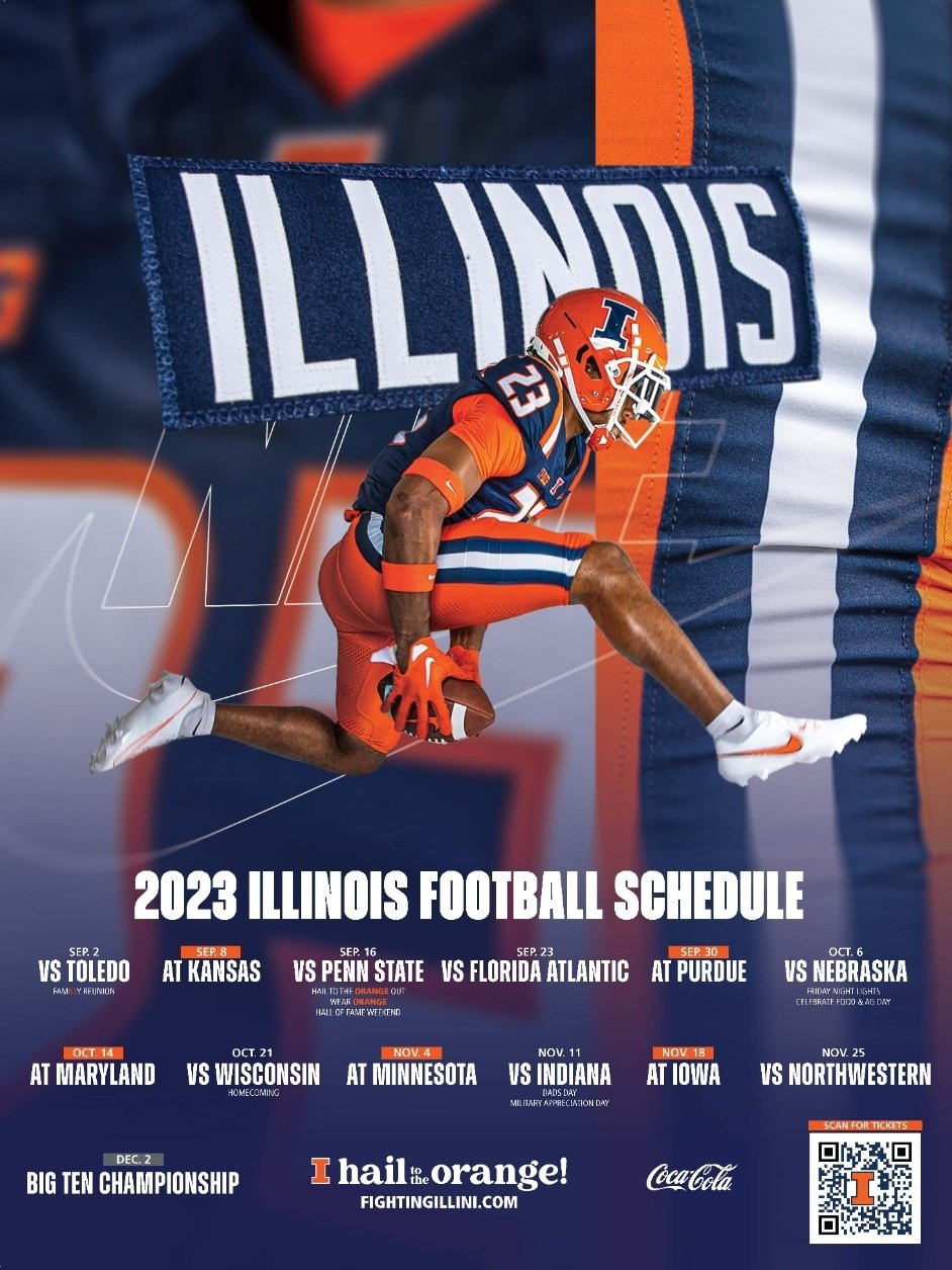


correct. that matte helmet and stripe-less orange pants never did it for me.Notice how "what amount of orange does it have?" and "does the orange pop?" are two different things?


the new pants and high gloss helmets however -

I'm still getting used to the shoulder stripes, but there is no doubt the update is an improvement.
It's crazy how seemingly minute details like the color of the facemask and outline of the block I can also make such a difference.
The white face mask and other subtle white features are what make the orange pop. Crazy difference.Notice how "what amount of orange does it have?" and "does the orange pop?" are two different things?


lstewart53x3
- Scottsdale, Arizona
My new uni journey:
Ugly.
Meh, they’re decent.
Okay, I see what they’re trying to do here.
Those shoulder stripes are actually pretty sharp.
Wait a sec, do the stripes on the pants, jersey, and helmet all match? That’s nice.
The orange outlined in white sure does pop.
We’re gonna look fantastic under the lights against Toledo in 26 days.
I actually disagree that the jerseys are an improvement. I loved the simple, previous design. The helmets are a big step in the right direction. That being said, I don't hate the new jerseys and a couple wins on the field will satisfy me.correct. that matte helmet and stripe-less orange pants never did it for me.
the new pants and high gloss helmets however -


I'm still getting used to the shoulder stripes, but there is no doubt the update is an improvement.
It's crazy how seemingly minute details like the color of the facemask and outline of the block I can also make such a difference.
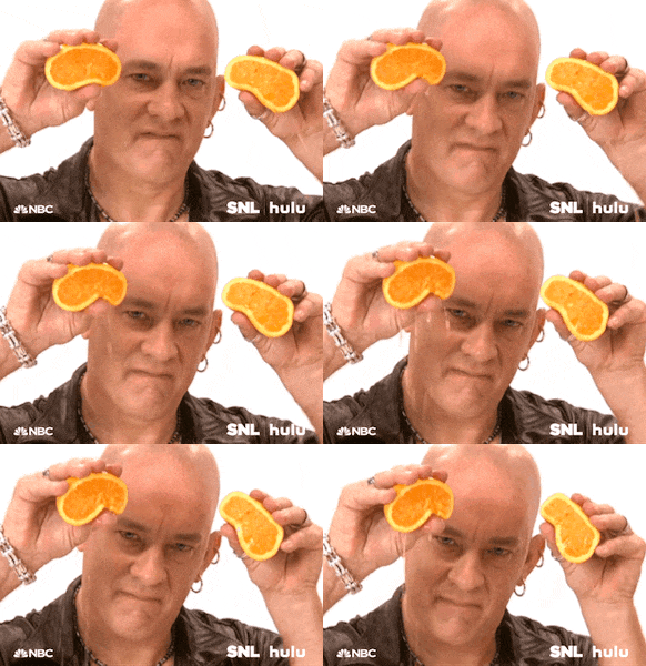
On another note, I had to google "Tom Hanks squeezing oranges". That is some weird stuff, man.
For me
Helmet 10/10
Pants with stripe 10/10
Outlined numbers 10/10
Shoulder stripes.....we'll see what they look like on TV
Helmet 10/10
Pants with stripe 10/10
Outlined numbers 10/10
Shoulder stripes.....we'll see what they look like on TV
To add to the helmet improvement, going back to the shiny finish and away from that matte finish was huge and definitely the right thing to do. Gives the whole uniform a different look, IMO.For me
Helmet 10/10
Pants with stripe 10/10
Outlined numbers 10/10
Shoulder stripes.....we'll see what they look like on TV
- Status
- Not open for further replies.

