Do something like this. It's simple and clean looking.

Do something like this. It's simple and clean looking.

Why in the world would Illinois drop the I, the logo, from their helmet?
Their brand is that, period. It's clearly staying.
Because I was offering a suggestion to the poster I replied to. Don't want anything ultra fancy, and want a clean, classic look like ND, Bama, Penn State, UM? Well, that was my suggestion. Bring back a helmet that was unique to us then and would still be so now. Logos change or are updated all the time. That could be a consistent look for decades. I don't think it would ever happen, but that's never stopped anyone from posting about it.
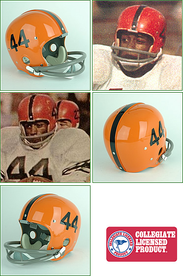
Like these?
These are not Illinois. They're Syracuse. Illinois is an orange I or a white or blue I on an orange field. I understand what you're saying, but we're not Penn State or Michigan harkening back to the glory days, we're Illinois trying to develop our own brand.
No like the one Farley just posted with the stars... Anyway, it's fine... I just offered a half joking response to tie our uniforms to the 3 most famous players that ever wore our letters to create that classic look. Fwiw, though, I would prefer the numbers and stars helmet, but that's not here nor there. I'm fine with the current iteration and really like the jerseys.
Too plain. It's not classic Illinois, to me. It's too Bears. What about our current look would you consider "unclean"?
This is modern clean to me:
Maybe a less metallic orange, but this is simple, clean, and fine.
We are linked to the Bears. Actually, the Bears are linked to us due to Halas having an affinity for UI. That is why he chose those colors, and why our uniforms have been a lot alike until recent. Why not go with history and stay with the simple and clean look?
And I totally respect that opinion. It makes it tough, though. The issue is, on one hand, the classic look is a great one. On the other, a 15 year old football player doesn't look at an orange helmet with a blue uniform and immediately think "Illinois". That's why branding is such a huge struggle across multiple industries and fields.
Why not go with history and stay with the simple and clean look?
We are linked to the Bears. Actually, the Bears are linked to us due to Halas having an affinity for UI. That is why he chose those colors, and why our uniforms have been a lot alike until recent. Why not go with history and stay with the simple and clean look?
We do have a simple and clean look. It just doesn't aim itself at the design aesthetic of the 1950's.
I don't know how you get more simple and clean than what we have now without being generic and boring.
Baseball finally after 20+ years has gotten their new home whites. The vest look had grown tiresome to look at, not terrible just dated etc. The new ones are with sleeves and have the seams in a blue stripe. Think Cardinals retro or Braves jersey with the colored seams. The only thing I'm not sure of is the ILLINOIS across the front in the two toned font. Waiting to see them in person, really just happy they finally updated their whites. Also heard they have new greys. The Orange and Blue jersey's were new last year.
This would be fantastic.Do something like this. It's simple and clean looking.
What do you think of Alabama's?I just can't wrap my head around people who would prefer those nondescript '63 throwbacks to our current uniform set. It's like they're speaking in tongues or something.
Our uniforms are fantastic. Some of the very best in the country, IMO.
What do you think of Alabama's?
Illinois does not share colors with Florida. Florida is Royal Blue. Auburn is similar to IL.There are teams that can get away with that kind of look
The ones that come to mind:
Texas
Texas A&M
Alabama
Michigan
Notre Dame
The list goes on, but they all have winning pedigrees and have had the same look for a long time. A blue jersey with an orange helmet is fine, but Illinois isn't enough of a winning program for recruits to say "yes! That's Illinois!" when they see an orange helmet and plain blue shirt.
I'm excited about Lovie Smith, but the idea that Illinois can take colors shared by Florida, Clemson, and Syracuse and be like "Look at our classic look!" would result in confusion.
Illinois does not share colors with Florida. Florida is Royal Blue. Auburn is similar to IL.
The current orange Illini helmet is hideous. When it comes to uniforms, I hope the new head coach prefers a classic look to gimmicks, acronyms and bracelets. I hope we see all white with white or blue helmet and blue or orange jerseys with white pants and the blue helmet or perhaps the white one. I would be tying Illini and Bears history as much as possible to further invade the Chicago market and help win some recruiting battles.
The latter statement is what I'm talking about. Tell recruits the Halas loved Illinois so much he wanted the colors identical to illinois'. Uniforms fairly similar, 2 of the greatest bears are Illini.
Using the history of Chicago and UI is a selling point.
 .
.Illinois does not share colors with Florida. Florida is Royal Blue. Auburn is similar to IL.
The current orange Illini helmet is hideous. When it comes to uniforms, I hope the new head coach prefers a classic look to gimmicks, acronyms and bracelets. I hope we see all white with white or blue helmet and blue or orange jerseys with white pants and the blue helmet or perhaps the white one. I would be tying Illini and Bears history as much as possible to further invade the Chicago market and help win some recruiting battles.
The latter statement is what I'm talking about. Tell recruits the Halas loved Illinois so much he wanted the colors identical to illinois'. Uniforms fairly similar, 2 of the greatest bears are Illini.
Using the history of Chicago and UI is a selling point.
illinois. When you see that I on an orange helmet, everyone knows what school it is. That's what rebrands are supposed to do.What do you think of Alabama's?
The uniforms were identical colors back then because he purchased used uniforms from Illinois, IIRC.