You are using an out of date browser. It may not display this or other websites correctly.
You should upgrade or use an alternative browser.
You should upgrade or use an alternative browser.
The 2014 Illini Nike Uniforms and Rebrand
- Status
- Not open for further replies.
Kams Bathroom
K
Guest
Color Fail. There are no marks in our brand book that have a blue I with an orange outline...
Yup. Another one. Frustrating....
matt1all
- Chicago, IL
Almost certainly
can you like describe them with words

Color Fail. There are no marks in our brand book that have a blue I with an orange outline...
I thought the whole point was for all of it to work seamlessly.. I think it does that for the most part.
I like everything but the zig zags and the two tone ILLINOIS. I'm not seeing feathers in that zig zag design at all.
Indicchief
I
Guest
I was hoping for a single feather ........................... somewhere.
Kams Bathroom
K
Guest
can you like describe them with words
The pictures of the silver/gray basketball jersey are even up on our own website, and the leaks of the '63 throwback football jersey were pretty obvious in that earlier YouTube video in the other thread.
If there's anything else, it would surely be a throwback basketball uniform and a gray football combination. Not rocket science.
Kams Bathroom
K
Guest
I was hoping for a single feather ........................... somewhere.
I mean, how much more blatant of a feather motif do you want?
ajerwin96
- Belleville / Champaign
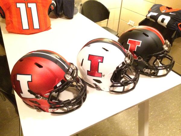
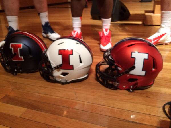
I am in love with these new helmets. I'm actually excited to watch the football team now.
Almost certainly
That's what I was afraid of
matt1all
- Chicago, IL
I was hoping for a single feather ........................... somewhere.
the bball jersey is covered with as close to feather imagery as you will get
I'm not seeing feathers in that zig zag design at all.
And that, to me, is the beauty of it. There's enough of a resemblence to the edge of the
 logo to please us Chief lovers and allow us to take it as a nod to the Chief/past. But without being overly in-your-face about it to anyone else. Just a classic "in the eye of the beholder" type situation if you ask me.
ILLiNimob
I
Guest
The side panel. ..even if we all know or think it's feathers, the average fan will think it's a lighting bolt or just a overall attempt to add some crazy on the side of the uniforms. To big an borderline annoying. Jmho
IlliniNation05
- Champaign, IL
Baseball looks terrible, so boring. That is really the only one I don't care for
I agree...probably why it's not even featured on the new brand website lol. Which is very strange because when they introduced the Nike designer (name is escaping me right now) they said he's a lead designer for Nike Baseball?
So when do the other sports get this stuff?
peace davids
- Colorado
I love this shirt and the Navy on Gray look.

Too bad it isn't part of our color palette either. Single color on gray is supposed to be orange. (I think orange on gray is a bad decision... make it Navy all the time on gray.)
I'll stop harping on this, but I really hate creating standards and breaking them on day 0. If you are going to be loose with your wordmarks and colors, everyone else will think it is ok to dilute the image.
http://tisbookui.com/MerchDetail.as...REBRAND&CatID=26220&Name=REBRAND#.U087AVePMXE
Attachments
IlliniNation05
- Champaign, IL
I noticed the new fan apparel doesn't have anything other than some t-shirts, shorts, and polos. Are the hoodies and sweats coming later???
Yea, don't worry!
I love this shirt and the Navy on Gray look.
Too bad it isn't part of our color palette either. Single color on gray is supposed to be orange. (I think orange on gray is a bad decision... make it Navy all the time on gray.)
I'll stop harping on this, but I really hate creating standards and breaking them on day 0. If you are going to be loose with your wordmarks and colors, everyone else will think it is ok to dilute the image.
http://tisbookui.com/MerchDetail.as...REBRAND&CatID=26220&Name=REBRAND#.U087AVePMXE
Isn't that the very bottom right corner combination or close?
Yea, don't worry!
Haha, I'm just being impatient because my birthday is Saturday and I'm hoping for a brand spanking new Dri-fit Illini hoodie with the new logo on it
")
http://tisbookui.com/MerchDetail.as...tID=22073&Name=MENS NIKE APPAREL#.U089Il5NJZg
This is freaking terrible.
This is freaking terrible.
- Status
- Not open for further replies.