My dad was a locomotive engineer. Always wore solid dark gray or navy blue to work. However, when vacation rolled around, he wore some combination of a pastel short and button up plaid shirt. With black socks and black tie shoes. He was a sight to behold.1. Black socks
2. Black NB or Adidas
3. Prefer t-shirt and jerseys
4. Forgot the baseball cap
5. Never played golf somehow
You are using an out of date browser. It may not display this or other websites correctly.
You should upgrade or use an alternative browser.
You should upgrade or use an alternative browser.
Illinois Football Uniforms
- Status
- Not open for further replies.
Can confirm.the sh+* holes of Minneapolis and St Paul).
I used to work for Cargill years ago and spent a lot of time in the cities. Clean, beautiful, vibrant, safe.
Was back last year…big yikes.
mattcoldagelli
- Script Illinois Enthusiast
Devolved, you say?How did this thread devolve into a vexillology debate? I am receptive to the state of Illinois changing the flag but ...
mattcoldagelli
- Script Illinois Enthusiast
Here's another recent state flag update - Utah
Old:

New:

Another significant upgrade, IMO, and a really good example of why the "state seal but on fabric" approach doesn't make a flag at all. Utah is nicknamed "The Beehive State" - and guess what? It's actually the centerpiece of the old state "flag" but it's buried, Inception-style, hiding under words, inside of a state seal, disappearing into the void and accomplishing nothing. Contrast that with the new one - it's at center stage, simple and unmistakable, occupying the space between the mountains (white) and the canyons (red).
Old:
New:
Another significant upgrade, IMO, and a really good example of why the "state seal but on fabric" approach doesn't make a flag at all. Utah is nicknamed "The Beehive State" - and guess what? It's actually the centerpiece of the old state "flag" but it's buried, Inception-style, hiding under words, inside of a state seal, disappearing into the void and accomplishing nothing. Contrast that with the new one - it's at center stage, simple and unmistakable, occupying the space between the mountains (white) and the canyons (red).
...and my socks are no shows.
RabidDawgClassic
- Los Angeles, CA
Other than the lettering, this one checks.And here is where we can move beyond the simple subjectivity involved in uniforms and into an area where there are actual pieces of guidance to ensure design furthers - as opposed to hampers - the function of a flag. From the North American Vexillological Association:
Here are the old and new flags, together, for reference:
- Keep It Simple. The flag should be so simple that a child can draw it from memory.
- Use Meaningful Symbolism. The flag's images, colors, or patterns should relate to what it symbolizes
- Use 2 or 3 Basic Colors. Limit the number of colors on the flag to three which contrast well and come from the standard color set
- No Lettering or Seals. Never use writing on any kind or an organization's seal
- Be Distinctive or Be Related. Avoid duplicating other flags, but use similarities to show connections


I see the gentleman from UtahHere's another recent state flag update - Utah
Old:
View attachment 37326
New:
View attachment 37327
Another significant upgrade, IMO, and a really good example of why the "state seal but on fabric" approach doesn't make a flag at all. Utah is nicknamed "The Beehive State" - and guess what? It's actually the centerpiece of the old state "flag" but it's buried, Inception-style, hiding under words, inside of a state seal, disappearing into the void and accomplishing nothing. Contrast that with the new one - it's at center stage, simple and unmistakable, occupying the space between the mountains (white) and the canyons (red).
Our friendly Beehive State
How can we help you, Utah?
How can we make you great?
Well, we got to irrigate our deserts
We got to get some things to grow
And we got to tell this country 'bout Utah
'Cause nobody seems to know.
--Randy Newman, "The Beehive State"
OrangeBlue98
Iowa is not in a great spot right now (LvilleILL1)
- Des Moines, IA
My wife used to think I dressed like this (minus the knee-length crew socks). I decided to upgrade my wardrobe some this year and she thinks I'm now in a mid-life crisis.I love everyone on board, but based on the uni suggestions in this thread, I feel like most of y’all dress like this:
View attachment 37271

ChiefGritty
- Chicago, IL
Since we're on this topic, what on earth was the State of Maine thinking voting against changing their flag from thisHere's another recent state flag update - Utah
Old:
View attachment 37326
New:
View attachment 37327
Another significant upgrade, IMO, and a really good example of why the "state seal but on fabric" approach doesn't make a flag at all. Utah is nicknamed "The Beehive State" - and guess what? It's actually the centerpiece of the old state "flag" but it's buried, Inception-style, hiding under words, inside of a state seal, disappearing into the void and accomplishing nothing. Contrast that with the new one - it's at center stage, simple and unmistakable, occupying the space between the mountains (white) and the canyons (red).
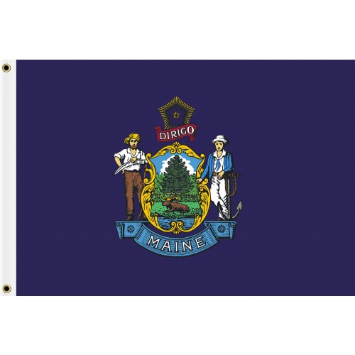
To this beauty

Fighter of the Nightman
- Chicago, IL
I guess I like the idea of some of these state flag changes in theory, I just don't really think it has to be a dichotomy between this old, cluttered design and something so simple it looks like it was created using Microsoft Office programs. Using that legitimately cool Maine flag idea that Gritty posted, you could easily do that design where the star and tree have some texture and look a bit more 3D ... i.e., like an actual artist put his or her time into it.
Some of this highlights what I call "The George Lucas ProblemSince we're on this topic, what on earth was the State of Maine thinking voting against changing their flag from this
To this beauty
 ". I.E. going back and revising past work to make it more appealing to modern sensibilities. Lucas did this repeatedly to his Star Wars films to the point that it's hard to find versions of his movies as they existed in their time.
 In my opinion the context of the times in which a piece of art was made is part of the art itself.
TBF, flags walk the line of historical art and something that serves a modern purpose. So I do see the argument for them being more of an ever evolving representation of the times.
*Dashes away from the Topic Cops
Fighter of the Nightman
- Chicago, IL
I would agree with this. Something like a state flag should effectively be "innocent until proven guilty," haha. It's not like these things can never be changed ... but it's misguided to feel like they necessarily SHOULD without a really, really good reason.Some of this highlights what I call "The George Lucas Problem
In my opinion the context of the times in which a piece of art was made is part of the art itself.
TBF, flags walk the line of historical art and something that serves a modern purpose. So I do see the argument for them being more of an ever evolving representation of the times.
*Dashes away from the Topic Cops
mattcoldagelli
- Script Illinois Enthusiast
I think we should be a little more honest and just say that, with a few noteworthy exceptions, the people developing state flags put zero effort into it and considered the box checked. Fair enough, maybe! We had other things going on in the early-to-mid-19th century. But you are giving them an abundance of credit to say they were making pieces of art.In my opinion the context of the times in which a piece of art was made is part of the art itself.
TBF, flags walk the line of historical art and something that serves a modern purpose. So I do see the argument for them being more of an ever evolving representation of the times.
Fighter of the Nightman
- Chicago, IL
Okay, but consider the example of the Maine state flags above. Do you see no validity in the basic notion that there is some INHERENT level of art/effort in trying to make a tree look like an actual tree rather than a flat, 2D image? I'll at least give these early flags that. A good example of a "simpler" flag that still actually tries to add some depth/3D appearance to the focal point is Prussia's, IMO:I think we should be a little more honest and just say that, with a few noteworthy exceptions, the people developing state flags put zero effort into it and considered the box checked. Fair enough, maybe! We had other things going on in the early-to-mid-19th century. But you are giving them an abundance of credit to say they were making pieces of art.
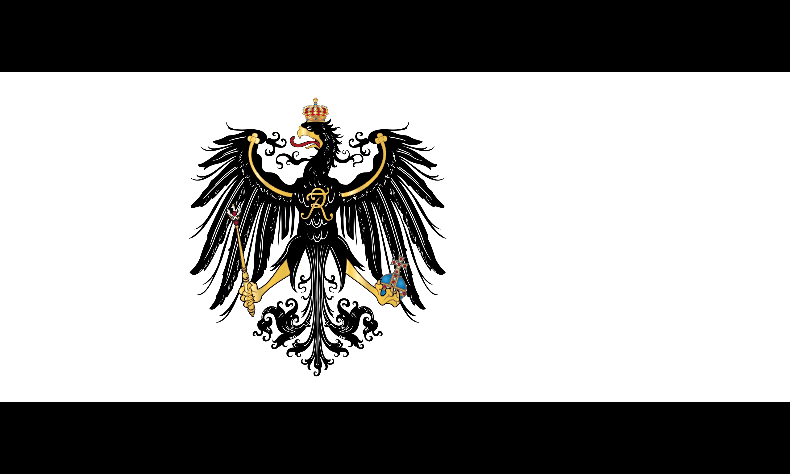
It's not too busy, there is a very simple color pattern and it is easily identifiable ... but that doesn't mean the eagle has to be clip art.
Along the same lines with what @mattcoldagelli has pointed out, the "past work" and "historical art" was basically just lazily putting the state's seal onto a piece of fabric. I don't think the seal should be changed - that can and should stay as a piece of history (and thus the image on the current flag would still be an official part of our state's brand). But Illinois, like most states, when first faced with the need to put together a flag, decided to not really do the assignment. It wasn't a conscious choice so much as a "this isn't a big deal, just toss the seal on it" kind of thing. I don't think we necessarily need to honor that decision and live with it for time immemorial.Some of this highlights what I call "The George Lucas Problem
In my opinion the context of the times in which a piece of art was made is part of the art itself.
TBF, flags walk the line of historical art and something that serves a modern purpose. So I do see the argument for them being more of an ever evolving representation of the times.
*Dashes away from the Topic Cops
To tie things to back somewhat to topic (wrong sport, but still) these were our basketball jerseys back in like 1911, very close to when our basketball program was founded:
Is it a problem that we abandoned this look? Did we George Lucas it when we "revis[ed] past work to make it more appealing to modern sensibilities." Or are we better off for the more aesthetically pleasing options we adopted (not including 1LL1NO1S)?
mattcoldagelli
- Script Illinois Enthusiast
It's a good seal, as seals go! It should stay and do the job that state seals do (appearing on documents and podiums and whatnot).I don't think the seal should be changed - that can and should stay as a piece of history
I mentioned the Wallace Rice centennial flag earlier, and didn't share an image, so here it is:

Illinois is the 21st state, so there are 21 stars - the most prominent one representing the state itself and then the 10 Northern and 10 Southern states already in existence when Illinois entered the Union.
Battle89
- Cary-Grove, the better Trojan team
Nice design, hope it really takes offIt's a good seal, as seals go! It should stay and do the job that state seals do (appearing on documents and podiums and whatnot).
I mentioned the Wallace Rice centennial flag earlier, and didn't share an image, so here it is:
Illinois is the 21st state, so there are 21 stars - the most prominent one representing the state itself and then the 10 Northern and 10 Southern states already in existence when Illinois entered the Union.
Ah yes who could forget the 1911 Fighting BIBs led by Watson and Popperfuss.To tie things to back somewhat to topic (wrong sport, but still) these were our basketball jerseys back in like 1911, very close to when our basketball program was founded:
View attachment 37336
Is it a problem that we abandoned this look? Did we George Lucas it when we "revis[ed] past work to make it more appealing to modern sensibilities." Or are we better off for the more aesthetically pleasing options we adopted (not including 1LL1NO1S)?
But logos and fashion have never been held sacred in that way. I wouldn't argue with you if you felt a flag was closer to a logo than a piece of art or something of historical significance. In a lot of ways I agree.
GrayGhost77
- Centennial, CO
Pretty awesome that we had a guy names Popperfuss on our bball team at one time, but why does the coach look younger than every single one of the players?Along the same lines with what @mattcoldagelli has pointed out, the "past work" and "historical art" was basically just lazily putting the state's seal onto a piece of fabric. I don't think the seal should be changed - that can and should stay as a piece of history (and thus the image on the current flag would still be an official part of our state's brand). But Illinois, like most states, when first faced with the need to put together a flag, decided to not really do the assignment. It wasn't a conscious choice so much as a "this isn't a big deal, just toss the seal on it" kind of thing. I don't think we necessarily need to honor that decision and live with it for time immemorial.
To tie things to back somewhat to topic (wrong sport, but still) these were our basketball jerseys back in like 1911, very close to when our basketball program was founded:
View attachment 37336
Is it a problem that we abandoned this look? Did we George Lucas it when we "revis[ed] past work to make it more appealing to modern sensibilities." Or are we better off for the more aesthetically pleasing options we adopted (not including 1LL1NO1S)?
Yeah my whole point is kind of that the current flag is literally a pre-existing logo, that predates the flag by about 50 years, and was repurposed as a flag...Ah yes who could forget the 1911 Fighting BIBs led by Watson and Popperfuss.
But logos and fashion have never been held sacred in that way. I wouldn't argue with you if you felt a flag was closer to a logo than a piece of art or something of historical significance. In a lot of ways I agree.
Lot of great potential law firm names from that team. Levey, Lord, & Popperfuss? Best law firm since Watson, Oliver, & Rockwell!Pretty awesome that we had a guy names Popperfuss on our bball team at one time, but why does the coach look younger than every single one of the players?
- Status
- Not open for further replies.