The 2014 Illini Nike Uniforms and Rebrand

Status
Not open for further replies.
#1,051      

DaytonIllini

D
Guest
Amazing how everyone's friends, wives, and kids opinions exactly echo their own, verbatim....lol

That snark would be funny if it was even remotely true.

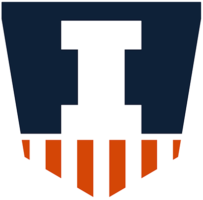
I like the shield. I like it the least of the redo but I still like it. Wife hates it and doesn't notice it when it's a tiny badge on a uniform. Doesn't get why Illinois should be associated with columns when every university more than 100 years old is littered with columns and other pseudo-Hellenic architecture.
 
#1,052      

FinalFour88

Charlotte, NC
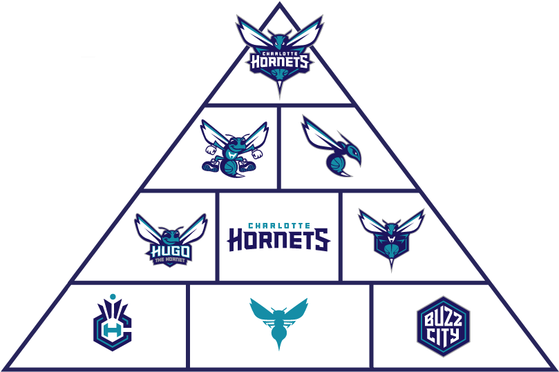
One mistake I think Nike made was in only creating one new logo. I live in Charlotte, and the Hornets recently introduced their new branding package. They have four distinct hornet logos. It was very well received.
 
#1,053      
If the DIA changes the logo to fix the obvious design problems, almost everyone who loves the stonehenge victory logo will quickly decide they like the new version better.

But as long as the "official" logo is the current VB, yes, you will continue to see the "true fans" rally around the flag.

It sure sounds a little bit egotistical for you to decide there are "obvious design problems."

I'd guess if they designed the one you are currently using on your avatar, there'd be people changing the design of it as well; would there still be "obvious design problems"?
 
#1,054      

whtnillini

W
Guest
These alternative shields are fun but they lose something from the original Nike version which is the symmetry of the shield itself being the top half of a Block I. I prefer the original for that reason as it reinforces the Block I concept.
 
#1,055      

Groundhogday

G
Guest
It sure sounds a little bit egotistical for you to decide there are "obvious design problems."

I'd guess if they designed the one you are currently using on your avatar, there'd be people changing the design of it as well; would there still be "obvious design problems"?

If half of your logo vanishes against and orange or white background and you have orange or white uniforms then you have a serious design problem. If your logo looks like a down arrow from a distance then you have a design problem. If every one thinks your logo is a shield but can't figure out why your shield has ears, then you have a design problem.

I don't claim that my avatar is the ideal solution to these problems. But it at least points in a direction that works. I fully expect the DIA and Nike to come out with a new secondary logo that does a better job with the I in a shield idea.
 
#1,056      

Kams Bathroom

K
Guest
One mistake I think Nike made was in only creating one new logo. I live in Charlotte, and the Hornets recently introduced their new branding package. They have four distinct hornet logos. It was very well received.

GHD would have to quit his job to henpeck all of those!
 
#1,057      

ivwilsoniv

Aurora, IL
These alternative shields are fun but they lose something from the original Nike version which is the symmetry of the shield itself being the top half of a Block I. I prefer the original for that reason as it reinforces the Block I concept.

Even though I've proposed a few alternate shields, I do agree with the "box" portion of the original Nike shield for this reason.
 
#1,058      

mattcoldagelli

The Transfer Portal with Do Not Contact Tag
I'm just glad I don't inhabit the world some apparently do, where you never know when you might have to parse out every single aspect of a logo to passers-by. Sounds pressure-filled.
 
#1,059      

Kams Bathroom

K
Guest
I'm just glad I don't inhabit the world some apparently do, where you never know when you might have to parse out every single aspect of a logo to passers-by. Sounds pressure-filled.

WHO IS THAT MUSTACHIOED MAN AND WHY DOES HIS SHIRT NOT MATCH HIS HAT!??
 
#1,060      

illinicb

Northbrook
If a couple of amateurs fooling around for a couple of days can fix major problems in the new athletic logo, then the DIA probably needs to fix the problems with the new logo.


I'm guessing the DIA doesn't feel there are problems with the new logo.
 
#1,061      
I'm just glad I don't inhabit the world some apparently do, where you never know when you might have to parse out every single aspect of a logo to passers-by. Sounds pressure-filled.

tumblr_n251j1rPHa1tuwcflo1_500.gif
 
#1,063      

Groundhogday

G
Guest
These alternative shields are fun but they lose something from the original Nike version which is the symmetry of the shield itself being the top half of a Block I. I prefer the original for that reason as it reinforces the Block I concept.
The thing is, we already have a blocky, square - corner logo. :illinois:
 
#1,065      

Groundhogday

G
Guest
I'm just glad I don't inhabit the world some apparently do, where you never know when you might have to parse out every single aspect of a logo to passers-by. Sounds pressure-filled.
Yes. Designing a good logo requires great attention to detail.
 
#1,066      

Groundhogday

G
Guest
I'm guessing the DIA doesn't feel there are problems with the new logo.
The fact that they changed the rationale for.the logo after going into production, and even the day of the release suggests that they did see a problem.
 
#1,067      

tiburon

Chicago
One mistake I think Nike made was in only creating one new logo. I live in Charlotte, and the Hornets recently introduced their new branding package. They have four distinct hornet logos. It was very well received.

The Hornets ended up with so many logos out of that, I can't even imagine how they'll find a use for all of them:
charlotte_hornets_2013_logo_pyramid.png


This board is having a tough enough time with one new logo, can you imagine if there were nine?
 
#1,069      

tiburon

Chicago
Strangely enough I think my favorite iteration of the shield is a completely unintentional one.

The twitter account "Illini Nation" is using the new shield as their profile picture, but twitter adds a rounded white border around it that cuts off just a bit of the top and bottom of the shield and rounds out the protrusions on top as well:

MWKMURl.png

http://twitter.com/illinination14

I think the slight but noticeable slimming down of the top helps give the shield a less awkward shape that isn't as top-heavy, without substantially altering its overall design.

Again this isn't another fan creation or my own suggestion, just a complete accident due to the way twitter displays profile pictures that I happen to think looks kind of nice :thumb:
 
#1,070      

Epsilon

M tipping over
Pdx
Count me in for Team Shield too, but I feel like they may have tried to cram too much imagery/meaning into this shield design. I'm definitely not sold on the two "Fs" facing each other, and simply let the orange stripes symbolize the columns at Memorial Stadium - the two abacuses or "wings" as people have called them seem extraneous and make it look more like a banner.

That being said, I'm being completely critical for the sake of being critical. I love this shield as our secondary logo, but if I had a say, I'd modify it as seen below. Would look just as awesome on jerseys, t-shirts, but especially helmets. Thoughts?

illini-alternative-victory-shield.png

My first thought was "makes a great toilet seat cover."
 
#1,071      

illinicb

Northbrook
The fact that they changed the rationale for.the logo after going into production, and even the day of the release suggests that they did see a problem.
I don't know what you're referring too, but it is what it is and I don't see it changing in the future, even though I'd like it to happen.
 
#1,073      

JSpence

Evansville, IN
Strangely enough I think my favorite iteration of the shield is a completely unintentional one.

The twitter account "Illini Nation" is using the new shield as their profile picture, but twitter adds a rounded white border around it that cuts off just a bit of the top and bottom of the shield and rounds out the protrusions on top as well:

MWKMURl.png

http://twitter.com/illinination14

I think the slight but noticeable slimming down of the top helps give the shield a less awkward shape that isn't as top-heavy, without substantially altering its overall design.

Again this isn't another fan creation or my own suggestion, just a complete accident due to the way twitter displays profile pictures that I happen to think looks kind of nice :thumb:

Ugh. Looks like a bolt. That looks bad, the orange is incorrect, and they should fix it.
 
#1,074      

ILLiNimob

I
Guest
Home plate. Love the thinner top
 
#1,075      

Redfoxdogs

Gurnee, IL
College kids at my house this weekend for the holiday. The kids don't mind the shield as a tiny badge on the clothes...in the form of a clothing brand logo like Champion, Columbia, etc. but think it looks ridiculous as anything more significant.

Some of the Illinettes and Flags are worried that they might have to wear big sparkly shields on their chests, or even worse, Wonder Woman outfits.

A bigger fear/suspicion from the students...the shield is being rolled out as a test to see if a new "Super Hero" mascot could be accepted, or even emerge spontaneously out of sarcasm, and then be quickly endorsed by the administration. A Captain Illini.

I suppose this is possible, I remember seeing a superhero mascot somewhere in the past, I just can't remember where.

No comment on the b-ball uniforms, discussion was all shield.
 
Status
Not open for further replies.