Basketball Uniforms

Status
Not open for further replies.
#82      
any reason to believe we haven't been bamboozled?
 
#84      

t7nich

Central IL
Whatever they are I hope they have narrow shoulders...i hate all wide shoulder jerseys. :eek:

Apparently they will be a slimmer fit and the shoulder won’t be as wide. Shorts won’t be as long. Probably similar to what Syracuse wore this year (fit wise)
 
#85      

The Galloping Ghost

Washington, DC
Apparently they will be a slimmer fit and the shoulder won’t be as wide. Shorts won’t be as long. Probably similar to what Syracuse wore this year (fit wise)

And considering the football uniforms, probably look similar to Syracuse's current uniforms, also.
 
#86      
Apparently they will be a slimmer fit and the shoulder won’t be as wide. Shorts won’t be as long. Probably similar to what Syracuse wore this year (fit wise)

This is the same jersey style all of Nike’s top programs have been wearing the past two years. Duke, Oregon, Arizona, Kentucky, Ohio State are a few of the many examples as well.
 
#87      
This is the same jersey style all of Nike’s top programs have been wearing the past two years. Duke, Oregon, Arizona, Kentucky, Ohio State are a few of the many examples as well.
The problem with this jersey style is that now that we will finally catch up, the big boys will probably switch in a year again and then we will once again be behind in style...it matters to the recruits...and us crazy fans.
 
#88      

Ransom Stoddard

Ordained Dudeist Priest
Bloomington, IL
The problem with this jersey style is that now that we will finally catch up, the big boys will probably switch in a year again and then we will once again be behind in style...it matters to the recruits...and us crazy fans.

Meh. I'm admittedly an old fart, but the old farts buy gear, and this old fart won't wear anything that uses a "1" for an "I."
 
#89      
I don't know... the last time we were tier 1 when it came to uniforms we got silver shoulders, so I'm fine with not being on the cutting edge.
 
#90      
The problem with this jersey style is that now that we will finally catch up, the big boys will probably switch in a year again and then we will once again be behind in style...it matters to the recruits...and us crazy fans.

A thousand times this, plus this particular momentary trend looks terrible.
 
#91      

KBLEE

Montgomery, IL
1WW1NO1S F1IGHT1NG 1WW1N1

serwiosly.jpg
 
#93      
2524048-c.jpg


I think I know the answer to this but would anyone here but disappointed if the new jerseys were just an updated, modernized version of this set of jerseys?
 
#94      

haasi

New York
2524048-c.jpg


I think I know the answer to this but would anyone here but disappointed if the new jerseys were just an updated, modernized version of this set of jerseys?


I think it depends on the execution, but in principle no. I don’t think it would necessarily be our strongest potential uniform, but it could be good.


Sent from my iPhone using Tapatalk
 
#95      

mattcoldagelli

The Transfer Portal
2524048-c.jpg


I think I know the answer to this but would anyone here but disappointed if the new jerseys were just an updated, modernized version of this set of jerseys?

Kinda? Happy memories in those, but they're not very good from an aesthetics standpoint.
 
#97      
The black on the navy uniform always killed me.

Ya that's one thing I'm sure a renovated design would get rid of. Just like how the Knicks got rid of their black panels a couple years ago. The panels on the side in general are very 2000s
 
#99      

wILL-INI

Charlotte, NC
Yes, the dreaded BFBS, in UniWatch parlance.

Also, that number font is blocky and extremely awkward and the "Illinois" font is the definition of nondescript.

I'll grant you the numbers dont match. But I think the arched "illinois" is extremely distinctive and one of our best looks. For me it hits the 3 areas I want for a logo/wordmark. It's clean + classic + bold, it could even touch on modern. I think with a bit of tweaking too it can become even more impactful. Such as a shortened arched "illini" (which I used for my fb mocks a while ago and on the actual helmets). I think it is in the same vein as many other successful collegiate brands. We just never built a brand around it.

Also FWIW, we've had an arched "Illinois" as our jersey for much of our history. As much a jersey tradition as we've ever had (our others would be a Orange helmet with white mask, but i'll save this rant for future conversations). Even the 89's had an arch. I just think this wordmark deserves a little more credit, in our tumultuous design history.

https://im6.ezgif.com/tmp/ezgif-6-018d4aee93.gif

Sorry that was rather long winded but in an unbiased way, I genuinely think this is a beautifully designed wordmark, and far and away the best wordmark we've ever had. I was, no joke, heartbroken when nike cast it aside so readily in the rebrand (for a two tone italic trendy nonsense of all things). I wish so much our fanbase loved it as much as i do haha.
 
Last edited by a moderator:
#100      
But I think the arched "illinois" is extremely distinctive and one of our best looks. For me it hits the 3 areas I want for a logo/wordmark. It's clean + classic + bold, it could even touch on modern. I think with a bit of tweaking too it can become even more impactful. Such as a shortened arched "illini"
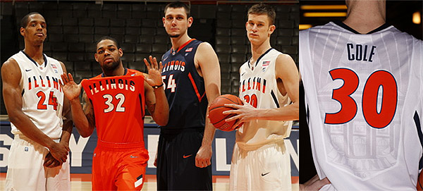
Nike-Hyper-Elite-Fighting-Illini-Basketball-Uniforms.jpg


We had an arched "Illini" recently and I quite liked this series of jerseys too, even if they don't seem to get much love
 
Status
Not open for further replies.