The Dawgfather Don James at 0:55UW Athletics posted this up.
You are using an out of date browser. It may not display this or other websites correctly.
You should upgrade or use an alternative browser.
You should upgrade or use an alternative browser.
Conference Realignment
- Status
- Not open for further replies.
Two words: Channeled Scablandseven nicer than the rolling (ahem) prairie of east central Illinois? c'mon
This is interesting because this has always been a possibility. But over the last 20 years of terrible incentives leading to cupcake scheduling, we didn't get it....But, as an Illinois and Big Ten fan, going forward I like it. Am I sad I won't get to watch UCLA and Oregon State play at 10pm local time, not really. Am I excited to have USC and Oregon come to Champaign every few years, hell yes...
Now, the schools WILL get it and they will like it!
We didn't need this clustereff to have Oregon on the schedule semi regularly.
Joel Goodson
- it's all ball bearings, nowadays
Two words: Channeled Scablands
those are really something. learned about them in an Earth's geology series a few years ago. definitely need to see them, hopefully relatively soon. lots of very interesting things to see in Washington. hopefully, including an Illini W in the not too distant future.
I’m well aware, I used to live there. But in 202? when Illinois plays at USC, the CMI-LAX flight will be sold out.I have been to South Bend for a USC/ND game. USC fans will just fly their chartered jets to Champaign and skip O’hare.
altgeld88
- Arlington, Virginia
Yes they are. Still wearing mine from '88:My 16 & 20 year old girls are still wearing my Champion reverse weave sweatshirts from the the late 80’s. Those things are bulletproof.
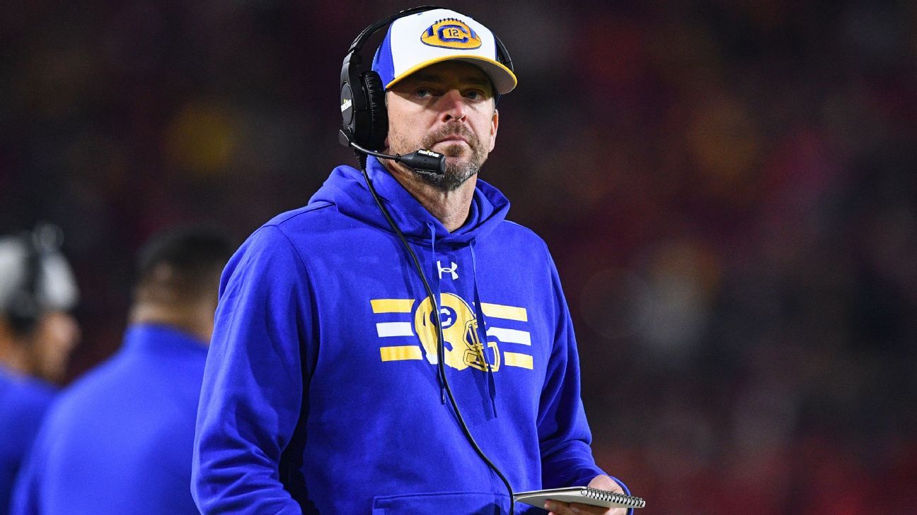
Cal's Wilcox: Pac-12 exits 'sad,' likely preventable
Cal football coach Justin Wilcox, who played in the Pac-10 and has spent much of his career in the Pac-12, called the recent departures of five teams to other conferences "shocking, "sad" and likely preventable.
Given that the olden days are completely over, I kinda like that idea. Relegation would add a whole different level of excitement.This column by Sullivan sounds like a terrible idea that i hope never gains traction. I would cease to be a college football fan.
Illini in Italy
- Illini HQ, Florida Panhandle
FIFYCollege football is going to be dead.
The Big Ten is going to be dead.
The University of Illinois is going to be fine.


BZuppke
- Plainfield
Yes. If you’re going NFL lite then you’ll eventually go all in and the quality of your organization will be more important than your history.Doesn't all this lead to player contracts, salary caps & a union?
Doesn't this all just lead to the NFL system, but with maybe 64 teams?
Parity is good for the sports business. Spread out the SEC teams. Spread out the talent somewhat equally across the college football league.
Or does college football slowly turn into a southern NASCAR thing?
mattcoldagelli
- Script Illinois Enthusiast
Are you saying this as a negative?Yes. If you’re going NFL lite then you’ll eventually go all in and the quality of your organization will be more important than your history.
ChiefGritty
- Chicago, IL
Yes. If you’re going NFL lite then you’ll eventually go all in and the quality of your organization will be more important than your history.
I don't think I understand what he's saying.Are you saying this as a negative?
Remember the days when the big complaint was too many bowl games?
Feels like this is pretty close to a football basketball split.This column by Sullivan sounds like a terrible idea that i hope never gains traction. I would cease to be a college football fan.
ChiefGritty
- Chicago, IL
Lol those dots are pretty far off in a couple of cases.For nostalgics like me, the BT logo of my youth in the '70s & '80s [EDIT: when those damned Spartans joined in the '50s it just threw everything off-kilter]
View attachment 27636
altgeld88
- Arlington, Virginia
I noticed that, too. They're all off by the same amount. It's like a slightly-misplaced transparency overlay. Shift all of them up a wee bit to the same degree and it's perfect.Lol those dots are pretty far off in a couple of cases.
In any event, it's allowing the best be the enemy of the good. It's such a better logo than the Big-Televen one of the '90s after PSU joined.
mattcoldagelli
- Script Illinois Enthusiast
In any event, it's allowing the best be the enemy of the good. It's such a better logo than the Big-Televen one of the '90s after PSU joined.
False. Big Televen was great - I'm a sucker for anyone creatively using negative space.
altgeld88
- Arlington, Virginia
I agree regarding the use of negative space. The logos ringing it, however, are twee, and on its own the block Televen is dull save for that embedded "11." The original one was relatively much better (for its time.) Thank goodness the Big Televen one was developed before the late '90s and the age of the ubiquitous "logo swoosh."False. Big Televen was great - I'm a sucker for anyone creatively using negative space.
In addition, the Illinois, OSU, and NW logos of that period were awful.
It's Chicago, for goodness sake, a center of great creative advertising. They could have done better.
mattcoldagelli
- Script Illinois Enthusiast
But you're criticizing the individual school logos. I don't think anyone ever thought of what you have there as "the Big Ten logo" - that's "the Big Ten logo with the logos of the member schools surrounding it."I agree regarding the use of negative space. The logos ringing it, however, are twee, and on its own the block Televen is dull save for that embedded "11." The original one was relatively much better (for its time.) Thank goodness the Big Televen one was developed before the late '90s and the age of the ubiquitous "logo swoosh."
In addition, the Illinois, OSU, and NW logos of that period were awful.
It's Chicago, for goodness sake, a center of great creative advertising. They could have done better.
Separate from that, yeesh was "Block I w/ slant Illinois" bad. Easily #11 out of 11 in that group.
ChiefGritty
- Chicago, IL
Oh, I dunno if I'd let "S stands for State" off that easily.Separate from that, yeesh was "Block I w/ slant Illinois" bad. Easily #11 out of 11 in that group.
altgeld88
- Arlington, Virginia
I was criticizing the choice to use those logos on the periphery of the block Televen. The union is poor. I like the current B1G logo, frankly. Pretty good for what it is. Succinct and somewhat elegant.But you're criticizing the individual school logos. I don't think anyone ever thought of what you have there as "the Big Ten logo" - that's "the Big Ten logo with the logos of the member schools surrounding it."
Separate from that, yeesh was "Block I w/ slant Illinois" bad. Easily #11 out of 11 in that group.
Speaking of that terrible slant Illinois and block "I", I never understood why we resisted using a simple, classic block I after the chief logo (my all-time favorite) was taken off the table. Also, why OSU moved away from the block "O" and NW inserted the cat head in what is a fairly cool block "N" was a mystery. I look at those three now and they're hideously dated (and hideous).
I get chills (of horror) looking at that Illinois logo. I still have a pair of gym shorts I picked up at IUB in 2000 (on clearance, which says something) with the slant ILLINOIS across a basketball. I can live with that more than I can the imposition of the Block "I" beneath. TBF, they've worn well over 23 years! Good value.
Last edited:
- Status
- Not open for further replies.