I'd love to see the return of the white and blue Flyin' Illini jerseys as well. We'd easily have the best uniform set in all of CBB with that throwback set + the script jersey.
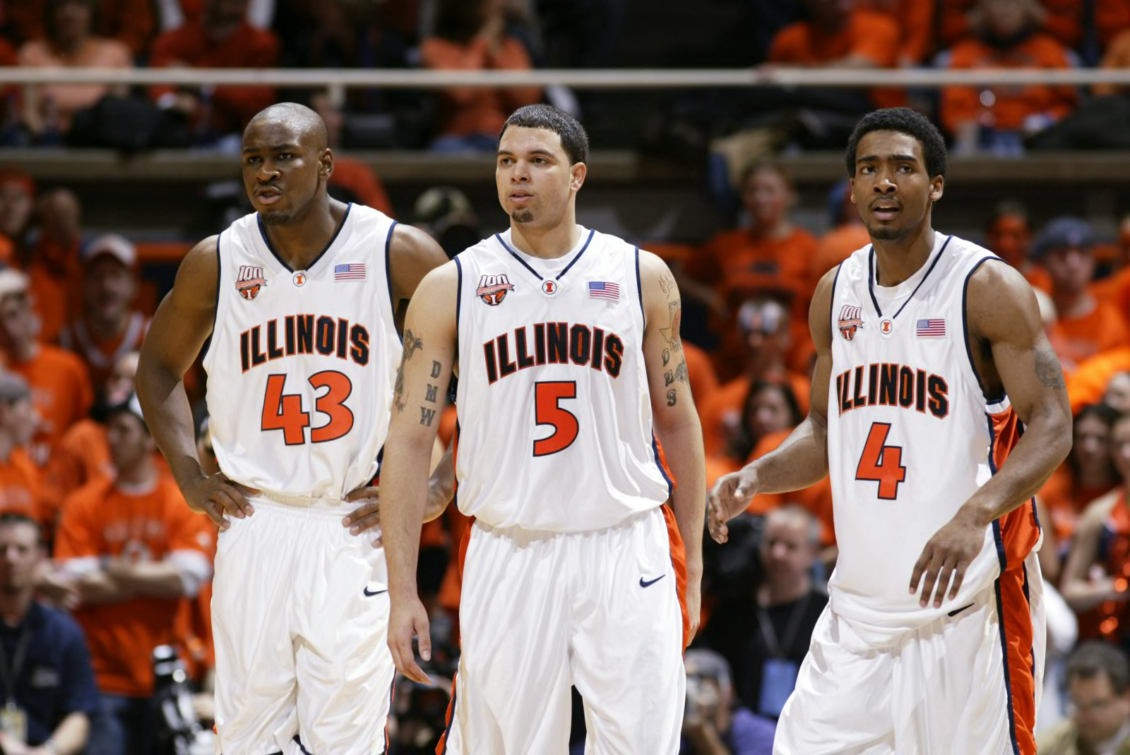
Amen. What's weird is that during the Groce years, we DID have a white Flyin' Illini throwback jersey, and we have not worn it in several years. For example, we were wearing these during Rice's famous buzzer beater to win Braggin' Rights. I have no idea why we don't just rock with these jerseys 100% of the time ... we can just alternate between the two styles and do something a bit different compared to other programs! It would help us stand out in a legitimately cool way.
Home A
Home B
Away A
Away B
Alternate A (Someone with photoshop skills can have at this one! Lol...)
Alternate B
Alternates for Next Season (Used sparingly for huge games and maybe the NCAA Tournament)
Maybe a controversial take but our "rebrand" blues are the best uniforms of that set:
Would be perfectly happy to live in a world where our white is The Script, orange is Flyin' Illini, and blue is this.
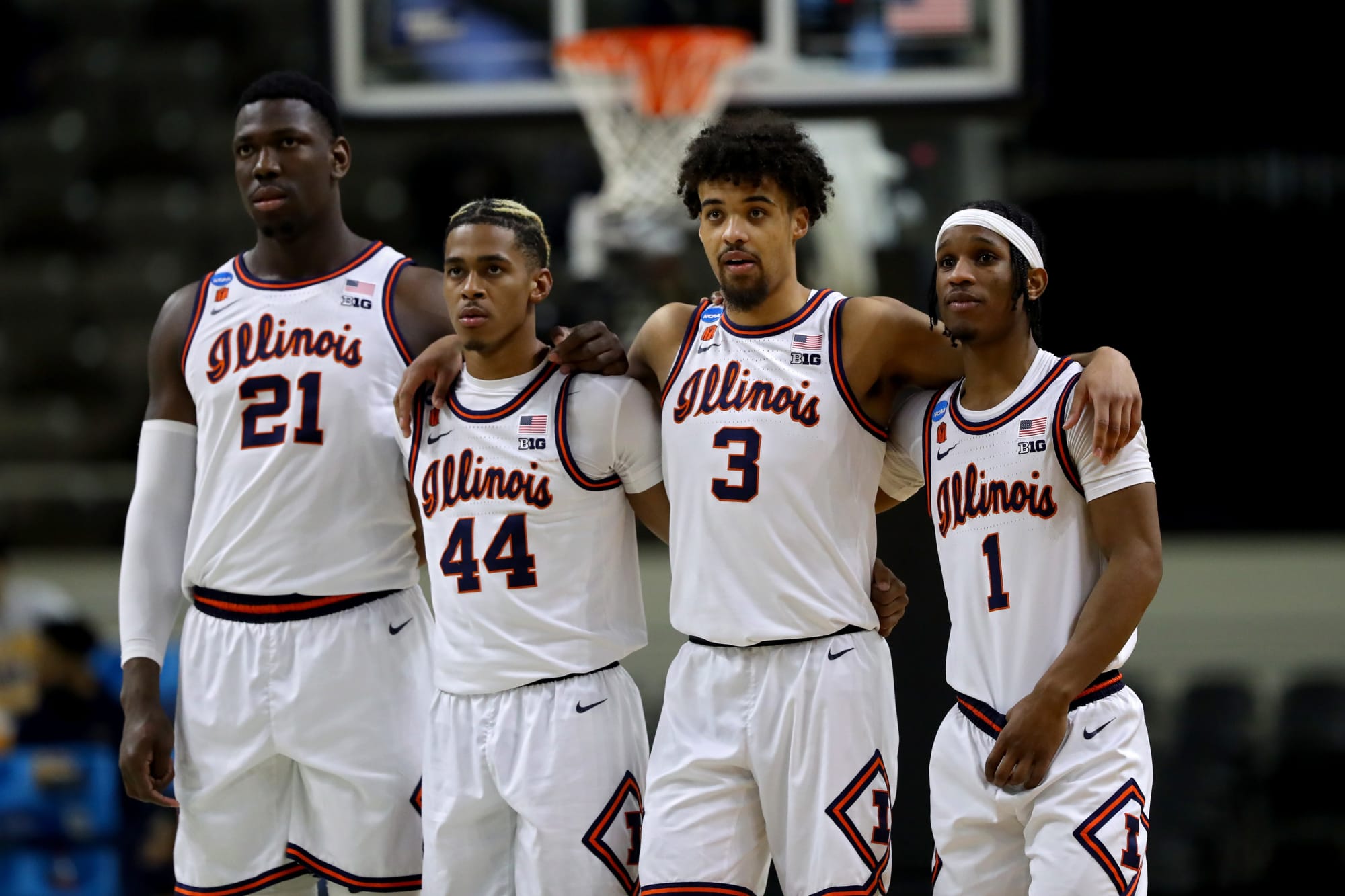
I hope that is not controversial! The orange and white versions suffer from my issue with the previous football set ... we utilize orange on white or white on orange with zero blue, and it looks like we just didn't really care how they turned out. So, we end up using only one of our primary colors and white ... and it looks stupid, IMO. Also, the font for "
1LL1NO1S" just looks too small on our default basketball jerseys! With the navy versions, you at least correct those two issues, as we have orange on blue, and having it say "FIGHTING" and "ILLINI" at least fills up more of the jersey.
I agree and it's really not close. Only uniform that used the stupid format Nike used from the Lovie football team gave us and did something interesting with it.
What's really perplexing is that the women have an infinitely better color/font scheme than the men with our default jerseys:
Just using both of our colors in ANY way (whether that is an outline, actually using both colors for fonts, etc.) just makes it look so much less cheap. Again, I am a broken record here ... but our Lovie Era aesthetic combined being minimalist and being modern to make a look that just looked boring and bad, lol.


/cdn.vox-cdn.com/uploads/chorus_image/image/45522290/usa-today-8336956.0.jpg)
/cdn.vox-cdn.com/uploads/chorus_image/image/68902648/usa_today_15658736.0.jpg)