rebrand uni's
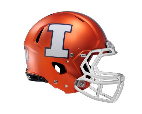
I realize the product on the field is the most important thing, but our uni's (especially the helmets) just don't do it for me. I'm really hoping Josh Whitman has something else in mind in the near future. I'm probably in the minority here but really dislike the block I and matte finish on the helmets. Very few teams have the matte finish that I see, just looks like primer.
I'd like to go back to gloss finish and newer Illinois logo spelled out on the sides.
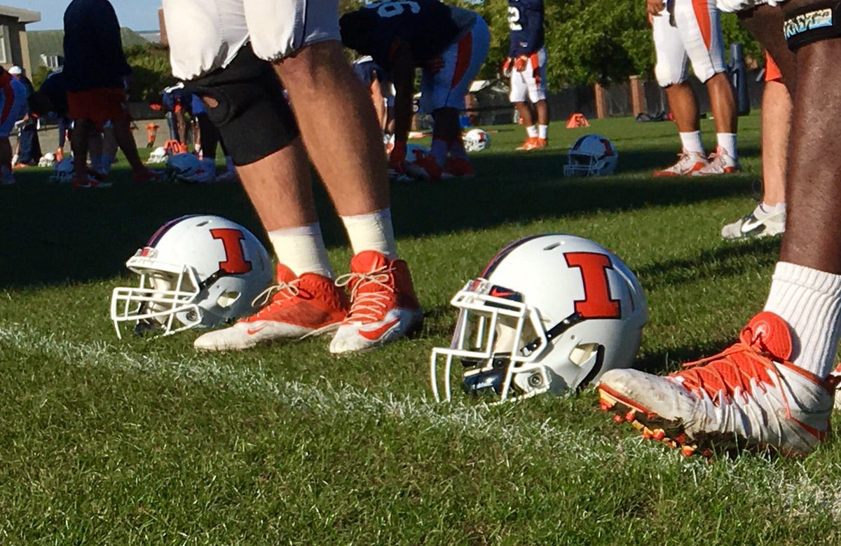
 logo on the side of our helmets.


 is on straight,