mattcoldagelli
- Script Illinois Enthusiast
Coming up with distinctive, helmet-ready logo (The Shield) and then never attempting to put it on the helmet is such an Illinois outcome I feel silly for assuming it would ever be any different.
The I is about the most boring letter possible. The fact that Nike came up with such a distinct, new-yet-traditional-looking logo for us is really a huge accomplishment. Think about it. We gave them an I and an undefined "fighting illini" team name to work with. Then of course we decide to just throw it away for the Block I, of which we now have 2 different versions (football and basketball) that still get mixed up with old block I's of the past 30 years. It's just such an embarrassment and probably the exact opposite of how you would want to actually market and create an identity.Coming up with distinctive, helmet-ready logo (The Shield) and then never attempting to put it on the helmet is such an Illinois outcome I feel silly for assuming it would ever be any different.
Just imagine the Clemson helmet, with the shield in place of the paw (and of course navy instead of purple striping). Tell me that wouldn't be a beautiful helmet.Coming up with distinctive, helmet-ready logo (The Shield) and then never attempting to put it on the helmet is such an Illinois outcome I feel silly for assuming it would ever be any different.
Yeah this is really underappreciated. Nike had an impossible task (make it classic and timeless, except all of the historical record you're working with either has Native American imagery which you can't use, or an interlocking U and I which you can't use because of Indiana) and they knocked it out of the park.The fact that Nike came up with such a distinct, new-yet-traditional-looking logo for us is really a huge accomplishment.
I just want to see the block I on the back of the helmet, much like what Oregon has done. Open to other ideas for the sides.View attachment 6917
 LLIN
LLIN around the back (e.g. take our current helmets with the block I's where they are and from left to right around the back connect them with the middle letters)?
Weirdly, the shield wasn't super prominent on the uniforms from the rebrand. It was on the football collar, and I believe the basketball shorts waistband, but the 2 biggest logo areas in football and basketball, the helmet, and the side of the shorts, both had block I's. It's like they never wanted to use it. If I had any sort of design skill, I'd put something together. I think if you made the shield front and center, you could market the school and teams so much better. They'd have an identity. Even now, if you consider the Block I their identity, there's still countless versions of it being used. There's no uniformity. I'd put the shield on the helmet, mid-field, mid-court, sides of the shorts. I'd use the new typefont but with the outline colors, no single tone. I'd standardize the striping similar to the original rebrand helmets and the current basketball uniforms. It seems like there's nobody that has any idea about marketing or branding in our athletic department.Yeah this is really underappreciated. Nike had an impossible task (make it classic and timeless, except all of the historical record you're working with either has Native American imagery which you can't use, or an interlocking U and I which you can't use because of Indiana) and they knocked it out of the park.
But nothing Nike could have done stood a chance up against:
1. Being coded as the hip new thing to appeal to recruits, as against the preferences of the Army of Peoria Dads
2. The association with Mike Thomas
3. The absolutely pathetic performance of our two revenue sport teams following the rollout of the rebrand stuff
Now, the rebrand font, which is an immeasurably worse job and worse product by Nike has survived and will continue because it wasn't given anything to compete against. But the Shield and the Block I were pitted against one another, with the barely hidden subtext that going full-Shield in the snap of the fingers in 2014 felt like too big of a shock to the system, but they were confident the Shield would quickly out-compete the Block I and leave it in the dustbin of history. A miscalculation, in retrospect.
If the Shield would have been rolled out as "the new Block I" in April 2016 by Whitman and Lovie, there would be a giant sticker of it on the bumper of every single Illini fan who ever spoke ill of it. That's what's so frustrating. It could have had a 100% approval rating, but because flukes of circumstances swept it up into the broader culture war, we now have to have subpar branding for the rest of my life.Yeah this is really underappreciated. Nike had an impossible task (make it classic and timeless, except all of the historical record you're working with either has Native American imagery which you can't use, or an interlocking U and I which you can't use because of Indiana) and they knocked it out of the park.
But nothing Nike could have done stood a chance up against:
1. Being coded as the hip new thing to appeal to recruits, as against the preferences of the Army of Peoria Dads
2. The association with Mike Thomas
3. The absolutely pathetic performance of our two revenue sport teams following the rollout of the rebrand stuff
Now, the rebrand font, which is an immeasurably worse job and worse product by Nike has survived and will continue because it wasn't given anything to compete against. But the Shield and the Block I were pitted against one another, with the barely hidden subtext that going full-Shield in the snap of the fingers in 2014 felt like too big of a shock to the system, but they were confident the Shield would quickly out-compete the Block I and leave it in the dustbin of history. A miscalculation, in retrospect.
The biggest problem is that it got pitted directly against the Chief when they had absolutely nothing to do with one another. They should've never redesigned the block I with that thick, curved outline. The Shield needed to be the primary logo. Then use the plain Block I that is literally the inside of the Shield as a very secondary logo.If the Shield would have been rolled out as "the new Block I" in April 2016 by Whitman and Lovie, there would be a giant sticker of it on the bumper of every single Illini fan who ever spoke ill of it. That's what's so frustrating. It could have had a 100% approval rating, but because flukes of circumstances swept it up into the broader culture war, we now have to have subpar branding for the rest of my life.
(I had let this stuff go guys, this is tearing open old wounds!)
Agreed, add in Design! Also, why do they keep using the outline of the state like it's some logo of ours? It sucks. It's lazy.Weirdly, the shield wasn't super prominent on the uniforms from the rebrand. It was on the football collar, and I believe the basketball shorts waistband, but the 2 biggest logo areas in football and basketball, the helmet, and the side of the shorts, both had block I's. It's like they never wanted to use it. If I had any sort of design skill, I'd put something together. I think if you made the shield front and center, you could market the school and teams so much better. They'd have an identity. Even now, if you consider the Block I their identity, there's still countless versions of it being used. There's no uniformity. I'd put the shield on the helmet, mid-field, mid-court, sides of the shorts. I'd use the new typefont but with the outline colors, no single tone. I'd standardize the striping similar to the original rebrand helmets and the current basketball uniforms. It seems like there's nobody that has any idea about marketing or branding in our athletic department.
Yeah. That state outline needs to go when the Shield takes over mid-field and mid-court. I will say, the outline at least looks decent on the basketball court. The football field is an abomination. A thick white outline? Also those weird block number yard markers that don't match any font we've ever used? Who put that field design together? Probably Beckman after a few too many lasagnas.Agreed, add in Design! Also, why do they keep using the outline of the state like it's some logo of ours? It sucks. It's lazy.
Implicitly, yeah, there's an aspect to the Block I that says "something else used to go here." It connotes a rejection of the idea of moving on from the Chief.The biggest problem is that it got pitted directly against the Chief

Neither does Underwood and neither does Whitman.
...Not to mention the whole Mike Thomas factor.
The Shield..., but by this point the war has probably been lost
I guess that's where we differ. I still think it can work. Seriously, if BB puts that at midfield, and on an orange helmet with white facemasks and Blue White Blue strips and we start winning. That's the clear Illini logo for the foreseeable future.Implicitly, yeah, there's an aspect to the Block I that says "something else used to go here." It connotes a rejection of the idea of moving on from the Chief.
I still stand by my take about the potential 100% approval rating for the Shield under the right circumstances, even though you make a good point.
The Shield could have been our University of Arizona logo, which is also a simple letterform that nonetheless is easily renderable in any size or context, instantly recognizable even without color cues, and even in its simplicity manages to evoke something about the place and institution it represents.
RIP to a real one

Still bothers me to no endYeah. That state outline needs to go when the Shield takes over mid-field and mid-court. I will say, the outline at least looks decent on the basketball court. The football field is an abomination. A thick white outline? Also those weird block number yard markers that don't match any font we've ever used? Who put that field design together? Probably Beckman after a few too many lasagnas.
Oh it could, sure, and I'm sure we still have all the necessary copyright and whatnot. But it has been totally buried, you basically never see it anywhere in official places or merchandise anymore. It is still on the waistband of the basketball shorts actually, but most of our guys roll their shorts down these days, so it gets hidden.I guess that's where we differ. I still think it can work. Seriously, if BB puts that at midfield, and on an orange helmet with white facemasks and Blue White Blue strips and we start winning. That's the clear Illini logo for the foreseeable future.

Looks like a pocket protector.Implicitly, yeah, there's an aspect to the Block I that says "something else used to go here." It connotes a rejection of the idea of moving on from the Chief.
I still stand by my take about the potential 100% approval rating for the Shield under the right circumstances, even though you make a good point.
The Shield could have been our University of Arizona logo, which is also a simple letterform that nonetheless is easily renderable in any size or context, instantly recognizable even without color cues, and even in its simplicity manages to evoke something about the place and institution it represents.
RIP to a real one

Ew.


It looks like a t-shirt and bikini bottom. The fact that people ask what it is should be a good indication of a bad design.
:strip_exif(true):strip_icc(true):no_upscale(true):quality(65)/arc-anglerfish-arc2-prod-gmg.s3.amazonaws.com/public/YQZNSTPF7JGQDJBBVRE2E4CJHU.jpg)





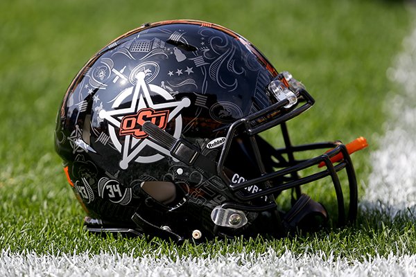
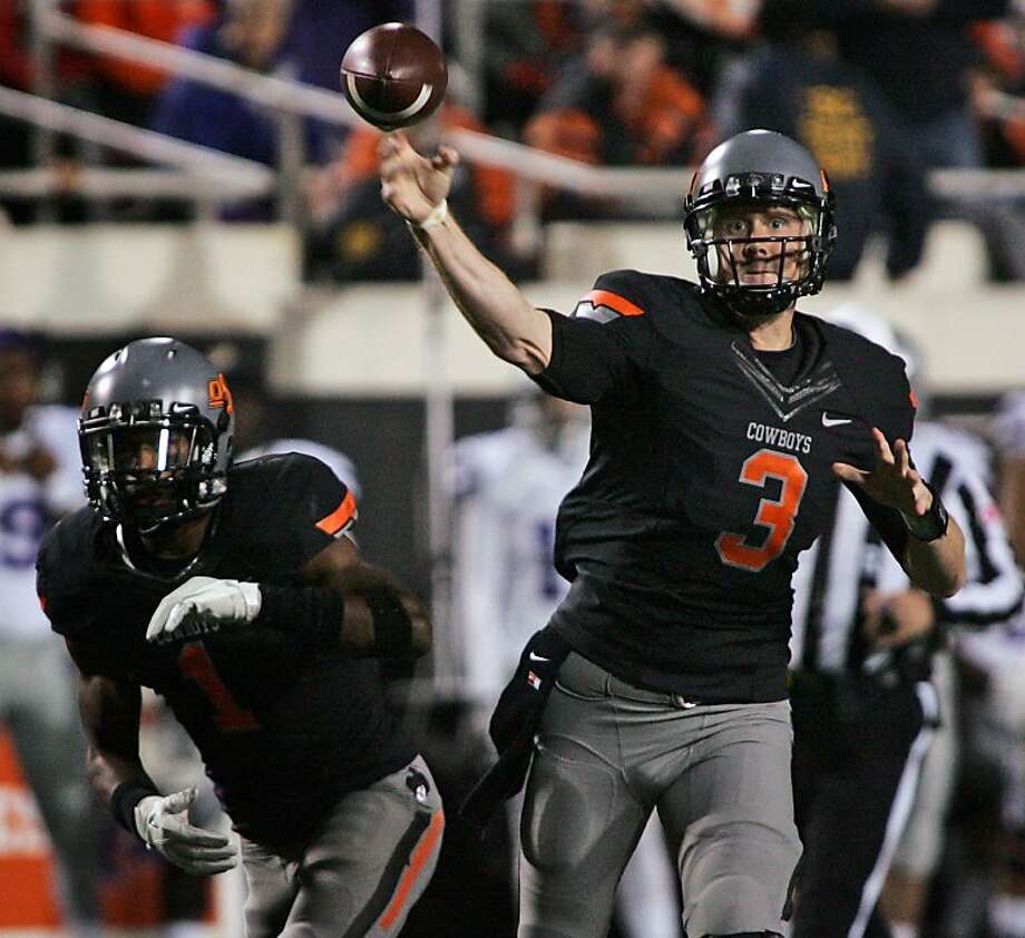

I think Richard Simmons used to wear those as shorts.It looks like a t-shirt and bikini bottom. The fact that people ask what it is should be a good indication of a bad design.
Do you reckon you could dig up the Shield that groundhogday mocked up (or perhaps others) that had some smoother/rounded edges, angles, etc.? I seem to recall liking those a bit more than the original.Implicitly, yeah, there's an aspect to the Block I that says "something else used to go here." It connotes a rejection of the idea of moving on from the Chief.
I still stand by my take about the potential 100% approval rating for the Shield under the right circumstances, even though you make a good point.
The Shield could have been our University of Arizona logo, which is also a simple letterform that nonetheless is easily renderable in any size or context, instantly recognizable even without color cues, and even in its simplicity manages to evoke something about the place and institution it represents.
RIP to a real one
