Illinois Football Uniforms

Status
Not open for further replies.
#326      
So this pains my #TeamShield heart, but the Nike rebrand can now officially be declared a failure in every way, right? I know we can zero in on some positive developments (cleaned-up Block I, the aforementioned Shield), but the goal was to stop each individual sport from doing its own separate thing, which in turn was separate from what the University as an institution was doing and now we're.....right back to doing that, in perhaps even more pronounced ways (basketball and football have maybe less in common than ever before when it comes to how they look).

I will give all of us armchair designers a bit of credit that we saw the fatal flaw - the font - from the outset, we just perhaps didn't see how quickly it would cause things to unravel. It can't be stressed enough that when we don't have much else in terms of a visual identity, the font HAS to be something that people want not just to use, but use in a lot of different ways.
I would say it's a failure as an isolated venture, but it might be good that we didn't cling to it out of a "Sunk Cost Fallacy" way of thinking. As you said, the cleaned up Block I was WAYYYYY better than what we had before ... the Block I with ILLINOIS across it looked so cheap, unimaginative and honestly kind of insecure, lol (we need to tell them it's us compared to Idaho and not even in a cool font??). However, the new font was so generic yet not classic, unimaginative yet not understated in any way. It didn't hate it at first, but when you look at the two basketball throwback fonts, they just seem so much more "alive" and creative ... it gave us an identity.

Personally, I think that last option needs to be priority 1A when it comes to any rebrand - it needs to scream that it's the Fighting Illini. Nobody OBJECTIVELY thinks Indiana's logo or Michigan's logo or Kansas' literal Times New Roman font on their jerseys is inherently cool ... it's cool because they have stuck with these things, and we immediately associate them with their schools. At this point, I am all for the script being our new thing. It's kind of "hip" yet undeniably retro, it would make us stand out against EVERYONE in the Big Ten (especially with the already-unique orange) and it's so easy to work into different sports' uniforms.

Already getting chills thinking of an O-B-O football uniform with the new shade of Orange and a white/blue script Illini on the helmet!

P.S. Regardless of rebrand, never throw our two basketball throwbacks away ... they're literal perfection, and they point out just how awful or regular jerseys are in comparison.
 
#327      
It’s funny that beauty is always in the eye of the beholder. I like the traditional O B O at home, love white pants and the greys on occasion. On the road prefer O W O but occasional all white (the most retro look) or blue pants. I hate all orange all the time. There.
I actually love our white pants, but as I have moved to Chicago and seen all of these Big Ten fan bases packing bars on Saturdays and seeing the relative lack of enthusiasm from Illini fans ... I think we need to make creating a brand and tradition top of mind. There will always be room for "special occasion" jerseys, but I have come around to supporting a "look" that we rarely deviate from. I think it's a mistake to do the Lovie move of literally randomly mixing and matching O/B/W for every third of our uniforms, lol. My personal pick would be move toward the script font and new orange and rock these:

Home: O-B-O
Away: O-W-O
vs. Northwestern: Look like the Bears!!! B-B-W at home, B-W-B on the road, B-O-W on occasion

Then make sure to keep any deviation like all Blue or all Orange for a very special occasion ... maybe have a special uniform for the Mizzou game once it's back? Either way, the point is the same ... we need an identity in a post-Chief world!

P.S. This is very hard for me in some ways, as I honestly love our White helmets from a strictly aesthetic perspective! However, a lot of teams do that, and ... it's just not us.
 
#328      

mattcoldagelli

The Transfer Portal
However, the new font was so generic yet not classic, unimaginative yet not understated in any way. It didn't hate it at first, but when you look at the two basketball throwback fonts, they just seem so much more "alive" and creative ... it gave us an identity.

It's extremely limiting to have a wordmark that only works in a straight line. The word "Illinois" is juuust long enough where that's not always going to pan out.

We've seen this play out with basketball - the overall set is so great that it's easy to just say "wow that looks a lot better" and be done with it without thinking why; one of the reasons is that the word "Illinois" can be a lot bigger because it doesn't have to run straight across the jersey:

1658254276323.jpeg
1658254292235.jpeg


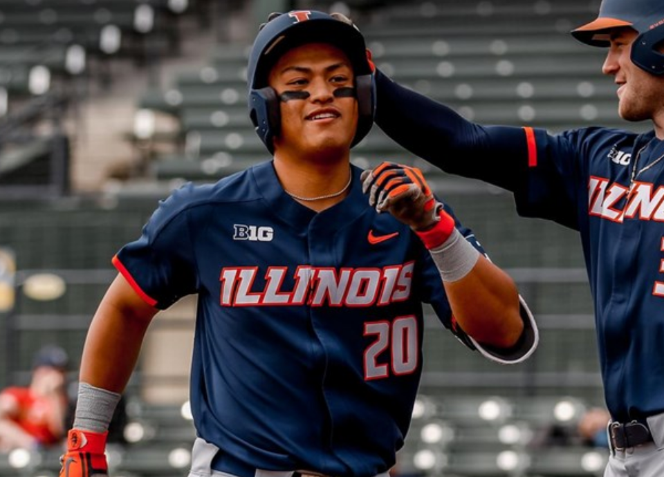
But it's applicable elsewhere, too. Let's take baseball - see how the "I" (and part of the "L") and the "S" end up creeping into the armpit area of the top? Think of how much better this would look with even a gently arched script "Illinois."

9649619.png


Two letters of length makes a big difference. Avert your eyes, but this approach works better for Mizzou (who has a similarly styled font):
1658254511587.jpeg
 
#330      
Incidentially, what's going on here is that new uniforms would have been designed for 2022 and Bielema must not have liked them, and putting something new in the pipeline pushed the time frame back a season.
Honestly, based on some Easter eggs and a healthy dose of wishful thinking, I’m thinking a Bielema/Whitman brain trust would come up with WAY better uniforms for us, so I’m glad we waited!
 
#331      
I actually love our white pants, but as I have moved to Chicago and seen all of these Big Ten fan bases packing bars on Saturdays and seeing the relative lack of enthusiasm from Illini fans ... I think we need to make creating a brand and tradition top of mind. There will always be room for "special occasion" jerseys, but I have come around to supporting a "look" that we rarely deviate from. I think it's a mistake to do the Lovie move of literally randomly mixing and matching O/B/W for every third of our uniforms, lol. My personal pick would be move toward the script font and new orange and rock these:

Home: O-B-O
Away: O-W-O
vs. Northwestern: Look like the Bears!!! B-B-W at home, B-W-B on the road, B-O-W on occasion

Then make sure to keep any deviation like all Blue or all Orange for a very special occasion ... maybe have a special uniform for the Mizzou game once it's back? Either way, the point is the same ... we need an identity in a post-Chief world!

P.S. This is very hard for me in some ways, as I honestly love our White helmets from a strictly aesthetic perspective! However, a lot of teams do that, and ... it's just not us.
Why not just mimic the bears uniforms. They are classically cool.
 
#333      
Why not just mimic the bears uniforms. They are classically cool.
I think vs. NU is enough of a “point” to make. One thing Beckman had right was touting the uniqueness of us having orange within the Big Ten. I think he overdid it, of course, lol … but the Bears are a bit too navy and white focused for the Illini, IMO.
 
#336      
It's extremely limiting to have a wordmark that only works in a straight line. The word "Illinois" is juuust long enough where that's not always going to pan out.

We've seen this play out with basketball - the overall set is so great that it's easy to just say "wow that looks a lot better" and be done with it without thinking why; one of the reasons is that the word "Illinois" can be a lot bigger because it doesn't have to run straight across the jersey:

View attachment 18903 View attachment 18904

But it's applicable elsewhere, too. Let's take baseball - see how the "I" (and part of the "L") and the "S" end up creeping into the armpit area of the top? Think of how much better this would look with even a gently arched script "Illinois."

9649619.png


Two letters of length makes a big difference. Avert your eyes, but this approach works better for Mizzou (who has a similarly styled font):
View attachment 18905
Yes, we seemed to have accomplished this back in the early 2000’s with basketball

05DD915D-8336-4BAC-B152-DC315C33D272.jpeg


Those we’re my second choice for best Illinois basketball jerseys. My favorites were, and always be

B30631D8-18BC-41A3-9DC0-E53CE8E64DE6.jpeg


Yes, I’m old school, and I am not a fan of the script font at all. For football, I’m good with the block I on the helmet. It’s certainly better than the slant Illinois decal from my time on campus.
 
#339      
So this pains my #TeamShield heart, but the Nike rebrand can now officially be declared a failure in every way, right? I know we can zero in on some positive developments (cleaned-up Block I, the aforementioned Shield), but the goal was to stop each individual sport from doing its own separate thing, which in turn was separate from what the University as an institution was doing and now we're.....right back to doing that, in perhaps even more pronounced ways (basketball and football have maybe less in common than ever before when it comes to how they look).

I will give all of us armchair designers a bit of credit that we saw the fatal flaw - the font - from the outset, we just perhaps didn't see how quickly it would cause things to unravel. It can't be stressed enough that when we don't have much else in terms of a visual identity, the font HAS to be something that people want not just to use, but use in a lot of different ways.
I maintain that those first football uniforms and even the ones we have now are pretty solid. But yeah the font sucked then and now. It seems pretty clear we are going 70's era now and we probably owe a lot of that to the script throwbacks being the most popular uniform we've had in a long time. My guess if the football uniforms will look a little more 70's era as well.
 
#340      

redwingillini11

White and Sixth
North Aurora
NY Giants are bringing back Giants throwback helmets for two games this season. I’m just saying…..

#90sNostalgia
 
#341      
So this pains my #TeamShield heart, but the Nike rebrand can now officially be declared a failure in every way, right? I know we can zero in on some positive developments (cleaned-up Block I, the aforementioned Shield), but the goal was to stop each individual sport from doing its own separate thing, which in turn was separate from what the University as an institution was doing and now we're.....right back to doing that, in perhaps even more pronounced ways (basketball and football have maybe less in common than ever before when it comes to how they look).

I will give all of us armchair designers a bit of credit that we saw the fatal flaw - the font - from the outset, we just perhaps didn't see how quickly it would cause things to unravel. It can't be stressed enough that when we don't have much else in terms of a visual identity, the font HAS to be something that people want not just to use, but use in a lot of different ways.

#TeamShield :(

I think the cleaned up Block I was a success. Hopefully it doesn't change again and the orange color just changes without them telling anyone about it if that is the way it is going.
 
#343      
The script font on the hoops jerseys ended in March 1980. The block "FIGHTING ILLINI" bracketing the numerals began in November 1980. So... "ancient" and "old" abutted each other in the summer of 1980. Got it. ;):unsure::ROFLMAO:
So Gen-Xers are ancient and Millennials are merely old. Sounds about right.
 
#349      
View attachment 18918
Was going down a university beer google rabbit hole, and found the Illini inspired one from 1983 complete with our football schedule. Gotta say, I really dig the ILLINI font here.
Yeah, the font is nice, but what’s really awesome is one of the all time great symbols. Too bad the freaking pantywastes that run the university cried and made Chief go away.
 
Status
Not open for further replies.