ChiefGritty
- Chicago, IL
So like, is this where we're heading? Seems like an open secret at this point?
I would absolutely love that to be the new helmet decal.
So like, is this where we're heading? Seems like an open secret at this point?
So like, is this where we're heading? Seems like an open secret at this point?

A thousand monkeys sitting at a thousand drafting tables drawing “Illini” logos for a thousand years could not come up with a better helmet+everything-else design than this.
So like, is this where we're heading? Seems like an open secret at this point?
I'm assuming you prefer the top (old) one. Please tell me you prefer the old one.Compared to our current logo it’s the difference between this
View attachment 22873
and this
View attachment 22874
The hoops jersey script Illinois looks WAY better, that looks really funky and I cannot imagine it on a helmet. Kinda looks like 'LLLini'
Wait, I thought you liked it? Because this is a pretty dang good analogy, and the eMb/elb (or ello, if you're me) - while iconic in its own way - is not good.Compared to our current logo it’s the difference between this
View attachment 22873
and this
View attachment 22874
Right, it’s great.the eMb/elb (or ello, if you're me) - while iconic in its own way - is not good.
Agree here 100% on the script being better than the block I, and I think a script 'Illini' would be amazing, as long as the 'ILL' and 'INI' were not such different sizes on a helmet.It's because the ini is too tiny compared to the ILL. I think if they adjusted that and made the tail on the I stand out more, it'd be better.
That being said, it's better than the block I and I think it'll look great on a helmet
^^^ It remains my favorite sports logo of all time.Right, it’s great.
Blackhawks, Nordiques, and Devils logos are pretty sweet, too. NHL has the best logos IMO.Oh those Expos jerseys (the newer one) are just cream of the crop.
Whalers sweaters are right there too.
Blackhawks and Mapleleafs are my all time favorite logos in any sport.Blackhawks, Nordiques, and Devils logos are pretty sweet, too. NHL has the best logos IMO.
I was an ardent Whalers (WHA) fan in my youth in the '70s. Their pre-NHL jerseys just rocked:Oh those Expos jerseys (the newer one) are just cream of the crop.
Whalers sweaters are right there too.
A thousand monkeys sitting at a thousand drafting tables drawing “Illini” logos for a thousand years could not come up with a better helmet+everything-else design than this.
It’s the best we could ever possibly do.
Please green light. Please.

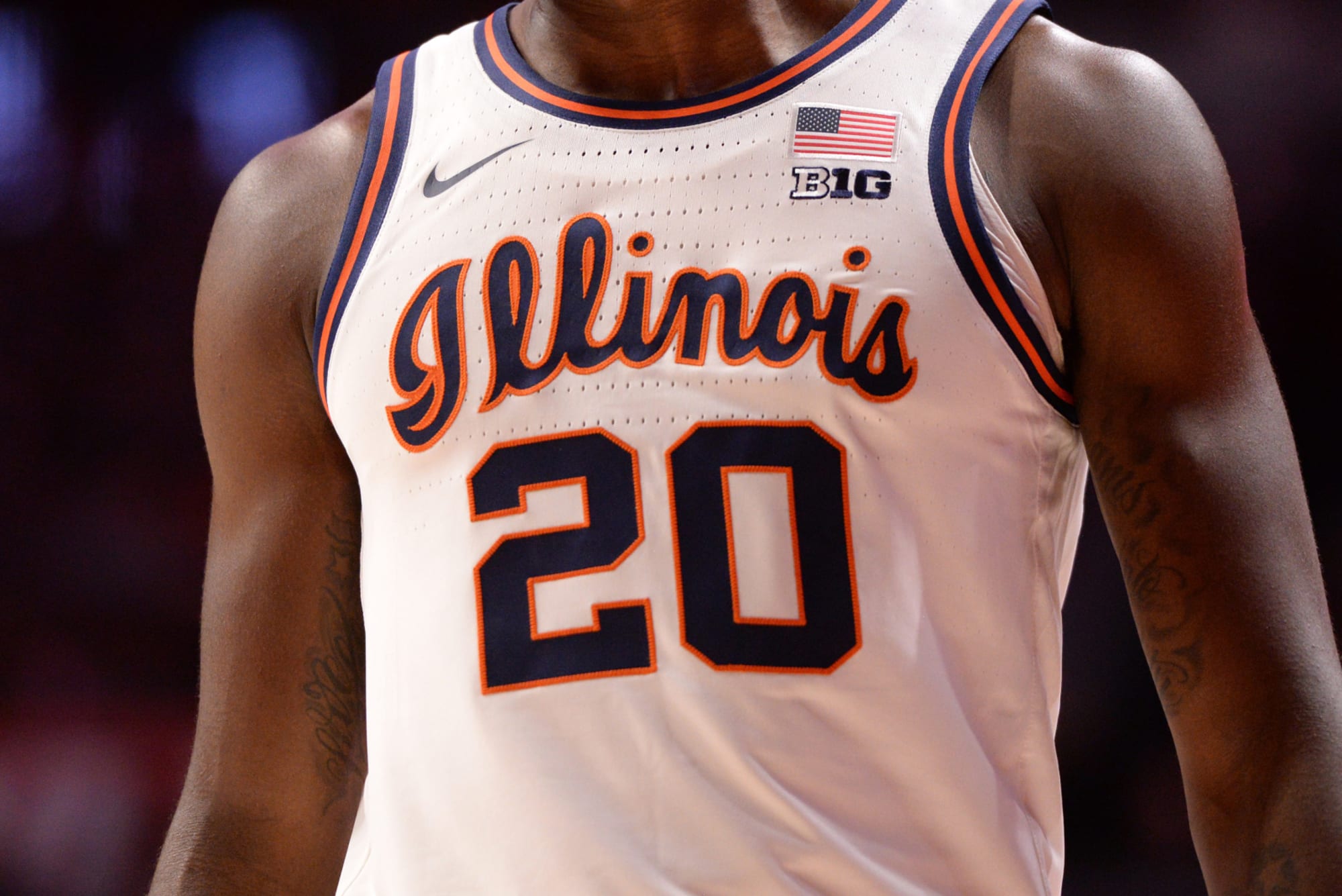
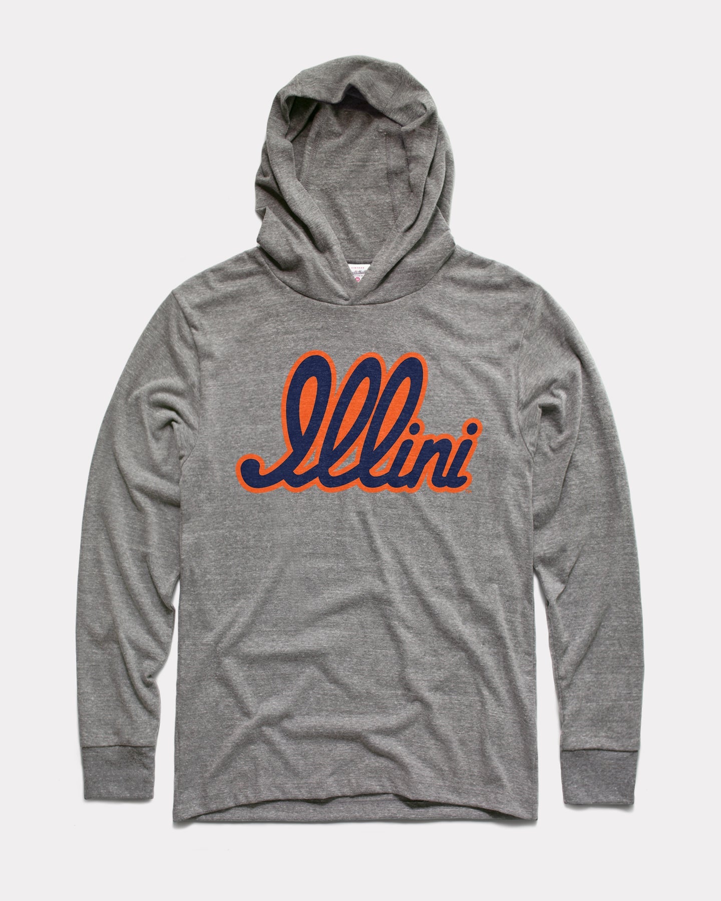
Yep bball version way better.I like the script, but am I the only one who thinks the basketball version looks a bit cleaner/better? You could just spell "Illini" instead to shorten it for the helmet:
I think consistency between sports with that badass script (on the basketball jerseys) would be great!
EDIT: Someone beat me to it, glad I'm not alone!
yea, that is kind of how I recall it.I thought BB made it clear that the helmets we wore this year were going to be the helmet of the future. He came up with (or strongly endorsed) the design.