You are using an out of date browser. It may not display this or other websites correctly.
You should upgrade or use an alternative browser.
You should upgrade or use an alternative browser.
Illinois Football Uniforms
- Status
- Not open for further replies.
Fighter of the Nightman
- Chicago, IL
I see a very small but important difference that "makes or breaks" this style for me, personally. In the previous photo from the Senior Bowl, we have our lighter color (white) surrounding our darker color (blue), whereas in this photo it is the opposite (darker purple surrounding lighter gold). If we are going to do those three stripes, I think the white has to be in the middle and the blue has to be on the outside.From the recruiting thread- similar style?
I wouldn’t rule it out, but I doubt it. Bielema departed from the blue-white-blue helmet stripe in favor of a white-blue-white one. No reason to think he did that unintentionally. Flipping the stripes within one uniform set on the same background color is a Cardinal sin.I see a very small but important difference that "makes or breaks" this style for me, personally. In the previous photo from the Senior Bowl, we have our lighter color (white) surrounding our darker color (blue), whereas in this photo it is the opposite (darker purple surrounding lighter gold). If we are going to do those three stripes, I think the white has to be in the middle and the blue has to be on the outside.
mattcoldagelli
- Script Illinois Enthusiast
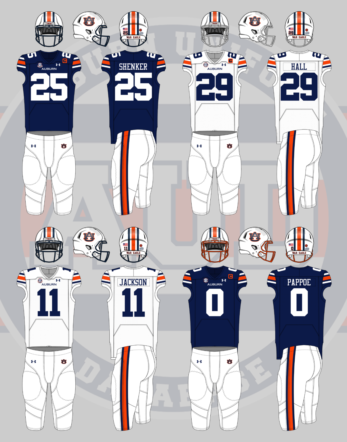
If you're looking for the GOAT when it comes to striping consistency (and in orange and blue, no less), then War Eagle, my frent:I see a very small but important difference that "makes or breaks" this style for me, personally. In the previous photo from the Senior Bowl, we have our lighter color (white) surrounding our darker color (blue), whereas in this photo it is the opposite (darker purple surrounding lighter gold). If we are going to do those three stripes, I think the white has to be in the middle and the blue has to be on the outside.
redwingillini11
White and Sixth
- Batavia
Auburns uniforms are absolutely perfect. If we could do the same thing but with an orange helmet and orange pants I think we’d have a timeless look. Hopefully these “patriots color rush” uniforms are equally clean.If you're looking for the GOAT when it comes to striping consistency (and in orange and blue, no less), then War Eagle, my frent:
For some reason I so irrationally hate what Bret did with the helmet stripe. Putting the two lighter colors next to each other with the darker one in the middle is a bad look. I'm no graphic designer but you'd think you'd want to go light/dark/light.
GrayGhost77
- Centennial, CO
Yep. Auburn uses the blue and white as their primary on their unis and orange as more of the accent color, so if we could incorporate more orange into something like this, as well use the BlockIf you're looking for the GOAT when it comes to striping consistency (and in orange and blue, no less), then War Eagle, my frent:
 (or
(or  ), then I think we'd really have something that could be classic and timeless.
ChiefGritty
- Chicago, IL
Auburns uniforms are absolutely perfect. If we could do the same thing but with an orange helmet and orange pants I think we’d have a timeless look.
It's hard to make universally applicable statements, different designs do different things and it's all about the whole package adding up. But it does seem like all-white numbers is a key to making orange and blue work. White facemasks and white numbers make everything else there pop.
Last edited:
For some reason I so irrationally hate what Bret did with the helmet stripe. Putting the two lighter colors next to each other with the darker one in the middle is a bad look. I'm no graphic designer but you'd think you'd want to go light/dark/light.
I prefer the current helmet stripe to this one.
It's hard to make universally applicable statements, different designs do different things and it's all about the whole package adding up. But it does seem like all-white numbers is a key to making orange and blue work. White facemasks and white numbers make everything else there pop.
Auburn unis are tight/ classic look, without being crazy.Auburns uniforms are absolutely perfect. If we could do the same thing but with an orange helmet and orange pants I think we’d have a timeless look. Hopefully these “patriots color rush” uniforms are equally clean.
For the Illini--- stripes on the shoulders, numbers on the sleeves, with a good number size/ square font (past uni numbers have looked too small, and not fond of the current script), and we'll be set.
Haven't thought about pants- white/ white storm trooper look, or, orange pants. Though, I always liked the white jersey/ blue pant combo. Throw in an orange jersey/ or Butkus-era blue jersey/ orange numbers as alternates.
Here is my unprofessional attempt at an orange uniform with all white numbers and shoulder stripes...google search and paint.

BZuppke
- Plainfield
As I’ve often said uniform design, like beauty, is in the eye of the beholder. For me it’s orange lids with the block I, blue jerseys with orange numbers (we have history with this going back a long time) and blue pants. Occasionally white pants with orange or orange and blue stripes. White roadies (a BB favorite it seems) with orange helmets and occasionally blue or orange pants. Never all orange and never all blue (even though I liked them in the eighties). Stripes on the jerseys, helmet stripes and accent colors are fine details best worked out by the professionals.
As to Nike - they have every reason to do their best. I think we’ll be pleased with the final product.
As to Nike - they have every reason to do their best. I think we’ll be pleased with the final product.
The high school I work at is navy, orange and white. The first order of business our new football coach made for this year was these exact uniforms with our logo. They are considered the gold standard by many in the football world with this color scheme apparently. And as they say, imitation is the sincerest form of flattery.If you're looking for the GOAT when it comes to striping consistency (and in orange and blue, no less), then War Eagle, my frent:
I hope the goal is to not look anything like Syracuse!!!!!!!! That is all.
If one more person makes a “don’t look like Syracuse” comment I’m gonna lose it.
We have the same color palette and both teams consistently aim for what’s “on-trend.” Until Illinois goes with something completely unique, you’re gonna look like some other orange and blue team. It’s just gonna happen.
We have the same color palette and both teams consistently aim for what’s “on-trend.” Until Illinois goes with something completely unique, you’re gonna look like some other orange and blue team. It’s just gonna happen.
Completely agree.If one more person makes a “don’t look like Syracuse” comment I’m gonna lose it.
We have the same color palette and both teams consistently aim for what’s “on-trend.” Until Illinois goes with something completely unique, you’re gonna look like some other orange and blue team. It’s just gonna happen.
I just hope we don’t look like Florida.
/s

Krombopulos_Michael
- Aurora, Illinois (that’s a suburb of Chicago)
If one more person makes a “don’t look like Syracuse” comment I’m gonna lose it.
We have the same color palette and both teams consistently aim for what’s “on-trend.” Until Illinois goes with something completely unique, you’re gonna look like some other orange and blue team. It’s just gonna happen.

Start losing it then. I would suggest that whomever is designing the unis to do a great job then! A lame I on the side of a helmet is boring as an S. Go unique then or go retro. The design team at NIKE should have the talent for either shouldn't they?If one more person makes a “don’t look like Syracuse” comment I’m gonna lose it.
We have the same color palette and both teams consistently aim for what’s “on-trend.” Until Illinois goes with something completely unique, you’re gonna look like some other orange and blue team. It’s just gonna happen.
Fighter of the Nightman
- Chicago, IL
Couple random thoughts on a slow day:
(1) I hate orange jerseys for football. I am all for our crowds being orange and basketball wearing orange, but I'm sorry ... it just ain't it for football. Maybe bust 'em out even less sparingly than the Bears do for a "special game," but I think the O/B/O look is just so clean and classic that we should lean into it.
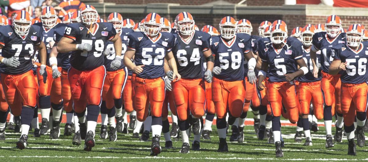
(2) Obviously I don't really want to just copy another school, but at this point I would more or less take the Auburn uniforms with white and orange switched pretty much everywhere (besides the numbers, I could support white or orange but I'd want both to have a colored outline, JMO) in a heartbeat:
:format(jpeg)/cdn.vox-cdn.com/uploads/chorus_image/image/36784670/20131116_ajw_sr5_638.0.jpg)
(3) I'll get on my soapbox ONE more time about my weird little pet issue with uniforms, because I cannot believe how obvious it is ... when we play Northwestern, LOOK LIKE THE BEARS! B/B/W at home, B/W/B on the road and randomly B/O/W. I'm not saying to make a blue helmet or white pants a part of our usual uniform set, and I'm actually saying literally the opposite! With how obsessed NU is with marketing themselves as "Chicago's Team," it is such an easy and obvious and awesome troll to deviate so clearly from our usual uniform set to remind them that the Illini and the Bears are forever intrinsically linked.
(1) I hate orange jerseys for football. I am all for our crowds being orange and basketball wearing orange, but I'm sorry ... it just ain't it for football. Maybe bust 'em out even less sparingly than the Bears do for a "special game," but I think the O/B/O look is just so clean and classic that we should lean into it.
(2) Obviously I don't really want to just copy another school, but at this point I would more or less take the Auburn uniforms with white and orange switched pretty much everywhere (besides the numbers, I could support white or orange but I'd want both to have a colored outline, JMO) in a heartbeat:
(3) I'll get on my soapbox ONE more time about my weird little pet issue with uniforms, because I cannot believe how obvious it is ... when we play Northwestern, LOOK LIKE THE BEARS! B/B/W at home, B/W/B on the road and randomly B/O/W. I'm not saying to make a blue helmet or white pants a part of our usual uniform set, and I'm actually saying literally the opposite! With how obsessed NU is with marketing themselves as "Chicago's Team," it is such an easy and obvious and awesome troll to deviate so clearly from our usual uniform set to remind them that the Illini and the Bears are forever intrinsically linked.
Going “retro” (i.e. script fonts, conservative striping patterns, predictability) is exactly the in-style thing I’m talking about. People love Ohio State uniforms, Penn State, USC, etc. because it’s an unchanging look that has cyclically become in-style again. What’s unfortunate about right now is that creating a retro look without having the timeless classic history behind it will feel very generic and - very likely - will roll out concurrently with changes from Syracuse or whomever the hell that make them look similar again.Start losing it then. I would suggest that whomever is designing the unis to do a great job then! A lame I on the side of a helmet is boring as an S. Go unique then or go retro. The design team at NIKE should have the talent for either shouldn't they?
There’s only one answer to nailing the “timeless classic” look for Illinois. Take the Kurt Kittner uniforms (think tri-colored collar and sleeves, jumbo mono-color numbers and orange pants on orange helmets and you’ve got a winner. Those will modernize so well it’s not even funny. I don’t understand why we don’t go back to it, but it’s the only thing that would hold a timeless look while holding up to the modern day. Bret could switch to those with his current helmet and they would be absolutely immaculate.
Will we do it? Hell probably not.
Oh my I love this idea lolCouple random thoughts on a slow day:
(1) I hate orange jerseys for football. I am all for our crowds being orange and basketball wearing orange, but I'm sorry ... it just ain't it for football. Maybe bust 'em out even less sparingly than the Bears do for a "special game," but I think the O/B/O look is just so clean and classic that we should lean into it.
(2) Obviously I don't really want to just copy another school, but at this point I would more or less take the Auburn uniforms with white and orange switched pretty much everywhere (besides the numbers, I could support white or orange but I'd want both to have a colored outline, JMO) in a heartbeat:
(3) I'll get on my soapbox ONE more time about my weird little pet issue with uniforms, because I cannot believe how obvious it is ... when we play Northwestern, LOOK LIKE THE BEARS! B/B/W at home, B/W/B on the road and randomly B/O/W. I'm not saying to make a blue helmet or white pants a part of our usual uniform set, and I'm actually saying literally the opposite! With how obsessed NU is with marketing themselves as "Chicago's Team," it is such an easy and obvious and awesome troll to deviate so clearly from our usual uniform set to remind them that the Illini and the Bears are forever intrinsically linked.
- Status
- Not open for further replies.