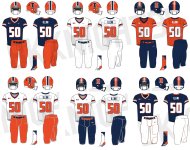
As someone who grew up, and fell in love with the Illini, in the 70s, I completely disagree. I am all in on the orange helmet, orange jersey, and white pants.Couple random thoughts on a slow day:
(1) I hate orange jerseys for football. I am all for our crowds being orange and basketball wearing orange, but I'm sorry ... it just ain't it for football. Maybe bust 'em out even less sparingly than the Bears do for a "special game," but I think the O/B/O look is just so clean and classic that we should lean into it.
(2) Obviously I don't really want to just copy another school, but at this point I would more or less take the Auburn uniforms with white and orange switched pretty much everywhere (besides the numbers, I could support white or orange but I'd want both to have a colored outline, JMO) in a heartbeat:
:format(jpeg)/cdn.vox-cdn.com/uploads/chorus_image/image/36784670/20131116_ajw_sr5_638.0.jpg)
(3) I'll get on my soapbox ONE more time about my weird little pet issue with uniforms, because I cannot believe how obvious it is ... when we play Northwestern, LOOK LIKE THE BEARS! B/B/W at home, B/W/B on the road and randomly B/O/W. I'm not saying to make a blue helmet or white pants a part of our usual uniform set, and I'm actually saying literally the opposite! With how obsessed NU is with marketing themselves as "Chicago's Team," it is such an easy and obvious and awesome troll to deviate so clearly from our usual uniform set to remind them that the Illini and the Bears are forever intrinsically linked.
You are using an out of date browser. It may not display this or other websites correctly.
You should upgrade or use an alternative browser.
You should upgrade or use an alternative browser.
Illinois Football Uniforms
- Status
- Not open for further replies.
I think that there is a better chance we do something like you bring up than the uniforms go full retro/script. My guess is there will be a throwback jersey, most likely the 70s orange jersey, but I think the actual jersey itself won't have much relation to the script. The script may tie into the time period of the throwback, but I doubt BB does anything else with it.Going “retro” (i.e. script fonts, conservative striping patterns, predictability) is exactly the in-style thing I’m talking about. People love Ohio State uniforms, Penn State, USC, etc. because it’s an unchanging look that has cyclically become in-style again. What’s unfortunate about right now is that creating a retro look without having the timeless classic history behind it will feel very generic and - very likely - will roll out concurrently with changes from Syracuse or whomever the hell that make them look similar again.
There’s only one answer to nailing the “timeless classic” look for Illinois. Take the Kurt Kittner uniforms (think tri-colored collar and sleeves, jumbo mono-color numbers and orange pants on orange helmets and you’ve got a winner. Those will modernize so well it’s not even funny. I don’t understand why we don’t go back to it, but it’s the only thing that would hold a timeless look while holding up to the modern day. Bret could switch to those with his current helmet and they would be absolutely immaculate.
Will we do it? Hell probably not.
mattcoldagelli
- Script Illinois Enthusiast
If one more person makes a “don’t look like Syracuse” comment I’m gonna lose it.
Yeah I'm with you - Syracuse is bizarrely being treated like some kind of universally recognized aesthetic touchstone. You'd think they were Oregon East and not a mostly traditional-looking team (their helmets used to be blank!) that just happens to share our colors.
Fighter of the Nightman
- Chicago, IL
I'd actually like those a lot if they had more "traditional" fonts for the numbers.I just want something like this so bad.
Lol, yeah I think "look like Syracuse" has become a stand-in for "boring, unimaginative uniform," regardless of what Syracuse' uniforms look like.Yeah I'm with you - Syracuse is bizarrely being treated like some kind of universally recognized aesthetic touchstone. You'd think they were Oregon East and not a mostly traditional-looking team (their helmets used to be blank!) that just happens to share our colors.

+1Completely agree.
I just hope we don’t look like Florida.
/s
Or Syracuse.
/s /s
I’m not a huge block i fan, however these look good. If the beloved walk out of the tunnel in these, I’d think it’d be pretty coolHere is my unprofessional attempt at an orange uniform with all white numbers and shoulder stripes...google search and paint.
View attachment 23413
The ‘I’ being blue is something I hadn’t considered
I’m like my girlfriend when we go out…. So many good options I can’t decide… but would you be able to do an ‘Illini’ in blue ?
Last edited:
Syracuse should go back to their glory days uniforms. Donavan McMabb single handedly beating Michigan/Rob Konrad (badass, look him up) to where I think late 80s were almost nat’l champs…. Maybe early 90s. Pasqualoni was coachI'd actually like those a lot if they had more "traditional" fonts for the numbers.
Lol, yeah I think "look like Syracuse" has become a stand-in for "boring, unimaginative uniform," regardless of what Syracuse' uniforms look like.
Nope looked it up. Dick MacPherson was coach of them in ‘87
Anyways, they should go back to those.
Last edited:
I have a lot of pictures from that era, not me in them though. However I could probably name half the guys in any early 70s team photo…. Look for #86 lolAs someone who grew up, and fell in love with the Illini, in the 70s, I completely disagree. I am all in on the orange helmet, orange jersey, and white pants.
Last edited:
On-field might look something like thisI just want something like this so bad.
Attachments
Shief
- Champaign Area
I could get used to that. Give me O-O-B and O-O-W as alternates for home and O-W-O, O-W-B, and all white as road options and I'll be good.On-field might look something like this
BZuppke
- Plainfield
Speaking of Dick MacPherson - it was rumored he was interested in the Illinois job when we promoted Tepper. Let’s see successful major college head coach versus untried DC. Seems like an easy call.Syracuse should go back to their glory days uniforms. Donavan McMabb single handedly beating Michigan/Rob Konrad (badass, look him up) to where I think late 80s were almost nat’l champs…. Maybe early 90s. Pasqualoni was coach
Nope looked it up. Dick MacPherson was coach of them in ‘87
Anyways, they should go back to those.
redwingillini11
White and Sixth
- Batavia
Safe, but solid.On-field might look something like this
Well, the offense couldn’t have been any worse.Speaking of Dick MacPherson - it was rumored he was interested in the Illinois job when we promoted Tepper. Let’s see successful major college head coach versus untried DC. Seems like an easy call.
Nor recruiting
Except for Robert Holcombe, and I’d venture to say he wasn’t exactly a tepper recruit
Didn’t know that though. Could have been interesting… I think macpherson ran the option though, which was dying out by that point.
Last edited:
TentakilRex
- Land O Insects between Quincy-Macomb-Jacksonville
Random thoughts while watching Illini baseball
1. The baseball has an anthracite (very dark gray) jersey. Not the best look, especially with navy letters. Stick with light gray for football, baeeball, etc
2. If the gray ghost jerseys were too unconventional for you, imagine a football version of this jersey they wore last year. (Yeah this is bit much for me, I know peacock blue was a thing in MLB during the 70s, but this might be a little too crazy).
I like that jersey, I just hate the 1LL1N015Random thoughts while watching Illini baseball
1. The baseball has an anthracite (very dark gray) jersey. Not the best look, especially with navy letters. Stick with light gray for football, baeeball, etc
2. If the gray ghost jerseys were too unconventional for you, imagine a football version of this jersey they wore last year. (Yeah this is bit much for me, I know peacock blue was a thing in MLB during the 70s, but this might be a little too crazy).
mattcoldagelli
- Script Illinois Enthusiast
This is an unpopular take, but the powder blue baseball uniforms look bad because they're mushing together a (good) 70s/80s trend - the blues - with a (bad) 2010s trend - our font.
Ole Miss incorporates a lighter blue more regularly than we do, but look at how much better this uniform looks because it has a classic font/wordmark:

That could be us with the Script Illinois!
Ole Miss incorporates a lighter blue more regularly than we do, but look at how much better this uniform looks because it has a classic font/wordmark:
That could be us with the Script Illinois!
To my knowledge Illinois never wore light blue. Especially in football (could be wrong) but no, not a fan. Dark blue jerseys, of maybe a lighter blue, or orange. We’re not North Carolina
Fighter of the Nightman
- Chicago, IL
Yep, as others have said ... the main issue with that light blue Illini uniform is the font is SO diametrically opposed with the general vibe the uniform is going for. It just completely distracts me, haha.
Some dude on twitter saying he heard our new uni's will be similar to the 'Canes. Which is also similar to the LSU rumors we heard (stripes on the sleeves and pants). If true, I'm very excited to see what they look like. I'm guessing they will until basketball season is over to release, so it get's more attention.
RabidDawgClassic
- Los Angeles, CA
That was the case of the Chancellor hiring a coach before an Athletic Director was hired.Speaking of Dick MacPherson - it was rumored he was interested in the Illinois job when we promoted Tepper. Let’s see successful major college head coach versus untried DC. Seems like an easy call.
mattcoldagelli
- Script Illinois Enthusiast
I think we've learned from the "it looks like the Patriots' color rush" commentary that people speak in broad and weird generalities when it comes to uniform comps, but for everyone's reference, here are Miami's latest uniforms:

Now, what is the common factor? The shoulder stripe (which would be different from LSU)? The color orange? Who can say?
Now, what is the common factor? The shoulder stripe (which would be different from LSU)? The color orange? Who can say?
redwingillini11
White and Sixth
- Batavia
I like it. Very clean look. Surprisingly, I am more at ease hearing this description compared to the "Patriots color rush" description.
Also that guy cited the reveal as being around the time of the spring game. Pretty cool that we may only be a little over a month away from the reveal!
Also that guy cited the reveal as being around the time of the spring game. Pretty cool that we may only be a little over a month away from the reveal!
Fighter of the Nightman
- Chicago, IL
Alright, where's our resident board artist to mock up an orange blue version??
- Status
- Not open for further replies.