Mostly white pants this past season. Think a little of that was riding the hot hand though.We generally wear orange pants with white jersey's under Brett don't we?
You are using an out of date browser. It may not display this or other websites correctly.
You should upgrade or use an alternative browser.
You should upgrade or use an alternative browser.
Illinois Football Uniforms
- Status
- Not open for further replies.
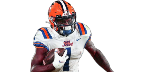
Generally ok with this look. However, the stripes need to match when possible. In this case with the white lid and jersey, the stripes need to be in the same order. There are 3 different triple stripes on this uni. Bad look Canes.Made the Orange and Blue a closer match to ours hopefully. Also erased the Miami logo on the jersey. That's when I noticed the Canes are dressed by Adidas.
Is there a Nike uniform that would be similar?

ChiefGritty
- Chicago, IL
The stripes don't match because they're paying homage to an era when the stripes matching wasn't as much of a concernGenerally ok with this look. However, the stripes need to match when possible. In this case with the white lid and jersey, the stripes need to be in the same order. There are 3 different triple stripes on this uni. Bad look Canes.

I'd be stunned if this is the direction we're going in, not least of which because all of these basic color elements have been available to Bielema the whole time. Not to say it couldn't look good, I'd just be really surprised.
What really worries me is that Bielema is caving and reintroducing something mix-and-match now that it has gone hopelessly out of fashion. That seems like the only way to square the circle with some of these comments and what we know to be the base look. A possible huge overread and misinterpretation but that's what we're here for.
mattcoldagelli
- Script Illinois Enthusiast
Sort of - I wonder if stripes are what are jumping out to people because (apart from the helmet stripe) it is the one thing our current uniforms completely lack.I'd be stunned if this is the direction we're going in, not least of which because all of these basic color elements have been available to Bielema the whole time. Not to say it couldn't look good, I'd just be really surprised.
ChiefGritty
- Chicago, IL
I'm making three predictions:
1. It will basically be a blue and orange version of LSU
2. It will have that "Illini" logo on the helmet
3. We're not seeing it until late August
1. It will basically be a blue and orange version of LSU
2. It will have that "Illini" logo on the helmet
3. We're not seeing it until late August
The Galloping Ghost
- Washington, DC
I'm making three predictions:
1. It will basically be a blue and orange version of LSU
2. It will have that "Illini" logo on the helmet
3. We're not seeing it until late August
MoCoMdIllini
- Montgomery County, Maryland
I might take another whack at this one later, because I chickened out on the helmet. I used the little script Illini where the little LSU logo had been.I'm making three predictions:
1. It will basically be a blue and orange version of LSU
2. It will have that "Illini" logo on the helmet
3. We're not seeing it until late August
And I could change the tint of the shoulder stripes but not so much anything else about them; they strike me as too light.
Attachments
Last edited:
Might get a peek at the spring game
TentakilRex
- Land O Insects between Quincy-Macomb-Jacksonville
There might be a "Nike weird" jersey in this set. I am guessing that the weird jersey will be copper colored like a penny, as the one Lincoln is on. I included the Arizona State "desert ice" and Springfield Lucky Horseshoes (who also has navy as a color) to give an idea of what I talking about. Don't worry I aam just a guy on a PC and not designing these jerseys

Jerse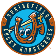
 ys
ys
Jerse
ys
Last edited:
IlliniMike_Aurora
Straight outta Champaign
I'm late to the party, but I would love to ditch the DEEP ORANGE (painters pants) for a brighter "Florida like" orange. Would also like to lighten the blue.
"Illinois" or "illini" mild arch across helmet (not the underlined Illinois early 2000s.
If we can't "lighten" the colors - which I doubt,
then I have to go with something I saw earlier on here - like Auburn's. shade lighter orange, but still dark blue.
we have to change the deep orange in my opinion or get rid of orange pants
my two cents, back to basketball...
Auburn look is best IMO.View attachment 24125
I'm late to the party, but I would love to ditch the DEEP ORANGE (painters pants) for a brighter "Florida like" orange. Would also like to lighten the blue.
"Illinois" or "illini" mild arch across helmet (not the underlined Illinois early 2000s.
If we can't "lighten" the colors - which I doubt,
then I have to go with something I saw earlier on here - like Auburn's. shade lighter orange, but still dark blue.
we have to change the deep orange in my opinion or get rid of orange pants
my two cents, back to basketball...
View attachment 24126
I'm actually a big fan of both the current shades of orange and blue.
chiefini
- Rockford, Illinois
IlliniMike, I don’t think there is a chance in the world that they’re going “to ditch the DEEP ORANGE (painters pants) for a brighter "Florida like" orange” after spending big bucks in a huge new marketing campaign ‘hail to the orange,’ which introduced a new Pantone of orange this past year. j/s
Fighter of the Nightman
- Chicago, IL
I have come to appreciate the more "traditional looks," including almost always wearing O/B/O at home and ditching a white or blue helmet, even if they look objectively cool. However, I am totally on board with blue pants on the road instead of orange and definitely instead of white. All white can look cool, but O/W/W just looks so damn goofy to me. My road preference would go:
1. O/W/B
2. O/W/O
3. O/W/W
EDIT: And yes of course, for the billionth time on my soap box - once our annual game vs. Northwestern (that the Big Ten Conferences insists must be our final game) logically gets moved to an annual indoor affair at the new Arlington Heights stadium, I obviously support looking like the Bears every year to rub it in Northwestern's face. B/B/W when we're the "home" team, B/W/B when we're the "away" team and B/O/W randomly to spice it up.
Last edited:
Fighter of the Nightman
- Chicago, IL
Without giving my specific opinions on any one helmet/jersey/uniform component, I do think Illini fans would be more willing to do "out of the ordinary" things like this IF we had a concrete look. Iowa fans love their blackout jerseys for "big games" because they look the same in every other game. I feel our issue (especially under Lovie) was we just mixed and matched at random ... that doesn't work.I liked the one year at Nebraska we wore all white with this helmet. Zook years I believe.
View attachment 24138
If we wore a very traditional looking O/B/O at home and O/W/B (my personal choice!) or O/W/O on the road, I think way more fans would like an occasional switch-up. As I have said before, when playing Northwestern, we could copy the Bears. When playing at PSU, we could go all white just to mess with them, lol. We can bust out all blue for a night game every couple of years or decide we will always wear orange jerseys for our bowl game (when we can). You get the idea.
This is a silly personal example of mine, but our high school baseball jerseys went like this:
Home: White vest top with green under shirt + white pants with cool green piping down the sides (we felt so cool...)
Away: Green regular jersey top + regular gray pants that you had to buy yourself, lol
Then, it was like a quirky program tradition of ours that you got to wear the green away jerseys with the cool white home pants IF you made it to the state tournament. Sounds dumb, but it felt like a cool tradition, and "getting to wear the state uniform" was a badge of honor, allowing you to join in on a tradition that only the best teams before you got to partake in. I would be on board with doing something like that, like reserving the orange jerseys for bowl games. Players often think that type of thing is cooler than many would realize, JMO.
I guess the helmets aren’t going glossy. Can’t wait to see what updates are made to the uniforms.
Interesting, but what’s the significance of this?

Illini92and96
- Austin, TX
Plastic
Plastic straws end up as plastic waste and floating in the ocean, so should be banned?Interesting, but what’s the significance of this?
View attachment 24264
TentakilRex
- Land O Insects between Quincy-Macomb-Jacksonville
Interesting, but what’s the significance of this?
View attachment 24264
Royal Blue and White "Prairie Ice" jerseys confirmed!
You’ve seen it haven’t youMight get a peek at the spring game
redwingillini11
White and Sixth
- Batavia
I’d be surprised if he hadn’t seen it months and months ago.You’ve seen it haven’t you
TentakilRex
- Land O Insects between Quincy-Macomb-Jacksonville
You’ve seen it haven’t you
So whose posts has he liked? That might be a clue.I’d be surprised if he hadn’t seen it months and months ago.
I think the matte helmets look a lot better than glossy.I guess the helmets aren’t going glossy. Can’t wait to see what updates are made to the uniforms.
I'm glad we are sticking with the current helmet, it's one of the better ones we've had in recent memory. BB changing to the white face mask, white outline around the Block I, and adding the stripe were great changes from the similar helmet the Lovie era had.
- Status
- Not open for further replies.