TheFlyingIllini1317
- Chicago, IL
Damn that would be disappointing. While I like those stripes I feel like it will look like knock off LSU. They really own that look in the college sphere of football.
Damn that would be disappointing. While I like those stripes I feel like it will look like knock off LSU. They really own that look in the college sphere of football.
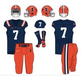
This could very well be it and imo it would be a downgrade. That massive ILLINOIS on the chest is ridiculous.New uniform. Road uniform has blue shoulder stripes with orange in middle. Blue numbers/lettering orange outline. Pants have same stripe as shoulders, orange pants with blue white blue. White set also. No orange jersey. Orange helmet, gloss finish, same stripe as pants. White facemask. Blue I with white outline.
This could very well be it and imo it would be a downgrade. That massive ILLINOIS on the chest is ridiculous.
Please please please no ridiculous ILLINOIS on the chest.This could very well be it and imo it would be a downgrade. That massive ILLINOIS on the chest is ridiculous.
Evil Genie: Wish granted, it will be 1LL1NO1S instead!Please please please no ridiculous ILLINOIS on the chest.
Nailed the helmet if Bielema’s picture with his daughters is the new helmet.This could very well be it and imo it would be a downgrade. That massive ILLINOIS on the chest is ridiculous.
Can you share this in the thread again? Went back and couldn't find it.Nailed the helmet if Bielema’s picture with his daughters is the new helmet.
For the recordLooks like the helmet stripe is about to switch and the helmets will move from matte to glossView attachment 25442
White popsIf that's the final helmet I have no complaints.... except that the face mask/straps should be blue.
“You’ve already seen the new helmet if you follow Bielema.”
I’ve been looking forward to it for a few months too!Can’t wait for the new uniform meltdown. Some of y’all been warming up for awhile.
View attachment 27268
Would not hate it.

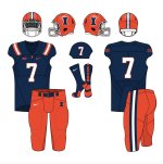
So much better, the #'s and not having the massive Illinois make a huge differnce. Based on the amount of script branding we've seen posted on socials let's hope it's more like this over the huge block letters on the chest.View attachment 27268
Would not hate it.
Neither would I. I feel decently strongly that stripes on the sleeve would look better than stripes on the shoulder, but I would consider the above a great, classic uniform that keeps much of the simplicity of the current set while updating it to just look more "complete." Also, while I am very sympathetic to Team Script, I really think the helmet posted above on Bielema's social media is all we had to do ... our helmet is great, the stripes just currently look "inside out." The script on the above uniform actually seems like the perfect dose of "pizazz" to compliment the otherwise very simple and traditional look.View attachment 27268
Would not hate it.
Eh, let me get my kids to bed and I can mock it up. I’ll try to do a better job than the last one lol I didn’t blend hardly anything together. Lots of crappy lines.Neither would I. I feel decently strongly that stripes on the sleeve would look better than stripes on the shoulder, but I would consider the above a great, classic uniform that keeps much of the simplicity of the current set while updating it to just look more "complete." Also, while I am very sympathetic to Team Script, I really think the helmet posted above on Bielema's social media is all we had to do ... our helmet is great, the stripes just currently look "inside out." The script on the above uniform actually seems like the perfect dose of "pizazz" to compliment the otherwise very simple and traditional look.
I'm curious what we will do for the road uniforms. I assume the same pants as above, but will we have blue numbers with an orange outline? Orange numbers with a blue outline? Bielema also seems to have somewhat of a preference for white pants (especially on the road), though, and it would be interesting if we had a pair of white pants with a B/O/B stripe ... wouldn't look awful at all if we used it sparingly!
Again, IMO, this uniform redesign was more about not messing things up than reinventing the wheel ... our current uniforms aren't BAD, we just mixed minimalist modern with traditional a bit too much, and the above mock-up would largely correct that. I'd be a pretty big fan, even if the stripes would look a bit better on the sleeve.
Epic photo editing work!View attachment 27268
Would not hate it.
")
If we go with this I'd take it, small script instead of the block I on the chest is fine too. I could do a road mock later, and team #bluepants on the road.
Definitely doesn't look as good.This, but orange number.