Alright, I am putting my official bet in before we get the reveal.

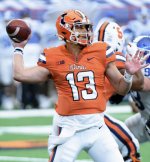
I think the above picture is spot-on, actually, and I am now fairly certain that my outline below is what we get. So, I call upon the graphic design gods to give us glorious mockups of the following with that jersey design! Personally, I would consider it a win for sure.
Home: O/B/O ... Same exact jersey as above, no graphic design gods required!
Away #1: O/W/O ... Same helmet as the Home jersey. Numbers are blue with an orange outline. Shoulder stripes
B/O/B.
Away #2: O/W/W ... Same exact uniform as Away #1 except for the pants. White pants with a
B/O/B stripe pattern (like the photo I posted above).
Alternate: O/O/W ... I actually would not be surprised if we do not have an orange jersey, but if we do this is my guess. Same helmet as every other uniform. Numbers are white with a blue outline. Shoulder sleeves are
B/W/B. Pants are the same as Away #2 - white with a
B/O/B stripe pattern.
I think we have that same orange helmet no matter what. I don't think we ever go all orange ... at least I sincerely hope we do not! I suppose we could sometimes do a
O/B/B uniform for a big night game in Champaign or something, but I doubt it ... I would prefer
O/B/W at home with these uniforms if we ever deviate.